
Explore interior trends, AI design insights, styling guides and real transformations
White and Grey Kitchens: A European Guide to Colour, Materials and Mood
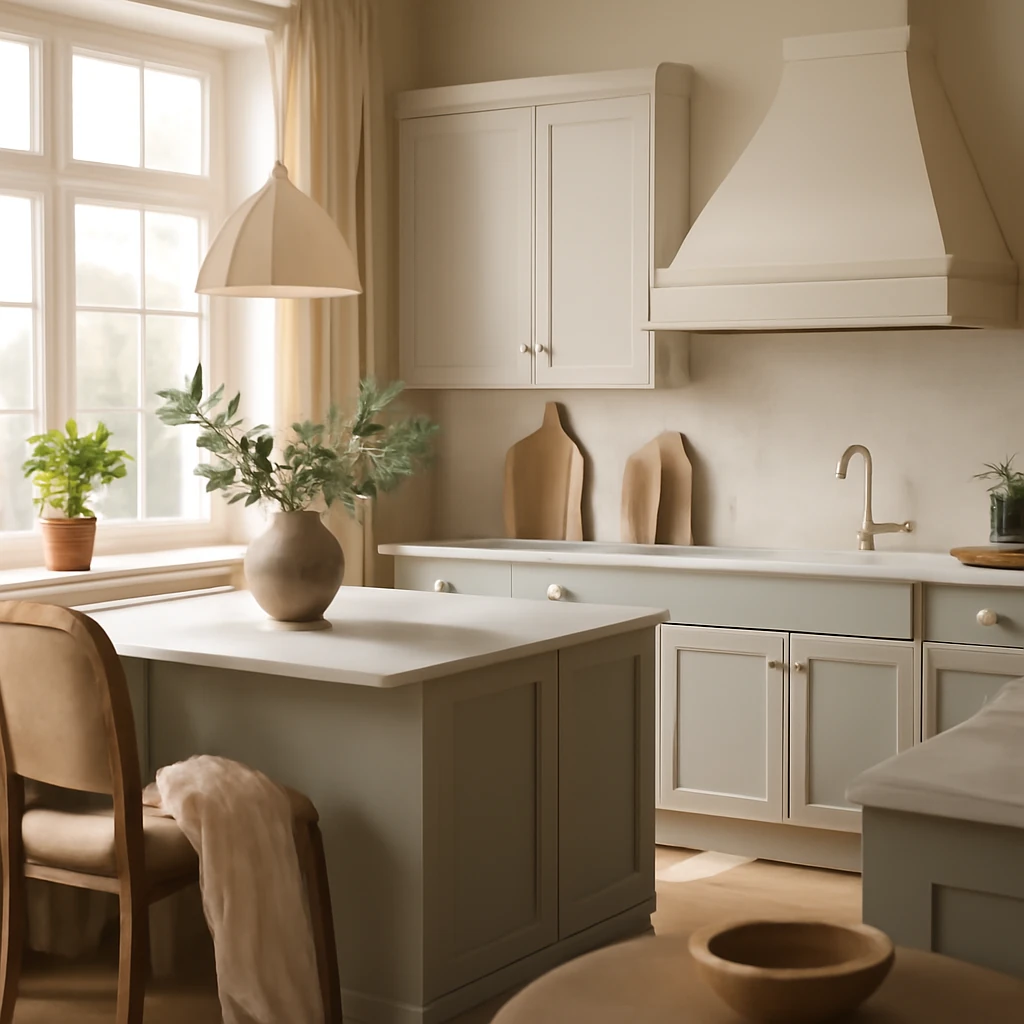
White and Grey Kitchens: The Timeless Duo
In European homes, white and grey kitchens have become a enduring baseline for contemporary interiors. The soft intermingling of white with mid to charcoal greys creates a calm, resilient backdrop that supports a wide range of styles, from rustic warmth to high gloss urban minimalism. Grey, in particular, is versatile: it pairs confidently with brass or nickel hardware, timber textures, and bold accent colours, without fighting for attention.
The approach works across compact city flats to generous family kitchens, offering light reflection, scale control and a sophisticated, understated mood that many homeowners crave. Below we explore the benefits, potential drawbacks and practical guidelines for designing a white and grey kitchen that feels timeless, welcoming and easy to live with in a European context.
Benefits and considerations
Benefits of a white and grey kitchen
- Increased sense of space: light surfaces reflect daylight and optical space expands, which is especially valuable in narrow or south facing layouts common in many cities.
- Styling versatility: white and grey form a neutral backdrop that works with classic, contemporary and Scandinavian influences alike.
- Timeless appeal: white and grey remain current for years, giving your kitchen longevity and ease of updates through accessories rather than full renovation.
- Practicality of maintenance: mid grey surfaces show fewer marks and fingerprints than light whites, while white worktops or counters stay crisp with proper sealing and care.
- Hardware and appliance compatibility: stainless steel, brushed nickel or matte black fittings sit nicely on a white-grey palette, enabling easy integration of durable appliances.
Considerations and potential drawbacks
Even a well-considered white and grey kitchen can feel cool if not balanced. The challenge is to add warmth through materials, lighting and texture to prevent a sterile impression, particularly in climates with lower daylight levels.
- To avoid a clinical atmosphere, introduce a third material such as warm timber, stone or textured coatings on walls or cabinetry.
- In rooms with limited sun exposure, plan layered lighting to mimic daylight and add warm accents to counterbalance the cool grey tones.
Three practical layouts for white and grey
White uppers, darker lowers
This is one of the most practical, timeless configurations. White upper cabinets visually lift the ceiling and brighten the room, while darker lower cabinets hide grime from cooking tasks and keep the footprint feeling neat and ordered.
Accent on the worktop
Designing with a white worktop and darker base units creates depth. White worktops on light cabinetry read as airy and clean, while a dark grey or charcoal countertop against lighter fronts adds architectural punch with a crisp edge.
Backsplash as a focal point
A backsplash can become a striking yet controlled feature. Pair a white or light grey cabinet range with a darker, solid colour backsplash or a subtly patterned tile. Just remember the rhythm: lighter walls with darker backsplashes, and vice versa, to maintain balance.
Using a contrasting backdrop
White cabinetry against a deep wall colour or dark floor can feel remarkably airy if the room has good natural light. Consider a charcoal floor or a dark wall to create a sense of depth in a white kitchen.
Monochrome enrichment - how to enhance a white grey space
A well composed white grey kitchen can feel complete on its own, yet carefully chosen third colours can add personality and warmth without overpowering the palette.
- Appliances and fittings
- Built in plumbing hardware
- Dining chairs and stools
- Islands or standalone cabinetry
- Open shelves and decorative panels
- Statement furniture pieces in milky timber or brushed metal
How to choose the third colour
The right third colour can transform a white grey kitchen into a signature space. The approach depends on the mood you want to create and the scale of the room. A practical rule to guide proportion is the 60 30 10 principle:
- 60 of the room should be the main tone
- 30 should be an auxiliary shade
- 10 should be the accent colour
For contrast - black
A touch of black can anchor a white grey kitchen. Use black hardware, a dark island or a black back panel to create a sophisticated focal point. Keep the proportion modest to avoid a heavy or oppressive feel, particularly in smaller spaces.
Metal accents in stainless steel or black finishes can read as complementary to the white grey palette and are commonly embraced in European kitchens.
For warmth - timber tones
Timber elements instantly soften a cool white grey scheme. Consider veneered doors, a natural timber breakfast bar, or a timber topped island. In small rooms, lighter sapwood tones enlarge the feel of the space, in larger rooms, deeper woods add luxury and depth without overpowering the palette.
Wood is a practical option for cabinet doors, tables, or open shelving, and pairs beautifully with both chrome and matte brass hardware.
For mood - yellow, orange, red
Bright accent colours in warm hues bring energy to a restrained palette. Used sparingly, they can act as a visual cue that guides the eye and elevates the whole interior. Limit strong hues to small patches or accessories to maintain balance.
- Limit to about 10% of the overall colour to avoid overpowering the space
- Integrate through tiles, textiles, or a statement chair or cushions
For calm - pink and green
Soft pinks and sage greens can inject gentleness and a boutique feel into a white grey kitchen. Subtle greens in plants or glassware, or a rosy accent on textiles, can create a refined, restful atmosphere.
For freshness and volume - blue
Blue tones, from powder to navy, can make a space feel calmer and more expansive. The choice of blue affects mood: cooler tones feel crisp and fresh, warmer blues offer a cosy, cocoon-like warmth. Pair with warm timber or brass for contrast.
How to craft a white grey kitchen design
Walls - flat or textured
For a calm neutral backdrop, a flat painted finish in a pale or mid grey can be ideal. In smaller spaces, a very light grey or off white maintains brightness and openness, while deeper greys work in larger areas with ample daylight.
Alternatively, wallpapers in complementary tones can add character. Choose a wallpaper that ties into the shade of the cabinetry to create cohesion rather than distraction.
Finishes - microcement, plaster, or paint
Microcement offers a tactile, contemporary texture even on imperfect walls. It creates interest through subtle variation, from a smooth satin finish to more veiled, muted mottling. It works well on feature walls or around the cooking area in larger kitchens, but is less forgiving on small details and maintenance in high wear zones.
Paint remains the simplest route for a uniform backdrop, while wallpaper can introduce texture and depth. When picking a wallpaper, consider the scale of the kitchen and the direction of light to avoid heavy patterns becoming overwhelming.
Flooring - timber, tile or composite
flooring sets the tone for the entire space. A light wood floor can keep the room feeling open and warm, while a light grey tile or warm ceramic can deliver durability and comfort for heavy use. In kitchens with frequent water exposure, choose non slip, sealed finishes and select materials that resist staining and cleaning agents.
Richer woods add warmth and value, while cool greys in floor tiles can reinforce the palette across the room. The pattern of the floor can echo the design of the backsplash or be intentionally independent to create visual rhythm.
Ceiling - white or light grey
White ceilings keep the space feeling open and bright. A pale grey ceiling can add designer depth in rooms with tall walls or where the walls themselves are very light. In some cases a slightly darker ceiling can visually ground a tall room, particularly in open plan layouts.
Cabinets - finish and texture
Cabinet fronts can be flat panel or have texture such as ribbing or a simple bevel. For contemporary looks, consider matt finishes with subtle undertones. Highly glossy fronts are less common in European kitchens but remain possible where a high shine is desired. The key is consistency and texture balance with the rest of the space.
Countertops - practical and durable
Countertops must withstand daily tasks and resist water, stains and heat. Engineered stone or quartz offers durability and a clean, contemporary look. Natural stone looks luxurious but requires careful maintenance to avoid stains and etching. Timber or timber-effect laminates offer warmth and are more forgiving in busy family kitchens.
Backsplash - subtle background or statement feature
A backsplash can be a quiet backdrop or a bold statement. If the cabinetry is light, consider a darker backsplash to create depth, or a lighter tile with texture to reflect light. Glass or ceramic tiles in a restrained pattern can add nuance without overpowering the overall palette. For a more continuous look, a seamless backsplash in a durable material such as ceramic or porcelain can simplify cleaning and maintenance.
Dining area - adapt to the space
In open plan spaces, the dining zone should feel integrated with the kitchen while remaining distinct. A dining table in wood or a pale stone finish can balance the cool palette. Chairs in a complementary colour or natural materials can add personality without clashing with the white grey core.
Lighting - multi level illumination
Lighting is crucial to reveal the beauty of a white grey kitchen. A layered approach typically includes:
- General ambient light to illuminate the whole room
- Task lighting above the cooking zone
- Decorative lighting over the dining area or island
- Under cabinet lighting to enhance work surfaces
Natural materials and a restrained decor
Even with a restrained palette, natural materials play a vital role in adding tactility and warmth. Avoid busy prints or florals in textiles and curtains. Instead, opt for solid fabrics and plant life to bring colour and life into the space without visually overpowering the neutral base.
Case studies and practical takeaways
Across Europe, homeowners and designers approach the white grey kitchen with a pragmatic yet expressive mindset. A typical urban scenario might feature a 40 to 60 m² apartment with compact kitchen zones that benefit from light, studio-style cabinets and integrated appliances. In larger homes, a white grey base provides a calm foundation for bold furniture and sculptural lighting. The following practical notes emerge with striking consistency:
- Test your palette with large swatches and observe colour under different daylight conditions across the day and through the seasons.
- Prioritise materials that age well and resist moisture and heat, ceramic tile backsplashes and quartz worktops are popular choices for their robustness and ease of maintenance.
- Balance warmth with timber accents or soft textiles to avoid a cold, uninviting atmosphere in darker northern climates.
- Plan lighting in layers to ensure both functionality and ambience: a well designed kitchen should glow with clarity during cooking and feel cosy at mealtimes.
- Keep the overall proportion simple, avoid overly busy patterns that can overpower the subtle elegance of a white grey palette.
Decor - natural and restrained
As a rule, avoid busy prints and loud patterns in curtains or tableware. A restrained approach works best: solid textiles, natural materials such as stone, wood and woven textures, and an abundance of living plants to bring warmth and life into the space.
Plants not only contribute colour but also improve air quality and soften sharp architectural lines. A single statement plant on an island or a trio of pots on open shelves can be enough to introduce tactility without disrupting the calm of the palette.
Conclusion
The white and grey kitchen is a timeless canvas that adapts gracefully to European homes of all sizes. With thoughtful material selection and a nuanced approach to lighting, texture and third colours, the palette remains inviting, flexible and resilient in the face of changing interiors trends. The secret lies in balancing surface finishes, light, and the judicious use of colour to create a space that is both highly functional for daily life and quietly stylish for years to come.
You may also like these articles
 Bedroom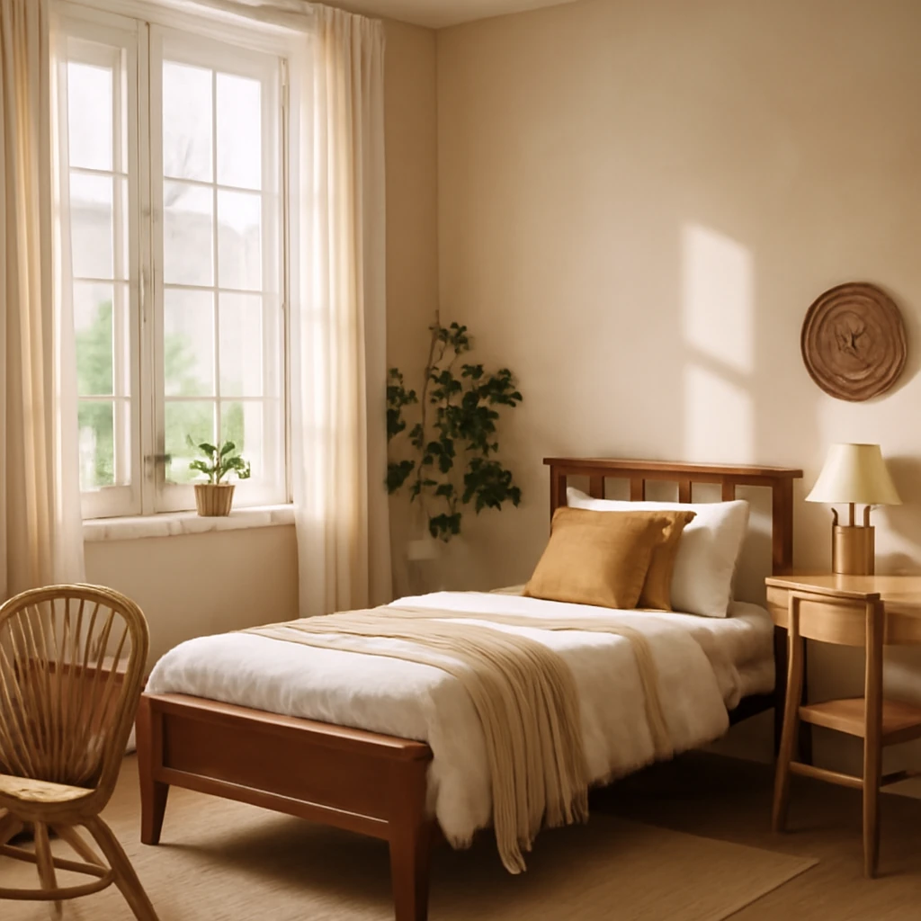
Creating a Teenager’s Bedroom: European Styles, Zoning and Comfort
Smart, stylish ideas for a teenage girl’s European bedroom.
Interior Design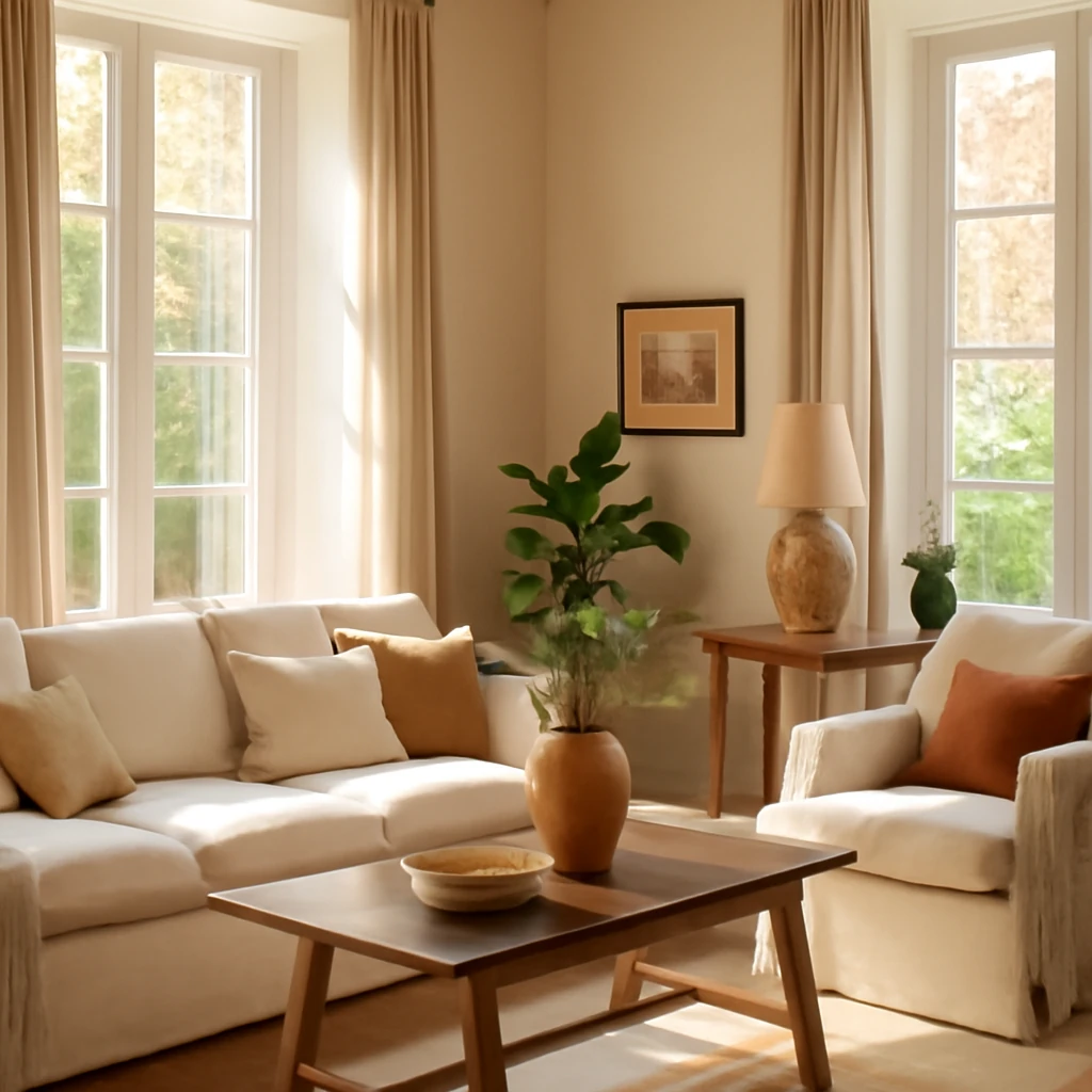
A sunlit Provençal-inspired home: warmth, light and crafted charm
A sunlit, Provence-inspired family home blending light, colour and handmade details.
Interior Design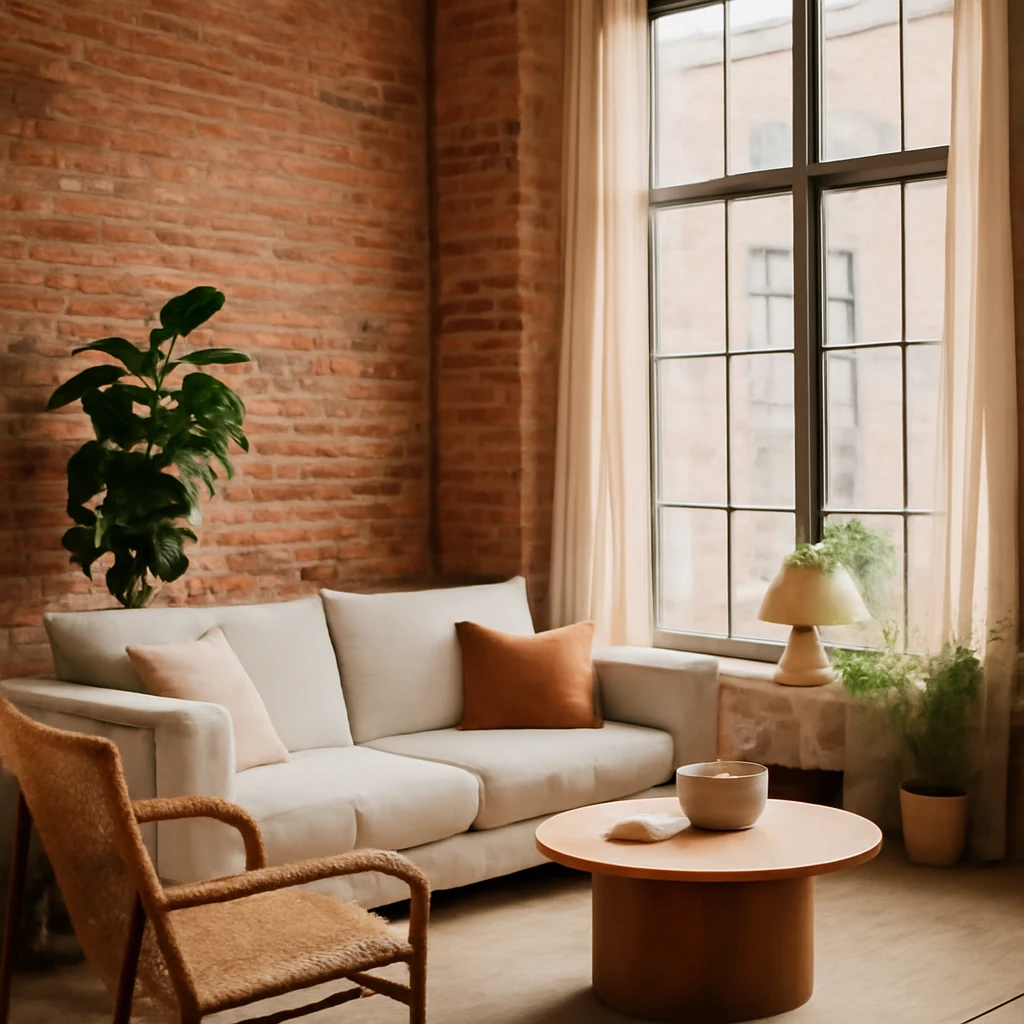
Industrial style interiors in Europe: brick, steel and warmth for every home
Practical guide to industrial style for European homes, from materials to lighting.