
Explore interior trends, AI design insights, styling guides and real transformations
Bright Living Rooms: Designing with Pale Palettes Across Europe
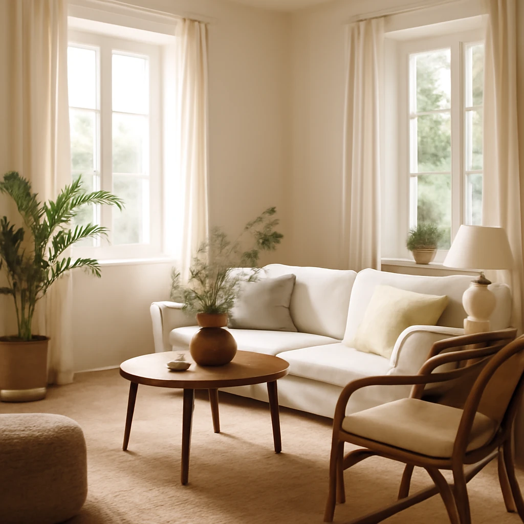
Why light-toned living rooms work across Europe
In many European homes, a light-toned living room is more than a colour choice, it is a design philosophy. Pale palettes can illuminate spaces with limited daylight, make compact rooms feel more generous, and provide a flexible backdrop for evolving lifestyles. Across the continent, architects and interior designers repeatedly return to these hues because they respond to diverse climates, architectural legacies, and the practical realities of urban living. A well-planned light interior is not merely about brightness, it is about atmosphere, texture, and scale. When executed with care, a pale palette can be simultaneously calm, warm, and surprisingly expressive.
In practice, a European living room built around light tones often relies on a deliberate layering of materials and finishes. Natural light plays a central role, while window treatments, flooring, wall surfaces, and soft furnishings are chosen to reflect and modulate that light. The result is a space that feels airy yet tactile, restrained yet expressive, and always ready to adapt to changing seasons and activities.
Palette foundations: base neutrals
The base of any light living room usually begins with neutrals that sit between white and beige, with undertones that read warm, cool, or neutral depending on the locale and the light. In practice, designers favour nuanced whites - ivory, eggshell, and pale stone - alongside soft greys and warm beiges. These hues form a canvas that can support a wide range of furniture styles, textures, and art without competing with them.
White can be a powerful ally when tempered with gentle undertones. A bright white with a touch of ivory reads warm in morning light and remains crisp in the afternoon. Pale grey introduces depth without dulling the room, while warm beige or stone evokes natural materials and a subtle warmth that makes spaces feel lived-in rather than clinical. The aim is to avoid the risk of flatness: even with light tones, the layer and interaction of materials generate visual interest.
Texture and material variety: enriching a pale palette
A light interior thrives on texture. When the colour story is restrained, texture becomes the language that conveys tactility, warmth and character. Consider mixing surfaces with care: matte plaster walls, a softly sheened ceiling, and floor coverings that invite bare feet. The eye recognises difference more than it does colour when contrast is achieved through texture rather than saturation.
- Textured wall finishes such as fine plaster, limewash, or subtle wallpaper with tactile surfaces
- Timber elements in light shades (driftwood, pale oak, ash)
- Natural stone or ceramic tiling with a matte or honed finish
- Textiles: bouclé, linen, soft cotton, crushed velvet or wool blends
- Soft furnishings in layered textures to create depth without colour overload
In European contexts, it is common to see a palette anchored by light stone, pale oak, and natural fabrics. Fireplaces, cabinetry, or shelving in off-white or warm timber help balance the coolness that pale walls can occasionally give in winter daylight. The key is to curate a range of tactile experiences that invite touch and linger in the memory of the room.
Colour distribution: balanced palettes and the 60/30/10 rule
Colour theory in light interiors often follows a practical distribution to maintain harmony. A frequently recommended approach is the 60/30/10 rule: 60% a dominant base colour (the walls and ceiling), 30% a secondary colour (sofa fabric, large carpets, or curtains), and 10% an accent colour (bright cushions, a rug with a subtle pattern, or a single piece of statement furniture).
In European living rooms, this framework is adapted to reflect local preferences and daylight. The dominant colour might be a warm white or pale grey, the secondary could be a complementary beige or soft taupe, the accent could be a muted blue, olive, terracotta, or a rich green. The emphasis remains on restraint: accents should feel deliberate and regenerative rather than overwhelming.
Ceiling, walls, and floors: building a cohesive base
The ceiling can either recede or lift the space, depending on treatment. In many modern interiors, ceilings are kept white or washed in a very pale grey to maximise daylight reflection. However, architectural interest can be added through timber beams, a panelled surface, or a concealed lighting coving that emits a gentle glow around the room's edges. Walls, meanwhile, are typically finished in paint or wallpaper with subtle texture, avoiding busy patterns that compete with the room's proportions.
Flooring anchors the room and sets the mood for the entire interior. Light-toned timber remains a favourite for European living rooms, its warmth is tempered by modern finishes such as engineered wood or ceramic tiles with wood-look textures. For compact spaces, a pale floor can expand the sense of space, while a tactile rug in a soft neutral can define seating areas and add a focal point without introducing loud colour.
Lighting layers: creating depth and atmosphere
Lighting is a critical tool for pale interiors. The most successful schemes combine multiple layers of light to create clarity, warmth, and texture. A well-planned lighting plan typically includes four layers:
- General or ambient lighting: the room’s primary source, such as a ceiling fixture or recessed lighting, which should illuminate evenly without glare.
- Task lighting: focused light for reading and desk work, positioned at seating zones or near key surfaces.
- Accent lighting: narrow beams or wall-washers that highlight architectural features, artwork, or textures in the walls and ceilings.
- Daylight strategy: optimise natural light through window treatments, glazing, and reflections to extend daylight hours and reduce the need for artificial light during the day.
Consider warm rather than cool white tones for general and task lighting to enhance the room’s warmth. In spaces with large windows, white or light-reflective surrounding surfaces amplify daylight, while reflective decor surfaces - metallic trims, glass, or light-coloured ceramics - can bounce light and add sparkle without colour saturation.
Furniture in light interiors: form, scale, and function
In pale living rooms, furniture often acts as the anchor for the space’s rhythm. A well-proportioned sofa is central to the plan, with colleagues, armchairs, a coffee table, and storage pieces arranged to facilitate conversation and movement. The furniture palette tends to stay within the neutral spectrum, but it is the texture and silhouette that determine the room’s character.
Key considerations for European living rooms include:
- Scale: ensure seating groups relate to the room’s dimensions, for a room around 26–30 m², a sofa around 2.2–2.8 m long paired with two chairs can create a balanced, sociable arrangement.
- Proportions: avoid oversized items in small rooms, choose streamlined, timeless shapes and avoid heavy, bulky forms that weigh down light surroundings.
- Mix of styles: a contemporary sofa can sit comfortably with a vintage armchair or a mid-century coffee table, provided the finishes and textures harmonise.
- Fabric choices: light-coloured upholstery should be selected with durability in mind, boucle, linen, and tight-weave textiles offer a pleasing tactility while resisting wear.
A single statement piece - a sculptural chair, a vintage cabinet, or a crafted coffee table - can act as a focal point without overpowering the space. The rest of the furniture typically remains quiet, allowing the accent piece to breathe life into the room.
Decor and textiles: the secret to layered warmth
Textiles are the easiest path to transform a pale living room across seasons and moods. They are also the most forgiving means of expressing personality without compromising the scheme’s restraint. Consider variations in weave, weight, and pattern rather than bold colour shifts.
- Luxurious throws and cushions in bouclé, wool, linen, or velvet add tactile warmth.
- Rugs define zones and introduce pattern, choose low- to medium-pile for practical wear and easy cleaning.
- Curtains or soft shading soften windows and reflect daylight more uniformly than blinds alone.
- A few decorative objects - vases, candles, and sculptural pieces - should tell a personal story and remain cohesive with the overall palette.
Pattern, when used, should be subtle: tonal geometrics, delicate botanical motifs, or soft abstracts read elegant against a pale field. The repeat should be thoughtful, not frenetic, ensuring the room remains serene even with layered textures.
Wall and surface treatments: finishes that speak softly
Walls and surfaces set the room’s tone. Paint remains the most economical and flexible option, but high-end options such as decorative plaster, microcement, or restrained wallpaper can deliver depth without overpowering the space. When considering wallpapers, choose textures or very restrained patterns - think gentle linen textures, fine grasscloth, or subtle timber-grain motifs that echo natural materials in the room.
For the ceiling, a smooth plaster finish in pale tones or a coordinating light wood panel can subtly extend the architecture. If you wish to introduce a moment of surprise, consider a completely pale ceiling with a delicate cove lighting system to create a soft halo around the room’s edge.
Styles in light palettes: adapting globally, feeling local
Scandinavian
The Scandinavian influence is still a perennial favourite across Europe for light-filled interiors. Expect white walls, pale woods, and functional pieces with clean lines. The aim is a calm, uncluttered space where natural light is king. Furnishings lean towards tactile textiles and hygge-inspired comfort, with a restrained colour cue that keeps the room bright but never sterile.
Minimalism
Minimalism in pale interiors emphasises simplicity and proportion. A restrained palette of white, grey, and beige, with occasional black or graphite accents, creates a sense of clarity and order. The focus is on quality over quantity, every item earns its place and contributes to the space’s rhythm.
Wabi-Sabi
Wabi-Sabi translates to an appreciation of impermanence and imperfect beauty. In light interiors, this translates into natural textures, subtle irregularities, and a quiet, earthy gentleness. Soft greys, warm beiges, and clay-like tones populate spaces that celebrate the energy of simplicity and the passage of time.
Japandi
Japandi fuses Scandinavian clarity with Japanese restraint. The palette stays light and neutral, while finishes become a blend of soft wood, stone, and lacquered surfaces. The effect is warm, meditative, and deliberately functional - an elegant balance of comfort and restraint.
Retro revival
Retro influences - from the 1950s to the 1970s - are often refreshed with a light, modern take. Contemporary pale interiors can combine vintage furniture with clean lines and subtle textures, creating a sense of nostalgia without heaviness. The palette remains soft, with occasional colour intros for warmth and personality.
Practical planning: a phased approach to project execution
When undertaking a pale living room project, careful planning reduces risk and ensures consistent outcomes across spaces. Here is a practical phased approach that European clients frequently adopt:
- Define the baseline: select the dominant base colour and document the undertones that will harmonise with daylight hours in the room.
- Establish the anchor: choose a main seating piece (sofa or chaise) and a complementing coffee table that establish the room’s scale.
- Layer the light: design a lighting plan with ambient, task, and accent layers, plan dimming options to shift the mood from day to night.
- Texture map: list any new textiles and finishes, aim for a coherent mix of textures that boosts tactility without introducing busy patterns.
- Surface cohesion: decide wall, ceiling, and floor finishes, ensure materials read as a connected, single story rather than isolated patches.
- Furniture choreography: arrange seating to promote conversation, allowing clear sightlines to focal pieces and access to natural light.
- Softening the space: plan textiles and decor that can evolve seasonally or with the occupant’s preferences without a complete redesign.
With careful planning, pale interiors can be refreshed without costly overhauls. Swap textiles seasonally, update a single decorative piece, and adjust lighting to alter the room’s feel while keeping the core palette intact.
Budgeting and phasing: practical considerations
European homes often face a balance between quality and cost. A staged approach helps manage investments effectively. Consider these guidelines:
- Prioritise durable foundations: durable flooring, quality base paint, and a well-proportioned sofa form the room’s backbone and should be funded upfront.
- Invest in textures: textiles and textiles-related accessories deliver the most noticeable gains in warmth and tactility without major structural work.
- Flexible lighting: plan a lighting system with adjustable brightness rather than a single fixed pendant, enabling the space to adapt over time.
- Seasonal updates: refresh the feel by swapping cushions, throws, and curtains, this maintains a fresh look without a full renovation.
In many European cities, compact apartments benefit from modular or custom-made storage that keeps surfaces uncluttered. Clever storage supports a lighter palette by ensuring only essential items occupy visible space.
Common mistakes to avoid in pale living rooms
- Over-reliance on white: without texture and warmth, a space can feel sterile or harsh, especially in darker corners.
- Pattern chaos: too many small patterns or busy motifs can compete with the room’s quietness, keep patterns restrained and cohesive.
- Inconsistent light: rely on a single lighting source, layered lighting is essential for depth and mood control.
- Poor scale: choose furniture that fits the room’s proportions, a sofa that dominates a small space will hinder movement and comfort.
- Neglecting storage: pale interiors benefit from thoughtful storage that keeps surfaces clean and visually calm.
Small spaces: optimising light and layout
A common challenge in many European homes is achieving a sense of space in modest footprints. Light-coloured walls reflect daylight and, when combined with large mirrors, glass surfaces, and translucent fabrics, can visually multiply the room. Furnishings with slender profiles and rounded edges reduce visual heaviness, while built-in storage resources keep the floor plan legible. In compact spaces, choose a lighter rug and keep furniture off the walls to create an illusion of depth and air.
Case study: a practical planning scenario
Consider a contemporary apartment living room with an area of 28 m² and ceiling height of 2.6 m. The client desires a calm, light ambience with a timeless sensibility. The plan may include a sofa measuring 2.4 m, two lounge chairs, a medium-sized coffee table, and a media console. The base palette includes white walls, a pale grey ceiling, and a pale oak floor. The sofa fabric is a warm grey-beige, with cushions in soft bouclé and linen. A layered rug - neutral with a faint geometric pattern - defines the seating zone. A single accent colour, such as a muted blue or olive, appears in cushions and a ceramic vase. Lighting comprises an overhead dimmable fixture, a pair of floor lamps beside the seating area, and wall-mounted fixtures to highlight texture on the walls and architectural details. The result is a room that feels expansive, comfortable, and quietly sophisticated, able to adapt to a busy family life or relaxed entertaining.
Conclusion: crafting timeless pale interiors for European homes
A pale, light-toned living room is not a temporary trend, it is a resilient strategy for European homes that balances daylight, comfort, and longevity. With careful material selection, texture layering, thoughtful lighting, and a disciplined approach to colour distribution, a light interior can be endlessly adaptable. It invites you to live in the space - weekdays and weekends alike - without shouting its own personality, while still allowing personal style to emerge through textiles, objects, and the occasional artful piece.
You may also like these articles
 Tips & How-To
40 Smart Cleaning Hacks to Keep European Homes Pristine and Efficient
Forty practical cleaning tricks tailored for European homes and interiors.
Colour & Materials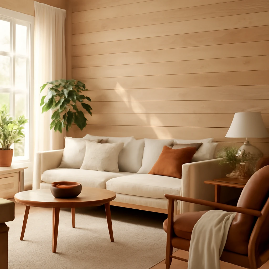
Timber wall finishes: nine options for European homes
Timber wall finishes for European homes—budget to premium explained.
Small Spaces
Welcoming Entrances: Designing a Practical and Stylish European Hallway
A guide to stylish, space-saving hallways across European homes.