
Explore interior trends, AI design insights, styling guides and real transformations
Green in the European Home: Trends, Pairings and Practical Ideas
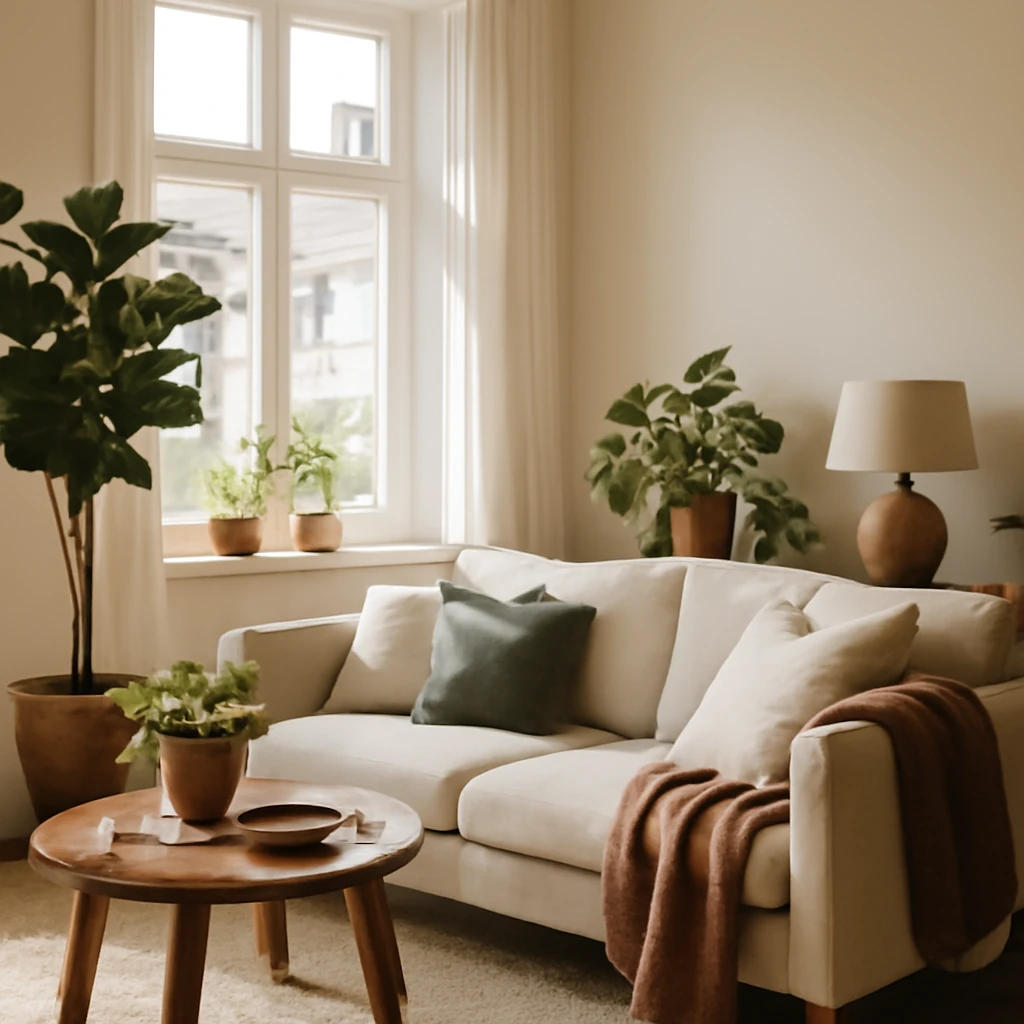
Why green works in European interiors
Green is the colour of growth, light and renewal, and in European homes it brings a sense of calm and connection to the natural world. In cities where daylight shifts with the seasons, a thoughtfully chosen green palette can soften contrasts, soften hard lines, and invite slower, more intentional living. The beauty of green lies in its versatility: it can recede into the background as a soothing backdrop, or stand tall as a deliberate design statement. When used with intention, green helps spaces feel more balanced, breathable and comfortable - a welcome antidote to the busyness of modern life.
Psychologically, greens with yellow undertones feel energising yet grounded, deeper greens convey sophistication and privacy, and cooler greens with blue notes provide a sense of airiness. The goal in European homes is to achieve a palette that harmonises with natural materials, daylight conditions, and the evolving needs of occupants - from quiet workspaces to social hubs for gatherings with family and friends.
Across diverse European contexts - from compact apartments in historic centres to light-filled new-builds with generous fenestration - green can be the connective thread. The key is moderation and layering: choose a dominant green, then add complementary hues in textiles, furniture and finishes to create depth and texture without overwhelming the space.
The green spectrum: shades that shape mood
Green encompasses a broad spectrum of hues, each with a distinct emotional resonance. Here are commonly used greens in contemporary interiors and how they influence atmosphere:
- Salad green - fresh, light and friendly, ideal for walls or ceilings in small rooms to increase perceived airiness.
- Emerald - rich and luxurious, perfect for statement furniture or an accent wall in larger living spaces.
- Turquoise - vibrant and rejuvenating, great for bathrooms, kitchens or colourful accessories.
- Teal / Sea tones - sophisticated without being heavy, suitable for dining rooms and libraries.
- Mint - cool, minty greens feel modern and calming, excellent in bedrooms and nurseries alike.
- Olive - earthy and versatile, pairs well with natural wood and stone for a grounded atmosphere.
The broad appeal of greens lies in their neutrality: even the most saturated greens can be balanced with white, grey, beige or timber to create interiors that feel timeless rather than fad-driven. The European home often embraces layered neutrals as the canvas, with greens weaving in colour, texture and mood across walls, furniture, textiles and accessories.
Where green shines in European homes
Green is adaptable for several rooms and roles within a home. Below are practical ideas for how to place green throughout living spaces, with attention to daylight, scale and proportion.
Living rooms and lounges
The living room is where green can make a bold first impression or quietly support a sophisticated, relaxed vibe. A pale sage or mint on walls can create a serene backdrop for large seating, while a saturated emerald armchair or sofa acts as a focal point. In larger rooms, a green sofa paired with a neutral rug, timber coffee table and soft textiles will feel grounded and refined. For smaller living rooms, consider a white or ivory base with green accents: cushions, throws and a single upholstered piece or artwork to avoid overwhelming the space.
Textures matter. Combine natural materials such as linen, wool and cotton with smooth lacquered surfaces in complementary greens to avoid visual heaviness. In terms of palette, pair cooler greens with blues and crisp whites to evoke an airy, coastal mood, or fuse warmer greens with warm neutrals and timber to create a cosy, modern rustic feel.
Bedrooms
Bedrooms benefit from greens that promote rest and focus. Soft, desaturated greens like pale sage or dusty mint create a quiet, retreat-like atmosphere. For a more luxurious master retreat, consider a deep forest or emerald bed surround with lighter, silky textiles in ivory or pale grey. Bedding in layered shades of green with white or beige accents helps maintain airiness and prevents the room from feeling overwhelmed.
In smaller bedrooms, wallpaper or a feature wall in a gentle green can establish a calm mood, while subtle green bedding and drapery keep the space cohesive. If you sleep best in cooler light, pair green with soft blues or greys to reinforce a tranquil ambience.
Kitchen and dining spaces
Green is particularly appealing in kitchens and dining areas. Olive, sage and emerald work well for cabinetry, islands or shelving, paired with natural timber finishes, stone worktops and ceramic tiles in neutral tones. A green island can ground the room, while white or pale-grey cabinetry elsewhere maintains brightness and legibility in the space. For dining, a warm olive table or upholstered dining chairs in olive or moss can create a welcoming, Mediterranean-inspired atmosphere.
Blue-green combinations - such as teal with mid-tones of grey or white - feel fresh without feeling clinical. In climates where heat is a factor, cooler greens paired with light surfaces create a refreshing culinary environment that encourages relaxed meals and sociable conversations.
Bathrooms and wet rooms
Bathrooms benefit from moisture-friendly greens such as seafoam, mint and soft turquoise. These tones pair well with natural stone, ceramic tiles and nickel or brass fittings. A green vanity unit with matte finishes can be both practical and stylish, while pale green tiles or a tiled shower wall can evoke a spa-like mood. Resist overpowering the room with too many saturated greens, instead, balance colour with white or warm neutrals to preserve a sense of cleanliness and light.
Home offices and studies
Green is associated with balance and concentration, making it a sensible choice for a workspace. Softer greens with a touch of grey or blue can support focus, while a deeper green can create a feeling of durability and permanence. Pair green walls or desks with white, ash, or light timber for an uncluttered, productive environment. Textiles such as cushions, rugs and curtains in varying greens can bring depth without distraction.
Small spaces and modular homes
In compact dwellings, green is a powerful ally. A light green backdrop can visually expand a room, especially when combined with white ceilings and lighter timber floors. Use green in accessories or a single feature wall to define zones within an open-plan layout. Consider matte finishes and minimal hardware to maintain a sense of air and ease in small areas.
Colour harmonies: with white, beige, grey and blue
Green pairing is a central theme of contemporary European interiors. The most successful combinations rely on restraint, texture and contrast rather than sheer volume of colour. Here are practical pairing strategies:
- White and green: The classic pairing. White allows green to take centre stage while giving space to breathe. Soft green walls with white mouldings, or a white room with a green sofa and accents, feels fresh and modern. This combination also enhances daylight by reflecting light back into the room.
- Green and beige: Warm, tactile and timeless. Pair a muted olive or sage with sandy beiges and natural fabrics to achieve a sunlit, countryside-meets-city atmosphere.
- Green and grey: A sophisticated, contemporary look. Choose mid to dark greens with cool greys to create depth, particularly in living rooms and home offices.
- Green and blue variations: Green with blue undertones (turquoise, teal, sea tones) reads as fresh and uplifting. Lighter greens with pale blues expand spaces, deeper greens with navy or cobalt emphasise elegance in larger rooms or libraries.
- Wood and earth tones with green: Natural timber, stone and leather textures anchor the palette, reinforcing an organic feel. Olive and forest greens pair beautifully with walnut, oak or birch finishes.
In practice, the pairing approach depends on room size and natural light. Light greens with white or pale timber suit smaller rooms, while deeper greens with warm neutrals fit more expansive spaces or areas that benefit from a sense of luxury.
Combinations that require careful handling
Some colour pairings can create visual tension if not balanced carefully. The following should be used with restraint, especially in bedrooms or children’s rooms:
- Red - energising but potentially disruptive if overused against green, best as small accents or in textiles rather than dominant surfaces.
- Black - adds drama but can overwhelm light greens, use sparingly as architectural details, furniture silhouettes or hardware rather than as a primary wall colour.
- Orange - vibrant and tactile, yet it can clash with greens if the palette is saturated. Consider muted orange or terracotta as accent notes rather than the main pairing.
In living rooms and studies, these bold pairings can work when the green is restrained or when the room benefits from high-contrast drama. In sleeping areas or children’s spaces, opt for softer combinations to preserve calm and balance.
Practical tips for implementing green interiors
Turning theory into a functional design plan requires a clear method. The following steps help ensure a successful green interior across European homes:
- Define a dominant green - select one shade that will anchor the space. This could be a gentle sage on walls or a deep emerald on a statement piece. The goal is cohesion, not saturation.
- Test in daylight - daylight shifts colour perception. Sample swatches or small-painted panels on different walls to observe how the colour reads in morning, afternoon and low winter light.
- Layer with neutrals - complement greens with neutrals such as white, off-white, grey or beige. Neutrals create space for the eye to rest and prevent colour fatigue.
- Incorporate texture - textiles, ceramics, stone, and timber introduce tactile depth. Velvet cushions, boucle throws, linen drapes, and wool rugs bring warmth to the palette without relying solely on colour.
- Vary finishes - mix matte, satin and gloss surfaces to avoid a flat look. For example, a matte green wall with satin-finish furniture or a gloss-topped table in a green hue can create subtle contrast.
- Choose durable materials - for kitchens, bathrooms and high-traffic areas, select finishes that resist moisture and wear. Ceramic tiles, quartz or solid surfaces in green tones, and treated timber offer longevity without compromising style.
- Think in zones - in open-plan homes, green can define separate zones. A green kitchen island, a green-backed shelving wall, or a green seating area can signal function while maintaining visual harmony.
- Lighting matters - warm and cool lighting will affect how greens read. A mix of daylight, warm ambient lighting and task LEDs helps maintain colour balance and comfort.
- Accessorise strategically - introduce greens through cushions, throws, vases, rugs and artwork rather than overhauling entire surfaces. This makes changes more affordable and adjustable over time.
For sustainable design, prioritise natural materials and low-VOC finishes. A European home can embrace green through materials that age well, such as timber, stone, ceramic and natural fabrics. These choices contribute to a timeless aesthetic that remains resilient across shifting trends.
Materials, finishes and textures that pair well with green
To achieve a polished, long-lasting look, combine greens with materials and finishes that offer warmth, texture and tactility. Here are reliable combinations to consider:
- Timber and stone - warm woods (oak, ash, walnut) and natural stone surfaces enrich green interiors with organic tactility and durability.
- Textiles - linen, wool, cotton in neutral or complementary greens provide softness, acoustics and comfort.
- Tile and surface finishes - glazed ceramic tiles in soft greens or white with subtle veining work well in kitchens and bathrooms, matte plaster or limewash walls create a sophisticated, tactile backdrop.
- Metallic accents - brass, brushed nickel or blackened steel hardware and light fittings add a contemporary edge.
When designing with green, always consider the room’s function, the amount of natural light, and the amount of time occupants spend there. A palette that feels serene during long European winters should also be adaptable to brighter summer days, ensuring year-round comfort.
Longevity and maintenance of green interiors
Green interiors, when selected with care, offer longevity beyond seasonal trends. To keep greens feeling fresh over time, consider the following practices:
- Paint quality and finishes - choose high-quality, washable finishes for walls in high-traffic areas. A semi-matt or satin finish is forgiving, durable and relatively easy to clean.
- Wall protection - in kitchens and entryways, consider tile or moisture-resistant coatings behind sinks and splash areas to safeguard green walls from wear and damp.
- Regular refreshes - swap cushions, throws and curtains seasonally or as tastes evolve. This keeps the space current without a full renovation.
- Maintenance of wood and textiles - follow care guidance for timber finishes and textiles to preserve colour integrity and texture. Use protective coatings where appropriate.
When considering renovations, plan for flexibility. A green-dominated space may require updates to textiles or surface finishes as trends shift, but with careful material choices and layering, the core palette remains relevant for years.
Timelessness: how to create green interiors that endure
Timeless green interiors are built on a few guiding principles. First, establish a subdued base with whites, greys or beiges, then weave in green through well-chosen elements that can be replaced or updated with minimal cost. Second, prioritise quality over quantity: invest in a few well-made pieces in greens or wood tones rather than many inexpensive items. Third, maintain an eye for proportion: greens can be emotionally powerful, so ensure the scale of furniture and architectural details suits the room size and ceiling height. Finally, embrace texture and natural materials. The tactile variety of textiles, stone, timber and ceramic enriches the colour and prevents the space from feeling flat or sterile.
Conclusion: green as a modern, European toolkit
Green is more than a colour, it is a philosophy for living well. In European homes, green offers a versatile toolkit: it can calm the mind, energise social spaces, and connect interiors with the natural world. By selecting a dominant shade, layering with neutrals, and using textures to add richness, designers and homeowners can craft interiors that feel contemporary, comfortable and distinctly human. With thoughtful pairings, mindful finishes and a responsive approach to light, green interiors will remain a reliable, timeless choice for diverse European contexts - from compact city flats to generous multi-room dwellings.
You may also like these articles
 Kitchen Design
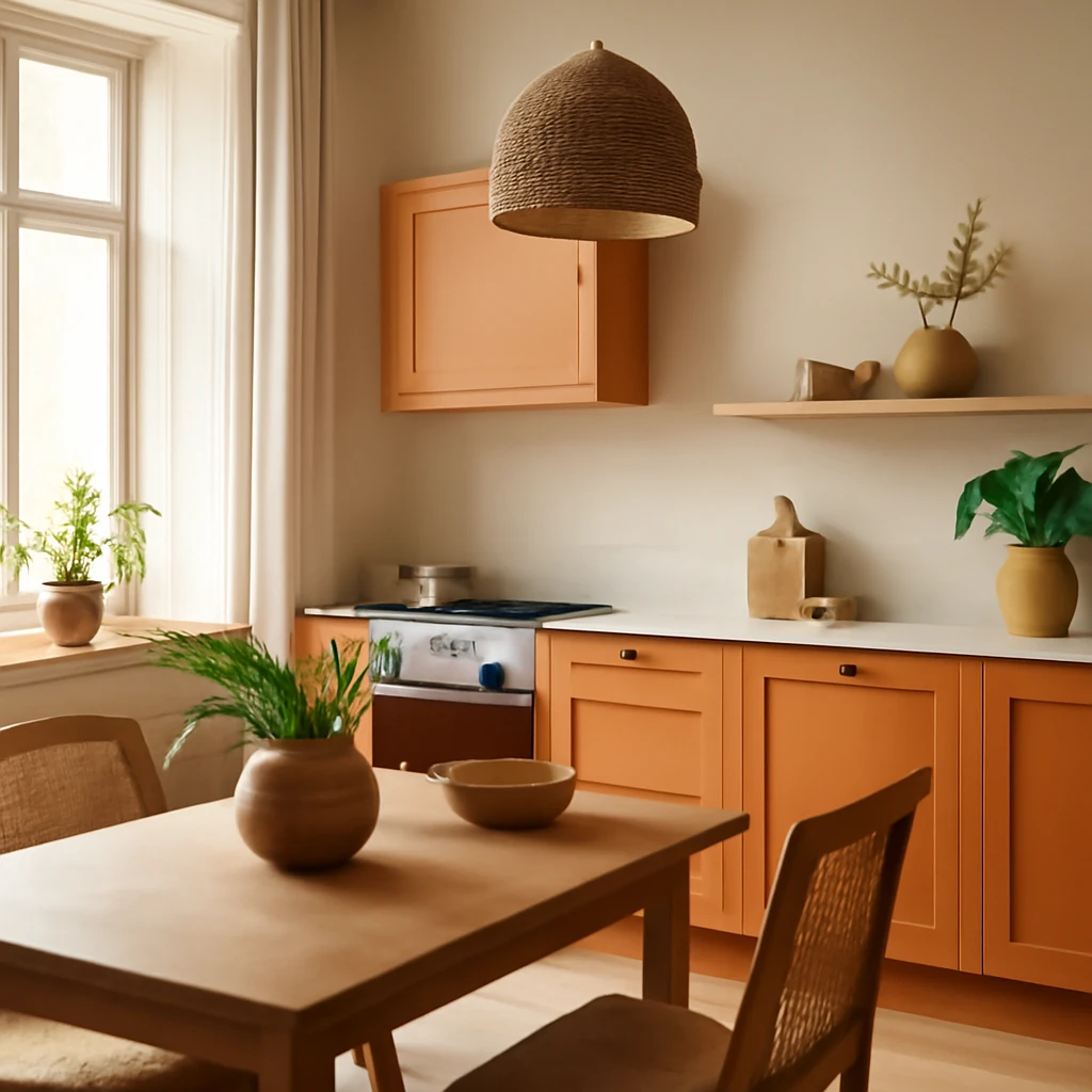
Orange Kitchen Design: Bright, Balanced European Interiors
Bright orange kitchens that balance warmth and style across European homes.
Tips & How-To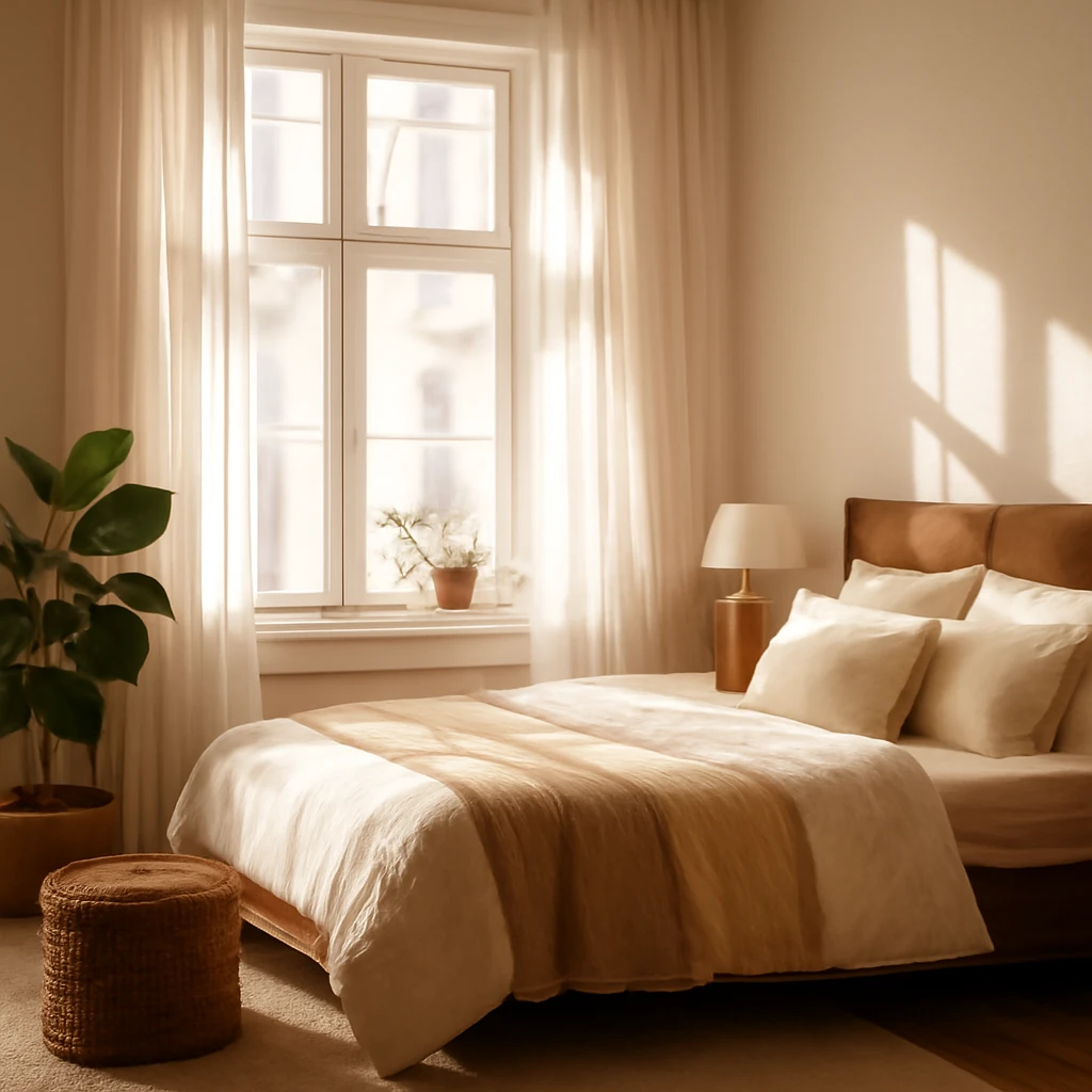
Sleeping by the Window: European Bedroom Layout and Design Solutions
Smart strategies for beds by windows across European homes.
Kitchen Design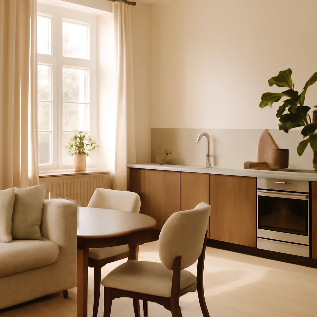
Open Kitchens: Designing without Upper Cabinets Across Europe
Bright, uncluttered European kitchens through upper-cabinet-free layouts.