
Explore interior trends, AI design insights, styling guides and real transformations
Light Interiors Across Europe: Timeless Tones for Calm, Bright Homes
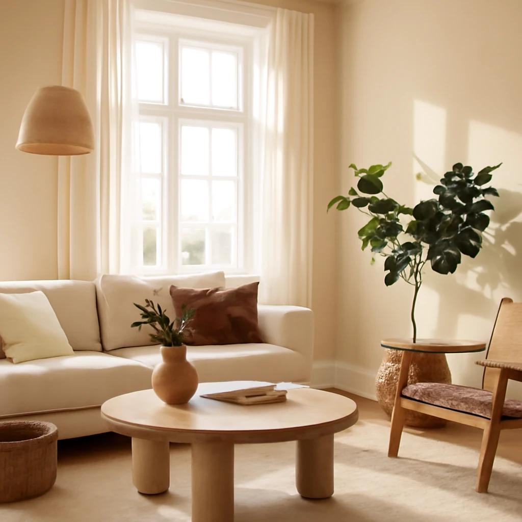
Why light interiors endure across European homes
Across Europe, interiors painted in light, neutral tones have a lasting appeal. They offer a clean, sophisticated backdrop that feels calm, orderly and effortlessly chic. Light colours reflect daylight, making rooms feel more spacious and airier - an important advantage in cities with limited daylight during shorter winters and in traditional townhouses with compact layouts. Neutral palettes are versatile, allowing designers to experiment with textures, materials and curated accents without overpowering the room. They are equally at home in contemporary apartments, modernised period interiors, or bright new-builds across the continent.
A light, neutral scheme gives you a flexible canvas for personal expression. It can frame art and furniture with architectural clarity, while remaining forgiving of changing tastes. It also tends to visually enlarge spaces and create a sense of cohesion when rooms flow into one another. For homes with north-facing windows, these tones can amplify the available light, while warm undertones help counteract any chill in northern light. In short, light interiors are a timeless choice for European living, adaptable to climate, cultural preferences and varying housing typologies - from compact city flats to generous country houses.
Contents
- Pros and cons of light interiors
- Main tones for light interiors: white, pearl, blue, beige, grey, cream, and soft greens
- Five essential rules for designing in light tones
- European styles in light hues: neo-classical, Provencal, Scandinavian, contemporary, minimalism, and eco
Light interiors: pros and cons
The pastel-inspired approach to interiors has remained popular for decades. The design narrative may shift, but the core appeal of light tones endures. Here are the principal advantages:
- They harmonise with almost any interior style - from modern and industrial to rustic and traditional.
- They are timeless and less prone to looking dated than trend-led palettes.
- They shift attention to details: vases, artworks, sculptures become focal points against a pale backdrop.
- Light surfaces tend to read as clean, pristine and easy to care for when properly maintained, and dust is often less visible than on dark surfaces.
- They enhance natural daylight, helping spaces feel brighter even on grey days.
- They visually expand smaller rooms, making layouts feel more open and connected.
- Pale tones reflect ultraviolet rays, which can help rooms that face full sun feel comfortable rather than overheated in summer months.
- They pair well with natural materials such as timber, stone, wool and linen, adding warmth without sacrificing airiness.
- Muted hues create a versatile backdrop for textiles and decorative elements, allowing colour to be introduced gradually.
On the flip side, light interiors require thoughtful maintenance and careful material choices. Here are the main considerations:
- Mutability of the finish: light-coloured surfaces can show stains and marks more readily, so regular upkeep is important to preserve their pristine appearance.
- Finding skilled craftsmen: precision in pale wall finishes, joinery and detailing is essential, and missteps are noticeable on light surfaces.
- Cost considerations: light furniture and bespoke joinery can be pricier than darker alternatives, particularly when seeking natural textures and high-quality finishes.
- Emotional impact: very bright whites, if used as a dominant backdrop, can feel clinical to some occupants, layered neutrals or warmer undertones help maintain a welcoming atmosphere.
Main tones for light interiors
Designers frequently work with a spectrum of pastel-leaning, light-colour palettes. Below is a practical guide to the base shades that form the backbone of contemporary light interiors in European homes.
Palette highlights includes pearl (pearlised), white, blue, beige, light grey, cream, and light green. Each colour can be used alone or mixed with others to form rooms that feel coordinated yet dynamic.
Pearl (pearlised)
Pearl is associated with luxury and refinement. In practice, it sits near light greys, blush pinks and pale blues, producing a soft, sophisticated backdrop. Pearl is ideal for lounges and bedrooms where a calm, relaxing mood is desired. It pairs beautifully with natural materials and with metallic accents - think mirrors, brass or brushed gold hardware - creating a refined yet approachable ambience. In contemporary projects across Europe, pearl tones offer a versatile foundation for both classic and neoclassical touches and modern reinterpretations.
White
White functions as the ultimate universal canvas. In a European context, it can work across every architectural style. The key is to utilise varying shades of white - ivory, eggshell, bone and parchment - to avoid a flat, monotonous space. White is particularly effective in classic and Scandinavian styles, where it can unify walls, ceilings and floors. In more contemporary schemes, white serves as a stage for decisive accents - bold art, sculptural furniture, or a striking black-and-metal approach for a high-contrast effect.
Blue
A light, airy blue brings a sense of calm and serenity, often associated with the sky and sea. It works well with white, grey and beige, and can be used to soften a room that faces south, balancing warmth with cool nuance. Blue is particularly well-suited to art-deco inspired settings, modernist interiors, and Nordic-inspired schemes, where it adds depth without overpowering the space.
Beige
Beige acts as a reliable backbone, capable of integrating with both cool and warm light environments. It is versatile enough for kitchens, bedrooms, and entryways, and is a natural fit for a Japen-inspired calm or a timeless European café style. Beige can elevate small rooms by creating warmth and subtle texture, especially when combined with lighter woods and soft textiles. In larger living spaces, beige helps to anchor more vivid accent colours without competing with them.
Light grey
Light grey exudes sophistication and a touch of mystery. It harmonises with a broad colour spectrum - blue, teal, pink, mauve, red, mustard and coral. When used as a base, light grey offers a modern, understated backdrop that supports a flexible decorating plan. It pairs beautifully with natural wood and stone, creating a quiet, cohesive environment suitable for living rooms, kitchens and bedrooms alike. In European projects, pale grey is frequently chosen for Scandi and contemporary interiors for its classic, hard-wearing appeal.
Cream
Cream layers warmth into the space while retaining a light, airy feel. In traditional interiors, cream sits well with classic detailing and mouldings. In modern schemes, cream softens the starkness of white, helping to create a cosy, lived-in ambience. Cream-laden rooms are inviting for family living and social gatherings, particularly in living rooms and dining areas, where the warmth of lighting and textiles can be enjoyed throughout the year.
Light green
Soft greens - sage, mint or pistachio - introduce a gentle, organic note to light interiors. They work well as a backdrop for Provence-inspired schemes, but they also suit kitchen and bathroom environments where a fresh, botanically inspired mood is desired. Light greens pair gracefully with warm neutrals and natural textures, offering an easy route to bring a touch of nature inside without overpowering the palette.
Five essential rules for designing in light tones
To successfully implement light tones in European homes, designers emphasise a few practical guidelines. The aim is to create spaces that feel calm, bright and well balanced, rather than sterile or overly minimal. Here are the five key rules.
- Mix textures for depth. Combine matte and polished finishes, soft textiles and tactile surfaces. A light room benefits from a collection of materials - wood, stone, fabric, leather or metal - that catch light in different ways, adding dimension without adding colour.
- Include several light accents. Use at least three to five shades within the light spectrum to give the space depth and interest. Subtle variations in warmth and intensity keep the palette from feeling flat while maintaining cohesion.
- Create contrast strategically. Introduce texture and emphasis with metal hardware, glass, architectural details and natural textures. A touch of contrast prevents an all-white room from becoming monotonous.
- Choose tones with sun exposure in mind. Cool, pale hues work well in rooms with abundant daylight or north-facing windows, while warmer neutrals are better suited to spaces that receive less direct sun or face east and west, where the light can be gentler or more variable.
- Layer lighting for atmosphere and space. Rely on a mix of ceiling, wall, and task lighting to sculpt the room. Reflective surfaces and light-coloured walls help to bounce light around, increasing perceived height and space. Thoughtful lighting makes a pale palette feel welcoming rather than clinical.
A practical trick to enliven a light interior is to include an accent wall or a carefully chosen wallpaper with a bold motif in a contrasting light shade. The aim is to create a focal point while preserving the surrounding airiness.
European styles in light tones
The versatility of pale palettes allows designers to translate several architectural vocabularies into coherent, light-filled interiors. While bold, avant-garde movements exist, the following classic and contemporary styles are particularly well suited to light tones.
Neo-classical
Neo-classical interiors reinterpret classical architecture for modern living. They favour refined symmetry, elegant proportions and soft, sophisticated colour palettes. The palette shifts away from heavy browns toward lighter beiges, soft greys, apricot, and platinum tones. Delicate mouldings, restrained decorative features and crystal or glass lighting fixtures complement pale walls without overpowering the space. The result is a balanced harmony between historic reference and contemporary comfort, ideal for city apartments and elegant townhouses across Europe.
Provencal
Provencal design celebrates the charm of rural France with a romantic yet restrained palette. Soft whites, chalk, lavender, and powder blues - often paired with aged wood furniture and gently worn textiles - create a sunlit, breezy atmosphere. In urban Europe, Provencal-inspired spaces frequently incorporate terracotta textiles, natural stone, and linen. The look is relaxed, rustic and nostalgic, yet remains sophisticated when paired with modern fittings and streamlined storage that keeps spaces uncluttered.
Scandinavian
Scandinavian interiors are anchored in light, with white and pale neutrals as the default. The style emphasises natural light, simplicity, and warmth through the judicious use of timber, wool and linen. The classic Nordic palette uses white as the dominant backdrop, with black or dark grey accents and occasional pops of muted colour. Textural variety - like a sheepskin throw, linen drapes, and a teak chair - adds depth without disrupting the clean, calm flow that typifies Nordic design.
Contemporary
Contemporary, or modern design, embraces current aesthetics and flexible forms. In light interiors, the emphasis is on geometry, restraint and a refined colour base. Neutral walls set the stage for a curated mix of materials - glass, steel, timber, stone - and carefully selected art. The contemporary approach is adaptable for large city lofts and compact city flats alike, using strong silhouettes and calm palettes to avoid visual clutter while letting focal pieces shine.
Minimalism
Minimalism is characterised by pared-back forms, limited colour, and a focus on function. In light-toned spaces, the base is typically white or ivory with warm or cool accents introduced through furniture and textiles. Textural variety - such as brick or concrete walls against soft textiles - helps avoid sterility. In small European homes, minimalist schemes offer efficient zoning, generous storage and a sense of order that can make compact rooms feel more expansive.
Eco
Eco-friendly interiors prioritise natural materials, low-toxicity finishes and sustainable production. A light palette complements natural materials - uncoated wood, stone, cork, linen and ceramic - creating a serene, healthful environment. In eco-inspired spaces, colour is often restrained to gentle beiges, soft greens and ivory tones. The focus is on reducing environmental impact while achieving a calm, breathable atmosphere that emphasises simplicity and wellness.
Practical guidance for applying light tones across spaces
In European homes, light interiors can span living rooms, kitchens, bedrooms, corridors and bathrooms. The practical challenge is to maintain warmth, texture and personality while preserving the sense of airiness. Here are a few practical considerations to help you plan effectively:
- Zone with purpose. In open-plan living areas, designate zones using light furniture placement, subtle area rugs, and changes in texture rather than heavy colour blocks. A cohesive palette ties the zones together while allowing each area to feel distinct.
- Texture as a central tool. Use different textures to create visual interest. A wool rug, a linen curtain, a velvet cushion, a timber coffee table and a stone fireplace can harmonise within a pale scheme, ensuring depth and warmth.
- Lighting as architecture. Employ layered lighting to sculpt space. A combination of ambient, task and accent lighting helps the room transform from daylight to evening ambience while preserving the light character of the palette.
- Material selection matters. Choose finishes that resist wear while maintaining elegance. For example, matte ceramic tiles, natural stone, oiled timber and brushed metals offer durability and a refined look that light surfaces deserve.
- Colour with intention. Introduce colour selectively through artwork, textiles or a single statement piece. The goal is to keep a sense of air and calm, while allowing human warmth to emerge in textiles and wood tones.
Conclusion: living with light tones in Europe
Embracing light tones in European interiors invites a lifestyle centred on clarity, comfort and subtle elegance. The palette is forgiving and adaptable, suitable for modern city dwellings as well as more traditional homes. Whether you favour neo-classical restraint, Provencal charm, Nordic simplicity, contemporary crispness, or eco-friendly materials, the light palette provides a unified stage on which to express personality through furniture, textures and decoration. By carefully balancing tone, texture and lighting - and by respecting the unique qualities of your space - you can create interiors that feel timeless, welcoming and wonderfully European.
You may also like these articles
 Tips & How-To
Eight online planners to design a European home in 3D
Plan, visualise and budget your European home with eight accessible online planners.
Colour & Materials
Grey in Interiors: Nine Timeless Pairings to Elevate European Homes
Discover how grey anchors European interiors with nine versatile pairings.
Tips & How-To
Mastering the European formal table setting: etiquette, arrangement and refined decor
A practical guide to European-style formal dining for stylish, comfortable tables.