
Explore interior trends, AI design insights, styling guides and real transformations
Olive Green Interiors: A Timeless European Palette
Why olive green endures in European interiors
Olive green has shed its associations with utilitarian spaces and emerged as a sophisticated, endlessly adaptable colour. When chosen with care, a single olive base can function as a stable backdrop or a vivid accent, informing mood, materials, and light in sustainable, timeless ways. Across European homes - from Baltic flats to Mediterranean townhouses and Alpine chalets - olive green grounds interiors in nature, warmth and quiet confidence. This article explores how to build a durable olive palette, how to pair it with other colours and materials, and how to apply it across rooms, lighting, and styles that define contemporary European living.
Features of the olive palette
Olive is a complex family of colours, ranging from deep, ripe olive to pale, sage-like greens. Its versatility stems from its multi-tonal character, which allows it to harmonise with a broad spectrum of hues and textures. When used judiciously, olive feels calm and refined, bringing a sense of groundedness and connection to the natural world. It also has a psychological effect: spaces feel more welcoming, and the subtle warmth can foster relaxation and focus - an especially valuable quality in our fast-paced urban environments.
- Olive as a base tone: works beautifully on walls or major furniture pieces, creating a warm, neutral field that accommodates brighter or moody accents.
- Two-key principle: pair olive with a lighter, cooler companion (white or grey) to keep spaces feeling airy, or with deeper, warmer neutrals for a cocooning effect.
- Material harmony: olive loves natural materials - wood, stone, flax, wool, and ceramic glazes - because textures emphasise its organic vibe.
Colour pairings with olive in interiors
There are many viable pairings for olive green. Below are the most reliable routes that European designers repeatedly employ to craft balanced, timeless interiors.
With white
White elevates olive, making spaces feel bright, clean and expansive. The duo is particularly effective with a cool underlying grey or a soft, warm ivory. This combination is forgiving in varied lighting conditions and suits both contemporary and traditional schemes. A crisp white backdrop lets the olive take centre stage, while white furniture or textiles maintain a sense of airiness.
- Idea: combine olive walls with white joinery and light timber floors for a Nordic-inflected calm.
- Idea: use white for large textiles and accent pieces to keep the room visually light.
With grey
Grey adds an urban edge to olive while maintaining sophistication. Lighter greys create a contemporary, minimalist frame, deeper greys bring depth and drama. This pairing is ideal for open-plan living areas or urban apartments where restraint and texture play starring roles.
Tip: mix matte olive with satin-grey surfaces and tonal textiles for a refined, tactile contrast.
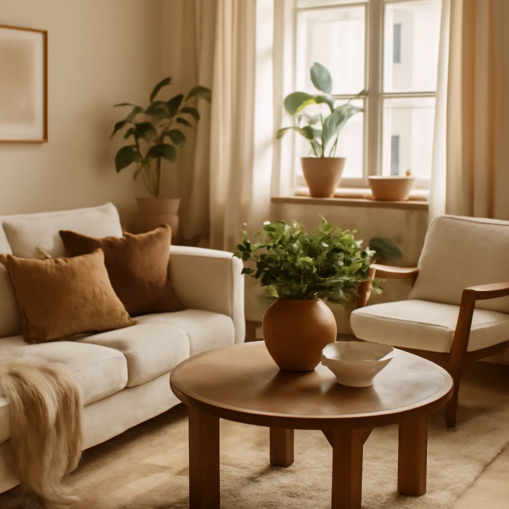
With beige
Beige softens olive and reinforces a warm, natural palette. It is a favourite for tranquil bedrooms and sunlit living rooms, where the combination evokes cosy hygge-like atmospheres and timeless warmth.
With brown
Earthy browns - oak, walnut, or clay-toned woods - anchor olive in a natural, grounded way. This triad suits rustic, farmhouse, or eco-conscious interiors, where materials speak as loudly as colour.
With yellow and wood tones
Mustard and sunlit yellows provide a subtle lift to olive walls, creating a playful yet tasteful mood. Pair olive with warm woods and ochre fabrics to evoke sun-warmed interiors that feel both cheerful and refined.
With orange
Contemporary schemes can embrace orange as a bold contrast to olive. Think terracotta, terracotta-inspired textiles, or copper accents to deliver an energy-rich, Bauhaus-leaning or modernist edge.
With pastel tones
Pastels in soft greens, pinks, and blues create a gentle, restorative environment. Olive can act as the stabilising partner to these delicate hues, producing interiors that feel serene and slightly retro in the best sense.
With burgundy
For evening-resolution rooms, olive and burgundy offer a sophisticated glamour. The muted green grounds the rich wine shade, preventing the palette from feeling too opulent or fussy.
With blue
Blue - especially navy or teal - provides a crisp counterpoint to olive. This combination suits dining rooms and living areas where formality and warmth are both desired.
With grey-blue
Soft grey-blue adds airiness and a sense of distance, making olive read lighter and more contemporary. Ideal for bright rooms with expansive windows or pale stone floors.
With purple
Subtle purples introduce a hint of twilight sophistication without overpowering olive. This pairing works well in bedding schemes or accent walls paired with neutral upholstery.
With red
Red accents in small doses can energise an olive scheme. Think cushions, vases, or a single statement chair in a rich red to create a lively but balanced focal point.
With pink
Soft pinks soften olive’s edges and are particularly effective in bedrooms and children’s spaces, where the aim is comfort, calm, and gentle warmth.
How to use olive in interior spaces
Olive is a versatile companion for many European interiors. Here are practical approaches to applying olive in key rooms, with attention to function, light, and materials.
In the kitchen - cabinetry and surfaces
Olive is a practical, forgiving choice for kitchens. It tends to hide fingerprints and minor marks better than purer greens, and it pairs well with both traditional brass or modern black hardware. For classic schemes, use a muted olive on cabinetry with warm marble or quartz worktops. For contemporary spaces, combine olive cabinets with black or charcoal accents, and balance with white wall surfaces to preserve brightness. Consider pairing olive with natural stone backsplashes and timber floors to emphasise a grounded, durable look.
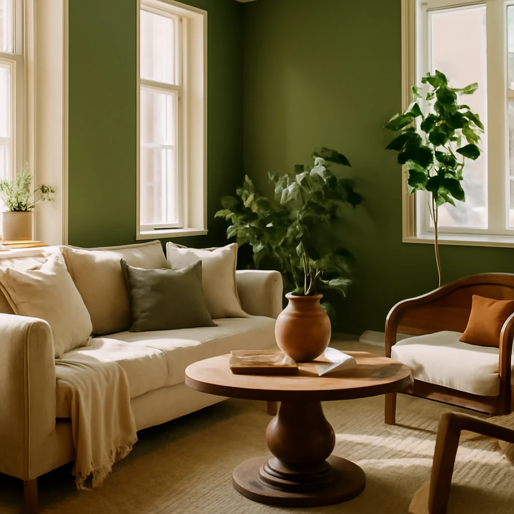
In the living room - as accents and furniture
In living rooms, olive can function as a dominant wall colour or as a strategic accent on furniture and textiles. An olive sofa anchored by neutral walls and a variety of textures - linen, bouclé, wool - creates a tactile, welcoming environment. Use cushions, throws, and curtains in complementary tones to build a layered, cohesive palette. For larger spaces, avoid painting all walls olive, instead, designate an olive accent wall or olive-upholstered pieces to maintain visual relief.
In the bedroom - backdrop and textiles
Olive works well as a backdrop for bedrooms, either on the walls or through bedding and textiles. A lighter olive on the walls provides a restful, restorative mood, while richer olive textiles - duvet covers, cushions, velvet throws - deliver warmth without overwhelming the room. Pair with soft whites, warm beiges, or pale wooden furniture to maintain a serene sleep environment.
In the bathroom - wall coverings and textures
Olive can be both calming and fresh in bathrooms, particularly when using glossy ceramic or porcelain tiles with a slightly textured surface. Consider olive on one feature wall or as a colour-tleck in large-format tiles paired with white plaster or stone. Contrasting grout in a lighter or darker shade can sharpen the look, warm metallic fittings (brass or aged bronze) further enhance a timeless, spa-like atmosphere.
In the hallway and entry - warmth and first impressions
Olive in entrances creates an immediate sense of warmth and welcome. Combine olive doors or a feature wall with natural timber, mirrors, and soft lighting to invite guests in. In narrow corridors, use olive on a short wall or a single architectural feature to avoid a boxed-in feel.
In the children's spaces - calm, balanced mood
Olive’s connection to nature can be calming for children while still providing a lively base when paired with brighter accents. Employ olive on a main wall or as upholstered furniture with playful textiles in accent colours to strike a balance between focus and imagination.
Choosing the right lighting for olive interiors
Lighting profoundly affects how olive appears. Rich, saturated greens can look heavy under too-warm light and may shift toward yellow or brown. Conversely, cool or overly cool lighting can dull the green, making spaces feel clinical. A balanced approach uses a neutral to warm-neutral spectrum of light (approximately 3,800–5,000 Kelvin) and introduces local lighting to adjust tone as needed. Layered lighting - including ceiling fixtures, wall lamps, and table or floor lamps - lets you modulate the olive hue across the day and seasons.
- Tip: include a warm, dimmable source near olive upholstery to keep textures inviting in the evening.
- Tip: use task lighting in olive-dominated kitchens or work zones to preserve clarity without overpowering colour.
Which styles suit olive
Olive is inherently adaptable and sits well in several European design languages. Here are the best matches for different moods and architectural contexts.
Modern
In modern interiors, olive can be pushed to bold, bicolour or triadic palettes. Pair rich olive with black hardware, glass, and high-contrast textiles. Combine with natural textures - concrete, stone, and timber - for a dynamic, layered contemporary look.
Classic
In classical interiors, olive harmonises with white or cream details and gold or brass accents. It reads as refined and timeless, especially when paired with mouldings, panelled walls, and traditional fabrics such as damask or velvet damask equivalents in olive and ivory tones.
Provence
Olive is a natural fit for Provencal styles: sunlit rooms, floral textiles, and a gentle blend of greens with soft yellows, creams, and warm woods. This combination evokes countryside tranquility and a subtly romantic atmosphere.
Country
Natural materials take centre stage in country design. Olive sits comfortably with linen, jute, oak beams, and stone floors, accentuated by rustic ceramics and handcrafted furniture to create a cosy, lived-in feel.
Scandinavian-influenced
Even in a light, minimalist palette, olive can introduce warmth without sacrificing simplicity. Use olive on one feature piece or a limited set of textiles to soften the starkness of pure white and light wood, while preserving the crisp, calm aesthetic.
In closing: practical takeaways
- Olive green is a universal designer colour: lighter shades for airy interiors, deeper tones for intimate spaces, and everything in between for flexible schemes.
- Use olive as a background or as a feature, a little goes a long way in heavy rooms, while larger surfaces require careful balance with lighter neutrals.
- Pair olive with natural materials and textures to reinforce its earthy character and environmental appeal.
- Think about lighting early: olive shifts with temperature and intensity, so layered lighting is essential for ambience and accuracy of colour.
Frequently asked questions
How do I choose the right olive shade for a room?
The choice depends on room function and daylight. If a space receives abundant natural light, you can safely choose deeper, more saturated olives. In darker rooms, a lighter, soft olive helps maintain a sense of airiness. Always test with soft fabrics or samples in the actual space before committing to large surfaces.
What materials best complement olive in interiors?
Natural materials work best: timber (oak, walnut, ash), stone, ceramic tiles, linen and wool textiles. Pair with warm metallics like brass or antique gold to elevate classic schemes, or with matte black for a contemporary edge.
Is olive suitable for small spaces?
Yes, with care. Use lighter olives on walls and larger surfaces, with white or pale neutrals to reflect light. Keep strong olive accents limited to furniture or textiles to avoid a visually heavy effect in compact rooms.
Olive green, when thoughtfully deployed, offers a timeless, adaptable path to contemporary European interiors. Its natural ancestry and versatility make it a colour that can anchor a home across generations, climates, and architectural styles.
You may also like these articles
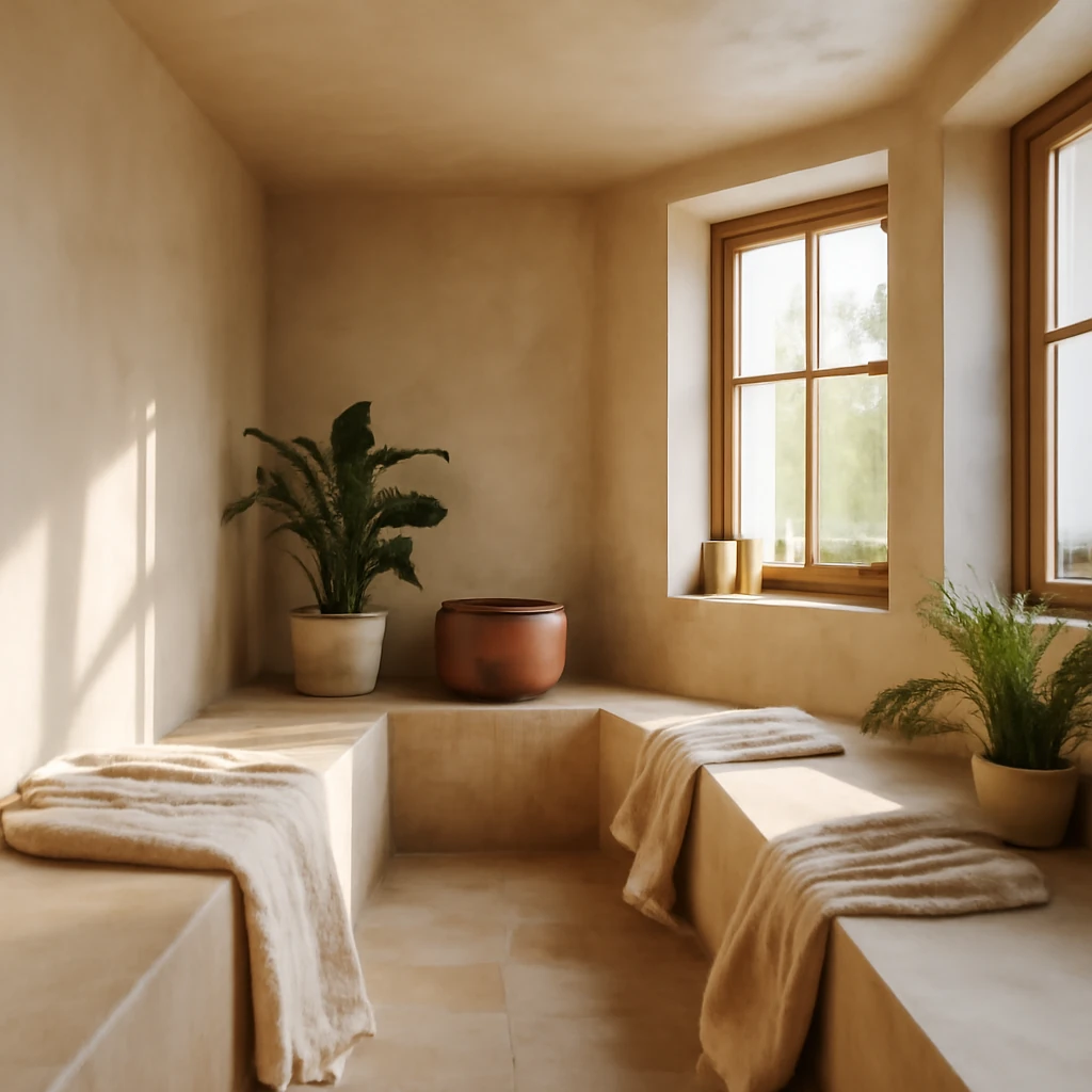
European steam room design: materials, layout and finishes for modern baths
A practical guide to designing European steam rooms with durable materials and versatile layouts.
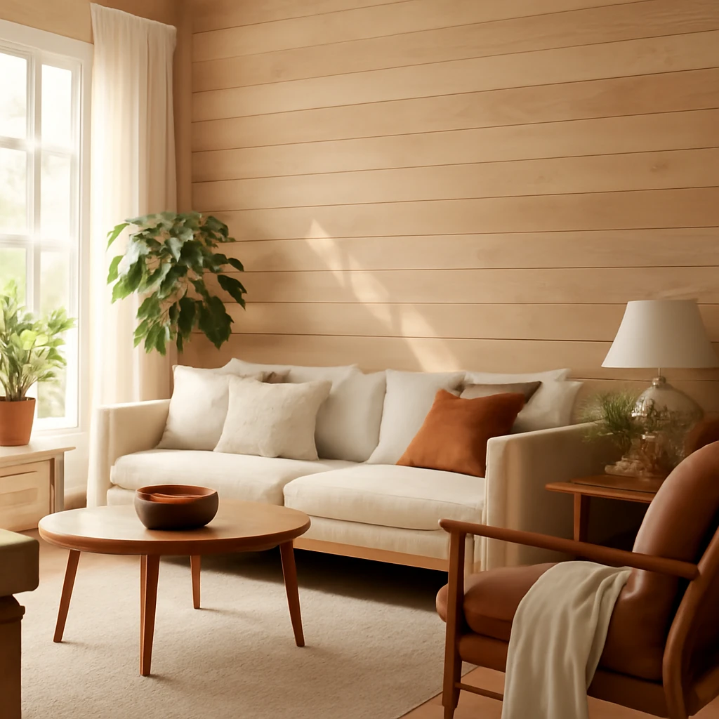
Timber wall finishes: nine options for European homes
Timber wall finishes for European homes—budget to premium explained.
Choosing European Interior Styles: A Practical Guide
A practical, European-focused guide to selecting and applying interior styles.