
Explore interior trends, AI design insights, styling guides and real transformations
Pink in the interior: how to apply it across rooms in Europe
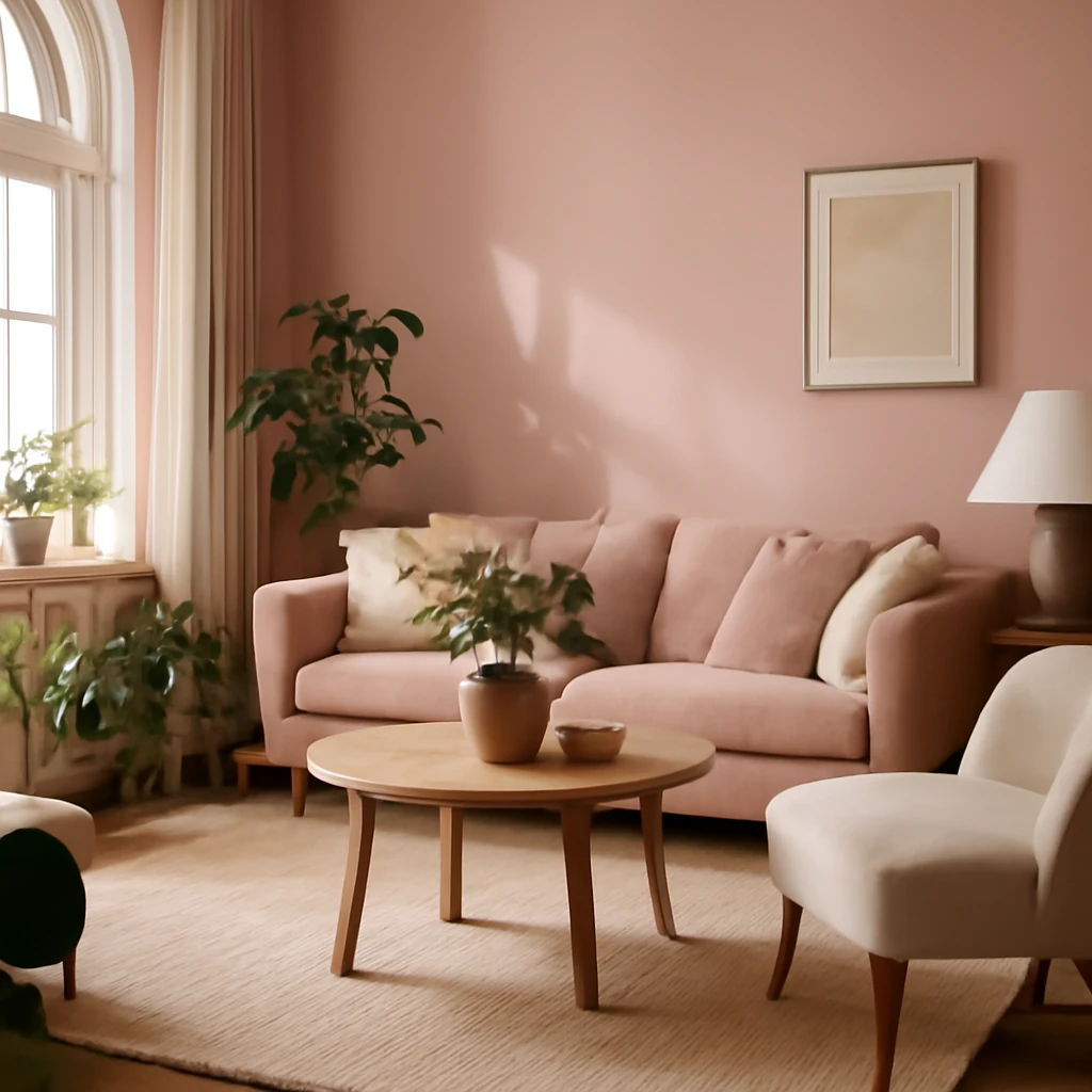
Pink in the interior: turning rose into timeless design across Europe
Pink has long been cast in familiar, playful roles: a childish bedroom backdrop or a theatrical blush that only bedrooms of princesses could justify. Yet in contemporary European homes, pink has evolved into a remarkably adaptable palette. It spans a spectrum from delicate, whisper-soft blushes to confident, saturated fuchsias, and it can read as warm or cool depending on the setting. This article explores how pink behaves in different rooms, which companion colours sustain it, and how to weave pink into sophisticated, liveable interiors that feel distinctly European.
All about styling pink in the interior
Key characteristics of pink in interior design include warmth, softness and emotional resonance. Psychologically, pink is associated with gentleness and comfort, yet certain tones can inject energy and playfulness when used strategically. In larger spaces, pink can act as a refined backdrop that softens bolder furniture, while in smaller rooms it can function as a restrained accent or calm canvas for texture and light. Crucially, pink is not bound to any single style. It performs beautifully in neoclassical spaces, contemporary chic, minimalist schemes with a soft edge, and even eclectic mixes - provided its temperature and saturation are calibrated to the room’s light and purpose. It is less comfortable in spaces designed to be ultra-technological or deliberately austere, but with thoughtful pairing it can still coexist with high-tech or restrained lo-fi aesthetics.
Choosing the right pink depends on the room’s exposure, mood and the scale of furnishings. The same pink can feel distinctly different in a sun-warmed southern flat than in a northern apartment with limited daylight. A careful approach to temperature - warm pinks with warm neutrals, cool pinks with cool neutrals - helps maintain balance and prevents the palette from feeling discordant. Across Europe, where homes vary from bright river-facing flats to compact city apartments, pink can be a unifying thread that ties disparate spaces together while allowing each room to celebrate its own character.
Companions and palettes: how pink plays with other colours
To build a harmonious pink interior, consider the temperature of the shade and the room’s light. The following pairings capture reliable combinations that work across European contexts.
- White - The classic pair. White acts as a clean, bright backdrop that makes pink feel airy and approachable. Light pinks rendered against white create a gentle, serene atmosphere ideal for bedrooms and bathrooms, deeper pinks against white bring subtle drama to kitchens and living rooms.
- Grey - A sophisticated, versatile alliance. Soft greys with pinks yield contemporary elegance, while charcoal greys paired with rosy hues can lend depth to living spaces and offices. In Nordic-influenced homes, pink-tinted greys read particularly refined and calm.
- Beige - A warm neutral that softens pink without dulling it. Pink and beige create cosy, timeless interiors, especially in open-plan living areas and kitchens where natural light is abundant. Slightly warmer beiges bring a hearth-like warmth to cooler pinks.
- Brown - Temptingly grounded. From Walnut to moka, brown expands pink’s palette with a stabilising counterpoint. Use pink as a gentle accent on foundations that feature wood for a layered, mature look in dining rooms and lounges.
- Green - A classic, nature-inspired duo. Sage, olive and eucalyptus greens paired with pinks evoke fresh, restorative spaces. The balance rests on proportion: the dominant colour defines the room’s mood, the pink provides warmth or lightness as an accent or broader field where appropriate.
- Blue - A cooling contrast that can feel sophisticated when tempered. Pink with pale blue creates coastal or contemporary vibes, deeper blues with pinks produce a refined, slightly opulent atmosphere perfect for bedrooms and living areas.
- Orange - Adjacent hues create energetic, appetising schemes. Pink and orange tones work best when one is dominant and the other acts as a bright flourish. Balance with whites or soft greys to prevent the palette from becoming overwhelming, ideal in kitchens and playful, family-friendly spaces.
Ideas for different rooms
With a generous range of pinks available, the same shade can read very differently from room to room. Here are guidelines for how pink can be applied in several common European homes, from compact city apartments to more generous layouts.
Kitchen
In the kitchen, warm, food-inspired pinks - salmon, peach, soft coral or crème rose - can create a welcoming, canteen-like warmth that stimulates appetite and conversation. You might opt for pink cabinetry in a muted, muted-lilac pink with a light stone or white worktop to keep the space crisp. Alternatively, use pink on walls or backsplashes paired with white or charcoal cabinetry for a more formal, contemporary look. White walls keep the space bright, while a blush or dusty pink ceiling can subtly elevate the room’s character without overpowering the work zones. If you prefer a bolder approach, a pink island or pink-tinged panels paired with a neutral perimeter create a focal point that still respects cleanliness and practicality required in a kitchen environment.
Living room
The living room is where pink can truly flex its versatility. A soft pink wall or a large pink sofa can anchor the space, with a palette built around blues, greens and warm neutrals in cushions, throws and accessories. For a more restrained look, combine a pink upholstery piece with white walls and timber furniture, letting the warmth of pink enter through textiles and lighting. If your room faces north and receives limited sun, choose pinks with a warmer undertone and pair them with brass or warm brushed metals to mimic sunlight. In sunlit southern rooms, cooler pinks - when paired with graphite greys or deep navy - can create a sophisticated contrast that remains inviting rather than sugary.
Bedroom
In bedrooms, pink can support calm, restful environments or soft luxury, depending on the tone. Powdery, desaturated pinks on walls with ivory or warm greys create a soothing sanctuary, introduce richer rose tones in bedding, curtains or bespoke headboards to add depth without over-stimulating. For larger bedrooms, a pink accent wall behind the bed can anchor the space, while a light pink ceiling adds a gentle lift. If you are designing a shared space for two people, consider a pink that leans neutral and pair it with complementary neutrals and metallic finishes to avoid a gendered impression. The right textures - velvet cushions, linen drapes, wool rugs - will reinforce the tactile depth that keeps the room comfortable and timeless.
Children’s room
Pink in children’s spaces can be playful yet balanced. For rooms shared by siblings or designed for one child, use a primary pink as the base with layered neutrals and playful accents that can be updated as tastes change. Peachy pinks, powdered rose, and soft coral are kinder for early years, while slightly stronger pinks can be introduced in textiles or small furniture to grow with a child’s evolving preferences. Be mindful of lighting: children benefit from cooler daylight in the morning and warmer evening tones, integrate dimmable lighting so pink remains pleasant at every hour.
Bathroom and sanitary areas
In bathrooms, pink can deliver a spa-like softness or a crisp, modern vibe. Pale pink wall tiles with white fixtures create a soothing, timeless scheme, while a rose-tinted tiled shower wall or vanity can add warmth to a compact space. For larger bathrooms, consider combining pink tiling with stone or concrete textures and muted metals to achieve a contemporary edge. If privacy concerns arise, keep pink in textiles or cabinetry rather than large wall areas, so the space remains bright and easy to maintain.
Practical considerations for a pink interior
To ensure your pink interior remains resilient, it helps to think about materials, lighting and longevity. Pink responds well to natural materials such as timber, wool, linen and stone, which temper its brightness and contribute to a timeless feel. When selecting materials, consider the room’s natural light and the scale of furniture. In open-plan living areas, pink can help delineate zones without the need for heavy partitions, while in compact rooms it acts as a soft, unifying backdrop for furniture and textiles.
Lighting is a powerful ally when using pink. Neutral white light (around 4000 kelvin) tends to reveal pink’s true character best in rooms with northern exposure, whereas warmer light (2700–3000 kelvin) can enhance cosy pinks and pale blushes in south-facing spaces. Dimmable lighting gives flexibility, allowing you to shift the room’s mood from daytime calm to evening warmth. Finally, consider finishes that carry colour well over time: powder-coated metals, porcelain, and natural stone tend to age gracefully alongside pink tones, whereas highly saturated, glossy surfaces may date more quickly if overused.
Design strategies: how to test and adopt pink responsibly
Introducing pink into a European home should be a considered process rather than a one-off decision. Start with small-scale trials - soft furnishings, a rug, or a single accent wall - and observe how the room behaves across different daylight conditions and seasons. If you are nervous about committing to a single shade, a versatile approach is to begin with a pink that sits between rose and blush, which tends to appear less saturated as lighting changes. A modular palette - pink as a base with interchangeable textiles and objects - helps you refresh the space without a full redesign.
In contemporary European interiors, pink can function as both a soft background and a powerful design note. It pairs well with high-quality neutrals and natural materials, elevating a space with warmth and character. Its adaptability across styles - from neoclassical to contemporary eclectic - makes pink a reliable companion for designers seeking to create rooms that feel both modern and timeless.
Conclusion: pink as a versatile, enduring choice for European homes
Pink is not a single, easily misinterpreted trend but a broad palette that can underpin a range of moods and styles. Used thoughtfully, pink offers warmth, softness and vitality to European interiors while remaining appropriate for everyday living. Whether you favour pale, soothing walls or a bold pink statement piece, the right pairing - white for clarity, grey for sophistication, or green for nature-inspired freshness - will ensure longevity and a sense of refined taste. As with any colour strategy, the key lies in proportion, lighting and texture. When these elements align, pink can become an enduring cornerstone of a well-designed European home.
You may also like these articles
 Trends
Wallpapers for the Living Room in 2025: Nine Trends, Materials and Practical Ideas
Nine wallpaper trends shaping European living rooms in 2025
 Renovation
Understanding pre-finish in European homes: a practical guide to white box stages
A practical European guide to pre-finish apartments and the white box stage.
Small Spaces
Clever design of small living rooms for European homes
Smart layouts, colour, lighting and furniture ideas for compact living rooms.