
Explore interior trends, AI design insights, styling guides and real transformations
Yellow as a Design Tool: Temperature, Tone and Timeless Combinations
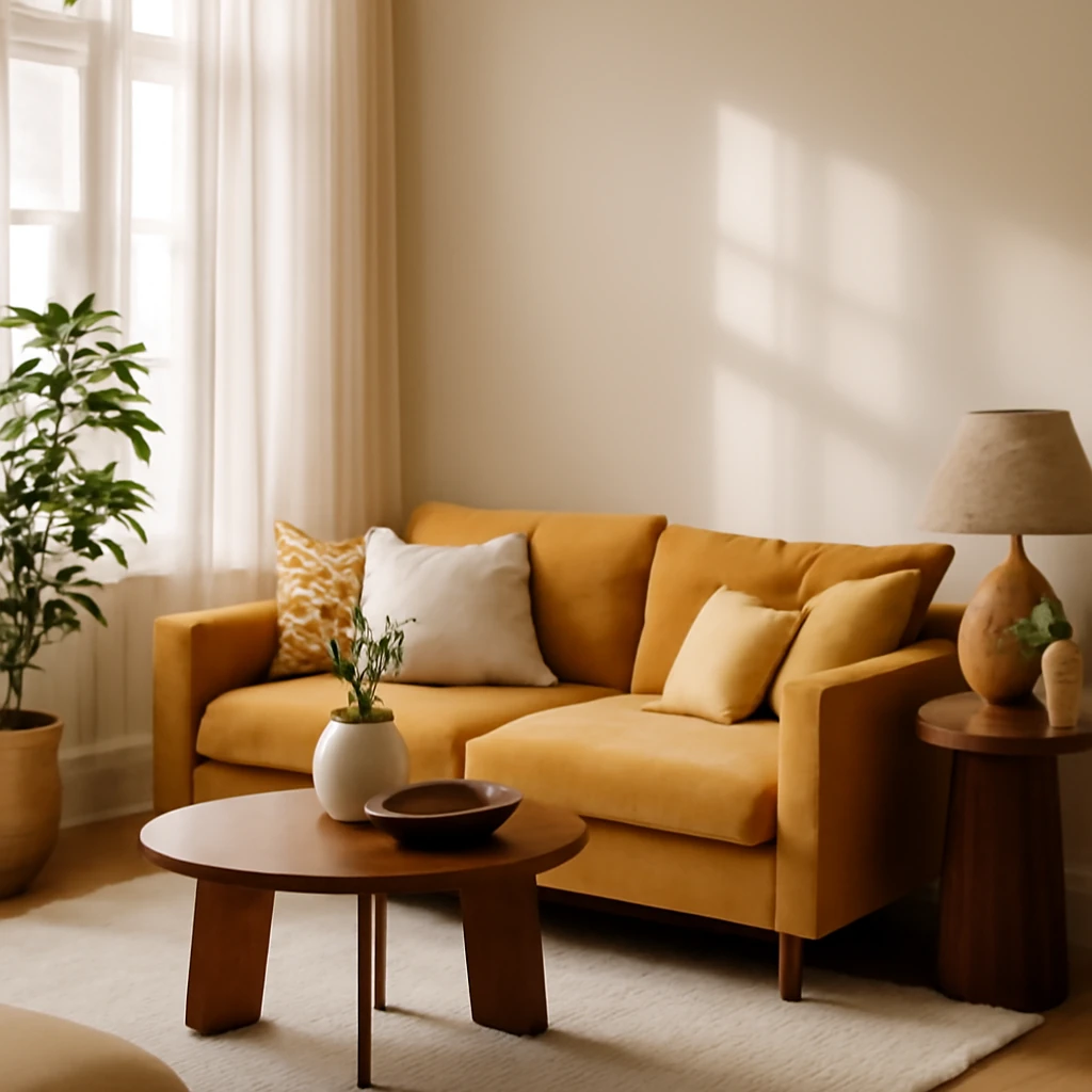
Introduction: the enduring appeal of yellow in European interiors
Yellow is the colour of sunshine, warmth, and optimism. Across European homes, it can energise a compact living room, illuminate a dim hallway, or add a sunlit accent to a cool, contemporary scheme. Used thoughtfully, yellow does not shout, it sings. The trick is to manage temperature, brightness and proportion so that the hue supports rather than dominates the story of a room.
Colour temperature: warm, cool and how to balance
Every shade of yellow can feel either warm or cool depending on the mix with other colours. Pale lemon skin can read cool, while a rich egg yolk or saffron can feel invitingly warm. The effect is created not by the pigment alone but by its companions on the colour wheel and the light in the space.
Strategy 1: pair yellows with others of a similar temperature. Build the room around a cohesive palette of warm or cool tones. This approach is useful in spaces with strong natural light that leans towards the warmth of a southern exposure or in high, airy rooms where the air feels bright yet soft. In practice, use a single temperature and let the undertones guide furniture, fabrics and architectural details.
Conversely, Strategy 2 embraces contrast. Introduce a vivid warm accent against a cool, restrained base. This creates a dynamic appearance where no single temperature governs the room. It is a frequent choice for contemporary European interiors that aim for energy without a fixed mood.
Open yellow versus complex yellow: what is the difference
Saturated clear yellows resemble a brush from a box of watercolours. They are open and bright and can read as playful or assertive depending on context. If you blend a touch of another pigment into the yellow, the result shifts toward a more nuanced tone - what colourists call a complex or layered yellow. In daily use, open yellows are terrific for accents in kitchens and children spaces, while complex yellows are better for living rooms and bedrooms where the hue can partner with multiple fabrics and textures.
Open yellow in interiors
Open yellows belong to the spirit of the 60s and 70s and resurfaced in modern kitchens and playful rooms. They inject vitality but can feel aggressive if overused. The safer role for open yellow is as a bright accent rather than the main field of colour. In European homes, a high intensity sole feature such as a sofa or a painted ceiling frame can be both cheerful and fashion-forward when tempered by neutral walls and pale woods.
Complex yellow in interiors
Complex yellows carry natural traces of other earth tones. They can shift toward rose, ochre, or green depending on lighting and adjacent colours. This adaptability makes them highly versatile, enabling smoother transitions between spaces and seasons. When selecting a complex yellow for a room, test the shade under daylight and under artificial light, and observe how it reacts with timber finishes, stone surfaces and textiles.
Open yellow and furniture: notes on scale and balance
In furniture and decor, open yellows work well as a single bold piece or a cluster of cushions. A bright armchair, a vivid footstool, or a rug in a sunny shade can anchor a scheme without overwhelming it. When a space features natural materials such as oak floors or stone countertops, an open yellow accent harmonises with the warmth and reflects light, keeping the room lively yet readable.
Understanding intensity and proportion
Intensity refers to the saturation of the yellow. A pale, pastel yellow feels delicate and airy, while a saturated hue can feel electric. The proportion of yellow in a space matters as well: a small dose can energise, but too much risks fatigue. Designers typically limit saturated yellow to accents on a modest portion of the surface area in a room, larger surfaces benefit from lighter or more muted yellows to maintain calm and legibility.
Another useful approach is to employ a suite of yellows within a single space. When the tones are related yet distinct, the room gains depth and flexibility. This creates a palette that remains cohesive as lighting shifts throughout the day and across seasons.
Popular pairings: what works with yellow
Yellow can act as a foil for cooler or warmer surroundings. On the cool side, pair with navy blue, teal, or forest green, on the warm side, combine with orange, terracotta, pink, or chocolate. Neutral companions such as grey and white allow yellow to take the lead without competing. For accent details, consider brass or gold for a touch of luxury, or matte black for crisp contrast. Remember that the colour wheel is a guide, not a rule, test combinations in the space and observe how they interact with light throughout the day.
Yellow in European spaces: applications by room
The kitchen
In kitchens, yellow can brighten large surfaces or serve as a focal counterpoint. On large scales, ensure the surrounding surfaces are pale or restrained to preserve legibility and avoid glare. A pale yellow kitchen island or a light yellow wall can visually enlarge a compact kitchen and reflect light, making the room feel more spacious. If a bolder yellow is chosen for cabinetry, temper it with white or light timber and keep hardware simple and understated.
The living room
In living rooms, yellow is often deployed to zone spaces or to warm a cool palette. A yellow sofa or a cluster of cushions can anchor a seating arrangement, while pale walls and a soft carpet prevent the hue from dominating. If the ceiling or walls are pale, consider a yellow ceiling border or a sunlit cornice to add architectural interest without saturating the room. The key is balance with textures such as wool, linen and velvet for depth.
The bedroom
Bedrooms benefit from gentler, more complex yellows with dusky undertones that support rest. A mustard or ochre shade behind the bed can create a cosy cocoon while allowing the rest of the space to stay calm. Use the yellow on a feature wall behind the bed or on bed furnishings such as an upholstered headboard or a pair of nightstands. Layer softer yellows with natural materials like wood, cotton and linen to maintain a restful atmosphere.
Children and study zones
Yellow can aid concentration and energy in children spaces, it is helpful for activity zones and study areas. However, children grow and rooms change, so keep large blocks of bold yellow to modest furniture and textiles to allow for reconfiguration as tastes evolve. Combine with gentle neutrals and consider subtle patterns to avoid overstimulation.
Hallways and entryways
In darker corridors, a touch of yellow can illuminate and invite. A pale or banana-toned wall can make a hallway feel wider and brighter. If space allows, a small yellow console or a corridor rug can create a welcoming moment as you enter the home.
Bathrooms and powder rooms
In bathrooms, yellow pairs well with white for a fresh, hygienic feel. A yellow tile border or a warm yellow vanity unit can give the room personality without overwhelming. For a modern twist, pair yellow fixtures with black or dark grout lines, or use yellow accents in textiles such as towels and a bath mat to maintain balance.
Textiles and surfaces: the easiest route to yellow
Textiles often provide the simplest route to incorporate yellow without large commitments. Curtains, cushions, throws, and rugs can be swapped seasonally to refresh the mood. For kitchens, yellow accessories can be an effective anchor for the space, while on walls or ceilings a more restrained, complex shade will protect the room from feeling clinical.
How to test yellow in a space before committing
To avoid missteps, test the colour in the actual space before painting or purchasing large items. Gather sample boards, paint chips or fabric swatches and compare them in daylight and artificial light at different times of the day. Observe how the yellow interacts with nearby materials such as wood floors, stone surfaces and metal fixtures. Consider using a temporary wall cover or large swatches applied to the wall with painter's tape to see how the colour reads in the space.
A practical checklist for using yellow effectively
- Define the mood and temperature you want to convey - warm, cool or balanced - and choose a primary yellow accordingly.
- Limit saturated yellows to small surfaces or accents unless the space is large and well lit.
- Pair yellows with neutrals to allow the hue to breathe, use textures to add depth rather than layering more colour.
- Test yellow under daylight and artificial lighting to understand its shift across the day.
- Use complex yellows in larger, cozier spaces with natural materials for a harmonious palette.
- In children spaces, combine yellow with patterns and soft furnishings to retain flexibility and comfort.
- In kitchens or bathrooms, consider finishes and fixtures that align with the hue for a cohesive look.
In practice: final guidance for designers and homeowners
Yellow is a versatile design tool not limited to fashion or seasonal palettes. When used thoughtfully, it can expand spaces, energise the day, and create warmth without heaviness. The most successful schemes treat yellow as part of a broader, coherent material and colour language rather than as a stand-alone statement. Pair it with natural materials such as timber, stone and linen to temper its brightness, and let daylight or carefully chosen lighting reveal the hue's full character across the day. In European homes with varied climates and daylight patterns, the key to success lies in patient testing, layered textures and balanced contrasts. The aim is to craft interiors that feel welcoming, timeless and attentive to the subtleties of light, rather than simply loud or trendy.
Lighting and the yellow effect
The character of yellow shifts with light. In spaces with abundant daylight, bold yellows can glow with clarity. In north facing rooms or those lit mainly by artificial light, warmer, softer yellows become more forgiving. Layer the lighting with a mix of ceiling fixtures, indirect light and warm glows to shape the hue through the day. A cool white LED can make a lemon yellow read sharper, while an amber LED warms an ochre tone into a cosy radiance.
Additionally, reflective surfaces such as pale marble, brass accents or glossy tiling can bounce light and diffuse the intensity, preventing any yellow from becoming too aggressive.
Materials, sustainability and longevity
Yellow harmonises with natural materials that age gracefully. Timber veneers from European forests, stone countertops, linen drapery and wool textiles create a tactile, durable palette. For sustainability, choose finishes with low VOCs, and pigments that maintain their hue over time under typical daylight. If using paints or wallpapers, select those with UV stabilisers and fade resistance to ensure the shade remains balanced for years to come.
Practical steps to implement in a project
- Clarify the mood and temperature you want to convey and select a primary yellow accordingly.
- Consider proportion, for bold saturated yellows, limit coverage to accent walls, a single piece of furniture or a textile with a clear focal point.
- Pair yellows with neutrals and natural materials to give the hue room to breathe.
- Test the colour in daylight and under artificial lighting across different times of day and seasons.
- Choose undertones carefully, for walls, a complex yellow with warmth can integrate with timber floors, for ceilings or trims, a lighter open yellow can lift the space without dominating.
- In kitchens, balance cabinetry with light countertops and matte hardware to keep the yellow from appearing either too sweet or too heavy.
- In living rooms or bedrooms, experiment with soft textures such as wool, linen and velvet to add depth and reduce glare.
- Maintain flexibility by using yellow in easily replaceable finishes such as textiles, cushions and soft furnishings rather than fixed elements.
Practical applications and long term considerations
Across Europe the daylight pattern and architectural typologies vary greatly from compact urban flats to welcoming suburban homes. Yellow adapts to these contexts when treated as part of a broader palette rather than a single statement. Use it to reflect light, connect spaces and enhance material tactility. With mindful testing and layered textures, yellows can feel timeless rather than transient, offering warmth and brightness in equal measure throughout the year.
Closing thoughts: designing with yellow in a European context
Yellow is a versatile design tool not limited to fashion or seasonal palettes. When used thoughtfully, it can expand spaces, energise the day, and create warmth without heaviness. The most successful schemes treat yellow as part of a broader, coherent material and colour language rather than as a stand-alone statement. Pair it with natural materials such as timber, stone and linen to temper its brightness, and let daylight or carefully chosen lighting reveal the hue's full character across the day. In European homes with varied climates and daylight patterns, the key to success lies in patient testing, layered textures and balanced contrasts. The aim is to craft interiors that feel welcoming, timeless and attentive to the subtleties of light, rather than simply loud or trendy.
You may also like these articles
 Bedroom
Designing a Masculine Bedroom: European Insights for Modern Living
A guide to crafting a bold, serene masculine bedroom across Europe.
Tips & How-To
11 Fresh Ideas to Organise Kitchen Storage in European Homes
Clever storage ideas to maximise European kitchen space.
Kitchen Design
Classic Kitchen Design: A European Guide to Timeless Luxury
Timeless European elegance for the modern kitchen, from layout to textiles.