
Explore interior trends, AI design insights, styling guides and real transformations
Wall Photography as a Design Narrative: Ideas for European Homes
Introduction: turning memories into design
Photographs on a wall are more than mere decoration, they are a narrative of life, a tactile archive of moments that colour a living space with personality. In contemporary European homes, thoughtfully arranged wall photographs can unite disparate rooms into a coherent story, amplify natural light, and offer a personal focal point that evolves with time. This guide gathers practical strategies used by interior design professionals across the continent, adapted for homes from compact city apartments to airy countryside houses. It covers planning, framing, placement, lighting, and maintenance, with concrete, repeatable ideas you can apply in any room.
Idea bank: how to arrange wall photos
Photographic displays come in many forms: family images, travel photographs, abstract or landscape prints, portraits, and poster-sized graphics. The goal is to create a curated display that feels intentional rather than accidental. Here are proven approaches used by designers in Europe:
Display photos on sturdy picture ledges for an adjustable, drill-free option. This approach allows you to rotate pictures seasonally or as new favourites arrive, without creating holes in the walls.
Classic, formal frames work well in study rooms or offices, while bedrooms and children’s spaces often enjoy more playful or painterly frames. For generous living rooms, oversized images in substantial frames provide a dramatic statement.
In living areas, aim for sightlines from multiple viewpoints. For bedrooms, the headboard area is a reliable focal point for a single prominent print or a carefully composed small cluster.
Collage arrangements and narrative sequences can be designed as a single, cohesive story or as a dynamic, evolving gallery. Plan the sequence to tell a theme - family history, travel, or a progression of moments.
Consistency in framing across spaces helps create unity. If frames vary, ensure the materials or finishes are harmonised to avoid visual chaos.
Before selecting frames, analyse how many rooms will feature photographs, their function, the design direction of the apartment, and the type and scale of prints you will display. A thoughtfully curated collection feels intentional rather than decorative.
Unframed photographs can be fixed with double-sided painter’s tape or clipped to a hanging string - an inexpensive option for temporary displays and frequent changes.
Colour decisions matter: some designers prefer a unified palette for frames, while others create contrast by letting the prints themselves stand out. Avoid mixing wooden and glass-heavy frames in the same cluster to maintain a cohesive look.
Passe-partout (matting) can elevate a collection by creating a consistent border around each image. If any image uses colour, consider matching the mat colour to harmonise the display, the same goes for frame colour choices.
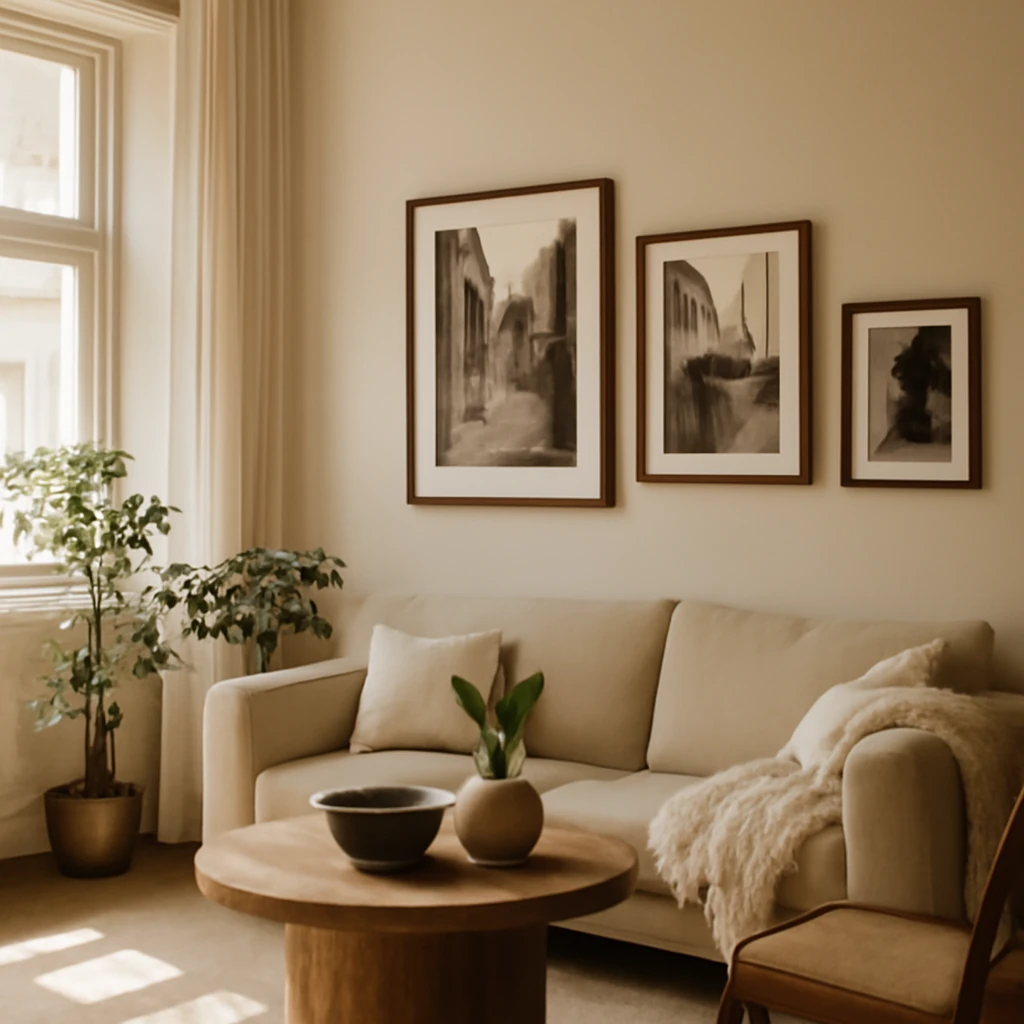
Black-and-white photographs often suit more formal frames and a restrained gallery layout, while colour prints can energise a space when used with purpose-driven composition.
For a gallery-style wall, a moulded frame or baguette frame with a subtle profile can accommodate a wide range of image sizes, from square 20×20 cm to panoramic 50×70 cm shapes.
Provenance-inspired frames - light wood, whitewash, or aged tones - work well in cottages and Provencal interiors, whereas glass and brushed metal tones pair nicely with minimalist or high-tech aesthetics.
Choosing the right place: where to position photos
In Europe, the “wall-for-all-photos” concept has gained traction, but success hinges on thoughtful planning. Rather than filling every available surface, identify a few anchor walls and allow the rest of the space to breathe. Here are practical placements and guidelines:
Hallways and entryways are excellent canvases for a striking, single large print or a compact gallery cluster. The aim is a welcoming encounter as you enter home, not a cluttered tunnel of images.
Living rooms benefit from a gallery that anchors seating areas, with the dominant frame placed at eye level (roughly 150 cm from the floor) and smaller pieces arranged around it. A monochrome collection can feel timeless in a contemporary lounge, while a colourful set can energise a light-filled space.
Bedrooms invite calm. A large image above the bed or a symmetrical pair on either side create balance. For children’s rooms, consider playful collages that capture milestones, stages of growth, or favourite stories.
Home offices respond well to orderly grids or linear sequences that convey discipline and focus. Consider prints that inspire or document professional journeys to personalise the space without distracting from work.
Dining areas benefit from seasonal changes. A cluster of portraits or travel scenes can mirror the room’s sociable mood and complement table settings without overpowering conversations.
Lighting: making the photos sing
Lighting is the invisible partner of any wall display. Proper light reveals colour and texture while shaping the mood. European design practice emphasises layered lighting - ambient, task, and accent lighting - on and around the display:
Wall sconces positioned at either side of a central piece create a gentle, balanced glow. Choose warm white light (around 2700–3000 K) to enhance natural tones in photographs.
Track lighting or adjustable spotlights can direct beams onto individual frames, allowing you to highlight particular images as the seasons change.
A discreet LED strip along the top or bottom edge of a display frame can create a subtle halo, especially effective for framed prints with light matting.
Let natural daylight be your ally. Position displays to enjoy daylight without exposing prints to direct sun for extended periods, which can cause fading. Use UV-filtering glazing and stabilised materials where possible.
Framing, mounting and display strategies
Framing choices set the tone. The following strategies keep the collection cohesive while allowing for individual character within frames:
Opt for a consistent line of frames across a single wall or room to create a unified gallery. A slim profile works well in modern interiors, while more ornate frames suit traditional or rustic schemes.
Uniform materials create visual harmony. If you mix finishes, ensure a shared feature - such as a common colour family or similar width - to guide the eye rather than jumbling it.
In spaces with high ceilings or long walls, a central anchor image surrounded by smaller frames creates a classical gallery feel. Conversely, an intentional off-centre cluster can feel deliberately avant-garde.
Space planning matters more than size. Shorter walls benefit from a tidy grid of small frames, while taller walls can handle a large single print or a dramatic vertical arrangement.
Soft mounts and pawsitters (or similar wall-mounting solutions) offer non-destructive options for rental homes. For permanent residences, consider professional hanging systems that distribute weight and protect plaster or drywall.
Avoid overloading a single wall. A good rule is to reserve 60–70% of the wall area for negative space - the breathing room around the display is essential for a refined result.
Frame options: materials, styles, and functions
The European palette ranges from pale timbers to cool metal and glass. When selecting frames, think about how the frame communicates with the room’s character:
Wood frames in light, natural, or whitewashed tones bring warmth and a touch of craft, ideal for rustic, cottage, or Provencal-inspired interiors. They can soften sharper architectural lines and complement soft textiles.
Metal frames - brushed aluminium, blackened steel, or champagne metals - provide a contemporary edge and pair well with minimal, industrial, or coastal schemes. Glass-fronted frames can offer a crisp, gallery-like appearance.
Mixed-material frames can be stylish if kept within a narrow spectrum - perhaps a wood-edged frame paired with a metal inner trim - for a modern twist without visual discord.
For a vintage or traditional look, consider frames with moulded profiles or slightly distressed finishes. A handcrafted feel can be especially appealing in living rooms or studies with heritage furnishings.
Framing and the art of colour: black-and-white vs colour prints
Photographic prints offer flexibility in how they interact with a room. The approach you choose can align with the room’s overall mood and the story you want to tell:
Black-and-white photographs convey timeless elegance and can anchor a sophisticated, restrained gallery wall. They often benefit from uniform framing and a calm arrangement that emphasises line, contrast, and texture.
Colour photos inject warmth and narrative richness. They work well within bright, contemporary spaces or rooms with muted furnishings that need a splash of vitality.
Mixing black-and-white and colour within a single display can be striking if done with intention. Use one consistent element (a common mat size, frame width, or a shared colour accent) to tie disparate images together.
Family heritage and vintage imagery
Old photographs carry emotional resonance and become living artefacts within a home. Displaying them thoughtfully can celebrate lineage and memory without appearing sentimental. Strategies include:
Creating a genealogical wall with portraits and key milestones, positioned near the bedroom or in a family room where gatherings take place.
Framing older prints with archival-safe mats and acids-free backings to preserve image quality for future generations.
Pairing vintage photographs with contemporary frames to achieve a balanced dialogue between eras, especially in modern interiors.
Photos without frames: quick-change options
Not every print needs a frame. Some youthful, flexible display methods can be particularly practical, especially for renters or people who like to refresh often:
Clips on a wire or string across a wall offer a charming, casual gallery that’s easy to update. This method is ideal for seasonal exhibits or a rotating selection of prints.
Shelf-based arrangements with horizontal ledges or shallow freestanding shelves allow you to lean frames for temporary exhibitions or to reconfigure layouts swiftly.
Whole-wall gallery: a bold design move
For minimalist interiors, a wall devoted entirely to photographs can be a striking focal point that adds texture, colour, and personal narrative. Achieving balance on such a wall requires careful planning and restraint:
Begin with a dominant, well-lit central piece and arrange surrounding prints to echo its scale and mood. Vary image sizes strategically to create a dynamic yet cohesive rhythm.
Choose a unifying thread - such as a shared colour family, a recurring subject matter, or a common framing style - to prevent visual overload.
In smaller rooms, a single oversized photograph can deliver a powerful statement that complements the space without overcrowding it.
Colour coordination and rhythm: building a visual sequence
How you sequence images affects the cadence of a room. Here are practical guidelines to achieve a harmonious rhythm:
Consider a step-down or ladder arrangement where larger prints anchor the middle and progressively smaller pieces frame the perimeter. This approach draws the eye across the wall without creating a jagged edge of attention.
In children’s rooms or playful spaces, a gallery that ascends in a gentle slope evokes a sense of movement and growth. It can also mirror a child’s height chart in a decorative way, creating a narrative arc over time.
In hallways, a linear progression of images can visually lengthen the corridor, especially when framed in slim, light-toned structures that reflect natural light.
Planning and practicalities: what to consider before you hang
Successful wall photo displays begin with planning rather than impulse. Consider the following practical points to ensure durability and ease of maintenance across European homes:
Wall type and weight capacity: For plaster or drywall, use appropriate anchors and consider using a professional hanging system for heavy frames. Ensure the chosen mounting method distributes weight evenly and avoid overloading a single wall stud area.
Print durability: Use archival-quality papers and fade-resistant inks, especially for prints intended to hang in bright or sunlit rooms. UV-protective glazing or UV-blocking acrylic can extend the life of photographs behind glass.
Matting and backing: Mat borders add visual depth and protect the image edges. When matting, select neutral tones that complement the photograph and room palette.
Spacing and alignment: A consistent 2–4 cm gap between frames creates a crisp, organised look. For stairwells or tall walls, calibrate vertical alignment to maintain a coherent visual line.
Rotation plan: If you enjoy rotating prints, keep a reserve of unused frames and photos in a dedicated storage area. This makes changes quick and preserves the life of prints that would otherwise be stored flat and out of sight.
Regional inspiration: European sensibilities
Across European cities, interiors blend legacy craftsmanship with contemporary restraint. In coastal homes, light timbers and white frames harmonise with sea‑washed colour schemes. In Nordic-inspired spaces, minimalism meets warmth through soft textures and natural materials. In Mediterranean residences, warm tones, sun-drenched images, and rustic frames echo the surrounding landscape. The common thread is an emphasis on subtlety, balance, and a considered approach to curation. A well-curated wall of photographs should feel like a natural extension of the room, not an afterthought.
Real-project mindset: designing with photographs in mind
Professional designers approach photo displays as an integral part of the architectural plan. The process typically involves:
Audit of spaces: which rooms will host photographs, the function of each room, and how the display will interact with lighting, furniture, and texture.
Storyboarding: creating a rough layout that shows the sequence and relationships between prints, including size variations and frame types.
Material selection: choosing frames, mounts, and display hardware aligned with the room’s materials - wood, metal, glass, textiles, and wall finishes.
Printing strategy: selecting print sizes that harmonise with room proportions and nearest furniture, with a plan for framing and mounting that minimises wall damage in rental settings.
Installation protocol: systematic hanging, verification of level lines, and a final stage of cleaning and tweaking for alignment and visual balance.
Practical examples: suggested layouts in European spaces
To translate these ideas into real rooms, consider the following generic scenarios that designers often employ:
Urban apartment with an open-plan living area: anchor a long wall behind a sofa with a mixed gallery of 6–9 images, including one large central piece (ca. 50×70 cm) and surrounding smaller frames (20×25 cm or 30×40 cm). Use light wood or pale metal frames for a cohesive contemporary look.
Mid-century modern living room: combine black-and-white photographs with one or two colour prints in slim black frames to reinforce a graphic, timeless vibe.
-
Bedroom with soft textiles and muted tones: place a single large print above the headboard, complemented by a smaller vertical piece on either side, all within matching frames to create a tranquil, symmetrical focal point.
Dining area in a renovated loft: a bold, single large image or a tight grid of four to six prints can form an intimate backdrop for meals and conversation.
Home office or study with a practical aesthetic: consider a linear array of prints that portrays milestones, client projects, or inspirational imagery, using slim frames to maintain a tidy, professional atmosphere.
Maintenance and longevity: preserving your wall gallery
A well-curated photograph wall should endure changing tastes while preserving image integrity. Consider these simple maintenance habits:
Keep prints away from direct sunlight to limit fading, use UV-protective glazing or display on walls with indirect daylight when possible.
Dust frames regularly with a soft, dry cloth. For glass fronts, avoid abrasive cleaners that may damage the frame or glass.
Rotate images periodically to refresh the space and maintain interest. Label prints or keep a small archive of prints for easy rehangs.
Check wall fixings annually, especially in areas of high humidity or in rental properties where walls may be refreshed. Ensure mounting hardware remains secure and level.
Conclusion: make wall photography a living part of your interior
Photographs on the wall are more than decoration, they are a continuous conversation between memory and environment. By planning thoughtfully, choosing frames and layouts that reflect your room’s architecture, and combining light, material, and colour with a clear narrative, you can create wall displays that feel both intimate and expansive. Whether you prefer a strict grid that reads as a single artwork or a more organic collage that evolves over time, a well-executed wall photo display can transform a space into a personalised gallery that evolves with you. Embrace the idea that every print has a place, and every place can tell a story - your story - in your own home across Europe.
You may also like these articles
 Tips & How-To
Curtains that transform a European home: practical guidance on fabric, length and colour
Essential curtain guidance for European homes, room by room.
Small Spaces
Under-Sink Washing Machines in Small European Bathrooms: A Practical Guide
Space-saving guide for under-basin washing machines in European homes.
Renovation
Timeline Masterclass: Planning and Speeding Up European Apartment Renovations
Practical guidance for predicting and accelerating European apartment renovations.