
Explore interior trends, AI design insights, styling guides and real transformations
Colour strategy for European homes: palettes, proportions and practical tips
Colour strategy for European homes
Colour is one of the most influential tools in interior design. It can recalibrate space, make a room feel warmer or cooler, and even influence how we move through a home. Used thoughtfully, colour elevates quality of life and enhances architectural features. In today’s European homes, where spaces vary from compact city flats to light-filled country houses, a clear colour strategy helps unify styles, textures and furniture across multiple rooms.
Colour does more than decorate. It shapes moods, supports daily rituals and communicates the character of a space. A well-planned palette can soften hard architectural lines, visually expand a compact room, or create a cocoon of calm in a busy family home. The following guide distills practical rules, age-old colour theory and contemporary European preferences into an actionable approach you can apply in any room.
Why colour matters in interiors
Scientific research into colour shows that hues can alter perception, physiology and emotions. In interior design, colour influences how large or small a room feels, how long we want to stay, and how we perceive light across the day. The same space can feel dramatically different with a minor shift in paint or textiles. So, start from function and light, then layer in colour thoughtfully. The goal is harmony that supports daily life, not a parade of competing shades.
When planning a palette, consider three broad objectives: ensure comfort and legibility of the space, support activities through subtle colour cues, and provide a cohesive thread across the home so that different rooms still feel part of a single design story.
How to choose shades: structure and proportions
Design professionals rely on a simple rule of thumb to create balanced palettes: 60 percent a dominant colour, 30 percent a secondary colour, and 10 percent an accent colour. This proportion translates well across European homes of varied sizes. For example, a living room with pale walls (dominant) can feature a mid-toned sofa (secondary) and a handful of bright cushions or a decorative rug (accent) to punctuate the scheme without overwhelming the room.
In practice, you might begin with a neutral base such as warm stone, soft taupe or a cool grey. Add a related secondary hue for upholstery or cabinetry, then select a bright or saturated accent to energise cushions, artwork or accessories. When the base is dark, lighter textiles and warm neutrals can lift the scheme, when the base is light, deeper tones on furniture or textiles create depth and texture.
For open-plan or multifunctional spaces, consider how the colours resonate across zones. A kitchen-dining-living area benefits from a consistent undertone, with distinct accents for each zone to preserve visual interest without fragmenting the space.
Colours by room: guidance for European homes
Bedrooms: soft, restful pastels
Bedrooms are sanctuary spaces, so many designers favour soft, neutral bases that support relaxation. Neutral tones such as warm beige, taupe or a pale grey can be enhanced with pale pinks, sage greens or powder blues. These gentle hues promote rest and reduce visual noise, helping create a calm atmosphere for sleep. Textiles in matte finishes and natural fibres can deepen the tranquillity without adding glare.
Children’s rooms: calm foundations with adaptable accents
Colour in children’s rooms should balance playfulness with serenity. A light, neutral base provides a versatile backdrop that can grow with a child. Introduce gentle colours in textiles, wall art or storage units, and reserve more saturated hues for accessories that can be updated as tastes shift. Consciously choose durable, easy-to-clean finishes for walls and furniture, and consider two to three colour tones that work well together for flexibility as the space evolves.
Bathrooms: restful or refreshing tones
Bathrooms often benefit from natural, water-inspired palettes - creamy beiges, soft greys, warm browns or cool blues. If lighting is soft, these tones create a spa-like ambience. If the space has ample daylight, slightly deeper blues or greens can bring a rejuvenating, maritime feel. In smaller bathrooms, a predominantly light palette with reflective surfaces can maximise perceived space, while a darker vanity or accents add architectural interest.
Kitchens: appetising and restrained palettes
Avoid a riot of colours in the kitchen. Focus on two or three tones: a neutral base for walls and cabinetry, a mid-tone for joinery or island units, and a vibrant accent for accessories such as textiles, shelving, or bar stools. If walls are in a darker shade, keep cabinet fronts lighter to maintain clarity and brightness. Conversely, a light walls-and-dark-wood scheme can feel timeless and warm, provided there is sufficient contrast to guide the eye through the space.
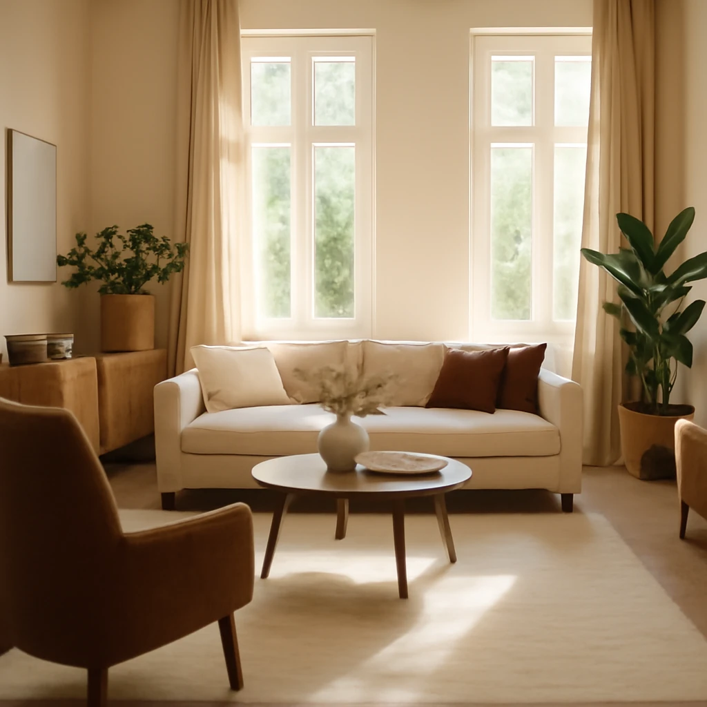
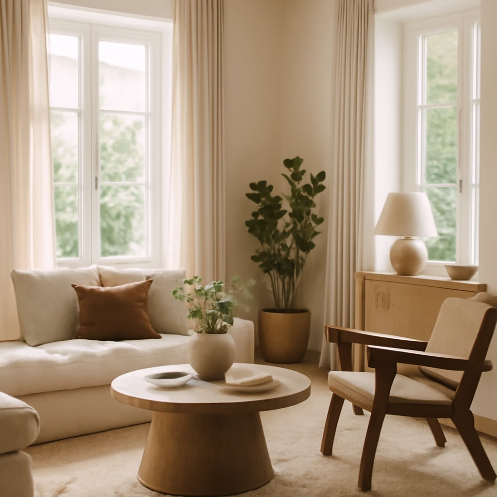
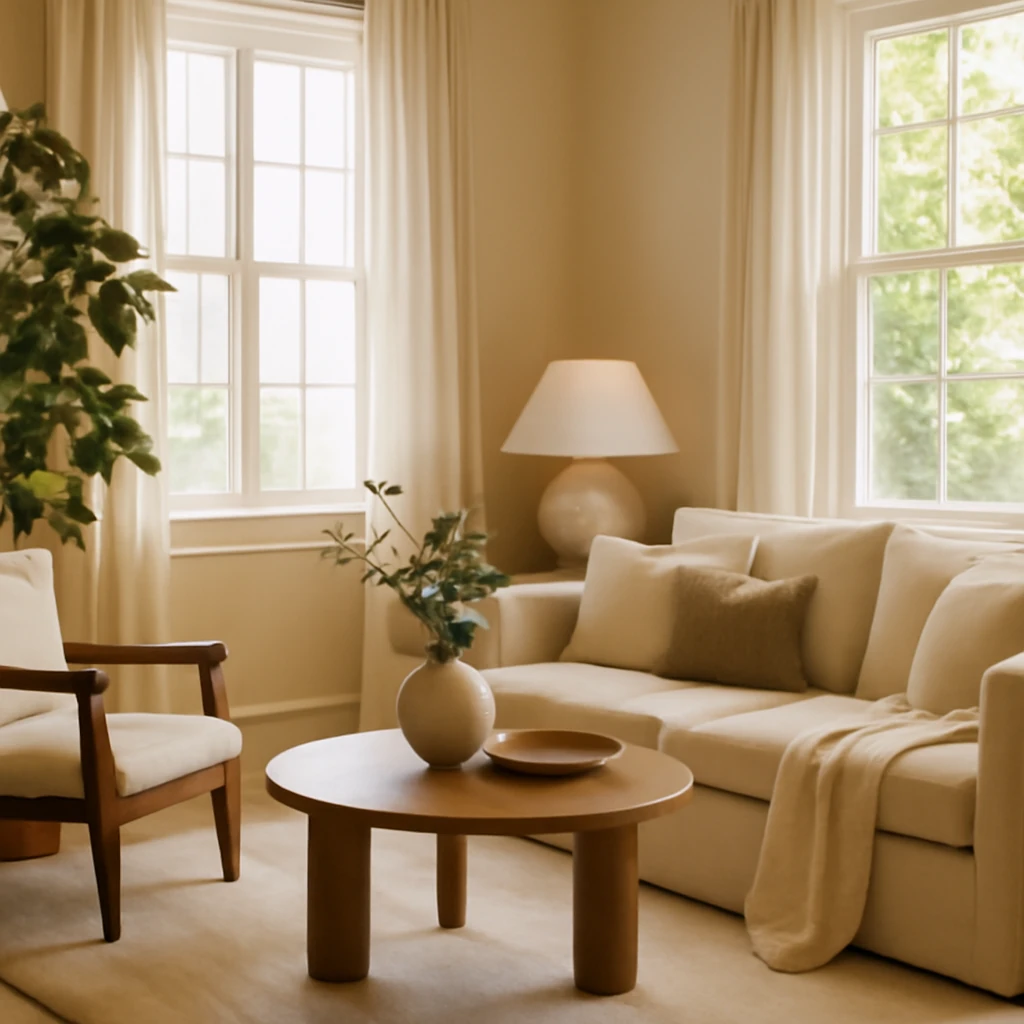
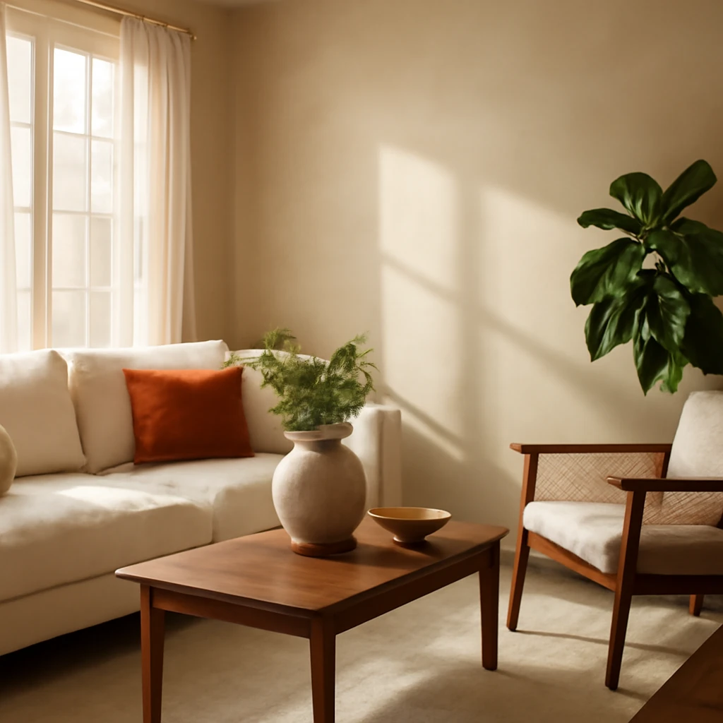
Living rooms: cosy and adaptable
The living room often blends comfort with social function. A flexible palette might feature warm neutrals like stone or mushroom grey, with accent colours drawn from nature or architectural details. Soft textures, such as felt, wool and linen, add warmth and depth, while carefully selected art and textiles provide personality. When the ceiling is high, lighter tones on walls help lower the perceived height, when spaces are narrow, mid-toned walls with darker furniture can create a grounded, intimate feel.
Colour features and patterns: practical theory
To translate theory into practice, designers use a handful of tried-and-tested tools. The most common is a colour wheel and a set of strategies to assemble harmonious palettes. Here are the core concepts you should know.
The Itten colour wheel
The Itten wheel remains the foundational tool for modern colour planning. At the centre lie the primary colours, and around them the secondary colours created by mixing these primaries. The outer ring shows tertiary colours formed by further combinations. In interior design, white, black and grey are usually treated as neutrals and used to anchor the palette rather than as main colours.
Combinations can be approached in several ways: the classic triad (three colours spaced evenly around the wheel), a contrasting triad (two colours opposite the main colour), an analogous trio (colours next to each other), or a complementary pairing (two colours opposite each other). These methods help maintain balance while allowing for rich variations in tone and intensity.
Warm and cool hues
The wheel’s warm segment includes reds, oranges and yellows, these hues feel energising and cosy, and they work well in rooms with limited natural light. Cool hues - blues, greens and purples - tend to calm and recede, making spaces feel larger and more tranquil. Neutral tones such as white, beige, grey and black are versatile and can act as bridges between warm and cool palettes. The perceived temperature of a colour can shift with its context, a violet shade can feel warm on a red backdrop and cool on a blue backdrop. Consider the lighting and surrounding materials when evaluating warmth and coolness.
Saturation and depth
All colours vary in saturation from bright to muted. In interior design, deeper or more saturated colours can anchor a room and draw attention, while lighter, desaturated tones recede and widen space. A monochromatic approach - varying lightness and depth within a single colour family - creates a cohesive, sophisticated look and reduces visual noise. A restrained palette often feels more timeless and flexible across seasons than a highly saturated one.
Colour accents
Accent colours provide vitality without dominating. In most schemes, accents should be kept to a small percentage of the overall colour weight - typically around 10 percent. This could be a throw, a cushion, a rug, or a single statement piece that energises the room. The best accents harmonise with the main and secondary colours while offering a deliberate contrast or a complementary hue that can be refreshed without a full redesign.
How many colours can you combine?
For small rooms such as compact bathrooms or compact kitchens, two colours are often sufficient: a base and a secondary. In larger spaces, four to five colours can create depth and interest, provided the balance is kept. It is crucial to allocate the core tones to fixed surfaces - walls, floor, ceiling, upholstery - and reserve the remainder for accents. The aim is a coherent look with meaningful variation, not a maximal spectrum of shades.
When applying the four-to-five colour rule, maintain a clear hierarchy: the dominant colour should cover most of the surfaces, the secondary colour should appear in larger elements such as furniture or textiles, and the accent colour should appear sparingly in small doses across decor pieces and accessories.
Colour combinations layouts: practical examples
To simplify experimentation, designers use practical reference grids. Start by selecting a base shade and then pair it with complementary or analogous colours. The following layout examples illustrate how typical European living spaces can be configured with just a handful of tones. These grids are flexible and can be adapted to different light conditions and architectural styles.
Colours to avoid and why
Fluorescent shades can be visually demanding and provoke fatigue for some individuals. They are best used sparingly as accent elements or as daring focal points rather than as dominant room colours. If you wish to introduce a bold vibe, consider saturated purples, hot pinks or electric blues as limited accents rather than wall or upholstery colours.
- Keep neon or high-intensity chroma as statements rather than backdrops.
- Avoid pairing multiple fluorescent tones in one scheme to prevent visual fatigue.
Brown-green combinations can feel heavy and swampy if not balanced with lighter neutrals and controlled lighting. When in doubt, limit brown-green to small traces in textiles or decorative items and ensure there is ample warmth elsewhere in the palette.
Two strong colours without a mediator often clash, neutral shades such as white or grey help soften the confrontation. Alternatively, blend strong colours within the same family for a more cohesive effect.
- Examples include pairing navy with soft stone, or charcoal with warm taupe to maintain sophistication.
- If using bold hues, consider applying one strong colour as a dominant surface and the other as an accent to avoid visual competition.
Colour psychology and physiology
Colour affects perception and mood in nuanced ways. Individual responses vary, but certain associations are widely observed across European cultures. The goal is to leverage colour to support the intended use of a room while ensuring comfort for everyday living.
Intense red and pink
Red and pink hues can stimulate energy and focus, which is beneficial in social spaces or for stimulating appetite in kitchens. However, high saturation red in rooms intended for relaxation can be tiring over time. Use intense reds and pinks as accents rather than as large expanses. Softer rose, blush or cranberry shades offer warmth without overstimulation.
Bright yellow
Yellow is optimistic and energising, often lighting up spaces with natural warmth. It can help brighten dull light and lift mood. In large doses, it can be overpowering, balance with cooler neutrals and ensure the floor and furniture anchor the scheme to avoid excessive brightness.
Blue, green and natural colours
Cool tones such as blue and green have a calming effect and can make larger rooms feel serene and expansive. In practice, lighter blues and soft greens are excellent in bedrooms and bathrooms, while deeper blues create sophisticated focal points in living rooms or study areas. Natural hues - stone, sand, taupe - provide a versatile backbone that pairs well with both warm and cool accents.
Choosing furniture colour to support the palette
Furniture colour should complement the walls and flooring, not compete with them. Here are practical guidelines to keep colour relationships clear:
- Furnishings in darker timber or charcoal tones generally work well with lighter walls and a mid-tone sofa, this creates a grounded look with clear visual anchors.
- Rich woods pair nicely with muted greens, mustard accents and warm greys, creating a timeless, European aesthetic.
- Black or white furniture can act as architectural punctuation, particularly in bright rooms with ample natural light.
- When selecting textiles, aim for a couple of tones stronger than the wall colour to ensure depth without creating visual friction.
As a practical rule, ensure that the furniture fronts and upholstery are darker than the walls, but lighter than the flooring. This helps define spaces without creating harsh contrasts.
Current interior colours across Europe
Across the continent, a strong preference for timeless neutrals persists: whites, creams, greys and warm stone tones remain the backbone of many schemes. However, regional tastes vary. In parts of continental Europe, deeper purples and lilacs are used to convey luxury and creativity, while in other regions earthy clay and olive tones dominate living spaces and kitchens. The most current trend is not a single colour but a flexible palette built around neutral bases, with carefully chosen accent colours drawn from nature and art. The best colour is ultimately the one that makes you feel at home and comfortable in your own space.
- In many European cities, harmonious schemes that blend natural materials with soft neutrals remain popular for their resilience and timeless appeal.
- Muted greens and warm ochres have gained traction in kitchen zones and living areas, offering a link to outdoor environments while maintaining indoor comfort.
- Bold purples or blues are embraced selectively in bedrooms or feature walls to signal refinement and creativity without overwhelming the room.
How to implement a colour plan: a practical checklist
- Assess light: observe how daylight changes across seasons and how artificial lighting shifts hues in the evening.
- Define function: determine how each room is used and which activities require calm, focus or sociability.
- Choose a base colour: select a dominant shade for walls and major surfaces that supports the room’s purpose.
- Pick a secondary colour: choose one hue for furniture, textiles or cabinetry to introduce depth.
- Select an accent: identify a bright or saturated colour for cushions, art or décor to energise the space.
- Test in situ: use large swatches or sample boards against walls and flooring to observe how colours interact under different lighting.
- Consider texture: combine matte and satin finishes to add subtle tonal variation without changing hue.
- Decide on consistency: determine which tonal family will run across rooms to ensure a cohesive home narrative.
- Plan for longevity: choose colours that endure beyond seasonal fashion, with the option to refresh through accessories.
Colour combinations: a practical reference table
The following table presents common, harmonious pairings that work well in European homes. It is a reference you can adapt to specific rooms or architectural styles. The aim is clarity and balance rather than strict rules.
| Colour | Style direction | Compatibility | Best rooms | Notes |
|---|---|---|---|---|
| White | Classical, Modern, Scandinavian | Any combinations | All spaces | Adds air and light |
| Grey | Country, Classical | Warm red-yellow-orange, neutral black-white, greens | Study, Living room, Play room, Kitchen | Calms without reducing functionality |
| Black | Classic, Loft, Hi-tech, Minimalist | Pure white, gold accents, red-violet tones | Spacious living areas, Master bedroom, Kitchen | Conveys luxury and depth |
| Red | Art Deco, Classic | Neutrals, white, grey, brown | Kitchen, Living room | Stimulates appetite and energy |
| Orange | Contemporary, Industrial | White, black, beige, greens | Kitchen, Living room | Lifts mood and vitality |
| Yellow | Modern, Country | White, grey, red, black, blue | Spacious living spaces or children's rooms | Brightens and energises |
| Green | Classic, Country | White and grey neutrals, beiges | Any room, including bathrooms | Freshens and calms |
| Pink | Classical, Shabby chic | White, grey, red, black | Bedrooms, Living rooms | Softens spaces, bolder tones mellow with time |
| Blue | Classic, Modern, Scandinavian | White, grey, red, black, plus yellows or greens | Open-plan living, Bathrooms, Studios | Feels solid and practical |
| Purple | Classical, Loft | White, red, black, pink, greens, greys | Bedrooms, Living rooms | Evokes refinement and creativity |
| Brown | Classical, Loft, Scandinavian | Red, white, yellow, greens | Any room | Creates warmth and comfort |
The psychology of colour in daily life
Colour is highly personal. Some people respond to saturated hues with heightened energy, while others prefer the calm of neutrals. Use colour as a tool for daily life, not a distraction. Incorporate bright accents through cushions, throws, artwork or a single statement piece rather than redecorating an entire room each season.
Strong red and pink elements
Strong reds and pinks can heighten arousal and focus, which may be beneficial in social or dining spaces. Yet sustained exposure to high-saturation reds can lead to fatigue. Use these hues sparingly, or opt for softer variations such as cranberry or rose to maintain warmth without overstimulation.
Bright yellow and citrus tones
Yellow is energising and sunlit, ideal for spaces that lack natural light. When used in larger areas, pair with cooler neutrals to avoid excessive brightness. If the space is already bright, a restrained yellow can offer a sunny note without overwhelming the senses.
Calm blues, greens and earth tones
Blue and green hues promote calm and focus, particularly in work zones, bathrooms and bedrooms. Neutral earth tones - stone, sand, taupe - offer timeless adaptability and harmonise well with both warm and cool accents, giving spaces longevity and ease of maintenance.
Practical guidance for European furniture and textiles
When selecting furniture and textiles, two simple criteria help maintain harmonious colour relationships: the furniture and upholstery should be darker than the walls, and lighter than the floor. This rule preserves legibility and depth, while avoiding a flat, two-tone look. Let the walls act as the quiet stage, furniture and textiles provide structure and personality, and accents deliver the spark.
- Dark wood or dark-finish furniture is a natural counterpoint to light walls, and pairs well with soft greens, warm ochre and muted blues.
- Light woods work beautifully with mid-toned textiles and cool neutrals, creating a refreshed, contemporary atmosphere.
- Bold, dark furniture can anchor a room with high-contrast architectural features, especially in rooms with abundant natural light.
- Textiles are the easiest way to calibrate a palette. Use a small number of tones across cushions, throws, curtains and rugs to knit surfaces together.
A practical palette for European living: current favourites
Timeless neutrals remain essential, but regional preferences add flavour. Across many European homes, a refined combination of greys, warm beiges and white remains universal, with accent colours drawn from nature and art. A popular contemporary approach is to pair neutral bases with soft greens, warm terracotta, or muted blues for variety without sacrificing cohesion. The most important colour is the one you feel most relaxed in, personal comfort is the ultimate design benchmark.
- Neutral bases with carefully chosen accent colours create flexibility as trends change and rooms serve different functions over time.
- Muted greens, earthy ochres and clay tones offer a connection to the outdoors while maintaining indoor sophistication.
- Deep, saturated hues appear as statement walls or dedicated features in living spaces, bedrooms or studies for a sense of drama without overwhelming the room.
Concluding tips
Colour is a powerful instrument when used with intention. Start with light, natural foundations and build complexity through texture, light, and well-chosen textiles. Use the Itten wheel as a practical guide, but remember that light and material quality can alter how a colour reads in a space. Frequent re-evaluation of the palette as light shifts with the seasons will help you maintain a space that feels both modern and timeless. The aim is harmony, comfort and a refined sense of European living that suits your daily life, hobbies and sense of style.
You may also like these articles
Euro Two-Bedroom Flats: Flexible Layouts for European Living
Smart layouts and stylish zones for compact European homes.
Beige as a Foundation: Elegant Pairings for a Calm, Sophisticated Home
Beige as a versatile neutral: how to pair with colour and texture across rooms.
Painting Walls: 10 Practical Mistakes and How to Get It Right
Master the art of wall painting with ten expert pitfalls and fixes.