
Explore interior trends, AI design insights, styling guides and real transformations
Grey in Interiors: Nine Timeless Pairings to Elevate European Homes
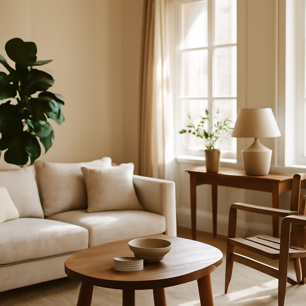
The quiet power of grey in European interiors
Grey is more than a neutral backdrop. In European homes, it acts as a sophisticated canvas that can convey calm, drama, warmth, or restraint depending on the companions, textures, and the light available. With well over 200 distinct shades, grey adapts to every style - from Nordic minimalism and urban loft to classic Riviera elegance and contemporary city living. The trick is not just choosing a colour, but balancing undertones, materials and proportion so that the palette feels cohesive and alive in real rooms.
Across continental Europe, daylight changes with the seasons and latitude, which makes grey an ideal central hue. It can soften the glare of bright south-facing rooms, add depth to north-facing spaces, or act as a bridge between architectural features - ceiling cornices, timber floors, stone walls - and the fabrics that dress them. The following nine pairings represent versatile, enduring combinations that work in kitchens, living rooms, bedrooms, study nooks and corridors alike.
Best colour pairings with grey
Grey’s strength lies not in its own colour but in how it collaborates with other hues. Below are nine pairings that show how to create different moods while keeping the palette elegant and timeless. Each section includes practical guidance for scale, contrast, and texture so you can translate the idea into real European spaces.
White and black
The classic achromatic trio is a reliable foundation for most interiors. White lightens and airies the scheme, black adds gravitas and structure. The most successful executions avoid too much contrast all at once and instead use grey as a bridge between the two extremities. There are two effective approaches:
- White–grey–black interiors: grey serves as a softer intermediary between white and black. Prefer dense, warm whites (buttermilk, ivory, or warm greys) and limit black to selective elements such as hardware, a frame, or a single statement piece to prevent the room from feeling closed in.
- Neutral base with bold accents: grey forms the quiet backdrop while one or two strong, saturated accents (for example, a vivid yellow or rich emerald) provide focal points. Use black sparingly as a grounding element for furniture silhouettes or lighting fixtures.
In European apartments, where walls are often painted in off-white or soft greys, this pairing works beautifully with tactile textures - wood, brushed steel, linen, wool - so the palette never reads flat. Always consider daylight: a north-facing room may benefit from slightly warmer whites and greys to avoid a chilly feel.
Beige (greige)
Beige and grey together form a timeless, serene duo known as greige. This combination is particularly versatile across styles - from Scandi to modern rustic to refined urban chic. The warmth of beige softens the clinical edge of grey, producing a natural, layered look that reads as calm and refined.
Practical tips:
- Balance the coolness of grey with warmer beige undertones. Pair warm-light woods (oak, ash) and natural stones (limestone, terracotta tiles) to emphasise the natural spectrum.
- Add texture to avoid flatness: woven fabrics, cork or stone flooring, and tactile leathers or suedes create depth without altering the colour balance.
Beige works across spaces: a grey walls with beige upholstery, a beige rug over a grey floor, or a grey kitchen island paired with warm-toned cabinetry. The result is a cohesive, contemporary environment with a soft, approachable warmth that suits many European living contexts.
Yellow
Yellow infuses space with warmth and optimism, making it a favourite pairing with grey in European homes seeking a bright, uplifting mood. The key is restraint: let grey do the heavy lifting and let bursts of yellow act as sunlit accents rather than dominant fields.
Colour strategy:
- Use yellow on soft furnishings, lighting or small furniture pieces to inject energy. Natural variations such as pale lemon, saffron, or ochre work well with cooler greys, while warmer yellows pair nicely with warmer greys.
- Ensure adequate natural or artificial daylight to keep the yellow from turning dreary in overcast climates. Where windows are small or limited, lean on white surfaces to bounce light and keep the space feeling open.
This pairing suits living rooms and kitchens especially well, where a warm, inviting atmosphere is desirable. The combination can be playful in a family home or refined in a contemporary apartment, depending on the scale of furnishings and texture choices.
Green
Green is a particularly versatile partner for grey because it carries a spectrum of moods - from the deep, moody tones of forest greens to the gentle calm of sage. The tone you choose will steer the room’s character, and the grey will remain as a stabilising base.
- Deep greens (emerald, bottle, pine) paired with graphite, slate or charcoal greys create elegant, sophisticated rooms with a resort-like feel. This pairing resonates with contemporary and classic designs alike, especially when natural materials like timber, stone, and brass are present.
- Lighter greens (sage, olive, pistachio) with warm or mid greys suit boho and eco-inspired interiors. Use warm textures such as rattan, linen and terracotta to keep the palette lively without turning cool.
- Mint or soft mints used with pale greys can bring a fresh, coastal vibe to kitchens or bathrooms, especially when balanced with white and light wood.
To avoid a cold air in cooler climates, balance grey with beige or brown undertones and incorporate organic textures. The result is a space that feels rejuvenating yet grounded, suitable for both modern and traditional layouts.
Red
Red, in its deep, saturated forms, makes a dramatic companion to grey. The idea is to use red as a statement rather than a background colour, allowing grey to maintain its calm presence while red injects energy where you most want focus.
- Choose deep reds - garnet, cranberry, ruby or burgundy - for upholstery, a feature wall, or a bold door. Keep the surrounding greys cool or mid-toned to prevent the palette from becoming overpowering.
- Balance is essential: keep red to about 20–30% of the space, or use it in smaller, high-impact accents - candles, throw cushions, or a piece of art - so the room remains harmonious.
This pairing lends itself to dining rooms and living areas where mood and drama are welcome, and it pairs especially well with natural wood textures and metallic highlights such as brass or gunmetal.
Blue and blue tones
Blue is inherently cool, and with grey it creates a serene, contemporary palette. Whether you lean toward navy, cobalt, or powder blue, the pairing benefits from a generous light source and reflective surfaces to keep the space from looking austere.
Guidance for Europe-wide contexts:
- In bright, sunny rooms, blue with grey can feel crisp and refreshing, in darker rooms, add warm whites or wood tones to prevent the space from feeling too chilly.
- Blue-grey walls with white or pale timber trim can visually enlarge smaller rooms and are well-suited to coastal or lakeside homes where light changes with the weather.
This mix works particularly well in living rooms and bathrooms, where calm, spa-like atmospheres are desirable. Pair with reflective surfaces and light textiles to maximise brightness and depth.
Pink
Pink softens grey’s severity and introduces a gentle romantic note without veering into overt prettiness. Dusty rose and blush tones sit comfortably with mid to cool greys, while warmer pinks can shift the balance toward a cosy, feminine mood in bedrooms or lounges.
Considerations:
- Avoid overly bright pinks with cold greys, instead choose desaturated or dusky pinks that harmonise with the undertones of the grey.
- Layer pink with natural textures (linen, wool, timber) and metallic accents to create a refined, mature palette rather than a childish one.
The pink–grey pairing is particularly effective in bedrooms and guest rooms, where comfort and quietude are priorities, but with careful scale it can work in dining rooms and daily living spaces as well.
Orange
Orange functions similarly to red and yellow as a bright, energising accent colour. With grey, it tends to lift the mood and bring warmth, particularly in spaces lacking natural light or in autumnal interiors where a cosy atmosphere is desired.
Strategy:
- Opt for terracotta, amber, or burnt orange rather than neon hues. Subtle, earthy oranges pair elegantly with mid-grey or blue-grey tones.
- Use orange in soft furnishings, a statement lamp, a rug, or a small piece of furniture. Let grey carry the majority of the space while orange provides a purposeful highlight.
In European homes, this pairing can be especially inviting in living rooms and kitchens, where the warmth of orange counters the coolness of grey and wood textures.
Brown
Brown and grey echo natural materials and environments, making this pairing particularly harmonious. The two neutrals share a natural cadence that feels rooted and timeless, whether in a traditional townhouse or a modern loft.
How to balance:
- Choose rich, warm greys with saturated browns or chocolate tones. Pair with white or pale stone to prevent the scheme from becoming too heavy.
- Bring in wood textures, stone, leather, and textiles such as wool or tweed to reinforce the natural mood. A white or cream ceiling helps keep the space buoyant and readable.
Brown and grey are well-suited to both classical interiors - where panelled walls and ornate detailing add depth - and contemporary schemes that prioritise tactile surfaces and honest materials.
Practical guidance for applying these pairings
Turning ideas into rooms that feel coherent requires a systematic approach. Here are practical steps to ensure your chosen pairing translates well in European homes, with attention to light, scale, and function.
- Assess undertones first. Grey comes with cool, warm, or neutral undertones. Identify the undertone that complements your space’s light - north-facing rooms often benefit from slightly warmer greys, while south-facing rooms can carry cooler tones with greater clarity.
- Test in daylight. Paint samples on walls and observe them at different times of day. Europe’s seasonal light shifts can dramatically alter how a grey reads in a room.
- Use texture to create depth. The same colour can feel different depending on material. Consider timber floors, stone or ceramic tiles, wool upholstery, linen drapes, and metal fixtures to add visual interest without changing the palette.
- Balance with light and mirrors. White ceilings, light-coloured floors, and reflective surfaces help prevent spaces from feeling too enclosed when pairing greys with darker accents.
- Proportion matters. If you use a strong accent colour like yellow or red, apply it in proportion - roughly 10–20% of the room (textiles, cushions, lamps, or a rug) to keep the space calm and legible.
- Consider function and climate. Bedrooms benefit from softer, warmer greys, kitchens and bathrooms may benefit from cooler greys with warmer accents, living rooms work well with mid-toned greys and a varied texture set to maintain interest through the day.
- Urban versus coastal contexts. In city apartments with limited light, lean toward lighter greys and reflective surfaces, in coastal or lakeside homes, deeper blues or greens can harmonise with sea views while grey anchors them.
Textures and finishes that make grey sing
Colour is only part of the story. The materiality of a space breathes life into a grey palette and helps you achieve a tactile, multi-dimensional environment that holds up under European lighting and usage patterns.
- Wood and stone. Natural materials introduce warmth and personality. Oak, ash, or walnut flooring with a grey backdrop feels contemporary yet timeless. Stone such as limestone or travertine adds subtle contrast without overpowering the palette.
- Textiles with depth. Layer textiles in varying textures - linen throws, wool rugs, velvet cushions - to create depth and softness. The interplay of matte and sheen surfaces keeps the room visually interesting.
- Metallic accents. Brushed brass, copper, or gunmetal fittings can lift a grey scheme, offering warmth (brass) or a cool edge (gunmetal). Use metals in lighting, hardware, and frames to punctuate the design.
- Ceramics and tiling. Matte or satin finishes on tiles and ceramicware can subtly shift the mood of the space, particularly in kitchens and bathrooms, where function meets tactility.
Room-by-room ideas: applying these pairings in practice
The following scenarios illustrate how these pairings translate into real European interiors, considering typical apartment layouts, daylight patterns, and regional aesthetics.
- Living room with white and black accents. A light grey wall paired with warm white upholstery, a charcoal sofa, and brass lighting creates a sophisticated living area that remains welcoming. Add a textured rug in natural fibre and a timber coffee table to ground the scheme.
- Greige sanctuary for the bedroom. A soft grey bed wall with beige textiles and a light timber floor forms a serene refuge. Introduce a pink or blue accent through cushions or art for a personalised touch without overpowering the calm.
- Kitchen with yellow highlights. A mid-grey cabinetry base with warm-white countertops and yellow pendant lights or a yellow bar stool can inject energy while maintaining refinement. Use natural materials such as oak and stone for balance.
- Home office in blue-grey tones. A cooler blue-grey wall with a white desk and warm wooden floors creates a professional yet inviting environment. Consider a deep navy chair as a focal point.
- Bathroom with green undertones. Sage or olive tiles paired with white fixtures and brushed brass fittings can yield a spa-like feel that remains practical in daily use.
European context: regional habits and architectural cues
European interiors vary from the timber-clad chalets of the Alpine regions to the marble-laced city apartments of central Europe and the sunlit villas of the Mediterranean coast. Yet grey behaves consistently as a flexible foundation across all these contexts. In northern climates where daylight can be limited for several months, softer greys paired with warm woods create cosy, human-scale interiors. In warmer southern climates, greys with white surfaces and reflective materials help maintain a sense of coolness while allowing architectural details to shine. Urban spaces benefit from the reduction of colour overload, country homes allow the temperament of each pairing to emerge through texture and scale. The universal key is thoughtful proportion and material honesty.
Starting points for your project
If you’re embarking on a new scheme or updating an older space, here are practical steps to start with:
- Define the base grey. Decide whether you want a cool, neutral, or warm grey as the backbone. This decision will cascade into the choice of second colours and materials.
- List the spaces and their functions. A living room, kitchen, bedroom, and bathroom each have different needs in terms of light, humidity, and daily wear. Tailor the pairing to function.
- Plan the texture map. Map where wood, textile, stone, and metal will appear. Ensure there is a balance of matte and subtle sheen finishes to prevent flatness.
- Experiment with swatches and samples. Collect fabric and paint swatches and place them in similar lighting to the room. Observe changes throughout the day and across seasons.
- Test with a small area first. In darker spaces, test a larger sample panel to see how the colour reads in real life before committing to walls or large furniture.
- Keep a changeable plan. Use modular furniture and removable textiles to adjust the balance as you refine your taste or as seasons change.
Conclusion: grey as a contemporary European hero
Grey offers a durable, adaptable platform for design across Europe. When paired with the right undertone, and when complemented by textures, natural materials, and carefully chosen accents, grey can read as serene minimalism, refined luxury, rustic warmth, or vibrant modernity. The nine pairings outlined here are practical starting points for achieving a coherent, timeless palette that respects regional aesthetics and climate while staying firmly rooted in contemporary design language. With thoughtful proportions and material honesty, grey becomes not just a colour, but a disciplined approach to space, light, and life.
You may also like these articles
 Renovation
Refreshing Your Kitchen Countertop: DIY Techniques for European Homes
Four practical DIY methods to refresh a kitchen countertop across European homes.
Tips & How-To
Silencing office chair squeaks: a practical European maintenance guide
DIY guide to diagnosing and silencing office chair squeaks.
Interior Design
Modern European Folk-Inspired Interiors: A Practical Guide
A European guide blending folk warmth with contemporary living.