
Explore interior trends, AI design insights, styling guides and real transformations
Mint Colour in Interiors: How to Use and Pair Effectively
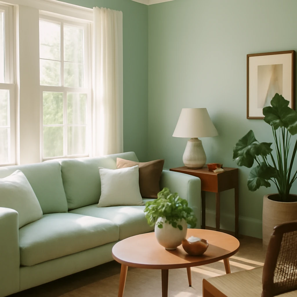
Mint colour in interiors
Mint is a colour that instantly lifts a space with a sense of freshness and calm. In European homes - from compact city flats to airy lofts and classic townhouses - mint works best when it’s treated as a design tool rather than a decorative afterthought. It can read as a cool, serene backdrop or become a confident accent, depending on how it is introduced and what it sits against. In this guide, we explore what mint colour can do in interiors, how to apply it thoughtfully, and which colours to pair with it for contemporary, long-lasting results.
What is mint colour in interiors?
Mint is a cool green with blue undertones that spans a spectrum from soft pastel to vibrant turquoise. In practice, mint behaves as a versatile neutral that can either blend quietly with surrounding materials or stand out as a crisp focal point. Its warmth is variable: though it sits in the cool end of the spectrum, being a natural colour allows it to be perceived neutrally in many contexts, which means it can be warmed or cooled through its surroundings.
Key characteristics to bear in mind:
- Mint exerts a refreshing effect without being clinical. With the right textures and lighting, it can feel light and bright or cosy and cosy-inviting.
- As a colour with cooling associations, mint is well suited to spaces that receive a lot of natural light or where you want a tranquil atmosphere, such as bedrooms, bathrooms and home offices.
- It is surprisingly versatile across modern, Scandinavian, and vintage-inspired schemes. When used in lighter values, mint can act as a backdrop, in deeper tones, it becomes a strong design statement.
- Mint pairs well with a broad range of colours, from whites and neutrals to pastels and even darker hues, making it a flexible choice for European interiors that value longevity and subtlety.
Where and how to apply mint colour
Mint is comparatively forgiving. It can be used liberally or sparingly, on walls or as accents, across different surfaces in a room. Below are practical approaches that work well in European homes.
Finishes
In living spaces such as lounges, bedrooms, entry halls and bathrooms, mint can function as a base tone or as a striking accent. Consider these approaches:
- Wall colour: A full wall in mint can create a serene backdrop for artwork and furnishings. For a gentler effect in smaller rooms, balance mint with white ceilings and skirtings or with warm timber tones.
- Feature wall: Use a deeper mint shade on one wall to create a focal point while keeping adjacent walls in a lighter tint or neutral.
- Colour-blocking: Employ large blocks of mint against contrasting neutrals or bolder hues to delineate zones in open-plan spaces.
- Surface texture: Matte finishes feel soft and cosy, a satin or lightly glossed mint can emphasise architectural features or trim without feeling oppressive.
Furniture
If a full mint backdrop feels bold, bring the colour in through furniture instead. In living spaces, mint sofas or armchairs can become rooms’ signature pieces. In bedrooms, mint headboards or bed frames offer a gentle, restful focal point. When mint is used on a larger furniture piece, pairing with more neutral upholstery or wooden textures helps to balance the composition. For kitchens, mint cabinetry can feel fresh and contemporary, pairing with natural stone worktops and white wall tiles often yields a timeless, European look.
Decor and textiles
Decor and textiles are the safest way to introduce mint without committing to major changes. Throws, cushions, curtains, rugs and table linens in mint can elevate a neutral scheme and are easy to swap with the seasons. In kitchens, mint-coloured textiles or tableware, glassware and linen towels can add brightness without overwhelming the space. In bathrooms, mint accessories paired with white fixtures create a water-inspired, airy environment.
Colours that mint pairs with
Mint’s versatility means there are many successful pairings. The most effective combinations balance mint’s coolness with warmth, depth or further softness from complementary colours. Here are common, well-proven pairings for European interiors.
With White
The classic pairing. White sets mint free to breathe, enhancing its freshness and giving an impression of space and airiness. In contemporary and Nordic-inspired schemes, mint and white work in various ratios - from white-dominant neutrals to mint-dominated schemes with white accents. The combination is ideal for kitchens, living rooms and bathrooms where a clean, uplifting mood is desired.
With Pink
Mint and pink - especially soft, dusty, or blush pink - offer a gentle, romantic contrast that feels calm and welcoming. This pairing is popular in bedrooms and nurseries, where pastel accents soften the room’s mood. Use mint as the primary colour and pink as a supporting accent to keep the palette balanced and sophisticated.
With Blue
Mint and blue form a tranquil, water-inspired spectrum. Lighter sea-tones create a fresh, coastal ambiance in bathrooms and kitchens, while darker blues with mint can ground a living space with a sophisticated, modern edge. In more bijou rooms, mint and pale blues can read as soothing and refined when paired with natural textures.
With Grey
A restrained pairing that reads modern and timeless. Warm greys (with a hint of taupe) complement mint without dulling its clarity, while cooler greys can lean into a more urban mood. This duo benefits from soft textures - wood, wool, cotton - and metallic accents to introduce warmth and tactility.
With Violet
Muted purples add depth when paired with mint. The resulting palette feels luxurious and contemplative - well-suited to living rooms and bedrooms. To prevent saturation, introduce neutrals like grey or beige to balance the scheme.
With Yellow
Mint with pale yellow brings sunny energy into a space. Use this pairing judiciously - mint works best as the dominant colour with yellow as an accent. In larger rooms, a touch of warm yellow can make the environment feel inviting and optimistic, while in smaller areas it acts as a lively highlight against mint.
With Black
For a bold, contemporary look, mint paired with black creates a striking contrast. Use black sparingly as an accent on textiles, hardware, or furnishings to prevent the space from feeling overbearing. In bathrooms or kitchens, this pairing can be especially dramatic when balanced with white or timber elements.
Mint in different rooms and spaces
Mint is adaptable to a wide range of European interiors. Below are practical guidelines for common rooms, with emphasis on proportion, lighting and materials.
- Kitchen: Mint cabinetry or a mint-tinted island can energise a kitchen. Consider white or light timber wall units to keep the space feeling open. A cool-toned stone or concrete worktop pairs well with mint and a white or pale-grey backsplash.
- Living room: Mint walls or textiles can set a serene mood. Use natural materials - oak flooring, linen drapes, wool rugs - to counterbalance the cool hue. If mint is used on walls, bring warmth with wood furniture or a statement natural fibre rug.
- Bedroom: Mint creates a restful backdrop. For a soothing scheme, use mint on the walls with a warmer bed linen palette - cream, soft taupe or pale sand. Alternatively, mint upholstery can be the focal point, with a softer neutral surrounding it.
- Bathroom: Mint tiles or wall panels paired with white sanitaryware evoke a clean, refreshing environment reminiscent of water. Introduce texture with stone or ceramic tiling and ensure good lighting to keep the space bright.
- Home office: Mint walls or accessories can calm the mind and improve focus. Pair with practical storage fronts in neutral tones and a timber desk for a grounded, productive atmosphere.
Practical tips for using mint in European homes
To ensure mint integrates well and stands the test of time, consider the following practical guidelines.
- Light matters: In darker rooms, keep mint lighter and lean on white ceilings and trims to maximise daylight reflection. In rooms with ample natural light, deeper mint tones can feel vibrant and inviting.
- Proportions: A common rule is to use mint as the base colour in about 40–60% of the palette in larger spaces, with neutrals or complementary colours filling the rest. For smaller rooms, mint works best as an accent or feature wall, balanced by generous white or warm neutrals.
- Texture and materiality: Combine mint with tactile surfaces such as plaster, textured wallpaper, timber, ceramic, or natural fabrics. The mix of textures keeps the colour from appearing flat and adds depth to the design.
- Lighting: Artificial lighting is crucial to ensure mint reads correctly at night. A mix of warm and cool LEDs can help preserve the space’s mood, avoiding the harshness of overly cool lighting on mint surfaces.
- Longevity and maintenance: Choose finishes that suit your lifestyle. Matte or satin finishes in mint are forgiving for daily wear and tear, while gloss can enhance brightness in smaller spaces but may show more marks over time.
- Sustainability: Opt for low-VOC paints and finishes where possible. Mint works well with sustainable materials such as responsibly sourced timber, natural stone, and organic textiles, aligning with European design values around health and longevity.
Putting it all together: a sample European palette
To illustrate how these ideas translate into a cohesive interior, imagine the following palette and layout for a medium-sized European apartment that blends modernism with warmth:
- Walls: a soft mint base on the main living area, with white ceilings and skirting.
- Furniture: a light oak dining table, mint-accent chairs, and a neutral sofa with mint cushions as a colour cue.
- Decor: white ceramic vases, natural linen textiles, and warm brass or brushed bronze hardware to add warmth.
- Kitchen: mint cabinetry with white walls and a pale grey stone worktop, subtle mint-talet preserved by neutral decor items.
- Bathroom: mint tiling or panels paired with white fixtures and soft grey floor tiles for a clean, spa-like feel.
Maintaining balance in mint-centric spaces
As with any bold choice, balance is key. Mint can dominate quickly if overused, so a thoughtful approach to proportion, texture and contrast is essential. Here are some final considerations for maintaining harmony:
- Limit mint to one dominant area with complementary neutrals elsewhere to avoid visual fatigue.
- Layer textures to prevent the colour from feeling flat - think wool throws, linen curtains, and stone or ceramic surfaces.
- Use lighting to sculpt the mood. Warm-white light softens mint for a more intimate effect, while cooler light can emphasise clarity and modernity.
- Test swatches in multiple lighting conditions across the day to ensure the shade remains appealing from morning to evening.
Conclusion
Mint is a versatile, refreshing choice for European interiors. Its cool, natural essence makes it suitable for a broad range of rooms and styles, from contemporary to traditional, from compact city flats to airy maisonettes. By choosing the right shade, pairing it thoughtfully with neutrals and textures, and applying mint in measured proportions, you can achieve spaces that feel both modern and welcoming. Mint is not merely a colour - it is a design strategy that invites light, fosters calm and delivers a timeless sense of renewal to interiors across Europe.
You may also like these articles
 Trends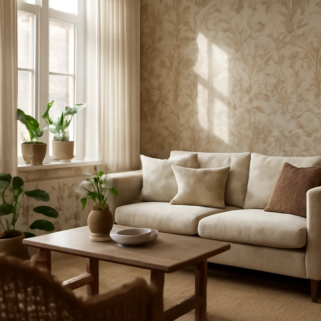
Wallpapers in 2026: A design-forward guide for European interiors
Wallpaper trends of 2026 reshape walls, ceilings and furniture across Europe.
 Small Spaces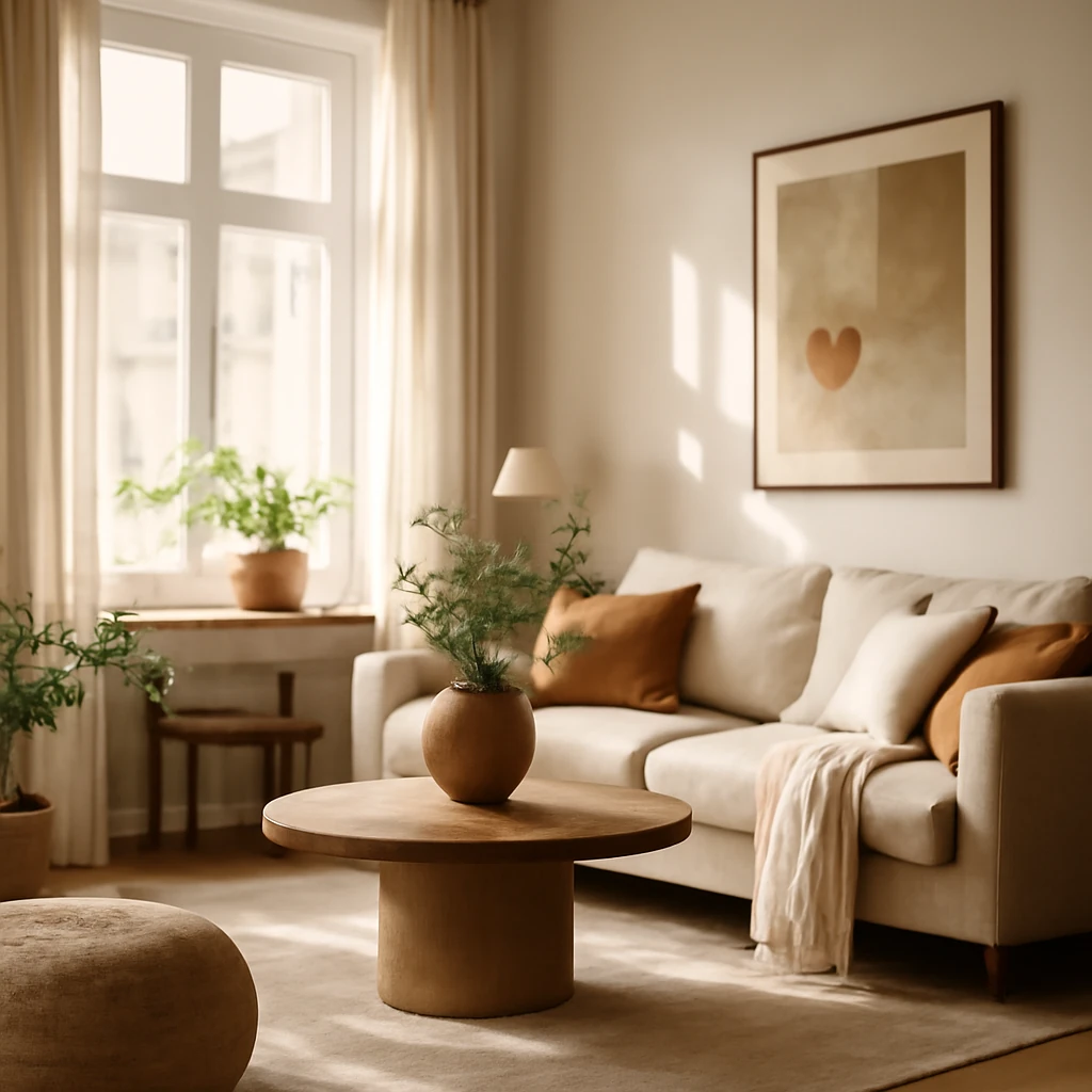
30 m², Made Brilliant: Design Strategies for Compact European Homes
Smart storage, zoning, and lighting ideas that transform 30 m² into comfortable, stylish living.
Renovation
Rough-In Finishing for European Homes: From Planning to Finishing
A practical guide to rough-in finishing for European apartments.