
Explore interior trends, AI design insights, styling guides and real transformations
Harmonising Tile Combinations in the Bathroom: Colour and Texture Across Europe
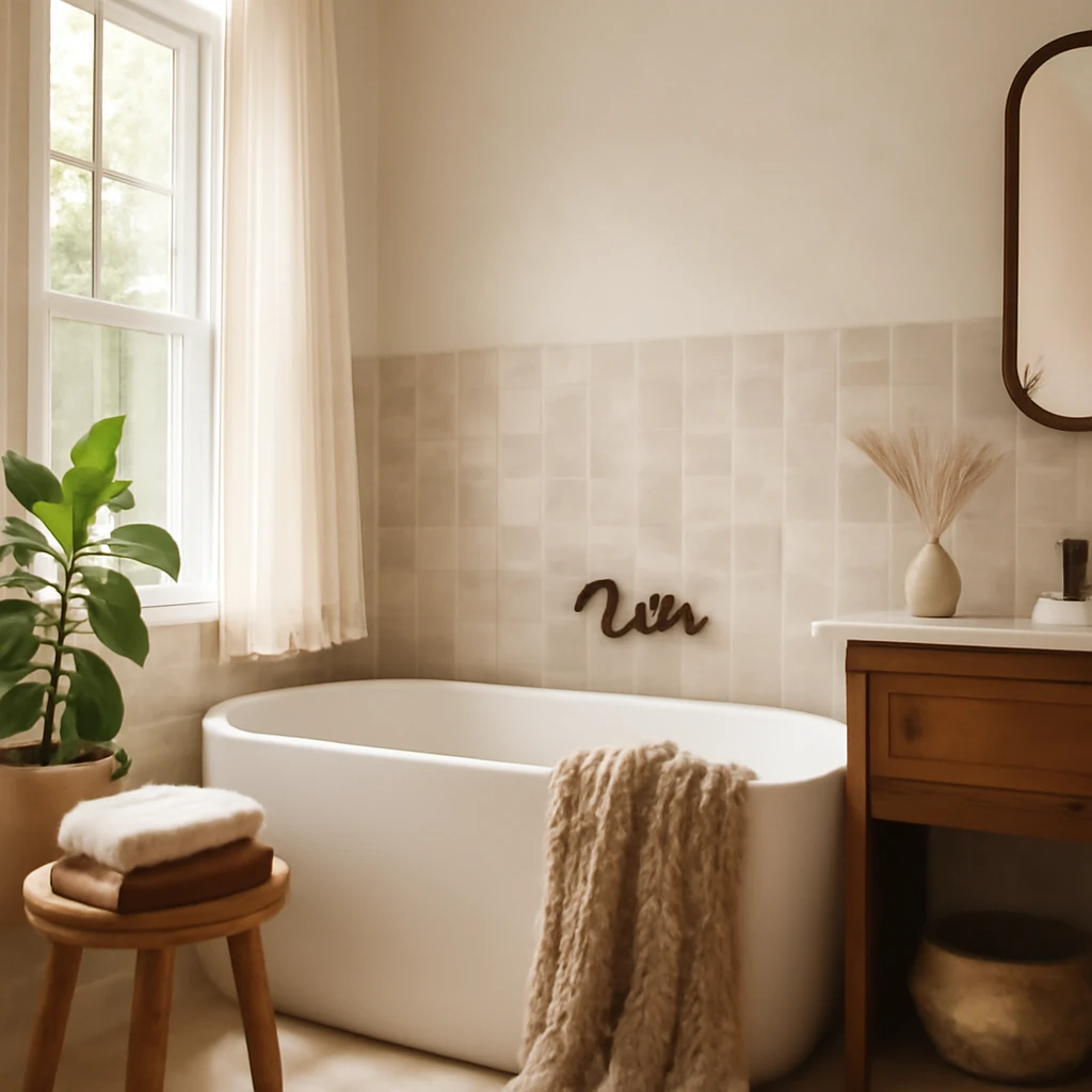
Introduction: why tile choices define a European bathroom
In many European homes the bathroom is a compact, often windowless space where tiles do more than decorate. They shape light, texture and mood, regulate moisture, and help define zones such as the shower, vanity and toilet. The right tile combinations can make a small room feel calm and generous, while purposeful contrasts can add depth and tactility. This guide translates the art of mixing tile colours and textures into practical strategies suitable for continental homes - from airy city apartments to family houses with efficient heating and robust ventilation.
Colour and light: the language of bathroom tiles
Light is your most precious material in a bathroom. Reflectance and colour temperature affect mood as much as the hue itself. European lighting commonly sits around 3,500–4,300 Kelvin, a warm to neutral daylight equivalence. When choosing tiles, consider how they respond to available daylight and artificial light at night. A cool blue tile may feel crisp in daylight but hard in the evening, a warm ivory can soften a space but read dull if illumination is weak. Planning lighting in parallel with tile choices will yield a more cohesive result than colour alone.
Palettes by colour: how each hue performs in a bathroom
Red: warm accents that energise
Red makes a bold statement in a bathroom, especially in European homes where space is precious. Use red as a restrained accent rather than an all‑over scheme. A single red wall or a stripe of red tiles can function as a focal point without overwhelming the room. When selecting red, opt for cooler undertones to temper intensity. Balance with substantial white or soft beige to keep the space calm. Ensure the floor and sanitaryware stay within the same tonal family for a harmonious look.
Yellow: sunshine in compact rooms
Yellow tile infuses a bathroom with optimism and brightness, particularly welcome in northern European homes. Choose lemon or warm canary shades that sit near cool yellows on the colour wheel to avoid a harsh effect. For a robust yellow scheme, pair a monochrome yellow wall with white fixtures and a pale floor. A black-and-white patterned floor tile can anchor the palette, while a restrained wall treatment keeps the space legible and contemporary.
Green: calm sophistication or fresh punch
Green tile reads as calm and refined when used judiciously. An emerald feature wall can ground a largely neutral space, with greys and whites on the remaining surfaces. Lighter mint or sage tiles work well with white fixtures and timber accents to evoke a spa-like atmosphere. For bolder applications, pair green with deep blues or warm terracotta highlights to create a dynamic, fashion-forward scheme.
Blue and teal: cool clarity or maritime charm
Blue tones in the bathroom are timeless in Europe, recalling water and cleanliness. Start with white or very light grey walls and introduce blue accents in a deliberate, repeatable pattern. A feature wall in deep blue or turquoise can become the room’s focal point, while a pale floor keeps the space feeling open. Balance blue with warm accessories, such as brass taps or timber vanities, to avoid a clinical impression.
Pink: soft elegance or playful charm
Pink tiles convey gentleness and can produce very different atmospheres depending on saturation. A saturated pink with vibrant sanitaryware can feel candy-store chic, while a dusty pink with black accents appears refined and contemporary. When pairing pink with marble-like surfaces or white fixtures, the result can be poised and stylish. Use pink sparingly to avoid overwhelming a small room.
Black or grey: drama with discipline
Black or charcoal tiles provide dramatic contrast when used with light walls. The trick lies in lighting and finish: a mix of matte and gloss finishes can add depth without creating glare. In lighter spaces, reserve black for a feature wall or a stripe along the shower enclosure, use lighter neutrals elsewhere to maintain airiness. If the space is predominantly light grey, introduce variation with texture rather than disparate colour to keep the look cohesive.
White and beige: timeless, but tricky
White and beige form a versatile base, yet uniform surfaces can feel flat. To prevent this, vary textures and finishes: combine a polished white wall tile with a matte beige floor, or introduce a subtle pattern on a white tile. Use contrast through fixtures - matte black taps, brass hardware, or timber vanity fronts - and consider a statement floor tile with texture or pattern to add warmth without sacrificing lightness.
Textures that imitate nature: wood-look and stone-look tiles
Wood-look and stone-look tiles are popular in European interiors for their warmth and tactility while remaining robust in humid environments. Wood-look ceramics - richer in texture than real wood and easy to maintain - pair well with stone-look walls or simple, pale cabinetry. Stone-look tiles convey permanence and calm, their weathered textures harmonise with neutral palettes and natural timber. When combining these textures, aim for balance: one surface should stay calm, the other can carry more visual weight. In small bathrooms, limit wood-look tiling to walls or a narrow band on the floor to preserve a sense of space. Keep obtrusive patterns away from adjacent surfaces to avoid visual clutter.
Mixing textures: walls vs floors
In compact spaces, texture is a primary tool for depth. Consider these strategies to manage tactile variety without visual chaos:
- Pair a matte wall tile with a glossy floor tile to catch light without glare.
- Use a textured tile as a shower panel while keeping surrounding walls smooth and simple.
- Repeat a subtle texture across wall and floor to create a cohesive rhythm without overloading the eye.
- Incorporate natural textures in accessories or vanity fronts to introduce warmth while keeping tile surfaces easy to clean.
Two-surface strategies: tonal harmony or deliberate contrast
For bathrooms, tile pairings on walls and floors generally fall into tonal harmony or deliberate contrast. Both work well in European homes if light and scale are carefully managed.
In-tone (tonal harmony)
Tonal schemes rely on a tight palette with subtle shifts. A white wall tile with a light grey floor reads as airy and calm, while a beige wall paired with a warmer sand floor can feel cozier. The aim is to keep the floor lighter than the walls in most European bathrooms to prevent the room from feeling bottom-heavy. Use small variations in finish or a gentle shade shift to maintain interest without disrupting harmony.
- White walls with pale grey floor (or ivory walls with soft taupe floor).
- Beige walls with warm sand floor tiles.
- Two tones from the same tile family on walls and floor.
Light reflection is your ally. Mirrors and varied sheens can bounce daylight around the room, while discreet grout lines help consolidate the surface into one legible plane.
Contrasting (bold contrasts)
Contrast schemes intentionally mix noticeably different colours or textures for a contemporary edge. A dark floor with light wall tiles creates depth, a bold patterned floor with plain walls can establish a striking focal point. When walls feature patterns, keep floors calm, if floors are busy, use restrained walls to avoid visual competition.
- Dark floor with pale walls to create depth and height.
- Matte walls with a glossy floor for light-catching effects.
- Patterned floor with solid walls, or plain floor with patterned walls for focused drama.
Planning practical layouts: measurement, pattern, and fit
European bathrooms vary from compact en‑suites to more generous family spaces. The layout logic of tile placement matters as much as the colour. When planning, consider these practical steps:
- Define zones: shower, vanity, toilet and storage. Use tile texture or colour shifts to delineate.
- Tile sizes should suit scale: small bathrooms benefit from 20 × 20 cm or 25 × 40 cm formats on walls to create verticality, larger formats such as 60 × 60 cm or 60 × 120 cm feel streamlined in more generous spaces.
- Assess maintenance: larger tiles reduce grout lines and simplify cleaning in moist spaces.
- Choose anti-slip floor finishes (EU classifications such as R9 and above) to ensure safety without compromising aesthetics.
- Anticipate moisture exposure: select appropriate tile material, seal grout, and ensure adequate ventilation to prevent staining and mould growth.
- Draft layouts with scale drawings and tile samples placed on walls to test the real impact before committing to cuts in visible areas.
Materials, finishes, and sustainability
European bathrooms frequently emphasise durability and ecological responsibility. Porcelain and ceramic tiles with low water absorption and high stain resistance are standard. Rectified edges enable tight grout joints for a seamless look. Consider grout colours that either blend with the tile or provide a crisp, contemporary outline. For eco-conscious projects, prioritise tile producers with responsible manufacturing practices and consider longevity and reusability of materials. When possible, select products that minimise environmental impact across the supply chain, from raw materials to transport and curing processes.
Practical layouts for small spaces: two to three square metres
Even on small footprints, you can achieve a layered, well-composed space. For a 2.5 m × 1.8 m bathroom, try a pale wall tile throughout with a slightly darker, textured tile on the shower wall, or a narrow band of contrasting tile to create a subtle focal point. A wood-look tile on the vanity or a slim band at eye level can inject warmth, while maintaining an airy feel. The objective is a clear focal point and a calm, readable surface hierarchy that makes the room feel larger, not smaller.
Maintenance and care: keeping tiles fresh over time
Humidity requires regular maintenance. Use a neutral cleaner suitable for ceramic or porcelain tiles and avoid acidic products that can degrade stone finishes. Seal grout lines periodically to resist mould and staining, particularly in darker grout joints where dirt is more visible. For wood-look tiles, ensure the substrate remains fully waterproof and adequately ventilated to prevent warping. Check silicone seals around baths and showers regularly to prevent leaks and water damage. A routine, simple cleaning plan helps keep colour fast and textures honest over years of use.
Case studies: small-bathroom ideas you can adopt
The scenarios below illustrate practical applications of the principles described, reflecting typical European urban homes where daylight varies and space efficiency is essential.
-
Scenario A: Neutral base with a blue highlight
A compact 2.0 m by 1.7 m bathroom uses white wall tiles with a soft grey finish and a pale grey floor tile in a matte finish. A deep blue niche behind the vanity and a matching border along the shower area add depth without overwhelming the room. A white sanitaryware ensemble, chrome fittings, and a pale timber vanity complete the look. The result is calm, contemporary and easy to maintain.
-
Scenario B: Warm wood-look with stone texture
In a 2.5 m by 2.0 m bathroom, wood-look tiles cover a vertical strip behind the vanity and extend across the floor, while the remaining walls are a soft stone-look tile in warm beige. The ceiling stays bright white and lighting is slightly warmer to enhance the cosy feel. The outcome is a spa-like space that remains modern and practical for daily use.
-
Scenario C: Bold black feature with white surroundings
For a master ensuite around 3.2 m by 2.2 m, a black feature wall tile paired with white walls and a light floor tile creates a striking contrast. The layout relies on strong lighting, with recessed ceiling lights and wall sconces to illuminate the dark feature without shrinking the room.
Accessibility and inclusive design: tiles that help
Consider safety and accessibility when choosing tile patterns and textures. Use non-slip floor finishes in wet zones, provide grab bars or accessible storage at appropriate heights, and ensure smooth transitions between surfaces for wheelchairs or mobility aids. Textured wall tiles can offer tactile interest without compromising wipe-ability if properly sealed and maintained. Plan for ease of cleaning around sanitaryware, and allow generous clearance around doors and storage to accommodate movement and cleaning equipment.
Technical considerations: standards, installation, and performance
European bathroom tiling benefits from adherence to recognised performance standards. Look for tiles with low water absorption and strong durability ratings suitable for wet environments. Ensure adhesive systems and grouts are appropriate for bathroom use, with attention to slip resistance, thermal expansion, and cleaning compatibility. For larger projects, work with a contractor who can detail substrate preparation, waterproofing membranes, and movement gaps to prevent cracking over time. While specifications vary by country and region, the goal remains consistent: a durable, leak-free, aesthetically cohesive bathroom that performs reliably in daily life.
Conclusion: thoughtful layering for a timeless bathroom
Tiles offer a versatile toolkit for European bathrooms, enabling homeowners to craft spaces that feel larger, calmer or more expressive while staying practical and durable. By blending colour, texture and pattern with careful planning, you can create a bathroom that remains stylish for years. Test colour in natural and artificial light, plan for floor safety, and balance surface textures with clean lines and well-proportioned fixtures. With patience and a clear plan, your bathroom can become a timeless, welcoming refuge that reflects the personality of the home and its occupants.
You may also like these articles
 Colour & Materials
Blue in Interiors: Balancing depth and light across European homes
A practical guide to using blue for depth, light and mood in European interiors.
Bedroom
Cozy European Bedrooms: eight inspirations for restful, stylish living
Eight cosy European bedrooms that blend comfort, light and smart storage.
Outdoor & Terrace
Five DIY Large Outdoor Christmas Ornaments for European Spaces
Five step-by-step outdoor Christmas decor projects for European spaces.