
Explore interior trends, AI design insights, styling guides and real transformations
Blue in Interiors: Balancing depth and light across European homes
Introduction: blue as a tool for atmosphere
Blue is a colour that can illuminate interiors, lending airiness and calm to a room. Yet the same blue can feel heavy or chilly if the shade is too deep, the surface area too large, or the surrounding palette too limited. For European homes - where light varies with latitude, climate, and urban density - getting the balance right is essential. This guide presents a practical approach to using blue effectively: choosing shades with precision, controlling how much blue appears, and pairing it with complementary colours and textures to create spaces that feel both serene and purposeful.
From compact city apartments to generous countryside homes, blue can work across schemes if we respect undertone, light, and proportion. Below you’ll find a framework for thinking about blue in interiors, plus room-by-room and texture-by-texture guidance that fits a broad European context.
Shades of blue: cool versus warm undertones
Blue sits on a spectrum of undertones. Some blues skew toward cooler notes - leaning into violet or grey - while others feel warmer, because they’re subtly blended with yellow or green. In practice, cold blues can emphasise structure and modernity, especially in spaces with strong northern light or south-facing rooms with lots of sun. Warmer blues - think teal, turquoise, or aquamarine - tend to read lighter and airier, softening a dense space and bringing a sense of openness.
Examples of cool blues include deep navy with a violet lean or graphite undertones, they ground a room and pair well with pale walls and bright whites. Warmer blues feature greenish or turquoise influences, such as mid‑to‑light teals, which create a sense of breeze and air. When designing, consider how the light in your room changes throughout the day and how the blue will interact with natural light, window frames, and nearby architectural materials.
Blue and human perception: mood and psychology
Blue has long been associated with calm, trust, and stability. Psychologically, blue tones can help reduce perceived clutter and lower tension, which is why blue is often used in bedrooms, study zones, or spaces intended for relaxation. In public or open-plan interiors, blue can also provide a unifying thread that makes disparate spaces feel cohesive. The key is to apply blue with intention: not all walls need to be blue, and not every surface should carry the same intensity.
In practice, blue tends to work best when it is deployed with restraint and layered with natural textures. Pairing it with stone, timber, woven fibres, and ceramics helps soften its edge and makes the colour feel tactile rather than clinical. A well‑chosen blue palette can evoke the sea, sky, or a cool morning in a European landscape while remaining entirely appropriate for contemporary living.
Reading blue by volume: three practical approaches
The way blue occupies space influences how a room is read. You can deploy blue as a dominant field, as a restrained accent, or as part of a broader set of accents. Here are three reliable configurations you can adapt to most homes.
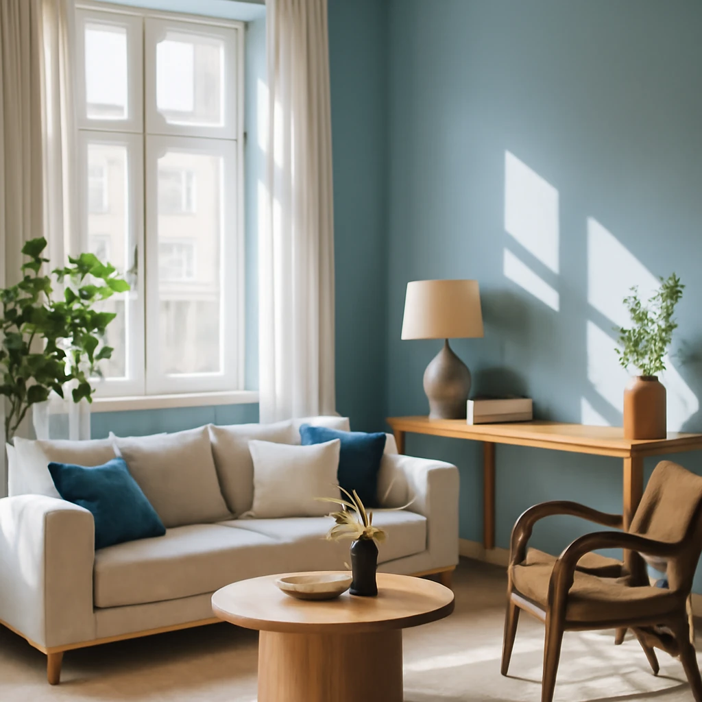
Blue as a backdrop
In this approach, blue covers a substantial portion of the room - walls, ceiling, or large furniture pieces - creating a strong, cohesive field. A blue backdrop works best when the surrounding palette is light and restrained, allowing the colour to provide depth without weighing the space down. Light, pale blues on walls or ceilings can give a sense of openness, while deep indigo stays dramatic when contrasted with pale timber, white plaster, or metallic accents.
In practice, a blue backdrop benefits from varied textures: matte plaster walls, a satin-gloss ceiling, and a mix of soft furnishings in neutrals. Too much intensity, with dense blue on all surfaces, can feel heavy in smaller rooms or spaces that receive little natural light. The antidote is to balance the blue with lighter textiles, warm lighting, and a few natural materials to keep the space welcoming rather than overpowering.
Blue as the sole accent
Using blue as the single accent in a light room can create a striking, intentional effect. The rule of thumb is a proportional balance - roughly 60:30:10. 60% is the dominant colour (often a white, grey, or warm neutral), 30% supports the main palette (a complementary but not overpowering colour), and 10% is the accent colour in blue. Importantly, the “accent” should be expressed across multiple items rather than appearing as one solitary object. A blue sofa, a pair of armchairs, cushions, and a rug can together register as the blue accent without feeling singular or gimmicky.
In a living room or bedroom, this approach offers a sophisticated, cohesive look. It also provides flexibility: you can refresh the space by swapping a few textiles or add a larger area of blue highlights if you wish to intensify the mood, or ease back if the room feels too saturated.
Blue among other accents
Blue can act as one of several statement colours in a room. In these schemes, blue typically partners with a contrasting hue - orange, terra cotta, copper, or mustard - creating a lively, energetic environment. The trick is to calibrate proportion and scale: the blue should remain a clear thread through the design, not a single spotlight. When blue shares the stage with other bright tones, ensure the balance is harmonious by varying saturation and keeping textures tactile to avoid visual conflict.
Examples of this approach include blue textiles paired with warm orange accents in a kitchen-dining area, or blue cabinetry offset by sandy neutrals and a terracotta tile pattern. The goal is to create a space that feels intentional and vibrant without appearing noisy or chaotic.
What to pair with blue in interior colour schemes
Beyond selecting an appropriate shade, you must consider what to pair with blue to achieve coherence. The good news is that blue is versatile and can sit comfortably with a wide range of companions. The following guidelines help ensure that your blue reads as part of a thoughtful, well-composed palette.
With grey, black and white
Blue sits naturally with white, grey, and black, forming a timeless monochrome family with depth. A crisp white or warm grey can soften a navy wall, while black accents (such as door frames, lighting fixtures, or a metal-framed mirror) sharpen the look. In this triad, blue acts as the colour that adds life to what would otherwise be a cool, austere palette. Texture becomes essential here: choose wool, linen, or boucle for soft furnishings to prevent the scheme from feeling clinical.
- In a city apartment with northern light, pale blue walls paired with charcoal furniture create a balanced, contemporary statement.
- A blue sofa and white walls with a few black-metal accents can achieve a polished, modern living room.
With warm tones
Blue can mingle pleasantly with warm colours - red, orange, and yellow - when the balance is carefully managed. Warm tones soften blue’s formality and raise energy levels in a space intended for entertaining or daily activity. The interplay between a cool blue and warm accents can feel sophisticated and inviting, especially when textiles, lighting, and decorative items pick up the warmth.
Use warm tones sparingly if the aim is calmness: limit bold contrasts to a few key pieces, such as a warm-toned throw, an amber lamp, or a copper vase, and let the blue ground the design.
With pastel tones
Pastels can soften blue into a serene, almost coastal atmosphere. Pair a soft blue with blush pink, pale lavender, or mint to create gentleness and approachability. This combination works notably well in bedrooms and nurseries, where subtle contrasts and textures promote relaxation.
With green
Blue and green can form a refreshing, natural palette, particularly in denotes of blue-green or teal. When both colours are saturated, balance is key: vary lightness across surfaces and use natural materials to temper the visual intensity. In contemporary schemes, blue and green together evoke a sense of landscape and air, suitable for living rooms and dining spaces.
Practical blue: what to do with blue in interior design
Ceiling: make it feel higher
A light, pale blue on the ceiling can visually lift a room, creating a sensation of more height and airiness. This trick is especially effective in modest-height spaces or rooms with lower ceilings. When using blue on the ceiling, ensure the walls remain a slightly lighter or more neutral tone to preserve the perceived vertical space and avoid a boxed-in effect.
Walls: blue as a backdrop
Blue walls read differently depending on light. In eastern or northern-facing rooms, blue can pick up a grey undertone, which may feel cooler or more somber. In southern or western-facing spaces with abundant daylight, blues tend to appear brighter and more saturated. If northern light makes a room feel cool, counterbalance with warmer woods or textiles rather than overloading with blue on all surfaces.
Furniture: blue for zoning
Using saturated blue on a sofa, chairs, or a storage piece can help define zones within open-plan interiors. When blue furniture dominates, balance with lighter walls and soft textures to avoid a heavy, blocking effect. If the furniture is particularly bold, consider painting adjacent cabinetry or walls in a close but lighter shade to knit the room together rather than fragment it.
- A deep blue sofa can anchor a living area, while lighter blue armchairs provide comfortable counterpoints.
- A blue-toned storage unit or bookcase can create a focal point without overwhelming the room.
Textiles: the easy way to highlight blue
Textiles are a flexible and economical way to introduce blue accents. Curtains, rugs, cushions, bedcovers, and throws allow you to experiment with scale and tone without committing to paint or furniture. When layering blues, vary textures - velvet, linen, wool - and combine with neutrals to avoid visual fatigue. A textured rug in a mid-blue combined with light curtains and a white or warm-beige wall can create a cohesive, inviting space.
- Soft blue textiles can soften angular furniture and add comfort to bedrooms and living rooms.
- A coordinated blue-and-grey textile palette can read as quiet luxury in contemporary interiors.
Blue in light and lighting
Lighting dramatically affects blue’s appearance. Cool white lighting can bring out a crisp, modern edge, warm lighting amplifies the warmth of blue undertones. In European homes with layered daylight, combining daylight with carefully chosen artificial light sources - dimmable warm LEDs or amber-tinted bulbs - helps maintain the desired mood as daylight shifts through the day.
Blue in different rooms: practical guidance by space
In the living room
Living rooms benefit from a controlled blend of blues and neutrals. If windows face south, a deeper blue on one feature wall can create depth without overpowering the space. For smaller living rooms, reserve blue for cushions, a rug, or a single sofa to maintain airiness and prevent the room from feeling crowded. If you opt for blue walls, introduce warmth through timber flooring or warm textiles to balance the cool undertone.
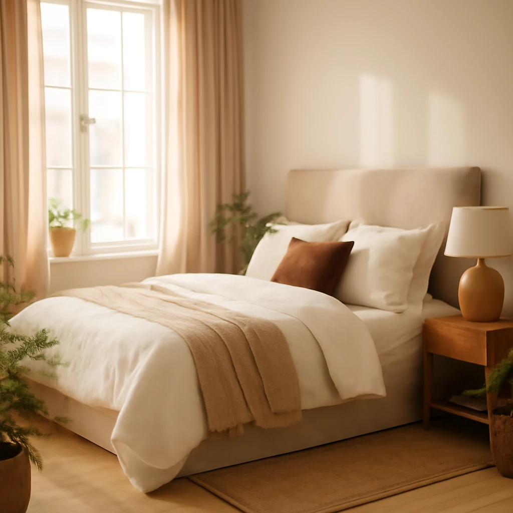
In the bedroom
Blue is well suited to bedrooms, where its calming associations support rest. Consider soft navy or powder blue walls paired with warm white or light timber, a blue bed frame or headboard can become a focal point. If the room has limited natural light, avoid heavy blues on all surfaces, instead, use blue in textiles and a single wall to retain light and keep the space inviting.
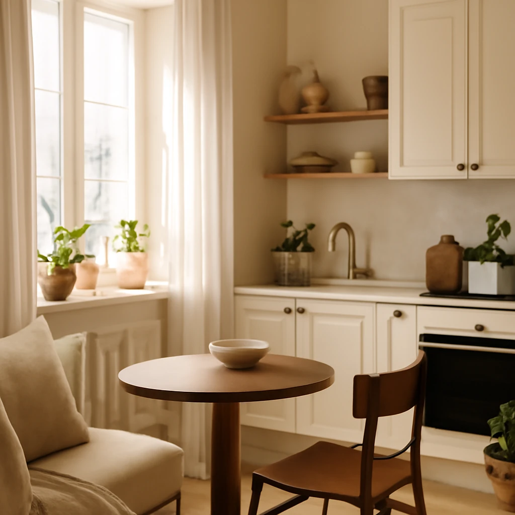
In the kitchen
Blue in kitchens can feel fresh and orderly when used on cabinetry, tiles, or accessories. Dark blues on cabinets pair nicely with pale countertops and natural stone floors, while lighter blues on wall tiling or chair seats can evoke a coastal or Nordic aesthetic. For busy kitchens, blue tones hide minor stains and fingerprints better than pale neutrals, and gloss finishes on blue cabinetry can read as clean and contemporary.
In the bathroom
Blue bathrooms convey cleanliness and calm. Solid-colour wall tiles or sanitaryware in white or warm neutrals with blue accents - such as a vanity unit, towels, or bath mat - create a serene spa-like atmosphere. Avoid heavy cobalt blues on all surfaces in small bathrooms, instead, use blue for key elements to avoid a crowded feel and to maintain light and airiness.
In the children’s spaces
Blue is versatile in children’s rooms, appropriate for boys and girls alike, and capable of growing with the child. Use blue as a soft, evolving element - think blue textiles, a feature wall in a gentle navy, or a playful blue rug. Balance with friendly neutrals and durable fabrics to cope with everyday wear. A blue bed or storage unit can become a lasting part of the room’s character as tastes evolve.
In the hallway or entrance
Hallways benefit from colour in proportion to space. If the corridor is narrow, a light blue on the walls can visually widen the passage, while adjoining wood or stone textures add warmth. For longer foyers, blue accents on furniture or a single wall can establish a cohesive route through the home without making the space feel segmented.
Blue checklist: practical reminders for designers
- Blue colour can create varied effects by adjusting shade and volume, light blues add air, deep blues create intimacy.
- The volume of blue determines perception: a small, concentrated patch adds energy, a pale blue background adds airiness and serenity.
- Blue generally has a calming effect, making it suitable for bedrooms, living rooms, and children’s spaces. If you fear saturation, start with textiles rather than walls.
- If you want blue but worry about durability, begin with furniture or textiles you can easily replace rather than entire walls or flooring.
Further considerations: sourcing and materials
When selecting blue for European interiors, consider the material finish and its interaction with light. Satin or lacquered surfaces will reflect more light and appear brighter, while matte finishes contribute to a soft, intimate mood. Fabric choice matters too: wool and linen textiles add texture and warmth, velvet sofa invites tactile luxury, and cotton blends offer easy maintenance for high-traffic spaces.
Conclusion: a practical path to blue that feels timeless
Blue is a powerful design tool, capable of transforming spaces with quiet confidence. By selecting undertones carefully, controlling the amount of blue, and pairing with breathable neutrals and natural textures, you can create interiors that feel both contemporary and restful across European homes. Start with a single blue element as a test, observe how daylight alters its character, and gradually expand the palette as you refine your space. The result should be a space that feels cohesive, purposeful, and endlessly hospitable.
“Blue has the ability to unite architectural form with human comfort, offering calm without rigidity when used with texture and light.”
You may also like these articles
Bed sizes in European homes: a practical guide to comfort, scale and storage
A practical guide to European bed sizes, space planning and sleep comfort.
From Pallets to Comfortable Seating: A European DIY Guide to Pallet Sofas
DIY pallet sofas for European homes: build, finish, and style.
Designing a Tiny Kitchen: Space-Smart Solutions for European Homes
Space-saving strategies for European small kitchens.