
Explore interior trends, AI design insights, styling guides and real transformations
Mocha Mousse: Pantone 2025’s warm brown transforms European interiors
Mocha Mousse: Pantone 2025’s warm brown in European interiors
Every year Pantone Design Institute selects a colour that embodies global mood shifts. For 2025, Mocha Mousse, Pantone 17-1230 TCX, offers a warm, embracing shade that blends chocolate undertones with caramel glow. It is a colour of quiet confidence, inspired by natural textures and the desire for sustainable comfort in living spaces across Europe - from compact city flats to airy coastal homes and refined townhouses.
Why this shade now? In contemporary European homes, there is a growing appetite for authenticity and tactility. Mocha Mousse communicates warmth without heaviness, working as a neutral that anchors furniture, textiles, and architectural details while allowing daylight to dance across surfaces. The result is a backdrop that invites linger and conviviality, rather than momentary trend-driven drama.
Palettes and pairings: how to combine Mocha Mousse
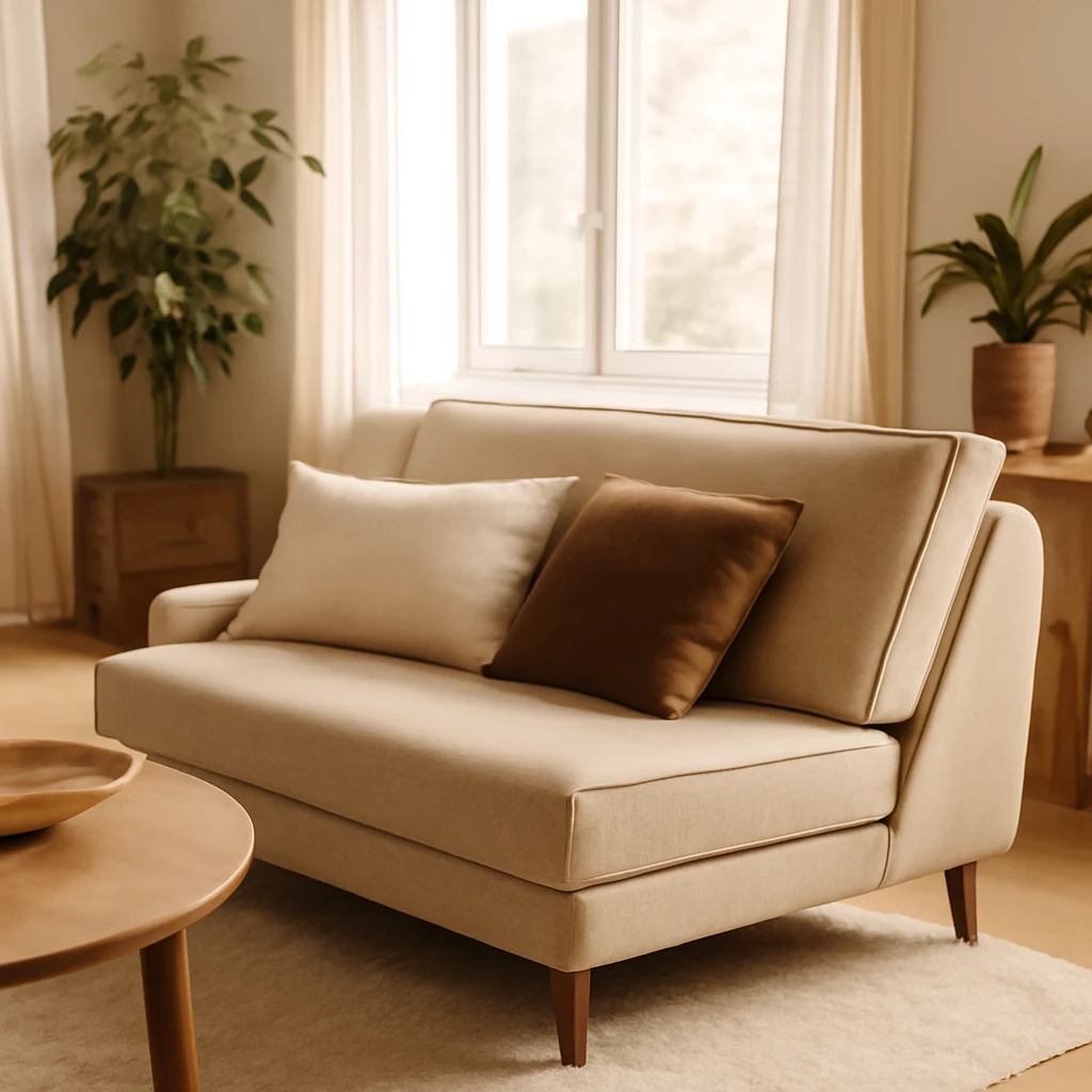
Mocha Mousse is versatile, it can act as a quiet, unifying base or as a focal point when used on furniture or cabinetry. Here are proven European-friendly pairing strategies:
- With neutrals: White, warm greys, and soft beiges amplify tranquillity and airiness. A white ceiling and lighter floor balance the depth of Mocha Mousse on walls or upholstery, creating a bright, inviting space.
- With greens and browns: Olive, sage, and emerald accents complement the natural mood of the shade, echoing forest walks and Mediterranean landscapes.
- With metals: Brass, brushed brass, or darkened copper add a refined glow and tactile contrast to Mocha Mousse surfaces.
- With pastels: Subtle pinks, creams, and powder blues can soften the intensity for bedrooms or boutique-style spaces.
Mocha Mousse in interiors: room-by-room guidance
Here we unpack how to apply this shade across common European living spaces, with practical cues on proportion, materials, and finishes.
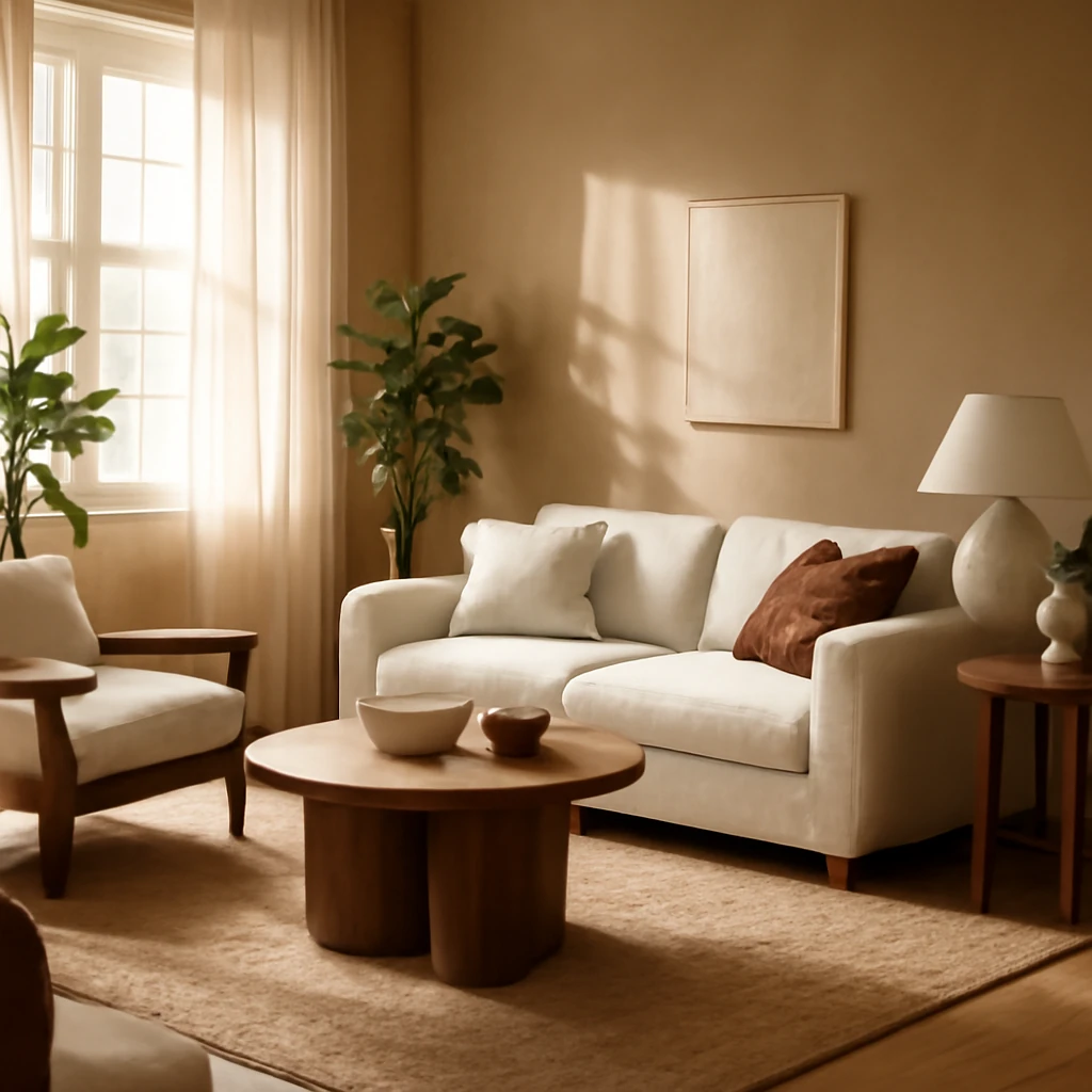
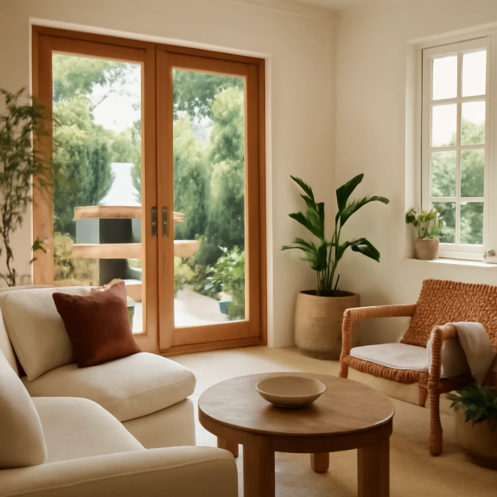
Living room: warmth as a centrepiece
In the living room, Mocha Mousse can be the dominant wall colour, a full-coverage fabric on a sofa, or used sparingly for a focal wall behind the seating arrangement. The intent is to cultivate a welcoming, restful environment that encourages conversation and shared moments after long days.
Practical layout ideas:
- Proportion: aim for roughly 60% Mocha Mousse on major surfaces (walls or large upholstery), about 30% in supporting neutrals or textures, and 10% as accent touches such as cushions, ceramics, or a single feature artefact.
- Textures and materials: combine soft textiles (linen, wool, cotton) with timber or stone surfaces. A medium-toned wood floor anchors the space, while a natural fibre rug adds warmth underfoot.
- Furnishings: choose a solid-colour sofa in Mocha Mousse or a complementary shade, pair with lighter chairs or a contrasting accent hue to prevent monotony. Subtle metal detailing on lighting or coffee tables enhances the tactile quality of the palette.
- Lighting: use layered lighting - ambient, task, and accent - to modulate the mood as natural light shifts through the day. Warm LEDs (2700-3000K) maximise the cosy feel of Mocha Mousse as daylight wanes.
Materials checklist for living rooms
- Mocha Mousse on walls (eggshell or satin finish) for durability, or upholstery in the same shade for a monochrome look.
- Textiles in natural fibres: linen slipcovers, wool throws, cotton curtains with tight weaves to keep glare low.
- Wood furniture in light to mid tones, avoid overly glossy surfaces that can reflect too much light.
- Rugs in neutral or subtly patterned tones to add depth without competing with the dominant colour.
Bedroom: calm, restorative retreats
Bedrooms benefit from Mocha Mousse as a backdrop that promotes calm and restful sleep. New-builds with daylightful orientation or renovated chambers with good insulation can handle deeper chroma on feature walls or bed frames without overpowering the space.
Design ideas for nurturing sleep:
- Feature wall: paint one wall in Mocha Mousse while keeping the other walls in white or warm beige to maintain light and airiness.
- Textiles: pair Mocha Mousse with white or ivory bedding, ivory curtains, and soft textures like brushed cotton or linen, add a throw in a lighter taupe or sage to create layered warmth.
- Storage and furniture: choose simple, streamlined pieces in natural wood or painted finishes, keep hardware minimal to preserve calm lines.
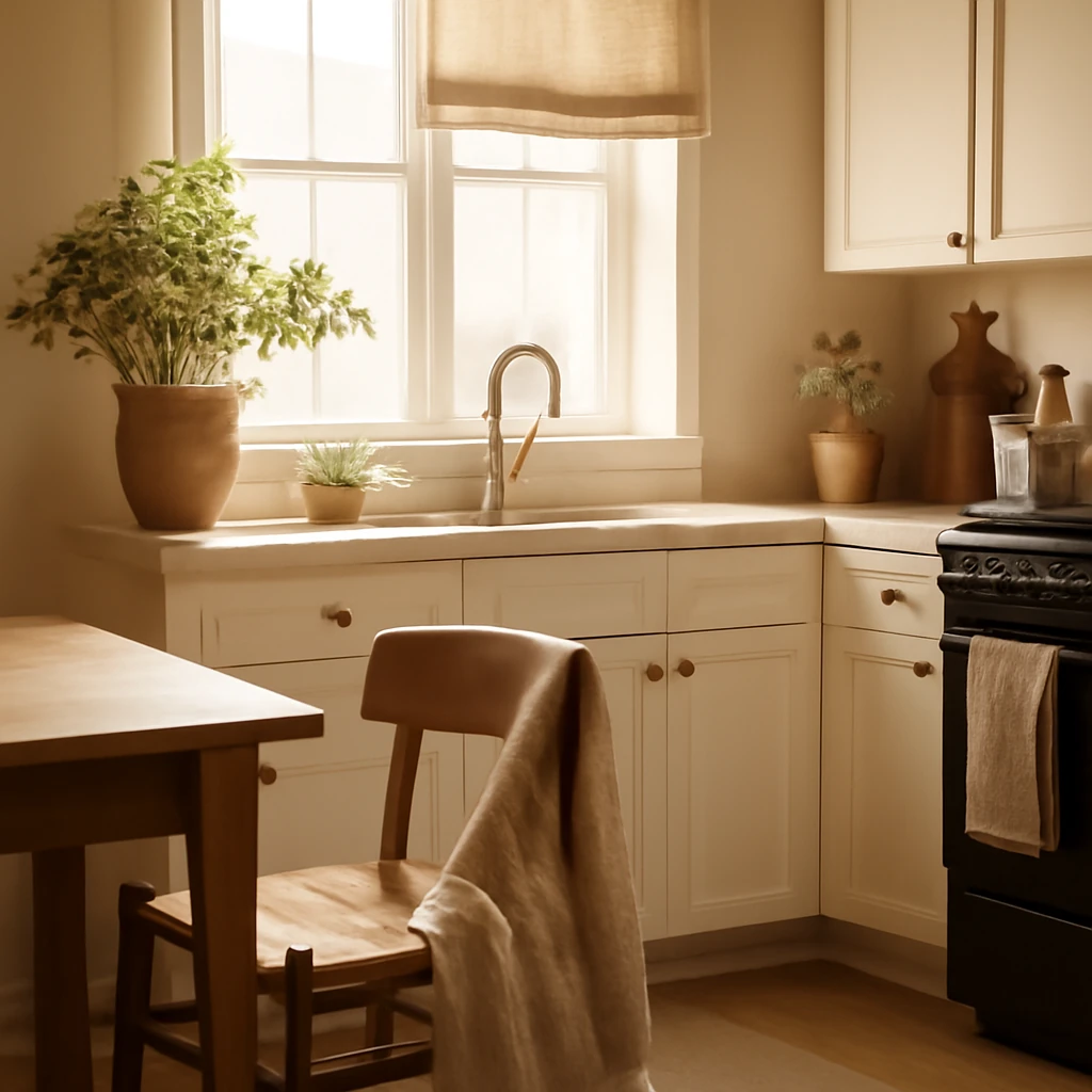
Kitchen: warmth on display, practicality in use
In the European kitchen, Mocha Mousse works particularly well as an accent or as cabinet fronts. It introduces warmth without dominating the room, especially in open-plan layouts where the kitchen flows into the dining or living area.
Guidelines for kitchen application:
- Cabinetry: consider Mocha Mousse on base units for a grounded feel, lighten uppers to maintain openness. For a more contemporary look, pair with white or pale stone counters and a glazed tile splashback in a complementary warm shade.
- Durability: select finishes designed for kitchens - matte lacquers, melamine, or durable veneer - with moisture resistance and stain protection.
- Hardware and details: brass or brushed nickel handles add tactile contrast, keep patterns simple to preserve a calm, cohesive look.
Hallway and entrance: a considered first impression
An entryway in Mocha Mousse can invite warmth and glide gracefully into the home, especially in European townhouses or apartments where corridors link living spaces. Use Mocha Mousse on a feature wall or the entire hallway with a lighter ceiling and framing to extend perception of space.
- Contrast elements: integrate metals (brass, copper) for hardware, lighting, and mirrors to create a premium feel.
- Display and storage: a slim console, pared-back hooks, and a well-chosen rug with soft texture ensure practicality and tactility as soon as you step inside.
Bathroom: spa-like calm with natural warmth
Mocha Mousse can set a serene tone in bathrooms when paired with natural stone, off-white ceramics, and warm timber vanities. Choose moisture-resistant finishes and keep the space light with high- reflectance surfaces on tiling and sanitaryware to balance the depth of the colour.
- Surfaces: consider Mocha Mousse on a vanity front or as a warm wall tone against stone or ceramic tiles in lighter hues.
- Lighting: use warm white lighting and ensure good task illumination for grooming zones.
- Accessories: integrate organic textures - baskets, cotton towels, wood-framed mirrors - to reinforce the spa-like mood.
Home office: warmth supports focus
In a European home office, Mocha Mousse can cultivate a grounded, focused atmosphere without the clinical feel of stark grey. Combine the shade with a lighter desk, organised storage, and a plan-lane of natural materials to balance productivity and comfort.
- Walls or shelving: Mocha Mousse can be applied to one wall or used on shelving back panels to create depth behind work zones.
- Accessories: pair with charcoal and cream accents, add a plant display to improve air quality and reduce visual fatigue.
Lighting, textures and the changing mood of Mocha Mousse
Lighting profoundly influences how Mocha Mousse reads in a space. In southern European homes with generous daylight, the shade can feel warmer and more caramel-like. In northern or central European interiors with longer evenings, it gains depth and cosiness. Layered lighting - ambient, task, and accent lighting - helps to modulate the colour as daylight shifts.
Texture is equally important. A smooth plaster wall will look different from a textured lime plaster or a fibre-reinforced paint. Textiles in natural fibres - linen, wool, cotton - bring tactile warmth that complements the matte finish of Mocha Mousse. Wood surfaces in oak, ash, or walnut add a tonal partner, while stone such as limestone or travertine provides a cool counterpoint to soften the overall mood.
Practical steps to implement Mocha Mousse in your project
For designers and homeowners planning a refreshed scheme around Pantone’s 2025 colour, a careful approach yields the best results. Here is a practical workflow that works across Europe’s diverse housing stock.
- Audit the space’s natural light: track how daylight moves through the room from morning to evening and note the colour of light from artificial sources.
- Test with real patches: apply small swatches to different walls and observe after 24 hours under different lighting.
- Define the palette: select a core neutral for walls (Mocha Mousse), a secondary palette for textiles and furnishings, and a small set of accent colours (green, ivory, brass).
- Plan for surfaces: decide which surfaces will be Mocha Mousse (walls, cabinetry, textiles) and which will stay lighter or darker to create contrast.
- Choose finishes: matte or satin for walls, durable fabrics for upholstery, consider lacquer and veneer finishes that stand up to daily use in kitchens and living zones.
- Organise composition: apply the 60-30-10 rule to keep balance and avoid monotony.
- Practical testing: implement a staged approach, starting with a single room or area to refine the look before expanding across the home.
Two European-inspired vignettes: how Mocha Mousse reads in real spaces
Imagine a typical central European city apartment of around 60–80 square metres, with an open-plan living area, a compact kitchen, and a compact bedroom. In this scenario, Mocha Mousse on the walls of the living area creates an enveloping warmth, while the white ceiling and pale timber floor reflect daylight and keep the space feeling airy. The sofa and curtains in Mocha Mousse or in close neutral tones set a restful baseline, and greens from plants or a soft olive rug add a natural counterpoint. A brass lamp and a light oak coffee table bring subtle contrast that elevates the overall mood without heavy intervention.
In a renovated townhouse with timber beams and high ceilings, Mocha Mousse can appear even more luxurious. Apply it to a main wall behind a dark-green sofa, with lighter neutrals on remaining walls. Pack the room with varied textures - velvet cushions, linen drapes, a wool rug, and ceramic vases - in natural tones. The finish of kitchen cabinetry or a built-in storage unit can echo the colour, tying living spaces together and creating a cohesive journey through the home.
From colour to translation: the lasting impact of Mocha Mousse
Mocha Mousse is more than a trend, it is a versatile tool for designers aiming to create comforting, well-balanced interiors. Its warmth helps to soften hard architectural details, such as concrete walls or steel-framed windows, while its natural undertones align with European sensibilities toward sustainability, craftsmanship, and timeless aesthetics. As with any shade, the key is to test, observe, and layer. The colour will read differently from room to room, season to season, and with varying light conditions, but its core appeal remains consistent: a warm, receptive backdrop that invites people to dwell, share, and enjoy the moment.
In conclusion
Pantone’s choice of Mocha Mousse for 2025 signals a shift toward authentic comfort and natural warmth in European interiors. By embracing this shade with thoughtful palettes, varied textures, and careful attention to light, homeowners and designers can craft spaces that feel both contemporary and timeless. The tone supports a broad range of applications - from living rooms that encourage gathering to bathrooms that feel like a spa, and from compact city flats to more generous family homes. As the season’s light shifts, Mocha Mousse reveals new facets, keeping interiors inviting and relevant for years to come.
You may also like these articles
Outdoor BBQ Zones for European Gardens: Design, Materials and Masterplans
Design a stylish, budget-friendly outdoor BBQ zone for European gardens.
How to Create a Budget Kitchen with Taste: Practical Tips
Smart, stylish kitchens that don’t break the bank.
Book-Style Sofa Mechanism: A Practical Guide for European Homes
A practical guide to the book-style sofa mechanism for compact European living.