
Explore interior trends, AI design insights, styling guides and real transformations
Purple as a Palette: Crafting Regal, Calm and Creative Interiors Across Europe
Introduction
Purple has long carried associations with nobility and ceremony, but in contemporary European interiors its value runs deeper. Used thoughtfully, the colour can set a mood that ranges from serene and moonlit to vibrant and energetic. When overused or misapplied, however, it can feel heavy, even oppressive. The challenge for designers and homeowners is to harness the drama of purples while maintaining balance with light, texture and daylight. This article offers a practical, European-centric guide to selecting purples, pairing them with complementary tones, and applying them across living spaces in a way that feels sophisticated, liveable and brand-new.
Across Europe, homes vary from compact city apartments to generous countryside houses. The same design principles apply: consider scale, natural light, and how the colour will perform at different times of day. Purple works best as a colour in motion - shifting from a quiet backdrop in daylight to a statement in evening illumination. The key is moderation, thoughtful combinations and a tactile language that invites touch as well as sight.
How purple is perceived
In psychology, purple sits between blue and red on the colour wheel. It inherits the calm of ultramarine and the vitality of crimson, which makes it an excellent ally for both contemplation and creativity. Lighter purples - lavender, lilac and wisteria - can evoke airiness and softness, ideal for bedrooms and feminine-inspired schemes. Deeper purples - eggplant, plum and aubergine - bring depth, drama and a sense of luxury, suitable for formal living rooms, dining rooms or feature walls. The effect of purple is highly contingent on brightness, undertone and contrast. A too-saturated, dark hue in a small, northern-facing room can diminish mood, whereas the same shade used as a carefully weighted accent can anchor a scheme with confidence and personality.
In European homes, purple is often tempered by natural materials and light-reflective surfaces. Woods in pale to mid tones, fabrics with subtle sheen, and pale stone or ceramic surfaces help soften intensity. Metallic accents - brushed brass, nickel or chrome - bring a contemporary edge that stops purples from feeling antique. The aim is to achieve a harmonious balance: a colour that feels regal without dominating the atmosphere.
Palette range: from muted to theatrical
The purple family is vast. Designers often distinguish between base tones (purple, plum, aubergine) and lighter accents (lavender, lilac, wisteria). A well-curated palette will include a spectrum that can act as a main colour, a secondary note, and a series of accents that punctuate rather than overwhelm. In practice, you might choose a base of soft plum for walls, with accents of lilac in textiles and a single statement piece in a deep aubergine to ground the room. Below are commonly used tones and their moods:
- Purple and lilac spectrum: airy, elegant, ideal for bedrooms and living rooms with ample daylight.
- Aubergine and plum: rich, dramatic, well-suited to feature walls, velvet upholstery and high-contrast schemes.
- Lavender and lilac: gentle, optimistic, pairs well with white, grey and natural wood.
- Grape and amethyst: can read as contemporary and luxurious when paired with metal and glass.
- Indigo and deep violet: for a bold, studio-palette approach in modern interiors.
In European interiors, it is common to balance intense purples with neutrals such as ivory, stone, soft greys and warm woods. A cool, white-based backdrop can make purples feel more pristine and modern, while warmer stone or creamy white backgrounds can give purples a cosy, welcoming glow. The tone you choose should align with the architectural character of the space and the function of the room.
How to combine purple with confidence
Choosing the right pairing is as important as the choice of purple itself. A practical way to master combinations is to use the colour wheel as a guide, considering hue, value (lightness) and saturation. Start with a dominant purple or a neutral base, then introduce secondary colours through textiles, accessories and smaller furniture pieces. The aim is to achieve a balanced composition where purple provides a unifying thread rather than a shouting marquee.
White and graphite for elegance
White and graphite create a crisp, contemporary counterpoint to rich purples. This pairing emphasises architectural lines and gives space a refined, high-tech feel. Use white for walls or ceilings and reserve the darker purple for a statement sofa, a dramatic armchair, or a geometric rug. Metallic accents in brushed nickel or satin brass can reinforce the modern vibe without overpowering the palette.
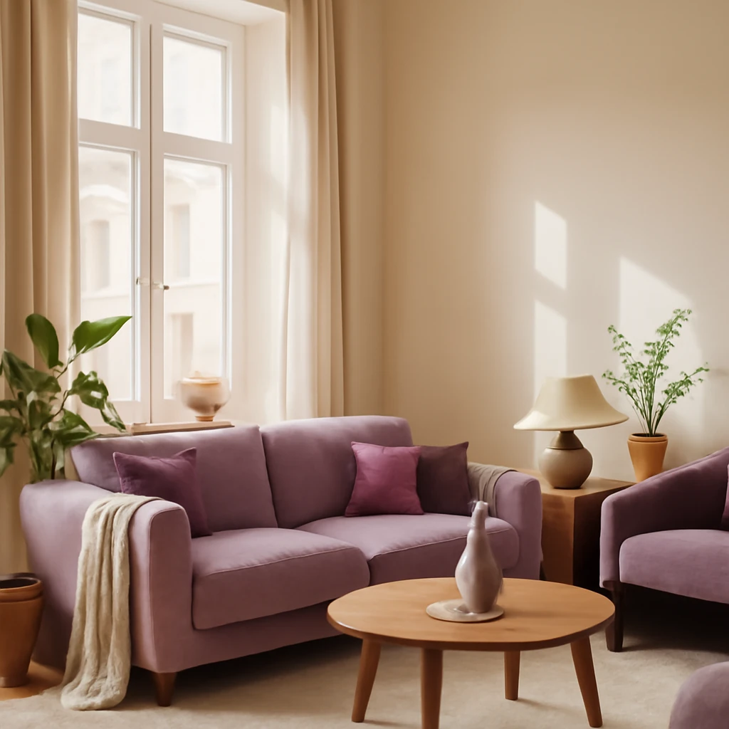
In practice, a soft plum-orientated sofa against a white-washed wall with a graphite rug and pale metal lamps can deliver a cohesive, serene space that still reads as luxurious.
Wood for warmth
Natural timber brings warmth and texture that counterbalances the intensity of purple. Light or mid-toned woods - oak, ash, or beech - create a friendly, welcoming atmosphere and prevent the room from feeling too formal. Wood tones work particularly well in living rooms and studies where the aim is comfort and ease. A plum velvet sofa paired with warm timber shelving or a carved coffee table can look exquisitely balanced, especially when offset with light textiles and soft lighting.
In practice, consider wooden flooring with a visible grain and light stone surfaces. The contrast between cool purple and warm wood is striking yet approachable, translating well to urban apartments and family homes alike.
Green for seriousness and balance
Green grounds purple with a sense of nature and calm. Olive, sage and emerald accents can temper the intensity of lilac and plum while maintaining an air of sophistication. A green plant-filled corner, a moss-toned chair or a forest-hued throw can anchor a purple-dominated scheme. Green also plays nicely with cooler purples, creating a refined, almost ethereal atmosphere that suits bedrooms and lounges intended for rest and contemplation.
For a more formal effect, pair deep greens with aubergine and soft greys, letting the purple act as a jewel-tone highlight rather than a main field.
Blue for creativity
Blue and purple sit adjacent on the colour wheel, offering a harmonious, contemplative pairing. Lighter blues can dilute intensity and encourage relaxation, while deeper blues can enhance focus and creativity. This combination is well-suited to home offices, studios and living areas where conversation and invention are valued. Consider blue textiles or a blue-tinted glass sideboard to introduce a complementary note without distracting from purple’s presence.
When hot-hued accents are added, such as a bright yellow or a coral, the blue-purple mix can become lively yet controlled, a balance that appeals to contemporary European interiors.
Yellow for energy
Yellow and purple produce a vibrant, high-energy combination. Use bright lemon or mustard hues sparingly to avoid visual overload. A sunny cushion or a small pendant light can lift the composition and make the space feel more invigorating. This pairing works best in rooms that benefit from optimism and social activity, such as kitchens, dining rooms or family spaces that double as entertaining zones.
In modest rooms with limited daylight, limit yellow to small, well-placed accents to preserve calm and avoid competition with the purple base.
Red for drama
To create drama, a red with purple can be deeply stylish if balanced with a neutral base. Approach with caution and keep red as a third or fourth element, such as a rug edge, a lampshade or a striking piece of art. The result is a bold, memorable space that reads as sophisticated rather than loud when executed with restraint and good proportion.
Where purple can live in interiors
Purple is versatile enough to appear in many rooms. The trick is to consider function, light, and material texture. Here is a practical framework for applying purple in different spaces across a European home.
- Walls: A single feature wall in a rich plum or aubergine can anchor a room. In a compact space, a pale lavender wall can open a room and set a soft mood that supports lighter furniture and textiles.
- Accent touches: Purple is an effective accent on kitchen cabinet doors, a bar console, a tiled backsplash or a bold rug. Limit saturation to avoid overpowering the space.
- Furniture: A purple sofa or armchair in velvet or bouclé adds texture and luxury. Pair with lighter upholstery on other pieces to keep the room legible.
- D interior details: Cushions, throws, curtains and tableware in complementary purples or contrasting neutrals can modulate the intensity without a full-scale commitment.
When designing, consider the environment and how the space will be used. In bright southern European interiors, purples can feel playful and energising, while in northern contexts they can feel romantic and enveloping. Always test light levels at different times of day and seasons to ensure the hue behaves as intended.
Purple across design styles
Purple adapts to a range of design idioms, from classic to contemporary. The following outlines illustrate how purples can integrate into diverse European aesthetics while staying fresh and timeless.
- Classic refinements: Soft ivory walls, lavender drapes, and a plum satin or velvet sofa create a refined, opulent mood. Rich fabrics such as silk and velvet pair beautifully with vintage brass fixtures and ornate detailing.
- Minimalism: Clean lines, monochrome surroundings, and a single deep purple accent produce a poised, modern look. A plum chair or a purple-tinged monochrome rug can be the deliberate focal point inside a restrained palette.
- Provencal harmony: A lighter lavender or lilac with whitewashed walls and natural materials evokes countryside calm. Textiles in linen or cotton blend with soft woods for a rustic yet polished finish.
- Ethnic and global influences: Purple fabrics with bright, handmade textiles and patterned rugs bring a sense of craft and warmth. Earthy walls and natural materials complement the boldness of purples without clash.
- Art Deco and modern luxury: Velvet is a natural ally in this setting. Pair a deep purple sofa with high-gloss lacquer, mirrored surfaces and chrome or brass detailing for a glamorous, contemporary edge.
Furniture and materials in purple interiors
Purple works best when paired with textures that read well in different lights. Velvet, bouclé, linen and wool offer tactile richness that enhances the colour, while smooth surfaces such as glass, polished stone and high-gloss finishes provide contrast. When selecting furniture, the rule of thumb is to use one or two purple-dominated pieces to act as focal anchors, complemented by neutrals and natural materials that soften the look.
Avoid overloading a space with a large amount of purple furniture, especially in small rooms. If you wish to incorporate purple as a major design element, balance it with large expanses of light walls, reflective surfaces and warmth-inducing woods. In European homes with open-plan layouts, purple furniture can unify zones without the need for heavy partitions, especially when paired with varied textures that catch the eye as you move through the space.
In terms of furniture types, consider the following language of pieces: a plum velvet sofa for the main seating, a lighter lilac armchair as a secondary seat, and a dark plum coffee table or console to ground the arrangement. For storage, a cabinet or sideboard in a rich plum finish provides depth without dominating the room. Metals - brushed brass, nickel or chrome - are excellent partners to purple, adding shimmer and modernity without clashing with the colour’s depth.
Important considerations
One should note a few practical cautions when designing with purple. Heavily dyed woods in yellowish or reddish tones (such as certain variants of walnut or stained maple) can clash with purple, visually competing for attention. If the space already contains warm-toned wood, lean into cooler purples or introduce discrete neutrals to create harmony. In contrast, cooler woods such as ash or oak can support more saturated purples without conflict.
Lighting also matters. Purple registers differently under daylight versus artificial light. In rooms with limited daylight, layered lighting is essential: a combination of ambient, task and decorative lighting keeps the purple from feeling oppressive. A well-placed dimmer can help modulate mood from bright, energising daylight to intimate evening warmth.
Purple by room: practical guidance for a European home
What follows is a practical framework for applying purple in common spaces, with considerations tailored to European living. The aim is to create interiors that feel coherent, comfortable and stylish, regardless of city, climate or architectural style.
Living room
The living room is where purple can shine as a signature hue. Use one dominant purple surface as a grounding anchor - such as a sofa or a feature wall in a deep plum - then balance with lighter textiles, neutral walls and natural materials. Consider a large rug in a soft mauve or lavender shade to tie seating and lighting together. The overall effect should be inviting rather than foreboding, ensure there is ample daylight or well-planned artificial lighting to soften the intensity of the purple.
In a space with architectural lines, the purple sofa can highlight geometric forms or sculptural furniture. Keep window treatments light and airy to prevent the room from feeling heavy. A small number of purple accents - such as cushions, a throw and a single floor lamp - can be enough to create a distinct character without overwhelming the room.
Bedroom
Bedrooms offer an ideal canvas for purple, balancing tranquillity with romance. Lighter purples on walls or textiles promote restful sleep, while deeper hues can be used sparingly as an accent to convey sophistication. A plum headboard, lilac bedding and a soft lavender throw can create a cohesive, soothing environment. Pair with natural materials such as linen sheets, a warm wood bed frame and woven textures to add tactility and comfort.
In the bedroom, consider lighting as a tool for mood. Dimmable bedside lamps in warm white are a practical way to adjust ambience for reading, dressing or relaxing. Avoid harsh, cool-toned lighting that can make purples feel clinical rather than comforting.
Children’s room
Purple can be playful and imaginative in children’s spaces. Soft lilac or lavender walls paired with white trim can feel bright and cheerful, while accents in aubergine or amethyst can introduce depth and personality. For a child-friendly approach, combine purple with durable fabrics and easy-care furnishings. Textiles in stripes or gentle floral patterns can provide visual interest without overwhelming the space. As children grow, you can update the palette with removable textiles, art, or rugs to keep the room fresh without major renovation.
Practical considerations include choosing washable fabrics, durable paints with low volatile organic compounds, and practical storage solutions to keep the space organised and calm.
Kitchen and dining area
Purple in kitchens can feel vibrant and modern when used in cabinets or high-gloss surfaces, tempered by cool neutrals and the natural warmth of wood. A soft lavender backsplash or lilac wall tones can introduce colour without competing with the function of the space. For dining areas, consider a plum or amethyst dining chair or a bench to create a subtle focal point and encourage conviviality.
Be mindful of the overall balance. A predominantly purple kitchen can feel intense in small spaces, temper with white or light grey cabinetry, pale stone countertops and steel accents to maintain a fresh, contemporary look. In larger kitchens, carefully placed purples can act as wayfinding cues and visual anchors that unify open-plan zones.
Hallway and entrance
Entrances benefit from colour that welcomes and calms. A soft lilac or lavender on a feature wall can set a refined tone as guests enter. Accessories in plum or amethyst - such as a console, mirror frame, or a vignette of decorative objects - can create a moment of visual interest without crowding the space. Since hallways often suffer from limited natural light, plan lighting that highlights the purple accents and prevents the area from feeling dull.
Bathroom
Purple in bathrooms can be surprisingly serene. Lighter lilac or lavender walls paired with white or pale grey fixtures evoke spa-like calm. For more drama, a deep eggplant or aubergine tiled shower wall can make the space feel boutique and luxurious, provided there is adequate lighting and contrast with lighter surrounds. Accessories in soft purples - towels, bath mats and containers - can reinforce the theme without overpowering the room.
When tiling, consider textures and finishes. Gloss tiles reflect light and enhance brightness, while matte surfaces offer a sophisticated, intimate feel. Combine with warm metals in taps and lighting to avoid a clinical look. In all cases, ensure that the room remains practical and easy to clean, particularly in smaller bathrooms where reflective surfaces can help create a sense of space.
Practical takeaways
- Choose a unifying base colour and use purple as a controlled accent to maintain harmony and readability in the space.
- Balance intense purples with neutrals, natural materials and reflective surfaces to keep interiors feeling fresh and modern.
- Test colour performance in daylight and artificial light before committing to painting walls or large furniture.”
- Use the colour wheel or a professional colour strategy to guide pairings and keep the palette cohesive across rooms.
- Consider the architectural context and climate, and adapt purple tones to suit natural light and heat gains for a comfortable European home.
In practice: designing with purple in European homes
The most successful purple schemes are those that treat colour as a texture of life rather than a static shade. A living room might feature a plum sofa as the main anchor, a lavender rug to soften the floor, and white walls to reflect daylight. A bedroom could use a light lilac wall as a backdrop, with a plum bed frame and velvet textiles to add depth. Public spaces such as kitchens and entryways benefit from restrained purples that signal elegance without sacrificing practicality. The key is to use one or two purples as the core while weaving in supporting neutrals and natural materials, so the space remains both contemporary and inviting.
Finally, remember that colour is not only about aesthetics but about mood. Purple can invite reflection, stimulate conversation and foster creativity, provided it is balanced with light, texture and proportion. In European homes - from compact city flats to expansive townhouses - the ability to adapt purple tones to each space is a powerful tool for designers seeking to craft interiors that feel both timeless and distinctly contemporary.
You may also like these articles
 Colour & Materials
Wall finishes for European hallways: eight top materials and ideas
Smart, durable hallway finishes and design ideas for European homes.
 Trends
Kitchen Curtains 2025: Trends, Styles and Fabrics Across Europe
A European guide to 2025 kitchen curtains: trends, fabrics and care.
Trends
European interior styles: a modern guide to timeless spaces
A comprehensive tour of European interior styles and how to blend them at home.