
Explore interior trends, AI design insights, styling guides and real transformations
Terracotta: A Warm Modern Colour for European Homes
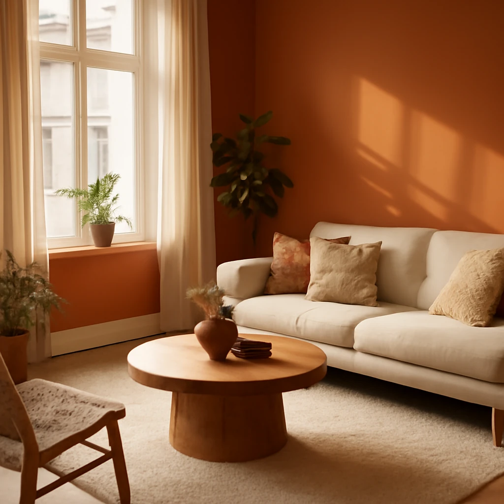
What terracotta is and why it works in European interiors
Terracotta is more than a colour, it is a natural material-inspired word that evokes baked earth, brick dust and the warmth of sun-dried clay. In European interiors the terracotta spectrum ranges from pale peach and soft apricot to brick red and deep clay brown, often with subtle grey or rosy undertones. When used thoughtfully, terracotta can make spaces feel grounded, welcoming and surprisingly versatile across different architectural styles - from historic townhouses to contemporary lofts and rural casas.
Historically, terracotta has been a durable, expressive finish in homes across the continent. Today, designers use it not only as a bold statement but as a flexible backdrop that harmonises with natural materials such as timber, stone, linen and variable textures. The colour carries an immediate sense of warmth, which can reduce the clinical feel of modern spaces while maintaining a sophisticated, contemporary edge.
Understanding the terracotta palette
The terracotta family embraces a spectrum: earthy browns, coppery reds, orange-tinted ambers and occasionally soft pinkish notes. The choice of undertone influences how the colour interacts with light, furniture, and other pigments in the room. In bright, northern light terracotta can feel crisp and energising, in the soft, late-afternoon sun it becomes mellower and more enveloping. For European homes with varied daylight, a well-chosen terracotta can optimise warmth without yielding oversaturation.
Сombinations with other colours
Terracotta is a dominant, nuanced colour. The key to a successful scheme is to pair it with calm, complementary tones that balance its energy and celebrate its depth. Below are tested pairings suitable for a wide range of European interiors.
White and beige
White and ivory whites provide a crisp counterpoint to terracotta, letting its warmth shine. A creamy backdrop keeps spaces bright while avoiding stark contrast. Pairing with light oak or birch enhances a timeless, refined look that suits kitchens, living rooms and bathrooms alike.
- Use warm whites for walls and ceiling to create a seamless canvas.
- Introduce beige textiles and light timber to reinforce a soft, cohesive palette.
- Consider a single terracotta focal wall or a terracotta sofa to anchor the room.
Brown
Terracotta and brown form a harmonious, earthy relationship. Darker russet or coffee tones add depth, while lighter walnut provides a classic, cohesive feel. This pairing works particularly well in living rooms and dining spaces with natural materials.
- Choose warm browns for furniture to maintain a cosy, rich ambience.
- Limit the palette to two or three browns to avoid heaviness.
- Use terracotta as an accent piece against a brown backdrop for a layered effect.
Grey
Grey and terracotta offer a contemporary balance between cool and warm. Light grey walls can make the terracotta pop, while charcoal or graphite tones create a dramatic, modern contrast ideal for kitchens, bathrooms and bedrooms.
- Soft, greying neutrals give a serene base for terracotta accents.
- Texture becomes important: combine terracotta with concrete, stone or brushed metals.
- In small spaces, light greys help reflect light and keep the room feeling open.
Yellow
Yellow and terracotta echo autumn sun and harvest tones. Used sparingly, they brighten the room and amplify warmth without overloading the senses. This pairing is especially effective in dining rooms and contemporary living areas.
- Keep yellow accents in textiles or accessories to avoid overpowering the space.
- Pair with cream or off-white to soften the saturation.
Blue
Terracotta and blue create a balanced, coastal-evocative palette when the blues are lighter or more muted. Deep navy or indigo can ground terracotta in a sophisticated, high-contrast scheme suitable for a study or main living area.
- Use blue as a cooling counterpoint on walls or in upholstery with terracotta accents.
- Match the depth of blue to the intensity of terracotta for a harmonious look.
Black
In minimalist and industrial settings, terracotta sits strikingly beside black. Keep the palette restrained to avoid visual clutter, use black for structural elements or statement furniture, letting terracotta speak in textiles and decor.
- Opt for matte finishes to soften the contrast.
- Limit black to about 10–15% of the scheme to preserve warmth.
Green
Terracotta paired with green evokes the outdoors and nature. Use a range from mint to olive to emerald, and consider a violet accent as a complementary twist. This trio works beautifully in living rooms and bedrooms aiming for a soothing, earthy vibe.
- Green textiles or plants provide gentle freshness against terracotta bases.
- Experiment with accent walls while keeping dominant surfaces neutral.
Terracotta in different spaces
Terracotta is versatile enough to function as a base colour or a bold accent, depending on room size, light, and architectural style. Here are practical ideas for key spaces across European homes.
Living room
In living rooms, terracotta serves as a warm backdrop or a striking feature. Consider a terracotta sofa or a brick-red wall as a focal point, then temper the space with neutral upholstery, light woods and soft textiles. Layer textures such as linen throws, wool rugs and woven screens to cultivate depth without heaviness.
- In spaces with strong natural light, a terracotta wall can look vibrant yet sophisticated.
- Pair with light timber furniture and pale textiles to keep the room feeling welcoming rather than overpowering.
- Incorporate metallic accents, such as brass or bronze, to add sheen and keep the palette from feeling flat.
Bedroom
Terracotta can foster a calm, nurturing atmosphere when used with restraint. An accent wall behind the bed or a textured headboard in terracotta tones can establish warmth without compromising sleep quality. Balance with cool whites or dove greys for a serene retreat.
- Warm-toned bedding and plush rugs create a cocoon-like feeling.
- Soft lighting and natural fabrics enhance the welcoming mood.
Kitchen
In kitchens, terracotta is well suited to earthy palettes that evoke rustic diners or countryside cottages, but it can also look contemporary when pared with sleek materials. Options include terracotta tiled backsplashes, countertops or cabinet fronts paired with neutral worktops and stainless appliances.
- Terracotta tiles on the floor or as a backsplash offer warmth and texture that is easy to maintain.
- A terracotta-adorned island or bar stools can act as a lively focal point.
Bathroom
Terracotta in bathrooms brings a spa-like warmth. Opt for matte or satin finishes on tiles and combine with pale stone, timber vanities and soft lighting. In small bathrooms, lighter terracotta shades help maintain airiness while still conveying warmth.
- Prefer natural stone or ceramic textures to emphasise the earthy feel.
- Mix terracotta with cool greys to prevent the space from feeling too warm.
Entrance and hallway
Entranceways are excellent for making a strong first impression with terracotta. A tiled floor, a compact console in a terracotta hue or a storage alcove can set a welcoming tone. Keep walls lighter to preserve a sense of space and movement as guests enter the home.
- Choose durable materials for high-traffic areas, such as terracotta floor tiles or robust fabrics.
- In narrow corridors, a terracotta accent wall can visually elongate the passage when paired with light walls.
Balcony and outdoor spaces
Terracotta is inherently suited to exterior schemes, recalling brick and terracotta pots. Outdoor furniture in warm timber or upholstered fabrics with terracotta accessories harmonises with garden greens and natural stone. Protect powders and fabrics with UV and water-resistant finishes to maintain longevity in European climates.
Children's spaces
Terracotta can support a stimulating yet balanced environment in children’s rooms when used as an accent. Pair with soft neutrals and playful textiles while mindful of scale and safety with finishes and furniture choices.
- Limit dominant terracotta to one wall or a single piece of furniture in active spaces.
- Incorporate green plants or natural textures to maintain a fresh balance.
Finishes and furnishings for a terracotta palette
Walls
Paint or plaster in terracotta tones can mimic brickwork and add warmth to both old and new buildings. For rural or coastal homes, a dusty terracotta can feel particularly refined, while in city apartments a brighter brick-toned wall becomes a bold statement.
When selecting wall finishes, consider undertones and the natural light a room receives. In northern or east-facing spaces, slightly lighter terracotta can preserve brightness, in southern or west-facing rooms, deeper hues can emerge with dramatic effect.
Tiles
Terracotta tiles have enduring appeal in kitchens and bathrooms, offering texture and a tactile surface. Glazed finishes give versatility for moisture-rich environments, while unglazed or brushed options highlight the material's rustic charm. Hexagonal or rectangular formats create contemporary patterns that remain timeless across decades.
Curtains and textiles
Textiles in terracotta tones can anchor a room without dominating it. Consider a velvet sofa, linen drapes or woven rugs in warm orange-brown hues. Layer several textures to avoid a flat appearance, using lighter neutrals to balance deeper terracotta tones.
- Choose fabrics with natural fibre content for improved comfort and air flow.
- In small rooms, lighter terracotta fabrics on cushions and throws help maintain airiness.
Rugs
Rugs in terracotta or related hues introduce warmth underfoot and visual richness. Pair with neutral carpets or timber floors to create a grounded aesthetic. A longer-pile rug in a warm orange-brown can soften large living spaces and invite relaxation.
Furniture
Terracotta furniture can be striking when used as an accent. A terracotta-coloured sofa, chairs or a carved timber piece can become a room’s centre of gravity. If you favour a subtler approach, select furniture in natural woods or muted terracotta-toned fabrics and let other elements carry the colour story.
Practical tips for implementing terracotta in European spaces
- Proportion matters: in smaller rooms use terracotta as an accent or in soft furnishings rather than covering large areas. In larger rooms it can dominate gracefully if balanced with lighter surfaces.
- Light matters: the warmth of terracotta can be enhanced by daylight. Where light is scarce, introduce warm artificial lighting with dimmable options to modulate mood.
- Texture is key: integrate natural textures such as wood, stone, linen and clay to amplify the organic feel of terracotta.
- Scale and rhythm: repeat terracotta in small doses across the room to create a cohesive rhythm rather than a single loud note.
- Durability and maintenance: choose floor and wall finishes that suit daily life in European homes, especially in kitchens and bathrooms where moisture and traffic are factors.
- Lighting strategy: combine warm white lighting with reflective surfaces such as brass, brass-matin or brushed nickel to keep spaces vibrant without sacrificing warmth.
- Mobility and flexibility: use terracotta in textiles and accessories that can be updated through seasons without a full redesign.
Design approaches and case ideas
To help visualise terracotta in practice, consider three contemporary approaches suitable for European urban and rural contexts:
- Minimalist warmth: a pale, nearly white backdrop with a single terracotta focal wall or sofa, paired with natural woods and soft textures for a calm, modern living space.
- Eclectic warmth: mix terracotta with reeded glass, vintage brass and soft textiles in a retro-modern setting, creating a cosy yet dynamic home environment.
- Eco-harmonic: blend terracotta accents with stone, linen and muted greens to evoke an outdoor-in feeling that suits terraces, courtyards and sunrooms.
Conclusion: embracing terracotta for a flexible European palette
Terracotta offers a warmth that is both timeless and adaptable. When used with intention, it harmonises with natural materials, daylight and various architectural languages found across Europe. Whether you are designing a grand living space, a compact apartment, or a country cottage, terracotta can unite form and function. It invites comfort, fosters a sense of belonging and provides a sophisticated canvas for evolving style stories over time.
You may also like these articles
 Tips & How-To
Curtains for the Kitchen: European Styles, Fabrics and Functional Tips
A practical guide to European kitchen curtain styling.
Colour & Materials
Decorative plaster: textures, finishes and how to apply
A comprehensive guide to decorative plaster finishes for European homes.
Living room
Combined Wallpapers in the Living Room: Ideas, Techniques and Layered Decor
Master the art of combining wallpapers to create depth, rhythm and zones in the living room.