
Explore interior trends, AI design insights, styling guides and real transformations
Harmonising Doors and Floors: Seven Design Principles for European Homes
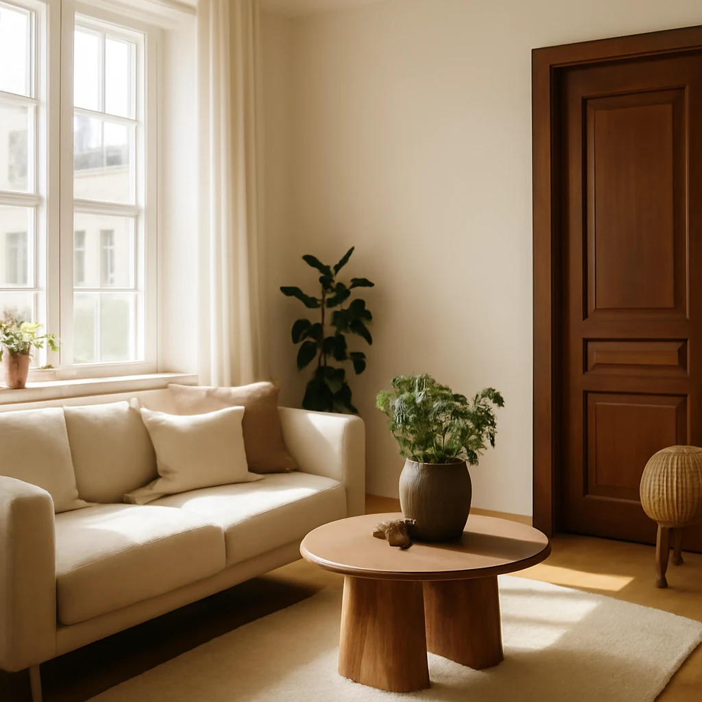
Introduction: doors and floors as the heartbeat of European interiors
In many European homes, the relationship between doors and flooring is more than a practical choice - it is a stylistic statement that sets the tone for the entire interior. The floor acts as the stage, catching the light, absorbing or reflecting texture, and guiding movement through spaces. Doors, in turn, mark transitions, frame moments, and offer the opportunity to tune acoustics, privacy, and mood. When these two fundamental elements work in harmony, spaces feel cohesive, calm and confident. When they don’t, misalignment can disrupt the flow, no matter how elegant the furniture or how stylish the walls appear.
This article presents seven design principles, rooted in European sensibilities, for pairing doors with flooring. It draws on contemporary practices in high-end homes, renovation projects and well‑considered new-build interiors. The goal is practical, workable guidance that helps you define a unifying colour story, choose the right textures, and create spaces that are both functional and beautifully resolved.
1. Start from the floor: colour and texture as the foundation
The floor is the base upon which everything else is built. When selecting doors, the prevailing approach is to align with the floor’s colour and texture, rather than attempting to force the doors to stand apart. In European homes, popular floor finishes include oak and other light‑toned timbers, warm walnut equivalents, versatile laminate reproductions of natural wood, and durable engineered wood planks with subtle grain. Stone and ceramic tiles offer a cooler, more tactile alternative and can set a distinctly different mood in kitchens and bathrooms.
Practical considerations:
- Light floors tend to brighten interiors and make rooms feel larger. They pair well with a wide range of door colours, particularly whites, creams, and soft greys. They also show dust less visibly when finished in matte or silk sheens.
- Warm floors (think honey tones, caramel, or chestnut) create a cosy, inviting atmosphere and work beautifully with doors in pale creams or warm whites, as well as with medium‑tone timbers.
- Darker floors add drama and depth, especially in open-plan spaces with ample natural light. They benefit from lighter or mid‑toned doors to avoid a space feeling overly heavy.
Material choices should reflect the room’s use and moisture exposure. For living areas, a durable engineered wood or wide‑plank laminate with a realistic grain is ideal. For kitchens and entryways, consider moisture‑resistant finishes and coatings that withstand spills and heavy wear. The aim is a floor that feels natural underfoot and a door finish that resists wear while keeping its colour and gloss consistent over time.
2. Choose a unified colour palette: warmth, coolness or a neutral base
Coherence often emerges from a shared colour language. A unified palette helps rooms feel organised and visually calmer. There are three broadly successful strategies:
- Warm palette - doors in warm whites or cream with warm-floor tones (pale oak, light honey, or warm beiges). This approach yields a welcoming, cohesive atmosphere ideal for living rooms and bedrooms.
- Cool palette - doors in cool whites, greys or greige with cooler floor finishes (ash, grey-brown timbers, or slate tiles). This pairing can feel contemporary and refined, particularly in urban apartments and minimalist schemes.
- Neutral base - doors and floors in a restrained, near‑monochrome spectrum (off‑white, light grey, taupe). Subtle shifts in undertone - warm versus cool - keep the palette interesting without shouting colour.
Even white doors can carry warmth or coolness depending on their undertones and the lighting in the room. The visible result should be a cohesive flow from room to room, rather than a zigzag of contrasting experiments. When mood boards and paint chips are placed together in a space, the doors and floor will either harmonise or clash, aim for harmony that feels deliberate rather than incidental.
3. Tone-on-tone: the timeless, adaptable option
Tone-on-tone pairings are among the most reliable in European interiors. They rely on variations within the same colour family to create depth without introducing jarring contrasts. A light floor with white doors, or a mid‑tone floor with soft grey doors, offers an understated elegance that works across a broad range of interiors, from classic to contemporary.
Key advantages:
- Quiet, cohesive aesthetics that support layered textures - textiles, furniture finishes and artwork won’t clash with the doors or floor.
- Flexibility to refresh interiors without changing major elements. If you repaint walls or change fabrics, the door-floor pairing remains relevant.
- Resists becoming dated, as subtle shifts in light and use influence the perception of the colour family over time.
When applying tone-on-tone, pay attention to the undertones. A pure white door with a blue‑tinged grey floor will read differently from a warm, creamy white door paired with a warm beige floor. The lighting in the room - daylight and artificial light - will magnify these subtleties, so it’s worth testing swatches in the actual space at different times of day.
4. The floor as a touch darker than the doors: controlled contrast
A precise but subtle contrast can anchor a space without creating a visual cliff. A floor that is a touch darker than the doors is a classic European approach that emphasises the architectural line between surfaces while maintaining a soft, sophisticated look. This strategy is particularly effective in open-plan living areas, where the floor acts as the path through the room and the doors act as the frame for each zone.
Practical guidelines:
- Choose a door finish with a light-reflective quality (gloss or satin) if the floor is dark to keep the space feeling airy.
- In small rooms, a very dark floor can make the space feel smaller. If you prefer this option, select doors with light, reflective panels or glass inserts to bounce light back into the room.
- Ensure the transition between floor and door is clean and crisp, using an unobtrusive door profile and aligned skirting boards to preserve lines.
This approach benefits from using samples across the space and testing light interaction in the evenings when artificial lighting changes the perceived colour. A subtle, controlled contrast often reads as a natural outcome of careful material selection rather than a deliberate, high-contrast statement.
5. A unified colour family, but with different tones: the nuanced monochrome
Another reliable strategy is to maintain a single colour family while varying the tonal depth between doors and floors. For example, light‑toned doors in a pale cream family combined with a medium‑toned beech or honey oak floor create a gentle progression that remains legible and coherent as you move from room to room. This method is particularly advantageous in renovation projects where you want to refresh a home without drastic structural changes.
Tips for execution:
- Keep doorway mouldings and skirting within the same tonal ladder to maintain visual flow.
- Use a consistent gloss level across doors and trim to avoid competing reflections, unless a defined design moment is desired.
- In open-plan layouts, maintain continuity by keeping the same base colour across interior doors, even if the floor tone shifts slightly between zones.
Even with the same colour base, the different tones provide sufficient interest to keep spaces from feeling flat. The trick lies in controlling the undertone and ensuring the hues sit comfortably within the room’s lighting regime.
6. Bold contrast: embracing stronger differences for impact
In contemporary European interiors, bold door-and-floor contrasts can deliver striking, cinematic results. Picture a deep-colour floor, such as a rich walnut or espresso‑toned timber, paired with white or pale doors, or a cool slate floor with bright, high‑gloss doors for high‑energy spaces. The key is balance: the walls and ceilings should be more restrained to prevent the contrast from dominating the room.
Guidance for bold combinations:
- Limit the contrasting surfaces to two or three rooms in the same dwelling to preserve coherence.
- Use lighting to sculpt the space - a strong floor colour can absorb light, fixtures with warm or cool tones will influence how the door colour reads.
- Match hardware finishes (hinges, handles) to the brighter or darker surface to reinforce the design intent.
When implemented with care, bold pairings can become the design’s signature, providing a clear language for the space and a sense of curated drama rather than randomness. It’s worth testing with large-format samples, and considering the room’s use - for instance, public zones with frequent foot traffic or kitchens that demand moisture resistance may drive finish choices in different directions.
7. Practical testing: how to trial door-and-floor ideas before committing
To avoid costly missteps, commit to a practical, in-space trial rather than relying solely on swatches or digital simulations. The goal is to simulate how the door and floor will appear under real conditions: natural daylight during the day and warm artificial light after sunset. Here are efficient ways to test:
- Bring samples into the room - take a swatch or a tiny plank of flooring and a small doorchip or painted panel and place them side by side at several points in the room, including near windows and under artificial lighting.
- Check reflections and textures - observe how gloss or satin finishes interact with the room’s surfaces and furnishings. A glossy door may reflect wall art or ceiling details, whereas a matte surface will recede visually.
- Evaluate dirt visibility - lighter floors show dust less than darker ones, but scuffs and wear may be more visible, select finishes with appropriate durability for the space’s level of use.
- Consider maintenance - doors with moisture-resistant coatings are essential in kitchens and bathrooms, while living areas benefit from finishes that tolerate light cleaning without wear on the surface.
Because colour perception shifts with light, conduct these tests over several days and different times. The most reliable decision comes from seeing the combination in real life rather than relying solely on paint swatches or on-screen renders.
Nine design ideas for durable, beautiful door-and-floor pairings
Across European homes, designers have explored many configurations that prove both practical and aesthetically pleasing. Here are nine ideas that translate well across climates, architectural styles and room functions:
-
Neutral core, expressive accents - start with a near‑neutral floor and door palette, then introduce one expressive colour through accessories, artwork or textiles. This keeps the door and floor cohesive while allowing a signature colour to pop in soft furnishings.
-
Open-plan synergy - in open spaces, unify door and floor across zones to reinforce a sense of flow. Use the same door colour throughout and vary only the floor tone subtly to delineate areas without breaking the visual path.
-
Dark floor, light walls - a dark floor can ground a bright interior, pair with pale doors to create a luminous contrast that keeps spaces feeling expansive.
-
Warm wood, cool surfaces - warm timber doors against cooler stone or concrete floors lend a contemporary edge, particularly in loft‑style apartments or urban townhouses.
-
Monochrome with texture - a single colour family across doors and floor, but with varied textures (matte doors, slightly textured floor) to add depth without colour disruption.
-
Statement doors - use high‑quality painted doors with a lacquer or enamel finish in bold light hues (soft whites, dove greys) when the floor is a quieter, natural wood tone.
-
Light-reflective surfaces - in darker spaces, choose doors with glossy or semi‑gloss finishes to bounce light and prevent the room from feeling heavy, especially when paired with dark floors.
-
Moisture‑zones addressed - in kitchens and bathrooms, opt for moisture‑resistant door finishes and floors designed for humidity, ensuring long‑term colour stability and minimal maintenance.
-
Texture‑driven drama - combine highly tactile flooring (e.g., brushed or cross‑grain textures) with smooth, painted doors for a refined interplay of surfaces.
Practical toolkit: quick checks for a successful pairing
Before committing to materials, assemble a small, portable toolkit of testing steps that you can perform in seconds or minutes inside a space:
- Swatch‑to‑room test - bring swatches of door colour and a sample of flooring into the room and compare them against walls and furnishings under both daylight and artificial lighting.
- Mock‑up with trim - place a small sample alongside skirting boards and door frames to ensure the transitions are clean and visually balanced.
- Lighting simulation - observe how different lighting conditions shift the hue or warmth of the door and floor, consider warm LEDs vs cool daylight bulbs in living areas and work zones.
- Function first - assess the room’s function and moisture exposure. Kitchens, bathrooms and utility spaces require finishes with proven moisture resistance and ease of cleaning.
- Future‑proof thinking - select materials and finishes that won’t look dated in five to ten years. Subtle, well‑paced shifts in tone often age better than overt colour tricks.
Design case studies: European homes in practice
Across the continent, designers are drawing on these principles to tailor door-and-floor combinations to the character of the building, the climate, and the inhabitants’ lifestyle. A compact city apartment often embraces tone‑on‑tone schemes to maximise perceived space, while a rural townhouse might favour warmer woods and softer whites to create a welcoming sanctuary. A modern loft might experiment with bold contrasts - dark floors with very light doors or vice versa - while maintaining a coherent overall palette through furniture, textiles and art. In renovated historic properties, subtle matching of door colours to existing timber floors or original plaster can preserve heritage while delivering modern warmth.
Consider a typical scenario: a compact living area with a light floor and white doors, connected to a dining space with a slightly darker floor and off‑white doors. This arrangement helps delineate zones without creating visual barriers, supporting a fluid, adaptable layout. A larger open-plan kitchen‑living room might feature a durable, moisture‑resistant floor in a mid‑tone and doors in bright white with a satin finish to reflect light while remaining easy to clean. In bedrooms, a warmer wood floor with pale doors can deliver a serene, restful ambience that remains timeless as trends change.
Practical insertion: how to implement these ideas in your renovation or new build
Whether you are renovating a period property or completing a contemporary build, the door‑floor pairing should be planned early in the design process. This ensures that long‑term decisions about flooring type, door style, and trim details align with the architecture and the occupant’s lifestyle. A few practical steps can help secure a successful outcome:
- Define the architectural language - the tone of the doors and floor should reflect the building's character. A modern apartment benefits from clean lines and restrained palettes, while a period home may call for warmer finishes and more textured surfaces that bridge old and new.
- Plan for light and scale - large rooms tolerate darker floors and bolder door colours, small rooms benefit from lighter floors and more reflective door finishes to maximise perceived space.
- Coordinate with ceilings and walls - consider the ceiling colour and wall treatment as part of the same family. A bright white ceiling can lift a darker floor if doors are kept in a lighter, complementary tone.
- Standardise hardware - consistent door handles, hinges and locksets contribute to a cohesive look and help unify the scheme across rooms.
- Allocate zones by function - if a single dwelling has distinct zones (living, sleeping, work), you may choose a base floor and door tone for cohesion, with slightly adjusted tones per zone to create subtle differentiation without fragmentation.
- Think about long‑term maintenance - especially in high‑traffic zones, select finishes with proven durability, and plan for easy cleaning and scuff resistance in the door surfaces and along the skirting line.
Practical tips for selecting materials and finishes
Material quality and finish integrity are crucial for a durable, elegant door‑and‑floor pairing. Here are recommendations to help you navigate decisions with clarity:
- Flooring - for living spaces, engineered wood with a realistic grain or high‑quality laminate in 7–12 mm thickness offers durability and easy maintenance. For busy zones like hallways or kitchens, engineered wood with a wear‑layer or stone‑look tiles provide resilience and longevity.
- Doors - doors with enamel or moisture‑resistant coatings perform well in moisture‑prone areas. In living spaces, satin or semi‑gloss finishes on doors balance reflection with a soft touch, while highly polished finishes can become high maintenance in high‑traffic corridors.
- Transition and trim - skirting boards, architraves and door frames should be harmonised with the door and floor finishes. A continuous line across rooms enhances perceived space and quality.
- Edge details - consider edge profiles and edge finishing on flooring (micro‑bevels, micro‑bevels with resin) to trap less dust and give a refined look that complements door hardware.
- Lighting strategy - lighting significantly influences colour perception. A mix of daylight, warm ambient and task lighting can transform the appearance of both doors and floors throughout the day.
Conclusion: a cohesive, flexible framework for European homes
Pairing doors with flooring is a fundamental design decision that shapes the character and practicality of interiors across Europe. By starting with the floor, aligning a unified palette, and applying measured contrasts where appropriate, you can create spaces that feel intentionally designed, comfortable, and enduring. The principles outlined here are deliberately adaptable: they support a range of architectural styles, from contemporary city apartments to characterful townhouses, and they respond to the diverse lighting and climatic conditions found across the continent. The most successful outcomes come from thoughtful exploration, real‑space testing, and a clear vision of how each room will be used, now and in the years to come.
You may also like these articles
 Interior Design
Provencal Interior Style: A Guide to Rustic Elegance Across Europe
Provencal-inspired interiors guide for European homes: tips and harmony.
Colour & Materials
Wall finishes for European hallways: eight top materials and ideas
Smart, durable hallway finishes and design ideas for European homes.
Tips & How-To
Japandi in Europe: calm, natural elegance for modern homes
Japandi styling: calm palettes and natural textures for European homes