
Explore interior trends, AI design insights, styling guides and real transformations
Seven simple tricks to make interiors feel more luxurious without a renovation
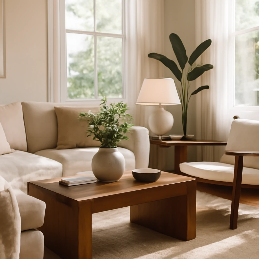
Introduction
In many European homes, a well-considered touch can transform a space without the upheaval of a full renovation. Thoughtful details, executed with restraint and quality materials, can elevate a room from merely functional to refined and cohesive. This article explores seven practical, renovation-free strategies that professionals use to create a sense of luxury. Each approach is designed to be implementable in classic city flats, modern apartments, or family homes across Europe, whether you’re updating a rental or refreshing a long-term residence. The focus is on enduring materials, precise proportions, and lighting and texture decisions that read as deliberate design choices rather than temporary fixes.
What follows is a practical blueprint: how to select materials, where to place elements, and how to balance aesthetics with durability. You’ll find tips on frames, lighting, hardware, glass, window treatments, and textiles - each aimed at increasing perceived value while keeping disruption to a minimum. The emphasis is on creating a unified, calm atmosphere where every detail supports the whole, rather than competing with it.
Before you begin, consider the overall palette of the room, the level of natural light, and the architectural details that already exist. European interiors often benefit from clarity and restraint - clean lines, tactile finishes, and a thoughtful mix of matte and soft textures. With that in mind, these seven strategies will help you tame clutter, highlight artwork, amplify light, and ensure that attention to detail translates into a sophisticated, liveable space.
1. Replace poster and photograph frames
Artwork and photography can instantly elevate a room, but the impact is closely tied to the way the piece is presented. In museums, every frame is chosen to support the work rather than compete with it. Translating that approach to a home involves selecting frames that breathe with the wall and the art itself, and using a passe-partout (mat) to create visual breathing room around each image.
What to do:
- Choose frames in natural materials such as wood or metal, or frames with a matte finish, avoiding glossy plastics which can read as cheap or incongruent with refined interiors.
- Utilise a passe-partout to visually enlarge the artwork and to create a gallery-like cadence across a wall.
- Keep consistency within a room or across a corridor - select a frame family (finish, width, and depth) and apply it to photos and prints alike.
- Consider the wall colour and lighting when selecting frame colour, for lighter walls, charcoal or soft brass can offer subtle contrast, while darker walls may benefit from lighter frames to avoid disappearing images.
- When possible, mount frames with cords, discreet screws, or spacer mounts that minimise obstruction to the wall surface and keep lines clean.
Practical note: in rental properties, use non-permanent hanging methods where allowed and opt for adhesive-friendly frames that won’t damage walls. The goal is a calm, curated display that reads as a deliberate collection rather than a casual wall clutter.
2. Add a wireless light in a dark corner
Layered lighting is a hallmark of considered interiors. Where a space has shadowed corners or dead zones, a battery-powered or USB-rechargeable light can create depth, warmth, and a sense of luxury without wiring. A compact wall lamp, a freestanding uplighter, or a small table lamp on a tray can anchor a seating area and reduce the perception of a flat, two-dimensional room.
What to do:
- Opt for wireless fixtures with a warm colour temperature of 2700–3000 K to mimic the glow of natural sunrise and sunset. This temperature range flatters faces and softens architectural details.
- Choose dimmable options where possible so you can adjust intensity throughout the day.
- Position a wrist-height lamp near seating or a reading corner, or install a small sconce above a console to create ambient glow without visible wiring.
- Consider a light with USB charging or rechargeable batteries to avoid the need for a socket in awkward spots.
- When space is tight, place a small lamp on a stack of books or on a decorative tray - this creates a stylish vignette while adding light.
Idea in practice: a subtle glow in a dark corner can read as considered design rather than a utilitarian fix. The effect - soft shadows, warm surfaces, and a sense that the room continues beyond the seating area - contributes to a luxurious atmosphere.
3. Install decorative overlays on cabinet handles
Hardware details can dramatically alter the perception of furniture. Decorative overlays or escutcheons around handles serve two purposes: they protect the surface from daily wear and they add a tailored, bespoke quality to flat-front cabinetry. This is especially effective when refreshing older pieces or when replacements would be too visible a change.
What to do:
- Choose metal overlays in finishes that echo other metal accents in the room - matte brass, brushed nickel, or dark bronze are versatile options.
- Measure precisely to cover existing holes or minor damage left by prior fittings, overlays should sit flush against the cabinet face.
- When upgrading handles, select a design with a longer legible silhouette or a modestly scaled plate that complements the cabinet proportions rather than overpowering them.
- Apply the overlays with appropriate mounting hardware, ensuring even alignment and clean edges.
The result is an understated transformation that refreshes the character of a piece without the expense or downtime of re-fitting hardware. In European homes where built-in storage is common, this is a particularly effective way to introduce a sense of cohesion and refinement.
4. Replace standard outlets and switches
Electrical fittings are often overlooked, yet they contribute significantly to the room’s overall finish. White plastic frames can look incongruent with a refined palette. Upgrading to frames that blend with the wall or feature a matte metal finish helps achieve a seamless, high-end look. The goal is to make these elements recede rather than compete with the surrounding surfaces.
What to do:
- Choose outlet and switch plates that match wall colour or come in a low-profile matte finish in brass, nickel, or black.
- Opt for square-edged or flush-mount designs that sit neatly against plaster or wallpaper without projecting awkwardly.
- Avoid high-gloss or mirror-like finishes which can reflect unwanted glare and draw attention away from other design details.
- Ensure any replacements comply with local electrical safety standards and are installed by a qualified professional if work requires wiring changes.
Strategic planning pays off here: the colour and finish of wall plates can unify the room as effectively as a new piece of furniture. In a European context, where plaster walls and subtle textures predominate, a discreet, colour-matched plate often reads as part of the wall rather than as an accessory.
5. Replace transparent glass in cabinet doors with frosted glass or mesh
Clear glass doors reveal everything inside, which can read as busy or casual. Replacing the glazing with frosted glass, etched panels, or metal mesh creates a calmer silhouette while maintaining the practical function of storage. It also gives cabinetry a tailored, bespoke appearance that feels more permanent and considered.
What to do:
- Consult a local glass specialist or glazier to discuss frost patterns or mesh options that suit the cabinet style and door dimensions.
- Measure door panels accurately and select frosted or textured glass, or a perforated metal mesh suitable for cabinet doors.
- Ensure the chosen option is compatible with any existing door hardware and mounting systems, so installation remains clean and unobtrusive.
- Be mindful of maintenance: frosted or textured surfaces can show fingerprints less readily than clear glass, but still require regular cleaning to maintain their pristine appearance.
The aesthetic payoff is substantial: the filtered view into the contents can feel luxurious and curated, inviting a calmer, more intentional interior experience. This approach is particularly effective in kitchens, dining rooms, and living areas where cabinetry forms a prominent architectural feature.
6. Extend curtains to the floor
Length and proportion are fundamental to a room’s perceived finish. Curtains that merely skim the floor can make a space feel truncated or unfinished. Floor-length drapery creates verticality, emphasises clean line, and signals a room that has been planned with care. It also helps emphasise the ceiling height and the architecture of the windows.
What to do:
- Install curtain rods as close to the ceiling as possible and extend drapery to just above the floor, allowing the fabric to pool slightly for a tailored look where feasible.
- Choose fabrics with a natural drape and weight - linen blends, wool blends, or heavy cottons - so the panels fall gracefully rather than bunching or fluttering.
- Avoid excessive gathers or fussy hems, a smooth, clean sweep of cloth reads as refined and intentional.
- In rooms with hard floors, consider a light lining beneath the main fabric to reduce glare and preserve the fabric’s colour and texture in daylight.
In European interiors, tall windows and generous ceiling lines benefit most from full-length curtains. The effect is not only aesthetic but also practical: higher curtains can help regulate light, improve acoustics, and enhance insulation when paired with appropriate lining.
7. Harmonise textiles and surfaces for a cohesive look
The seventh principle focuses on the quiet art of cohesion. A well-curated interior relies on a deliberate palette and a consistent mix of textures that work together rather than compete. When you choose fabrics, finishes, and surfaces with a shared vocabulary, the room feels curated and luxurious even without new furniture or structural alterations.
What to do:
- Define a restrained colour palette and repeat it across rooms to create a sense of continuity - soft neutrals, warm whites, and earthy accents are particularly versatile in European homes.
- Layer textures to add depth: try a wool rug, a linen sofa throw, a cotton cushion, and a boucle chair cover. The variation in weave and feel should be tactile and inviting.
- Balance glossy or reflective surfaces with matte finishes to prevent glare and to maintain a calm atmosphere. For example, pair a polished metal lamp with a matte wall or linen upholstery.
- Introduce natural materials - warm woods, stone, ceramic, and woven textures - to bring warmth and a sense of timeless quality to the space.
- Use proportion and scale thoughtfully: larger textiles and larger-scale patterns can anchor a room, while smaller accents can be used to punctuate details without overpowering the overall mood.
In practice, this seventh tactic is less about a single change and more about an ongoing discipline: assess a space as a whole, identify a dominant material language, and ensure new elements reinforce that language rather than fragment it. With careful selection, even modest rooms can feel serene, coherent, and confidently designed.
Putting the ideas into action
Implementing these seven strategies requires a measured approach. Start with a quick audit of your current spaces: where does the eye land first? Which corners feel dull or crowded? Which hardware or lighting feels incongruent with your wall colour? Answering these questions will help you prioritise updates that deliver the greatest impact with the least disruption.
Budgeting is also a key consideration. The beauty of these tips lies in their modular nature: you can sequence updates over weeks or months, rather than undertaking a single, disruptive project. For example, begin with simple frame upgrades and a new curtain approach, then move on to hardware and lighting, followed by glazing and textiles. In rental or shared homes across Europe, it’s often wise to start with non-permanent solutions that preserve deposit values and walls, while still delivering a refined look.
Maintenance matters too. Matte finishes resist fingerprints and wear better in daily life, but they reveal dust more readily than high-gloss options. Regular dusting, soft cloth cleaning, and appropriate fabric care will keep the new elements looking purposeful rather than brushed aside as afterthoughts.
Finally, remember that the aim is not ostentation but a sense of intentional living. A well-curated interior communicates care, restraint, and a clear design narrative. The seven strategies outlined here are designed to help you articulate that narrative - without the upheaval of major renovations - and to make European homes feel more luxurious, more cohesive, and more comfortable every day.
You may also like these articles
 Colour & Materials
Sonoma Oak in Interiors: How to Use and Pair It Across European Homes
A practical guide to using Sonoma Oak in European interiors.
Outdoor & Terrace
This is beautiful: 30+ ideas for stylish garden beds
Ideas to elevate every European garden with practical, stylish raised beds.
Tips & How-To
Room Dividers: Zoning Solutions for European Homes
Smart room dividers that transform open spaces into distinct, functional zones.