
Explore interior trends, AI design insights, styling guides and real transformations
Softer than steel: mastering the grey‑blue kitchen across Europe
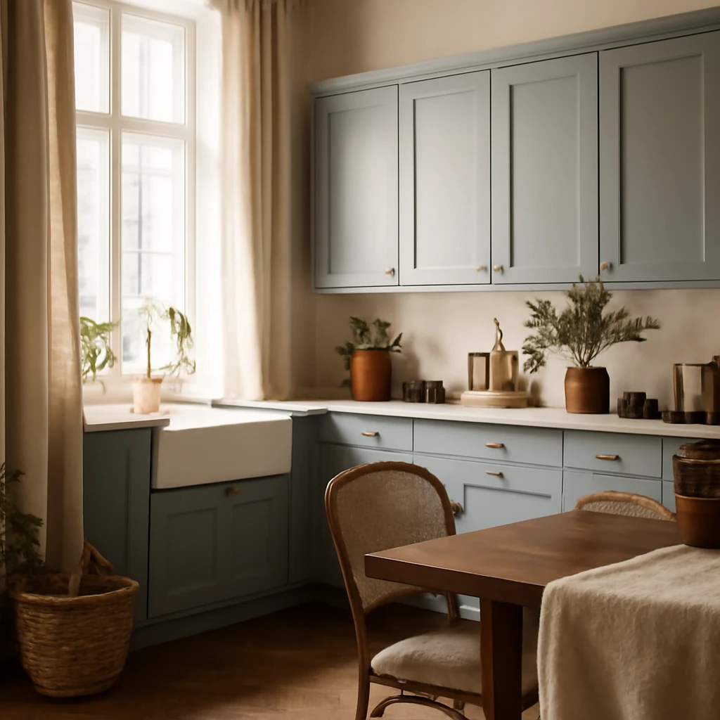
Why grey‑blue for the kitchen?
Grey‑blue is a sophisticated, year‑round palette that pairs the cool calm of grey with the quiet depth of blue. In European homes it offers a refined alternative to stark white or dark woods, capable of feeling both contemporary and timeless. The key is balance: the hue should feel deliberate, not clinical, and materials must work with the temperature of the colour to avoid a sterile or hospital-like impression. When executed well, a grey‑blue kitchen reads as effortlessly chic, with colour temperature that adapts to light, climate, and the everyday rhythms of a family home.
Choosing the palette
Grey and blue sit on a similar tonal spectrum, which makes their combination inherently harmonious. Yet subtle distinctions in shade, saturation and undertone determine the final mood. Here is how to approach palette selection for different European contexts.
- Room size matters. In larger kitchens, allow for a more pronounced contrast between tones, creating depth. In compact spaces, keep contrast minimal and lean towards lighter greys with pale‑blue accents to preserve airiness.
- Natural light can steer the temperature. Northern‑light rooms benefit from warmer undertones or warmer textures to counterbalance the coolness of the palette, southern exposures can handle cooler or more saturated blues without feeling chilly.
- Seasonal and climate considerations. In regions with long winters, introduce warmth through textures (woven textiles, timber, and stone with warm veining). In sun‑drenched homes, you can lean into cooler blues and lighter greys without compromising comfort.
- Consistency of temperature across surfaces. If the furniture, textiles and walls lean cool, err on the cooler side for cabinetry and backsplashes, if warmth is central, incorporate warm metals and natural materials to balance.
- Beware of overly bright neons. Extremely saturated blues or neon‑carried tones tend to feel dated or gimmicky when used as standalone features. Subtle saturations and muted pastels remain current and versatile.
Combinations with other colours
Pairing grey‑blue with other neutrals and gentle tones is essential for a cohesive European kitchen. Below are the most dependable companions, with advice on applying them in practice.
White
White acts as a crisp, unifying canvas, allowing grey‑blue to take centre stage. A white backdrop - walls, ceiling, or even a white‑toned floor - can brighten the space and emphasise architectural details. When white is used liberally, introduce warmth through textiles, timber finishes, and warm metals. If light levels are modest, consider a slightly warmer white with a pale yellow or cream undertone to avoid a clinical feel.
Beige and brown
Beige and brown inject a comforting warmth that softens the cool undertones of grey and blue. Natural wood veneers, warm stone surfaces, and beige or taupe cabinetry can create a cosy, inviting kitchen that still feels modern. This pairing is particularly effective in kitchens with limited daylight or in open‑plan schemes where the living area benefits from connected, earthy tones.
Blue variations
Introducing a second blue can create a rich gradient across surfaces - from pale, powdery blues to deeper navy accents. Use contrast sparingly, such as a blue island against lighter cabinetry, or a blue feature wall behind counters. Pair dark blues with black or very warm whites to establish clear boundaries and prevent the palette from becoming flat.
Pastel tones
Muted pastels - sage, powder pink, misty lilac, or soft moss - can be employed as gentle accents without overpowering the core grey‑blue scheme. Keep pastels desaturated and use them in soft furnishings, tile motifs, or decorative pieces. In Scandinavian or minimalist interiors, pastel touches can feel especially refined when balanced with sleek surfaces and clean lines.
Materials and textures
Material choice is the main tool for shaping mood in a grey‑blue kitchen. The European market offers a wide range of finishes that can emulate natural textures while delivering durability for daily use. The goal is to combine tactile interest with visual calm.
Natural materials - wood, stone, ceramic and porcelain - are central to this palette. The system you choose should mimic the feel of authentic materials as closely as possible, even if you opt for engineered or porcelain alternatives.
Marble and stone bring ritual and formality to the space. Use marble or veined porcelain on splashbacks, islands, or focal walls to introduce drama without overwhelming the room. Subtle veining in cool greys or blues can harmonise with cabinetry, while maintaining practicality for cleaning and durability.
Wood softens the environment and adds warmth. A generous wooden floor, timber countertops, or timber veneer on cabinetry can anchor the palette. Lighter oak or ash works well in Nordic and modern European homes, whereas a deeper walnut or ash with warm undertones can enrich classic interiors.
Surfaces and finishes - matte or satin finishes are particularly on trend, as they minimise glare and read as contemporary. For a high‑end feel, combine matte cabinet fronts with a slightly polished stone or ceramic countertop. Avoid glossy plastics on large surfaces in favour of tactile materials that gain beauty with age.
Metal accents can either reinforce the cool temperature or temper it. While chrome or polished nickel reflect the cool end of the spectrum, warm metals such as brass or satin brass create a refined contrast that softens the chill of grey‑blue. Use metal in lighting, taps, handles, and small appliances to punctuate the design without overpowering it.
Cabinetry, backsplashes and colours in finishes
Two practical questions often guide European kitchen projects: what to do with cabinetry colour and how to treat the backsplash. Both decisions influence the perceived warmth of the space and the level of maintenance they require.
- Cabinets: A monochrome grey or blue‑grey cabinet family offers a timeless look. For a more contemporary approach, consider a two‑tone scheme with a lighter grey on the wall cabinets and a deeper blue on the base units. Alternatively, blue‑accent islands or tall storage columns can act as focal points without dominating the room.
- Backsplash: The backsplash is your opportunity to introduce texture and pattern. Pale blue ceramic tiles with subtle texture, or a marble‑veined porcelain, can tie the palette together. For a bolder interpretation, a white‑blue azulejo motif or geometric patterns in soft shades bring a nod to European architectural heritage without feeling nostalgic.
- Countertops: Light‑coloured stone or porcelain countertops work well with blue‑grey cabinetry. For a warmer balance, introduce a veined light‑brown or beige stone that complements the wood elements elsewhere in the kitchen.
Layout and finishes for different spaces
The execution of a grey‑blue kitchen depends on the space type: a compact city flat, an open‑plan ground floor, or a rural kitchen in a traditional European home. Each context benefits from slightly different approaches.
Compact spaces
In small kitchens, simplicity and lightness win. Choose light grey walls with pale blue accents on limited cabinetry surfaces. Use handleless fronts or slim recessed handles to maximise perceived space. Consider a single, lighter coloured island or breakfast bar to create a visual centre without crowding the room. Reflective or semi‑gloss surfaces can help bounce light, but prefer satin or matte finishes to avoid clinical reflections.
Open‑plan and urban living
In open plans, your kitchen should dialogue with the living area. A two‑tone approach - lighter wall cabinets with a slightly darker base - can delineate cooking zones. Integrate a timber or stone island that doubles as a social hub. Lighting becomes crucial: layered lighting with warm sources at task level and cooler ambient lighting creates depth and mood that transitions between cooking, dining and lounging.
Rural and coastal settings
In homes with a connection to nature or the sea, the grey‑blue palette can lean into grey‑blue‑green tones that mimic coastal skies or stone cottages. Warm timber floors or a stone floor with a honed finish keep the space grounded. Textiles in natural fibres - linen, cotton, wool - add texture and warmth while preserving the palette's serenity.
Lighting and ambience
Lighting is the unsung hero of any kitchen, and its role is amplified in a grey‑blue scheme. A well‑balanced lighting plan includes three layers: ambient, task and accent. For ambience, select lighting with a warmer colour temperature (around 2700‑3000K) to offset the coolness of blue. For task lighting over work zones, cooler temperatures (3200K‑4000K) improve visibility without appearing harsh.
Natural light is a designer’s ally. maximise it with reflective surfaces and light window treatments. In darker rooms, introduce a pale reflective surface on the backsplash or a polished stone countertop to capture any available daylight and create the perception of space.
Styles that suit grey‑blue kitchens
Grey‑blue is versatile across several European design languages. Here are the most compatible styles and why they work well together.
- Classic and traditional: Subdued greys paired with pale blues, marble details, and refined metals (brass, bronze) bring a sense of timeless luxury. Embrace mouldings, framed cabinetry panels, and a restrained decorative programme to maintain elegance.
- Scandinavian and Nordic: A soft, muted palette with white walls and light timber floors creates an airy, calming environment. Blue accents in cabinetry or a feature island introduce colour without overpowering the light, pared‑back aesthetic.
- Contemporary: Clean lines, integrated appliances and minimal hardware suit grey‑blue exceptionally well. Use in a predominantly neutral space with subtle colour pops in textiles or a striking blue island to anchor the room.
- Minimalist: The philosophy of less is more aligns with a restrained grey‑blue palette. Focus on texture, light, and proportion. A monochrome scheme with quiet accents in matte finishes feels refined and current.
Finishes and decorative details
Details matter in preventing a cold, clinical environment. The following elements help to achieve a balanced, lived‑in kitchen that remains elegantly restrained.
- Texture layering: Combine matte cabinetry with a satin or honed stone countertop, and a soft textile on seating or window dressings. Subtle contrasts in texture add warmth without breaking the cool temperature of the palette.
- Backsplash as a feature: A backsplash with a delicate pattern, light veining, or a tiled motif can act as a focal point. If you prefer a calmer look, use a solid, softly veined stone that picks up the undertone of the cabinetry.
- Hardware and fixtures: Opt for warm metals (brass, warm pewter) for taps and handles to soften the coolness. If you prefer a more cohesive, contemporary look, full‑height integrated handles and finger pulls in a matte finish create a seamless effect.
- Textiles and soft furnishings: Cushions, curtains, and a rug in natural fibres with mineral tones bring tactile warmth. Choose pieces that reference timber or earth tones to ground the space and prevent a purely clinical impression.
Practical tips for European homes
To implement a successful grey‑blue kitchen in Europe, consider the following practical guidelines that reflect real‑world constraints and preferences.
- Durability first: Kitchens endure heavy use. Choose surfaces and cabinetry finishes that resist scratches and moisture, with easy‑to‑clean surfaces for the backsplash and countertops. Matte finishes tend to show wear less than high gloss, and composite materials often perform best for work surfaces.
- Ventilation matters: A robust range hood is essential, particularly if you build a darker, more dramatic blue island or metallic finishes into the design. Good ventilation keeps the space comfortable and odourless while preserving the integrity of materials.
- Storage efficiency: In European homes, efficient storage is critical. Integrate tall pantries, pull‑out organisers, and hidden drawers to maintain a calm aesthetic. Consider soft–close mechanisms to enhance the sense of quiet and control.
- Sustainability: Prioritise low‑VOC paints and finishes, FSC‑certified timber, and energy‑efficient appliances. A well‑insulated kitchen is essential for energy comfort in climates across the continent.
Case studies: practical configurations
While every space is unique, the following hypothetical configurations demonstrate how grey‑blue kitchens can be executed across different European contexts.
Urban apartment with northern light
In a city flat with limited daylight, use a predominantly light grey with pale blue accents on wall cabinets or an island. A white or pale stone countertop reflects light, while a warm timber floor adds warmth. Two‑tone cabinetry - light upper, slightly deeper base - creates depth without sacrificing perceived space. Introduce warm metal finishes for taps and light fittings to soften the cool cast of the blue.
Open‑plan dwelling in a temperate climate
Use a cohesive palette that travels between kitchen and living area. A soft grey cabinetry base with a muted blue island provides a natural focal point. Textiles in natural fibres - linen blinds, wool rugs - bring texture and warmth. Incorporate a timber dining table or breakfast bar to knit the zones together, with lighting layered to suit dawn, daytime, and evening activities.
Coastal home
Grey‑blue spaces align well with seagrass and sand tones. Introduce light stone flooring, a white or light timber cabinet system, and a backsplash with a delicate wave or geometric motif in blue‑green hues. A couple of woven or rattan accents can reinforce the coastal mood without overloading the palette.
Maintenance and longevity
Durability and ease of maintenance are practical realities in European kitchens. Choose finishes that resist staining and fingerprints on frequently touched surfaces. Regular cleaning with non‑abrasive products helps preserve the integrity of stone or porcelain. For timber elements, use a protective sealant and avoid prolonged exposure to sunlight to prevent fading. Periodic refreshes - such as reupholstering chairs or updating textiles - can keep the space looking contemporary without a full remodel.
Common pitfalls and how to avoid them
- Avoid an overly sterile vibe: Balance cool hues with natural textures (wood, wool, stone) and warm metals. Introduce textiles and patterns that give the space personality without compromising the palette.
- Be mindful of lighting: Cool lighting can exaggerate the coldness of the palette. Use warmer ambient lighting and ensure task lighting remains clear and practical for cooking tasks.
- Do not over‑repeat colour: If you keep repeating the same blue across different surfaces, the space may read monotonous. Vary tones slightly and introduce a contrasting surface to keep the design lively.
- Function over form: In kitchens, usability matters more than aesthetics. Ensure storage, access to appliances, and worktop heights support comfortable, efficient workflows.
Conclusion: a palette with lasting appeal
Grey‑blue kitchens offer a refined, contemporary language that resonates across European homes. The combination of cool depth and soft warmth makes spaces feel calm, collected and adaptable to changing needs - from family kitchens for everyday meals to entertaining spaces that host friends and neighbours. The secret lies in balancing hues, textures, and materials with practical layouts, thoughtful lighting, and a restrained decorative programme. When executed with care, a grey‑blue kitchen becomes more than a colour choice, it becomes a framework for a lifestyle - one that blends comfort with modern European sophistication.
You may also like these articles
 Furniture
Choosing the Right Sofa Filling: From Pocket Springs to PU Foam
A practical guide to sofa fillings for European homes: comfort, durability and value.
Tips & How-To
Maximise European Furniture Savings with Promo Codes
A practical guide to European promo codes for furniture and home décor.
Small Spaces
From One Room to Two: Simple Zoning Techniques for European Homes
Transform a single room into two stylish, functional zones.