
Explore interior trends, AI design insights, styling guides and real transformations
Combined Wallpapers in the Living Room: Ideas, Techniques and Layered Decor
Introduction: the living room as a canvas for layered wall design
In contemporary European homes, the living room is more than a place for relaxing or entertaining. It is a flexible canvas where architecture, light and furniture dialogue with surface treatment to create a sense of warmth, character and rhythm. Combined wallpapers - where two or more textures, patterns or finishes meet on the same plane - offer a powerful, economical way to define zones, enhance architectural features and express a personal sensibility. Used thoughtfully, this approach can transform a flat, featureless space into a layered, curated environment without resorting to drastic renovations.
Rather than applying a single wallpaper across all walls, designers in our region increasingly favour curated pairings that align with the room’s orientation, scale of furniture and the mood you want to create. The aim is not decoration for decoration’s sake, but a considered architecture of surfaces: a backdrop that supports conversation, light, and everyday living while giving the room lasting appeal.
Key principles of wallpaper combinations
Before choosing patterns, textures or finishes, there are a few universal principles that help ensure a cohesive result in European living rooms.
-
Colour and daylight. The direction and quality of light should guide palette choice. North-facing rooms often feel cooler and benefit from warmer tones to counterbalance the light’s softness, south-facing rooms can withstand cooler tones to reduce glare and maintain balance with saturated textiles and artwork.
-
Pattern compatibility. When combining patterns, keep the number of distinct motifs modest - usually two or three at most. Choose motifs that share a colour or a tonal range, so your eye reads them as a single composition rather than a mismatch of fabrics and wall coverings.
-
Scale and rhythm. Pair large-scale patterns with smaller ones to create a sense of order. A bold, expansive pattern on one wall can act as a strong anchor, while smaller motifs on adjacent walls provide relief and movement.
-
Texture and light diffusion. Matte surfaces absorb light, while subtle sheens bounce it around. Mixing textures - matte paints, tactile weaves, or lightly reflective finishes - can enhance depth without creating busy reflections.
-
Environmental responsibility. In living spaces used by families, schools, or shared hospitality rooms, consider wall coverings that combine good indoor air quality with durability. The choice of material should align with ventilation, cleaning regimes and the room’s use.
Choosing a unified yet flexible approach
Ideally, select wallpapers from a single collection or brand family when possible. A shared substrate, coat weight and finish will minimise perceptual differences across walls, creating a harmonious base. If you mix from separate ranges, test alignments in daylight and under artificial light before making a final decision. Order extra rolls to accommodate pattern matching, waste and future touch-ups.
In many European showrooms and studios, designers work with three-dimensional wall plans or digital mock-ups to trial combinations. This practice reduces costly mistakes and helps homeowners understand how the wall surfaces will read from different seating positions. When planning, begin with the wall that serves as the room’s focal anchor - often the wall behind seating or the wall that houses a media console - and build the rest of the composition around it.
Techniques for living-room wallpaper combinations
There are several effective strategies to combine wallpapers in living rooms. Below are the most practical and widely used approaches, each with guidance on when and how to apply them.
Vertical combinations
Vertical arrangements are a modern interpretation of a classic technique. They can widen a room visually and draw the eye upward, making ceilings feel taller. Practical variants include:
-
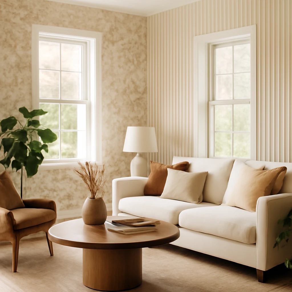
Variant 1 – striped anchor with a neutral backdrop. Apply a bold stripe or a graphic pattern on one wall, using a second, neutral wall covering as the rest of the room’s backdrop. The contrast is clear, yet the neutral background keeps the space calm and adaptable for furniture changes over time.
-
Variant 2 – tonal gradation. Use one colour family across two wallpapers with different saturation levels. A 2:1 proportion (dominant calm colour to slightly richer accent) creates a measured, sophisticated layered look that reads as a single design language.
Vertical compositions work well in rooms with standard ceiling heights, particularly where you want to elongate the sense of height without altering floor plans.
Horizontal combinations
Horizontal divisions are strongly associated with traditional interiors and can feel inherently comforting. To achieve a refined result, mark a clear horizontal boundary - often at the height of a dado rail or at a proportion that aligns with seating height. Techniques include:
Bottom wall in a darker, vertically textured or patterned wallpaper, top wall in a lighter, more expansive motif to soften the room and keep surfaces visually buoyant.
Incorporating wood or plaster mouldings to frame the transition between the two wallpapers, lending a crafted, architectural note to the composition.
This approach is particularly suitable for rooms with moderate ceiling heights and can be used to de-emphasise architectural irregularities by visually balancing surfaces.
Decorative inserts
Decorative inserts create a focal area without overwhelming the entire wall. The method involves first applying a neutral or subdued wallpaper to the full wall, then introducing a contrasting motif within a framed inset segment. The frame is typically a simple rectangle, but arches, curves or asymmetric shapes can add drama if aligned with furniture arrangement and doorways.
Edges of the inset are finished with mouldings or a thin wooden trim to define the boundary. This technique works well in living rooms with limited large furniture pieces, where a single feature wall can anchor conversations and viewing angles.
Accent on niches and architectural features
Architectural features such as alcoves, alcoves around fireplaces, or recessed shelving present natural opportunities for wallpaper accents. The surrounding wall surfaces stay calm to preserve readability, while the niche receives a contrasting or textural wallpaper that becomes a design “jewel” within the room.
In European homes where niches vary in depth and shape, the key is to maintain balance with the scale of furniture and to avoid overloading any single feature. A smaller niche benefits from a restrained pattern, a larger recess can carry a bold motif, provided there is enough neutral space nearby to anchor the composition.
One wall focus
A single wall treated with a striking wallpaper is a powerful way to create drama without overdesign. This approach is ideal for living rooms that regularly host conversations or media viewing. Choose a motif that complements the room’s furniture and textiles, such as a landscape-inspired or geometric pattern, and allow the remaining walls to stay neutral or timber-toned to prevent visual fatigue.
When selecting a wall for the focal wallpaper, consider seating arrangements and sightlines from the main chairs and sofas. The wall behind the seating area is often the most effective location, ensuring that the wallpaper becomes a backdrop for social interaction rather than a detraction.
Patchwork and mosaic approaches
Patchwork, or “quilt-like” mixing, combines several wallpapers in a balanced, mosaic-like layout. The concept requires discipline: limit the palette to a cohesive family of colours and textures, and choose 3–4 distinct fabrics or patterns that harmonise rather than compete. The goal is a coherent mosaic where each piece contributes to an overall narrative rather than a collection of disparate patches.
Important caveats include avoiding mixing high- and low-cost options within the same panel, as differences in texture and sheen can become distracting. When executed with care, patchwork wallpaper can create a refined sense of energy and depth, suited to contemporary spaces that embrace eclecticism.
Textile, metallic and embossed finishes
Advanced combinations may incorporate wallpapers with textiles, metallic foils or embossed textures. These surfaces introduce tactility and subtle light interaction, enriching the room’s sensory experience. Use them sparingly and in conjunction with flatter, more forgiving wallpapers to maintain legibility and comfort.
Choosing materials and considering environmental impact
Wall coverings come in a range of materials, each with its own environmental and practical profile. In the living room, where family life and frequent cleaning occur, consider performance alongside aesthetics.
- Paper wallpapers. Among the most eco-friendly options, they offer a natural feel and excellent wall coverage. However, they tend to be less durable and more susceptible to UV degradation and moisture - conditions that can be found in some European interiors with high window exposure or humid environments.
- Vinyl wallpapers. A robust choice with a wide colour range and durability under light exposure. They are often easier to clean but can be less breathable, so plan ventilation and consider alternative zones where humidity is a concern.
- Foil wallpapers. Known for their reflective quality and refined glamour, foils can enhance light and space but require careful planning to avoid glare and misalignment of reflections on irregular walls.
- Textile wallpapers. Rich and luxurious, textiles bring warmth and sound absorption, but they demand careful maintenance and can be more expensive. They pair beautifully with muted backgrounds to prevent overwhelming a room.
When combining wallpapers from different materials, ensure a unified design language through shared colour relationships and complementary textures. The best practice is to test a small, inconspicuous area under both natural and artificial light before committing to a larger installation.
Air quality is another essential consideration. Use low-VOC adhesives and, where possible, choose coverings with low emissions. A well-ventilated installation environment will contribute to healthier, more comfortable living spaces over time.
colour theory and pattern language for living-room combinations
Colour relationships and motif language shape how a wallpaper combination is perceived. A successful scheme typically balances warmth and coolness, contrast and harmony, and order with a gentle sense of surprise.
- Analogous colours - neighbouring tones on the colour wheel - are a safe route for serene interiors. A soft cream paired with pale taupe and an accent of warm grey can be empowered by a single statement wallpaper with delicate texture.
- Complementary contrasts - pairs of opposite hues - work best when used with restraint. Reserve high-contrast wallpaper for a single wall or a small inset to avoid sensory overload.
- Texture as colour - a textured wallpaper in a neutral tone can read as a subtle colour shift in different lighting, adding depth without introducing loud patterns.
Pattern selection should align with room use. A busy motif on a primary wall can energise a seating area but may fatigue the eye over long periods. Consider softer patterns for walls adjacent to windows and screens, and reserve bold motifs for walls that anchor conversation or draw attention to a focal object or feature.
Ornamental richness and the language of motifs
Patterns on wallpapers offer a spectrum from restrained florals to bold geometrics. The choice of motif communicates the room’s personality as clearly as furnishings do. Some guiding thoughts:
- Floral and botanical patterns bring tactility and nature indoors. They pair well with natural materials like wood, linen textiles and ceramic finishes, creating a calm, grounded atmosphere when used on a feature wall or as an inset.
- Geometric patterns - from graphic chevrons to tessellated grids - introduce order and modernity. They read as architectural statements and perform well in open-plan spaces where distinct zones require visual cues.
- Abstract and painterly motifs offer a contemporary, energetic edge. Used sparingly, they create a sense of movement and depth without shouting for attention.
When selecting patterns, consider how the adjacent furniture, lighting and textiles will interact. The aim is a cohesive narrative rather than a collage of disparate looks. A well-chosen motif should feel inevitable, as if it belongs to the space rather than being applied for effect.
Texture, tactility and the physical reading of walls
Texture is a crucial dimension of wallpaper design. A wall can be visually flat yet feel rich to the touch, or conversely, appear richly textured but remain excruciatingly smooth under the eye. The tactile quality of the wallpaper influences how light bounces around the room, how sound is absorbed, and how visitors experience the space at different times of day.
Texture can define a room’s hierarchy: a velvet-like finish on one wall can invite conversation and create a sense of intimacy, while a flat, smooth surface elsewhere keeps the room legible and restful. In living rooms with complex geometry - recessed shelving, niches, or protruding bays - textured wallpaper can emphasise architectural features when used with restraint.
Practical planning: from concept to execution
Executing a successful wallpaper-combination plan requires careful organisation and step-by-step thinking. Here is a practical framework that designers and homeowners can follow to minimise risk and maximise reward.
Survey the space. Note wall dimensions, window and door positions, and any irregularities such as non-rectilinear surfaces or plasterwork details. Measure each wall carefully and record the light quality across the day.
Define zones and priorities. Decide which area of the room should read as the primary focal point, where conversation will occur, and how to manage traffic flow and seating alignments.
Choose a core wallpaper. Select a base wallpaper that feels calm and cohesive with the room’s furniture and textiles. This choice will anchor the rest of the composition.
Experiment with samples. Obtain large samples or sample boards and test them in situ. Observe how they look in daylight and under artificial light, and how their tones shift with different bulbs.
Plan the layout. Use digital tools or paper sketches to mark where each wallpaper will go, including seams, matching patterns, and any frames or mouldings. Pay attention to pattern matching and waste factors.
Order with care. Buy extra rolls for potential later touch-ups and alignment issues. If possible, choose wallpapers from the same line to ensure consistent density and sheen.
Prepare and install properly. Prepare walls by ensuring smooth surfaces, filling defects, and applying a compatible primer. Use appropriate adhesives and follow manufacturer guidelines to achieve durable adhesion and clean seams.
Assess and refine. After installation, review the room under different lighting conditions and adjust lighting or textiles to harmonise with the new wall surfaces.
Common pitfalls and how to avoid them
Even experienced designers encounter challenges when combining wallpapers. Here are frequent pitfalls and practical countermeasures:
- Poor pattern matching. Uneven seam alignment or misaligned motifs can disrupt the entire composition. Plan pattern repeats carefully, use samples to verify alignment, and hire skilled installers familiar with multi-wall projects.
- Overloading the room with patterns. A room with more than three distinct motifs tends to feel chaotic. Opt for a dominant motif on the focal wall and a compatible secondary motif on others, or use texture as the third dimension rather than another bold pattern.
- Ignoring scale. Large patterns on small rooms can overwhelm, while tiny motifs on large walls may disappear. Balance scale with room size, ceiling height and furniture footprint.
- Incompatible finishes. Mixing materials (e.g., a high-sheen foil with a heavy textile wallpaper) without a unifying element can read as disharmonious. Tie finishes together with a shared colour or a unifying border frame.
- Neglecting maintenance and cleaning. Some materials require careful cleaning or protective finishes. Plan a practical approach to cleaning and consider future renovations when selecting decorative elements.
Putting it all together: a sample living-room narrative
Imagine a contemporary living room with generous natural light from two sides. The base walls are finished in a soft, warm neutral wallpaper with a subtle tactile texture. On the main seating wall, a wide, vertical stripe wallpaper in a refined charcoal conveys depth and sophistication. The stripe is complemented by a narrow, delicate pattern on the adjacent wall - perhaps a restrained geometric or botanical motif in cooler hues. The transition between walls is marked by a slim, painted dado rail or a shallow moulding to visually separate the two finishes while maintaining a cohesive look.
A recessed alcove near the seating area, framed by discreet lighting, features an inset wallpaper with a bold yet refined pattern - balanced by a calmer backdrop elsewhere. A single wall could host a panoramic, high-contrast motif that commands attention only when guests gather, leaving the remaining walls in quieter tones to ensure conversation remains the room’s focus. In this scenario, the overall composition reads as a carefully choreographed sequence of surfaces rather than a patchwork quilt of random choices.
Final thoughts: designing with intention
Wallpaper combinations in living rooms are more than a decorative flourish, they are a way to articulate a room’s function, personality and sense of time. By adopting a clear strategy - balancing colour, pattern, and texture, aligning with daylight and furniture, and following a disciplined planning process - you can achieve a sophisticated, resilient interior that remains comfortable and relevant for years. The living room becomes a studio for daily life, a place where surfaces actively support conversation, play, work, and relaxation.
Remember that the best results emerge from thoughtful planning rather than impulse purchases. Take your time with samples, consider the room from multiple angles, and work with professionals who understand how to translate ideas into a durable, elegant wallscape. With care, combined wallpapers can transform a room into a layered, expressive space that reflects European taste for craftsmanship, light, and refined detail.
You may also like these articles
 Colour & Materials
Five refined pairings of countertops and splashbacks for European kitchens
Five elegant countertop and splashback pairings for European kitchens.
Small Spaces
Designing a Small Bathroom: Practical Ideas for Compact European Homes
Smart layouts, light-filled rooms and clever storage for tiny baths.
Lighting
Illuminating the European Kitchen: Practical Lighting for Every Zone
Layered kitchen lighting for European homes: zoning, fixtures and energy-saving tips.