
Explore interior trends, AI design insights, styling guides and real transformations
Designing brilliance in 25 m²: four studio transformations across Europe
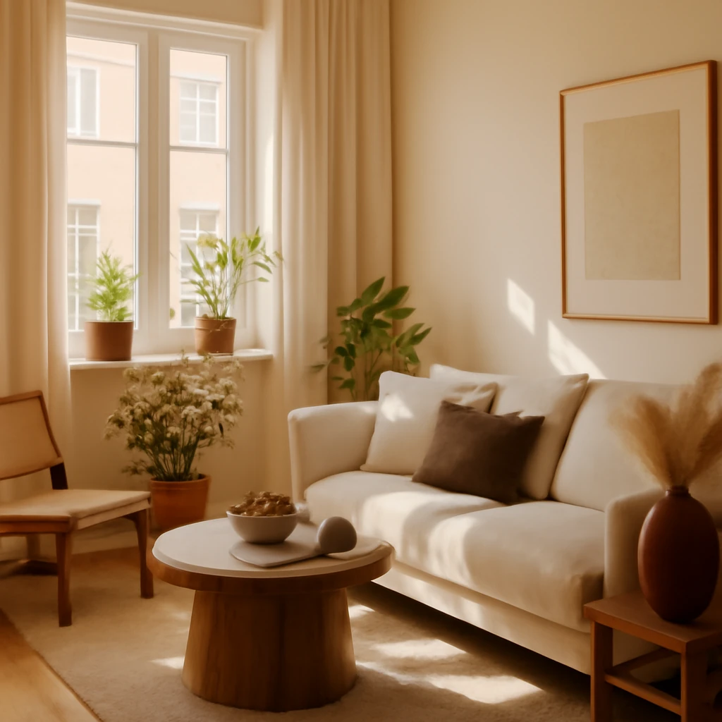
Smaller, smarter: four 25 m² studio transformations
Across Europe, urban living often means compact floorplates. Yet 25 square metres can be fitted with a distinct floor plan, a clear sense of light, and enough storage to feel uncluttered. The four projects below show how designers approach the same footprint with different personalities - grey‑violet minimalism, a move from studio to one‑bedroom, a loft‑style mood with a mini‑sleeping zone, and a studio that makes the most of a balcony. Each study emphasises adaptable zones, intelligent storage, and materials that reflect local European palettes.
How to plan a 25 m² studio
Designing in a compact apartment requires a disciplined approach to space, lighting and circulation. Here are core strategies that recur across European projects:
- Maximise light and permeability. Prioritise daylight by keeping sightlines open. Use light colours and reflective surfaces, but introduce warmth with textiles and timber.
- Vertical storage is your friend. Floor‑to‑ceiling cabinetry, lofted shelves and tall wardrobes help keep the living area uncluttered.
- Define zones with light, not walls. Use screens, furniture arrangement, different textures or ceiling heights to separate sleeping, cooking and lounging without isolating the space.
- Multi‑functional furniture. Invest in sofa beds, extendable dining tables, storage ottomans and modular units that can re‑configure as needs change.
- Respect regulations and safety. Any structural changes must be reviewed by professionals, non‑permanent partitions and freestanding furniture are often a safer, faster route to fresh layouts.
1. Grey‑violet constellations: a restrained minimalist studio
The first project presents a compact flat laid out as a long rectangle with a single generous living area. The interior relies on a restrained colour palette: cool greys bound with soft violet accents, creating a calm, contemporary mood. The design challenge was to fit essential functions within a single primary room while preserving a generous sense of air and light from the lone window at the far end of the apartment.
To maintain openness, the plan realigns the entry sequence by removing a wall between the hall and living space and shifting the wet zone wall to optimise plumbing alignment. The result is a seamless transition from entry to living zone, with a unified material language that reinforces scale. The kitchen is a compact corner with a bar‑height counter that can double as a casual dining spot or a work surface. A sofa bed anchors the living area and provides overnight accommodation without requiring a separate bedroom.
Storage is deliberately deep rather than wide: a tall, slab‑front wardrobe sits in the hallway, while open and closed shelving along the back wall contribute scale and order. A small work desk fits under the window, providing daylight for study without intruding on the main living area. The bathroom is warm in tone, featuring a roomy shower and wall‑mounted storage to keep the footprint uncluttered.
In terms of materials, the palette leans on cool greys paired with violet accents in textiles, cushions and a single feature wall. Finishes favour matte surfaces and soft textures to maintain a serene atmosphere. The result is a compact home that feels calm and refined, with every element chosen to maximise both function and atmosphere.
2. From studio to compact one‑bedroom
The second project shows how a square studio of around 26 square metres can be transformed into a fully functioning one‑bedroom. The design introduces walls to carve out a petite sleeping alcove while reclaiming corridor space as a practical wardrobe zone. The entrance hall becomes a bright, uncluttered gateway into the home, finished in modern minimalism with a bold terracotta pouf acting as a warm focal accent.
With the sleeping area clearly separated, the living zone and kitchen can breathe. The kitchen is compact - an eight to nine square metre corner module with handleless fronts sits flush against the wall, creating a seamless edge that blends with the living area. The lounge features a navy sofa and deep blue accents, balanced by nude or sand‑toned walls to maintain light and openness. A restrained decorative approach - two or three plants and a large wall clock - keeps the space readable and calm.
The sleeping zone is carefully fitted to maximise comfort within a tight footprint: a built‑in wardrobe, wall‑hung television and a small bedside table provide the essentials. The team used a practical strategy by applying the same light colour across ceiling and floor, subtly erasing seams between planes to create a cocooning sensation of space rather than a partitioned box.
In the bathroom, a simple, neutral palette prevails. Efficient fixtures and smart storage along a single wall keep everything tidy while maintaining an airy feel. The layout supports daily routines without fuss, reinforcing the sense that a compact home can operate with the ease of a larger space.
3. Loft mood with a mini‑bedroom
This design targets a young resident seeking a flexible, contemporary atmosphere. The apartment is treated as a single, adaptable canvas, where a few strategic partitions define zones without creating visual heaviness. The living area forms the core, with a dedicated sleeping niche carved out but still connected to the overall space to preserve a sense of openness. Overall, the interior leans towards a loft ethos - clean lines, tactile textures and a disciplined material palette.
The kitchen is a linear, compact module opposite the sleeping area. A full‑height partition segment creates privacy for the bed while allowing light to circulate from the window. At the far end, a small dining zone or desk area doubles as a workspace when needed. The brick‑like finish on two walls injects a sense of urban character and texture, giving the space a contemporary loft feel without resorting to industrial cues that might overwhelm the scale.
The entry area is generous - around four to five square metres - equipped with a large wardrobe, a bench for changing and a coat rack. The bathroom is compact, about 4.4 m², and configured with a bathtub, a wall of storage and a large mirror to amplify light. The overall colour strategy remains restrained, combining cool greys with warm neutrals and timber accents to create warmth and tactility. The result is a space that feels larger than its footprint due to careful planning, light, texture and proportion.
4. Studio with a balcony as a second living zone
The final project demonstrates that a studio need not be purely inward‑facing. With a balcony that functions as an extension of living space, the plan becomes more versatile and sociable. The accommodation is suitable for a range of occupants, including seniors, with a layout that prioritises daylight, views and easy circulation. The core idea is to keep the living area open to the balcony while managing sleep needs with two sleeping strategies: a primary bed for the owner and a fold‑out chair or small sofa that can serve guests.
The kitchen runs along a single wall, with a compact dining nook creating a natural boundary to the lounge. The balcony is treated as a genuine extra room: robust, weather‑resistant finishes, practical storage and a compact wall desk for morning routines or a quiet read. The interior palette remains light and cohesive, reinforced with warm timber textures and soft textiles that make the space comfortable and welcoming.
The wardrobe system is large and integrated, with shelving and hanging space that extend into the balcony area where conditions allow. The bathroom - approximately 3.5 to 3.8 m² - follows the same warm neutrals, with a corner shower and integrated storage for daily necessities. The approach demonstrates how a small room can function like a larger home when the balcony is truly incorporated into everyday life, not treated as a mere afterthought.
Top tips for styling 25 m² studios
In micro‑apartments, every square metre counts. The following guidelines are distilled from European projects that balance practicality with character:
- Let white lead, but not sterilise. Light whites and warm whites illuminate a space without evoking clinical sterility. Pair with natural textures and soft colour accents to maintain warmth and tactility.
- Make walls work. Floor‑to‑ceiling storage, tall wardrobes and overhead cabinetry extend storage without sacrificing floor area. A well‑chosen finish helps reflect light and enhance perceived space.
- Choose light, durable finishes. Large‑format porcelain, timber veneer and matt surfaces keep maintenance straightforward and give rooms a cohesive look that doesn’t feel crowded.
- Let light travel through screens and light furniture. Use slender screens, frosted glass or open shelves to carve zones without blocking light. Avoid heavy, solid partitions that darken the room.
- Select multi‑functional pieces. Invest in sofa beds, fold‑away tables, console‑cum‑desk units and wall beds where appropriate to create flexible spaces that adapt to changing routines.
- Embrace climate‑sensitive materials. In European climates, timber, stone and terracotta can provide warmth and texture without visually weighing down the interior.
What we learn from these 25 m² studios
Small spaces demand a disciplined, thoughtful approach to planning and furnishings. Across these four projects, the winning strategies are consistent: a light and cohesive palette that invites daylight, smart storage that disappears into the architecture, and furniture that serves multiple roles - especially in kitchens and living zones. The balcony, when present, is treated as a bonus square metre rather than an afterthought, extending the line of sight and providing a practical area for work, reading or simply enjoying fresh air.
European designers frequently use parallel lines and continuous materials to keep the eye moving and the space feeling uninterrupted. The careful use of texture - wood, brick, wool textiles - adds warmth that a single colour cannot supply. Finally, the importance of planning cannot be overstated: a well‑drafted plan, created in consultation with a builder or structural engineer, will save time, reduce costs and produce a home that genuinely feels larger than its footprint.
For those facing the challenge of a 25 m² studio, these case studies demonstrate that small does not mean limited. It means the space can be shaped with intention, elegance and comfort, yielding a living environment that is both practical and beautiful.
You may also like these articles
 Tips & How-To
DIY Wooden Decor: Crafting Warm, European-Style Interiors
Create bespoke wooden accents with easy techniques for European interiors.
Furniture
Wardrobe design for European spaces: a practical guide
A practical guide to selecting the perfect wardrobe for European homes
Tips & How-To
Ten bathroom plants for a lush tropical vibe across Europe
Revitalise small bathrooms with robust, low-light tropical plants.