
Explore interior trends, AI design insights, styling guides and real transformations
Colour Dreams: How to Paint a Bedroom for Calm, Comfort and Style
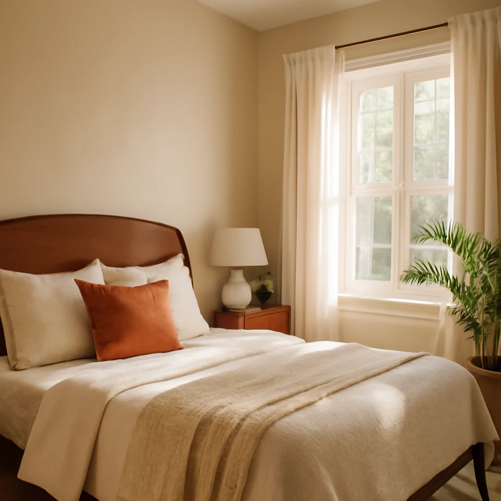
Colour Dreams: How to Paint a Bedroom for Calm, Comfort and Style
The bedroom is a sanctuary, a private retreat where the day’s pressures soften and rest becomes replenishing. Colour is the quiet conductor of this mood, it dictates atmosphere, influences perception of space, and interacts with light to create a personal narrative you want to live in every night. In Europe’s diverse homes - from compact city flats to generous family houses - colour strategy must adapt to daylight, room dimensions, and everyday living. This feature pulls together colour psychology, light management, and practical techniques to help you design a bedroom that feels calm, hospitable, and unmistakably yours.
Today’s paint systems offer a palette that endures, with low-emission finishes that are kinder to indoor air and easier to clean. A velvet-matte finish can cocoon a space in softness without sacrificing durability, while washable solids ensure longevity in busy households. The goal is a wall colour that stands the test of time - subtle, elegant, and flexible enough to evolve with you as tastes change. The following guidance is crafted for European settings, where natural light, materials, and climate interact uniquely with your walls.
Choosing Colour
When selecting the palette for a bedroom, restraint is often the most powerful ally. A well-chosen base colour creates a backdrop that complements soft textiles, natural timber, and the geometry of the room. A broad, dependable group of tones - ivory, white, light grey, beige - forms a universal foundation that remains quietly sophisticated as trends shift. Yet the best spaces rarely stay monochrome, they gain depth through carefully chosen accents and textures.
In practice, many designers favour a single dominant colour on the walls with one or two supplementary shades for trim, furniture, or a feature wall. This restrained approach helps keep the room peaceful while allowing a generous palette of textiles and accessories to express personality. For a European bedroom, consider the following base options:
- Soft ivory or warm white: timeless, luminous, and easy to pair with timber finishes and natural textures.
- Champagne or warm beige: a touch more depth while retaining airiness.
- Light greys: contemporary, versatile, and excellent at showcasing colour in textiles.
Beyond the neutral foundation, introduce colour through subtle accents. A delicate blush, a sage green, a powdery blue, or a muted taupe can add warmth or coolness without overwhelming the senses. It is wise to limit bold colours to one focal wall or to textile-led displays so the room remains restful. If the goal is a serene, sleep-supportive environment, prioritise cool greens and blues or muted earth tones. For a more intimate or energised mood, lighter yellows or soft pinks can provide a gentle lift without aggression.
Color psychology matters in the bedroom. While white and neutrals may feel safe, they can, if overdone, feel clinical or sterile. The trick is to weave colour that relaxes the mind. Green is widely recognised as restorative, promoting serenity and reducing fatigue. Blues, especially softer mid-tones, evoke calm and quiet, while warm neutrals create a sense of shelter and comfort. Red or saturated oranges are generally avoided in large quantities, as they can quicken heart rate and disrupt repose. If you crave a lively accent, apply it in small doses - on a headboard, a pair of cushions, or a slim feature panel - rather than in broad wall coverage.
In practice, you might opt for a light ivory base and introduce colour through textiles and soft furnishings. If you prefer more character, a very pale grey-blue or a warm greige can act as a versatile canvas for the room, while a muted green or dusty rose serves as a restorative focal point without dominating the space.
Colour and Light
Light is the primary sculptor of colour perception. The way a shade reads on a wall changes throughout the day, with daylight and artificial lighting shaping its depth and warmth. Understanding light direction helps you select a hue that remains balanced in the room’s natural and artificial environments.
To appreciate how a colour will behave, start with the colour wheel and consider the room’s light conditions. In European homes, daylight quality varies with latitude but also with window orientation and glass performance. A well-lit northern aspect tends to be cooler and less intense, a southern exposure brings stronger warmth and brightness. East-facing rooms catch morning light, which is lively and warm, while west-facing rooms feel the afternoon and evening sun, which can be amber and golden.
- North-facing rooms often benefit from slightly warmer, lighter tones to compensate for limited natural light. Think soft creams, warm beiges, or a pale, sun-kissed yellow that reflects available daylight without overpowering it.
- South-facing rooms can handle cooler neutrals or slightly cooler blues and greens, which counterbalance bright daylight and prevent the space from feeling washed out.
- East-facing rooms welcome gentle pinks, peachy creams, or light, airy blues that mirror morning light and keep mornings serene.
- West-facing rooms may benefit from cooler undertones or taming hues to temper late-day glare and preserve evening calm.
Artificial lighting also shapes colour perception. Warm lighting - a common combination of ambient ceiling lights with warm-toned bulbs - softens hues and makes spaces feel cosy. Cooler lighting tends to intensify blues and greys, giving a more contemporary, crisp impression. When selecting wall colours, test swatches under both natural daylight and the room’s primary artificial light. A practical test method is to apply several small swatches on different walls and observe them at different times of day and across varied lighting scenarios. If possible, bring small colour samples home to see how they interact with your furniture, textiles, and floor finishes in your actual space.
Swatch testing is an essential stage for European interiors, where homes often blend traditional materials with modern finishes. By comparing the same colour in multiple lighting conditions, you reduce the risk of ending up with a tone that feels right in the shop but mismatches your daily life at home.
Optical Effects of Colour
Colour does more than simply decorate walls, it can visually alter the size and scale of a room. The following practical rules help you manage space perception with intelligence and taste:
- Cool, light shades visually expand small rooms and create an airy feel. They reflect more light and minimise the sense of confinement.
- Warm, saturated colours can make large rooms feel more intimate and human-scale, especially when applied to one wall or used in textiles and furnishings.
- Accent walls can correct proportions. A bright colour on a short wall or behind a bed can define the focal point and balance the room’s silhouette.
- Long walls benefit from deeper tones on the far edges to create a sense of depth and enclosure without shrinking the space.
- Matte finishes soften the room and mask wall irregularities, enhancing a sense of calm, gloss or satin raises reflectivity and visually enlarges the space, but can reveal wall imperfections.
Ultimately, the right balance of colour and finishes creates a room that feels larger, brighter, and more inviting - without compromising comfort or practicality.
Preparing for Painting
Surface preparation is the foundation of a lasting paint finish. European homes feature a range of wall substrates - plaster, plasterboard, masonry, or stone - with differing levels of porosity and dust. Regardless of substrate, thorough preparation yields a smoother, longer-lasting result.
Begin with a clear plan and a clean environment. Remove furniture or place it on protective sheeting. Cover the floor with rosin paper or drop cloths and seal off adjacent rooms if possible to minimise dust transfer. Inspect walls for cracks, dents, and holes, and fill them with appropriate filler. Allow filler to dry completely, then sand flush with the wall surface. Sanding is essential to create a receptive base for primer. Wipe away dust with a damp cloth and let the surface dry thoroughly before priming.
Priming improves adhesion, halts staining, and even-s out porosity. Use a high-quality universal primer suitable for the wall material and the chosen topcoat. For walls with previous heavy colour or stains, a stain-blocking primer can prevent bleed-through and ensure uniform colour rendering.
For rooms with high humidity or kitchens and bathrooms, select a primer and topcoat designed for moisture resistance and washability. In most bedrooms, a standard interior matt or satin finish with low-VOC properties is suitable for healthy, comfortable living spaces.
Tools and technique matter as much as the paint itself. A 4–5 cm angled brush is ideal for cutting in near ceilings and mouldings, a medium-nap roller (10–12 mm) covers larger areas efficiently. A roller frame with smooth rotation reduces roller marks, while a quality edge-trimmer helps achieve crisp lines where walls meet ceilings or floors. For a flawless finish, work in operator-friendly sections, never attempting to paint an entire wall in one go.
Cross-rolling, a technique where you apply the paint in two directions (horizontal and then vertical), creates a uniform layer that minimises roller marks and ensures a seamless surface. Start by painting trims and ceiling edges with a brush, then switch to a roller for the main walls, maintaining a steady pace and light, even pressure. Allow adequate drying time between coats, typically 4–6 hours under normal European indoor conditions, and longer in cooler, damper climates. Do not rush the process, patience is essential to prevent lap marks and uneven coverage.
Choosing and Applying Colour
Once the primer is dry, it is time to apply the chosen topcoat. Consider a two-coat strategy for most areas, particularly when moving from a pale base to a more saturated colour. The base coat should be uniform and free of glossy patches, which can telegraph through the final finish. When selecting a finish, matt or velvet-mitre finishes offer a refined look with excellent light diffusion, while satin or eggshell finishes provide a subtle sheen and easier wipe-clean properties. In bedrooms, a velvety matt finish is often preferred for its tactile softness and quiet aesthetic, pairing beautifully with natural textiles and soft furnishings. For rooms with higher usage or little ones, a washable matt or an acrylic-based interior emulsion provides stain resistance and durability without a heavy gloss.
To achieve crisp colour boundaries when using more than one hue, apply painter’s masking tape along the edge lines before painting the adjacent surface. Press the tape firmly to prevent paint bleed, and remove it while the paint is still slightly damp to yield clean lines. If any small imperfections occur at the boundary, touch up with a fine brush once the paint has regained some rigidity.
When applying colour on large surfaces, avoid applying too thick a coat with one pass. Instead, work in multiple thin layers. Thin coats dry more evenly, reduce the risk of roller marks, and improve the final appearance. If you need to alter the colour intensity, a third, very light coat can help refine the result without compromising the finish.
Testing and Finishes
Test pots are an invaluable tool. Apply several swatches to the wall and let them dry in place to observe how they perform under varying light conditions. A practical approach is to label each swatch with the time of day and lighting scenario, then compare the hues side by side as the light shifts. The goal is to find a tone that remains harmonious throughout day and night, while still allowing the room’s textiles to come forward rather than compete with the walls.
In a European context, many design professionals favour low-VOC and hypoallergenic products for bedrooms, prioritising indoor air quality and comfort. Look for paints with minimal odour and strong washability, so your walls stay fresh through seasons of living - without requiring prolonged drying times that disrupt daily life. A good choice balances aesthetics with practical performance: a finish that looks refined, cleans well, and resists wear from routine use while still feeling soft to the touch on close inspection.
Expert Commentary
Choosing a colour for a bedroom should be as much about emotional response as technical performance. A space that feels right is rarely the result of pure rationality alone, it reflects personal comfort and daily rituals. In a bedroom, I advise selecting one primary tone and using one or two subtle family colours for textiles or small furnishings. The objective is quiet harmony, with the option to refresh through textiles rather than repaint. If your aim is sleep and reprieve, lean towards greens, blues, browns, beiges, and sandy tones. If work or contemplation occupies the room, consider energising hues like gentle yellows, oranges, or red accents - carefully balanced and limited to accent zones.
In practice, a recently completed project demonstrates how a restrained palette, paired with tactile textures, can create an interior with personality and enduring appeal. Softer blues harmonise with warm browns and soft greys, while a carefully chosen decorative panel and hand-finished textiles extend the theme without overwhelming the senses. The interplay of shape - clean architectural lines with rounded, comfortable furniture - adds depth and sophistication to the space, making colour feel intentional rather than decorative.
Practical Plan: Bringing It All Together
- Define the mood and set a base palette. Choose a dominant neutral and one or two accent colours drawn from textiles and soft furnishings.
- Assess light throughout the day and choose hues that read well in natural, task, and ambient lighting. Test swatches in the room under all lighting conditions.
- Prepare meticulously: repair, sand, prime, and protect surrounding surfaces. Invest time in a smooth substrate, it pays back in a flawless finish.
- Plan the project: schedule painting across a dry spell, gather tools, and mask edges. Work room by room to avoid disruption.
- Apply with care: use a cross-rolling technique for even coverage, apply in thin layers, and trim edges with a brush. Keep the space well ventilated during and after painting.
- Finish and sample: allow full curing, then evaluate in different lights. If necessary, touch up or re-coat to perfect the result.
Following a disciplined process yields a bedroom that is not only beautiful but also functional, ready to nurture restful sleep and daytime relaxation alike. The result should feel cohesive with the architectural language of the home - whether it’s a modern apartment with exposed timber or a classic European villa with refined mouldings.
Maintenance and Longevity
To preserve the integrity of the finish, regular cleaning with a soft cloth or a gentle vacuum removes dust that can cling to wall textures. Avoid harsh abrasives or solvent-based cleaners that could erode the surface over time. Should marks appear, address them promptly using a soft sponge with a mild cleaner, then touch up with matching paint. In rooms with high wear, such as a child’s room or a high-traffic corridor adjacent to the bedroom, choose washable emulsions that resist stains and retain their colour depth after repeated cleaning. Regular refreshes - often achieved by rotating textiles or changing a few cushions - can keep the space feeling current without the need for frequent repainting.
Finally, coordinate with other materials in the room. The wall colour should harmonise with flooring, wood furniture, textiles, and window treatments. Natural materials - timber, wool, linen, stone - toster a soft, tactile counterpoint to the walls and prevent the palette from appearing surgical or clinical. When the wall finishes are calm and refined, your textiles and lighting can do the talking, enabling a layered, well-rounded space that remains restful rather than busy.
Practical Dos and Don’ts
- Do test colour in situ and under all prevailing light conditions before committing to a full wall application.
- Don’t rely on a colour swatch alone, lighting dramatically alters how a shade reads.
- Do choose a finish that balances aesthetics with practical needs - matt or velvet matte for warmth, satin for easier cleaning in higher-traffic rooms.
- Don’t overlook prep work. Skipping sanding or priming creates an uneven surface that undermines the final appearance.
- Do keep a small reserve of the base wall colour for touch-ups and edge-cleaning in future months or seasons.
With thoughtful selection, careful preparation, and patient application, a bedroom can be transformed into a colour story that feels timeless yet intimate. The right tone, finished in the right manner, becomes the backdrop against which your daily life unfolds - peaceful by night, inviting by day.
You may also like these articles
 Tips & How-To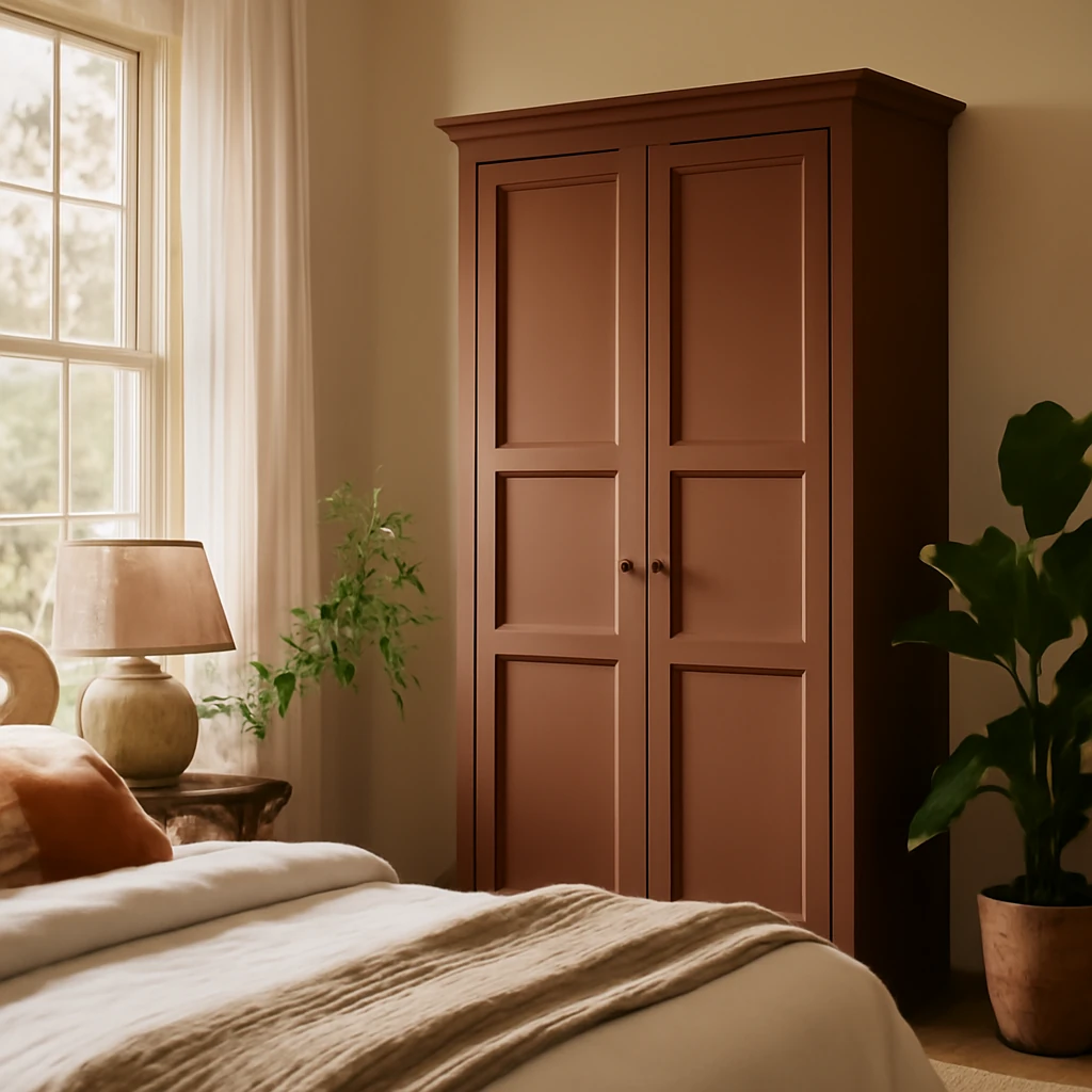
Colourful Wardrobes: A Practical Guide to Painting for Space and Style
Turn a plain wardrobe into a colour feature that enlarges space.
Tips & How-To
European Home Staging: A practical guide to selling or renting faster with style
How staging and pre sale tweaks can accelerate European property sales and lets
Bedroom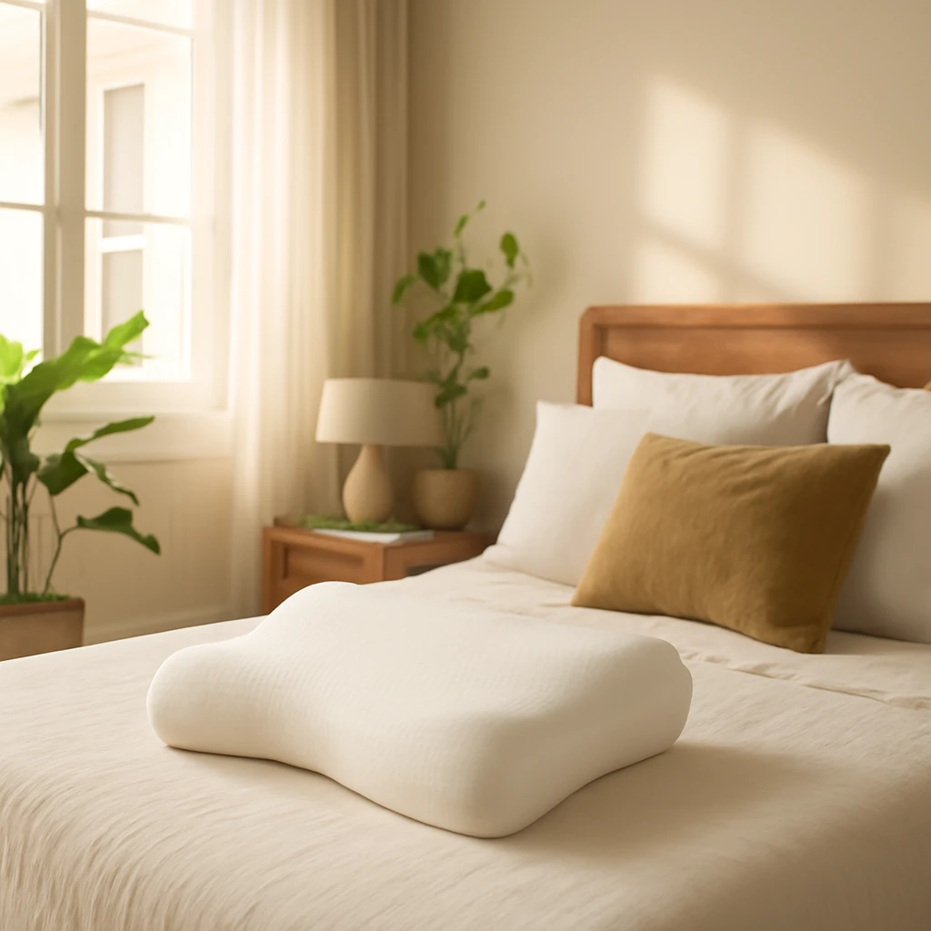
Choosing the Right Orthopaedic Pillow for a Healthier Sleep in Europe
A comprehensive guide to selecting the perfect orthopaedic pillow for European beds.