
Explore interior trends, AI design insights, styling guides and real transformations
Beige as a Foundation: Elegant Pairings for a Calm, Sophisticated Home
Beige as a foundation for European interiors
Beige is more than a colour, it is a design strategy. In contemporary European homes, beige acts as a quiet stage on which textures, natural materials and carefully chosen accents perform. When used thoughtfully, this warm neutral can unite disparate design ideas – from classic panelling to modern minimalism – while creating rooms that feel both intimate and expansive. The aim is not to saturate the space with colour, but to weave a sense of calm, cohesion and subtle luxury through subtle shifts in shade, light, and texture.
In many European cities, from sand-toned apartments in historic townhouses to airy lofts on the edge of the harbour, beige serves as the reliable spine of interiors. It translates well across climates, lighting conditions and architectural styles, providing a versatile backdrop for avant-garde furniture, tactile fabrics, and hand-crafted details. The following sections explore why beige remains popular, how to pair it with other colours and materials, and how to apply it room by room.
Why beige colour remains popular in European interiors
Beige’s enduring appeal rests on several practical and aesthetic traits that resonate across cultures and regions:
- Extensive range: The beige family spans a wide spectrum - from warm, honeyed creams to cooler, sand-based greys - allowing designers to tailor mood precisely for a space.
- Excellent compatibility: Beige harmonises with both warm and cool tones, and with natural materials such as wood, stone, linen and wool, making it a versatile base for any palette.
- Universal adaptability: It works in living rooms, kitchens, bedrooms, and even bathrooms, adapting to different amounts of natural light and architectural constraints.
- Luxurious neutrality: When paired with high-quality textiles and finishes, beige can read as luxe without shouting for attention.
- Spatial perception: Lighter beige tones can visually enlarge a room, particularly when used with strategic lighting and two-tone wall treatments or subtle wall-banding.
Beige’s quiet presence helps to temper strong architectural features or statement furniture, enabling a balanced composition that feels polished rather than fussy. In short, beige can be the unsung hero of a sophisticated interior, blending tradition with contemporary cues.
What colours pair best with beige
Beige derives its magic from how it interacts with other colours and textures. Below are practical, widely applicable pairings, described for European homes with diverse architectural DNA.
Beige and brown: an instinctive duo
Beige and brown sit comfortably on the same family tree. When used together, they create a refined, monochromatic effect that emphasises warmth and depth. Consider using beige walls with brown timber floors or carefully chosen brown upholstery. If contrast is needed, opt for slightly darker or lighter browns for trims or accessories to create a gentle rhythm across surfaces.
Beige and grey (greige): a cool-comfort balance
Greige – the fusion of beige and grey – is a contemporary standard in European homes. It cools the palette just enough to feel crisp without becoming clinical. To keep greige lively, introduce small pops of colour such as mustard, teal or coral in textiles or artwork. The goal is a layered, sophisticated environment where neutral tones let texture and light take the lead.
Beige and blue: calming and uplifting
Beige paired with blue offers a classic, soothing spectrum. A pale beige wall with a soft blue ceiling or accents in denser blues can create a serene retreat. In textiles, consider blue cushions or a navy sofa against warm beige walls to achieve a balanced, timeless look.
Beige and violet or plum: restrained elegance
Beige can soften violet or plum tones, turning bold purples into nocturnal, luxurious hues without overwhelming the senses. Use beige as the dominant field and introduce purple in textiles, drapery, or a single statement piece to avoid visual overload.
Beige and pink (soft or dusty): gentle warmth
Beige and pink is a forgiving pairing that can feel tender and timeless. Dusty rose or blush tones work well as curtains, cushions or a terrazzo countertop edge, while beige keeps the overall palette grounded and sophisticated.
Beige and yellow: sunlit vibrancy in moderation
Beige with warm amber or pale yellow accents can evoke sunlight and warmth without overpowering the space. Use yellow sparingly as a bright accent in a single rug, lamp, or throw to sustain a cheerful, breathable atmosphere.
Beige and green: nature-inspired calm
Combining beige with soft greens, from sage to olive, brings a grounded, organic feel. In Nordic or Mediterranean-inspired schemes, green accents on textiles or a plant-rich vignette can reinforce the sense of connection to the outdoors.
Beige and white: refined contrast
Beige and white remains among the most elegant European combinations. White elevates the lightness of beige, producing a crisp, pristine ambience. Silver or brass metallics, along with natural fabrics, reinforce a sense of quiet luxury.
Beige with metallic accents
Beige pairs beautifully with metals such as brass, brushed nickel or warm bronze. Metallic detailing on lighting, furniture handles, picture rails or mirror frames can elevate beige interiors to a refined, contemporary classic.
Beige with natural materials
Natural materials like linen, wool, cotton, stone and wood add texture and tactile warmth to beige schemes. A beige backdrop invites woven textiles, rattan, cork or terracotta to contribute depth and tactility.
Note on application
In practice, most European projects benefit from a cohesive base of beige on walls or floors, with a curated set of accent colours introduced through textiles, upholstery and decorative objects. The trick is to avoid a flat look: vary tone, texture and scale so that light interacts with surfaces and creates visual interest.
Beige in different design styles
Beige is versatile across styles from classic to contemporary, and across European interior typologies. Here are common pathways for integrating beige into several recognisable aesthetics.
- Classic and traditional: Beige walls with white wainscoting, gold or brass embellishments, and rich textiles like velvet or damask create timeless elegance. Light woods and antique mirrors reinforce the heritage feel.
- Eco and Scandinavian: Luminous beige walls paired with pale wood floors, cotton or linen textiles, and minimal lines define a calm, hygge-friendly space. Plants and natural textures amplify the connection to nature.
- Minimalist and contemporary: Beige serves as a refined neutral backdrop for sculptural furniture, high-contrast accents (black or charcoal) and metallic touches. A restrained palette emphasises form and light over ornament.
- Mid-century and art déco: Beige can harmonise with geometric patterns, luscious velvets, and bold shapes, tempering brighter accents with warm neutrals for a sophisticated, vintage-inspired look.
- Industrial and urban chic: Beiges layered with concrete, black metal, and raw timber create a grounded, pared-back aesthetic. Soft textiles soften the harder surfaces while retaining edge.
- Mediterranean and coastal: Beige walls reflect sunlit tones, complemented by white plaster, terracotta, blue accents and woven textiles to evoke warmth and lightness.
- Ethnic and artisanal styles: Beige acts as a calm canvas for patterned fabrics, hand-crafted ceramics and natural materials to shine without competing with bolder motifs.
In each case, beige is not a constraint but a flexible base that supports room character, light management, and the narrative of the space. The key is to define a couple of core neutrals and then layer with texture, scale, and light to avoid monotony.
How to use beige effectively in your interior
Practical strategies make beige work in real homes. The following guidelines help ensure the palette remains balanced, timeless and highly liveable.
- Define the base with precision: Choose a main beige shade for walls or larger surfaces. This establishes the mood. A slightly warm tone invites softness, a cooler beige reads more contemporary. Consider a second shade for ceilings or architectural features to create subtle depth.
- Texture is everything: Introduce contrasts through textiles - coarse woven fabrics, satins, velvets, and raw linen. Texture adds dimension and prevents the colour from feeling flat.
- Layer with natural materials: Wood, stone, cork, and natural fibres enrich beige palettes. The grain and warmth of these materials amplify the tactile quality of the space.
- Use lighting to sculpt tone: Windows, ambient, task and accent lighting should work in concert to reveal the warmth of beige. Dimmer settings can soften the mood in living rooms and bedrooms, while brighter light can highlight architectural details.
- Introduce colour sparingly through textiles and accessories: A few carefully chosen cushions, a rug, or a throw in a complementary hue can energise a beige room without overpowering it.
- Balance warmth with cool accents: To prevent the palette from becoming too warm, incorporate cool neutrals or steel elements in fixtures, artwork frames, or cabinetry hardware.
- Think in terms of scale and repetition: Repeat a colour cue across rooms or surfaces to create continuity, especially in open-plan spaces or multi-room apartments.
- Prioritise quality over quantity: In beige-based schemes, refined materials and tailored workmanship matter more than the number of items on display. A few well-chosen pieces will read as sophisticated and timeless.
Beige thrives on restraint and intent. It rewards thoughtful lighting, material choice and proportion. When used with care, beige becomes a stabilising force that allows personality, art and furniture to shine.
Beige in different rooms: practical guidance
Beige can be deployed across rooms with nuanced differences to suit purpose and activity. Here are practical recommendations for common European living spaces.
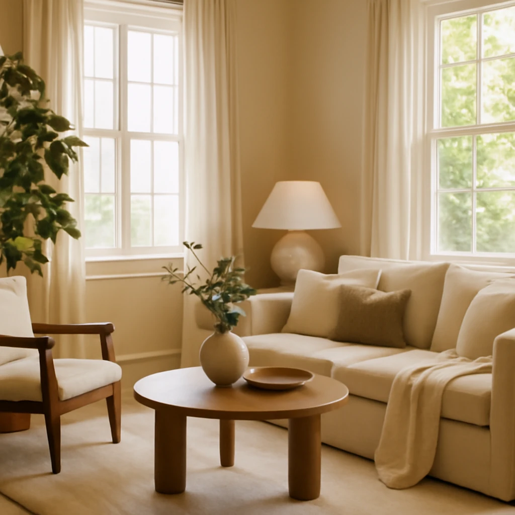
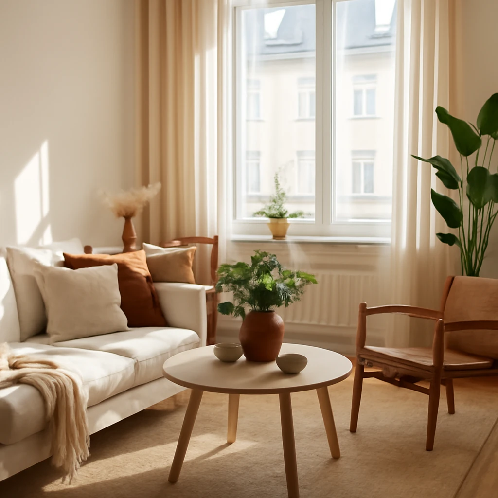
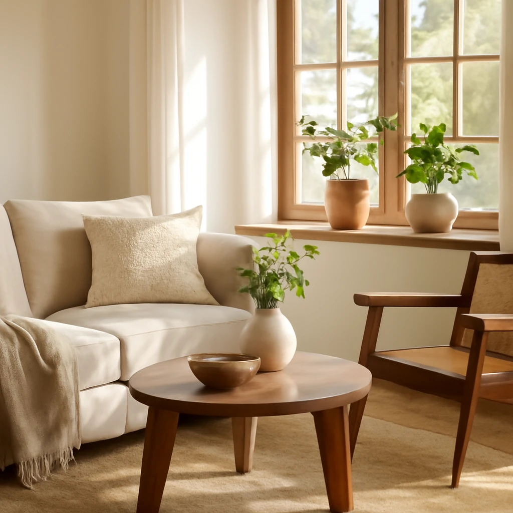
Living room: Keep wall colour to a soft beige and specify one or two bold colours in textiles or a rug. If the space lacks natural light, pair beige with lighter woods and a white or pale blue ceiling to maximise brightness. Add a statement sofa in a deeper beige or charcoal for contrast, and layer with cushions in warm ochre, taupe or muted teal to create depth.
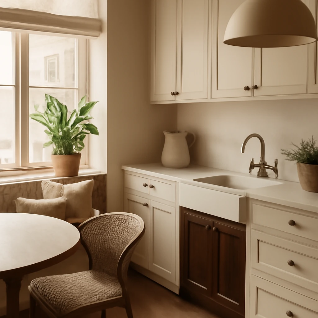
Kitchen: Beiges in kitchens convey cleanliness, warmth and calm. Combine with white cabinetry and dark countertops for a contemporary edge. Introduce brass or brushed nickel hardware and warm-toned lighting. A beige island with a contrasting worktop can anchor the space while keeping the atmosphere soft and inviting.
Bedroom: Beige walls can serve as a soothing canvas for sleep. Use a slightly deeper beige on walls behind the bed and keep bedding in white or ivory with textured throws for interest. For a touch of luxury, select natural textiles such as linen and wool in neutral tones or gentle hints of soft pink, sage or powder blue.
Dining room: Beige walls with wood furniture convey warmth. Introduce a rug with a tactile weave and subtle pattern in neutral tones, and select dining chairs in a slightly darker or lighter shade of beige to define the seating area without breaking the harmony.
Home office: A serene beige environment supports concentration. Pair with a cool-toned desk surface or chair upholstery and ensure sufficient lighting. Consider a single accent colour on storage fronts or a wall-mounted shelf to prevent the space from feeling monochrome.
Bathroom: Beige ceramics and tiles can radiate spa-like calm, especially when combined with natural stone finishes and soft lighting. Use white sanitaryware for brightness and add warmth with timber accents or woven textures in towels and accessories.
Beige: advantages and potential drawbacks
Beige offers numerous benefits for European interiors, but practical considerations help avoid missteps. Here are the main points to weigh up.
- Benefits: Wide shade range, easy to mix with many colours and materials, enlarges spaces visually, versatile across styles from classic to contemporary, creates a serene backdrop for artwork and furniture.
- Potential drawbacks: In poorly lit rooms, beige can appear flat or dull if not layered with texture and light. In homes with pets, ensuring durable, stain-resistant textiles and easy-care finishes is important. Carefully plan ventilation and moisture management in bathrooms to prevent discolouration or mould on lighter beige surfaces.
With mindful material choices and a curated mix of textures, beige remains a forgiving and enduring choice. Its adaptability is a powerful asset for designers working within budget constraints or aiming to future-proof interiors against shifting trends.
Practical design ideas and a framework for beige-led spaces
To help you translate these principles into real spaces, here is a practical framework you can apply to any European home.
- Create a beige backbone: Select a primary beige shade for walls or major surfaces. Use a second shade for trim, ceilings or a focal feature such as a built-in cabinet or paneling to add depth without introducing loud colour.
Integrate a mix of fabrics (linen, wool, velvet), floor coverings (natural fibre rug, woolen runner), and surface finishes (matte plaster, polished stone) to keep the palette lively. Choose a dominant seating colour in beige or taupe, with accent pieces in richer hues or contrasting textures to define zones within an open-plan plan. Layer general ambient lighting with task and accent lighting to sculpt the beige tones as daylight shifts. Consider warm white bulbs to preserve the warmth of the palette after sunset. In small spaces, larger beige surfaces can feel expansive, in larger rooms, introduce furniture with strong silhouette and tactile surfaces to avoid emptiness. In European homes with balconies or terraces, beige interiors can be extended by bringing the outdoor palette inside - soft greens, terracotta and stone hues echo natural landscapes.
Beige and sustainability
Today’s European design philosophy increasingly intersects aesthetics with sustainability. Beige-friendly strategies align with this approach when they prioritise natural, responsibly sourced materials and durable finishes. For example, choosing untreated or responsibly produced timber, natural stone, and high-quality textiles that age well reduces waste and supports long-term stewardship of resources. A beige-based aesthetic often benefits from minimal, well-made pieces that endure beyond fleeting trends, supporting a more sustainable home environment.
Conclusion: beige as a design philosophy
Beige has earned its place as a cornerstone of modern European interiors because it combines warmth, versatility and elegance. Far from being a bland background, beige offers a rich vocabulary of shades, textures and applications that invite careful curation. When used with intention, beige creates interiors that feel calm, refined and timeless, capable of evolving with the inhabitants’ needs and tastes. Whether you are renovating a grand city flat, a sunlit coastal villa, or a compact apartment, beige provides a dependable canvas on which to build a residential story that is quiet, sophisticated and distinctly European.
You may also like these articles
Zoning Made Simple: Flexible Layouts for European Apartments
Create flexible zones in compact European homes with style and smart storage.
Designing a European Kitchen: Colour, Layout and Finishes
A contemporary guide to European kitchen design from palettes to layouts and finishes.
Timber-Woven Homes: A European Guide to Interiors in Wood
A European guide to timber-home interiors that blend warmth, light and sustainable design.