
Explore interior trends, AI design insights, styling guides and real transformations
Beige as a Foundation: Subtle, Versatile Colour for European Homes
Beige as a foundation for contemporary European interiors
Beige is a universal colour for modern interiors. In combination with other tones it can feel refined, cool or vibrant. This article explores beige in European contexts and how to pair and implement it across rooms and styles, using materials and finishes suited to continental homes.
Why beige remains popular
As a member of the neutral family, beige works in spaces of any size and for any function. It serves as a dependable base that can be adapted with textiles and accessories, avoiding the need for a full renovation to refresh the look.
All shades in this palette sit within the neutral spectrum and are easily paired with a wide range of colours and surfaces. Beige acts as a stabilising backdrop for natural materials such as timber, stone, ceramic and linen.
Colour psychology
Beige variants such as sand, cream, ivory and warm whites evoke warmth, calm and safety. They are easy on the eye and establish a soothing atmosphere. A neutral backdrop supports rest after a busy day and can help reduce stress. Psychologists often recommend such finishes for homes prioritising harmony and stability.
Pros and cons
Here are the main considerations when choosing beige for a project.
Benefits
- Beige is versatile across spaces and styles from classical to contemporary.
- Lighter beige hues visually enlarge a room while maintaining cosy warmth.
- A neutral base makes mood shifts easy via textiles and accessories, you do not need major renovations to change the mood.
- Neutral surroundings are comfortable and timeless, reducing the risk of rapid fashion fatigue.
- Quality materials help ensure longevity, as beige remains current for many years.
Be cautious that a beige scheme can become predictable if variation is too limited. A thoughtful mix of textures and finishes is essential to maintain interest.
Drawbacks
Beige is sensitive to lighting. Very warm light can tilt the colour toward yellow, while cool light may push it toward grey. In neutral schemes, absence of texture can feel flat, it is important to introduce a deliberate variety of surfaces and accents.
How to keep beige from feeling dull
To avoid monotony, apply a few practical rules that work well in European homes.
- Use a palette of five to nine beige tones. They interrelate harmoniously and offer depth.
- Introduce varied textures - bouclé, linen, wool, timber, rattan - to add tactility and shadow.
- Mix matte and glossy surfaces to introduce light and visual interest to a monochrome base.
- Choose a single contrasting colour for emphasis, such as deep brown, black, navy, burgundy or marsala, to prevent colour fatigue.
- Plan lighting with multiple layers so the room can adapt to different moods and tasks.
When combining beige with other tones, avoid mixing warm and cool shades too freely. Aim for a temperature-consistent palette or include a deliberate contrast to create rhythm.
Beige pairings: with other colours
Below are the most popular pairing ideas that work in European homes.
With blue and pale blue
Blue tones neutralise warmth, refresh the space and soften the brightness. On a beige backdrop, blue appears richer and more expressive, curtains, cushions and upholstery in blue hues can anchor the room without overpowering it.
- Beige with a navy or powder-blue accent for living rooms.
- Vary textures with cotton, wool and velvet to keep depth.
With yellow
Yellow alongside beige brings warmth and sunlit energy, even on cloudy days. Use it sparingly, or in small doses with muted yellows to avoid overpowering the quiet beige.
- Soft mustard or saffron accents in textiles or accessories work well.
- A cautious approach ensures the space remains refined rather than exuberant.
With black and white
Monochrome palettes shift the focus to beige, which carries a subtle red and yellow undertone. White keeps things clean, crisp and elegant, often used in premium hotel styling with luxurious textures and metallic highlights. Black accents introduce depth and perspective, but should be limited to avoid a heavy feel.
For a bold emphasis, a single black piece can anchor the room while white remains the dominant backdrop.
With coral
Coral introduces warmth without the intensity of red, creating a cosy, slightly bohemian atmosphere. Beige loves coral accents as they soften brightness and add personality without clashing.
- Coral throw, cushions or a lamp can add character to a neutral space.
With grey
A greige blend - a mix of grey and beige - reads calm and sophisticated, lending a sense of airiness to the space. It is particularly well suited to smaller rooms that should feel more open, such combinations benefit from high-contrast details, like black or brown elements.
With brown
Light browns create a delicate, translucent ambience, while darker browns convey depth and drama. Using a few additional tones from the brown spectrum, from soft milk-chocolate to rich cocoa, helps create a layered, serene space that remains contemporary.
With violet
Violet introduces depth and mystery, while beige keeps the look grounded and comfortable. The combination yields a sophisticated, expressive contrast that suits modern and eclectic interiors.
With pink
In bedrooms and relaxation zones, beige with soft pinks conveys calm and freshness, without feeling childish or sugary. It adds lightness and serenity to the space.
Beige across interior styles
Beige is a universal tone found across historical and contemporary styles. Here are the main applications.
Classical and Neoclassical
Beige in classical interiors evokes elegance and refinement, with white plasterwork, ornate mirrors and fabrics in soft blues. A neoclassical approach adds black or chocolate accents and decor in matte gold or silver.
Country
Country interiors lean on light timber, linen textures and natural materials. Beige dominates, while woven textures and ceramics add warmth and character. Painted timber or beam details in beige or white provide a rustic yet polished finish.
Provencal
Beige serves as a perfect backdrop for Provencal style: white-washed walls, stone floors, and cottage textures. Wrought-iron lamps and pale linen fabrics pair beautifully with beige, complemented by floral patterns in soft pastels.
Minimalism
In minimalist spaces, beige reads as a calm, restrained background. A chocolate feature wall or mirrored panels can create contrast, while warm LED lighting softens the overall coolness of metal and glass surfaces.
Scandinavian
Beige and white form the core of Scandinavian aesthetics, where light timber, wool and linen textures reinforce a warm, clean look. Subtle black accents, like track lighting or furniture legs, add definition without dominating the space.
Eco style
In eco or sustainable designs, beige acts as a neutral root for natural materials: pale wood, clay plaster and natural textiles. Flooring in timber, creamy walls, and linen curtains contribute to an honest, tactile environment.
Loft
Beige in loft interiors can read warm and contemporary when paired with matte concrete, light timber and statement metal accents. White or pale beige surfaces balance the industrial textures, keeping the space inviting rather than cold.
Examples for different rooms
Beige works across spaces intended for living, cooking and wellbeing, here are practical guidelines for various rooms in European homes.
Kitchen - practical and forgiving
A beige kitchen feels bright, generous and surprisingly practical. Use a light base with durable surfaces, add a pop of colour through textiles or small appliances. Dark timber floors or cabinet fronts can bring warmth and industry to the area.
- Integrate a limited palette of accent colours such as deep reds or burgundy in textiles and hardware.
- Consider timber tones for flooring or island units to add contrast and texture.
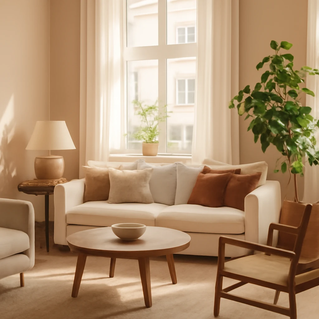
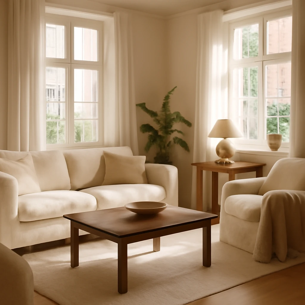
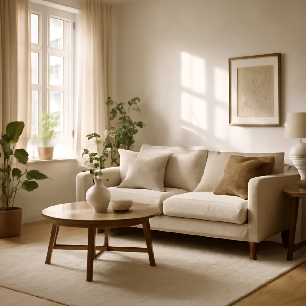
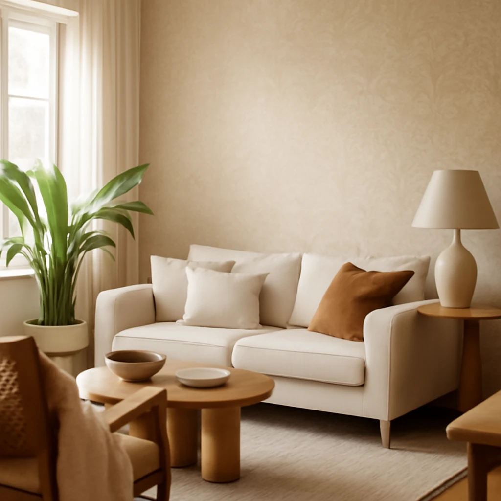
Living room - cosy and refined
The living room lends itself to a restrained nine‑tone palette, beige can form the canvas while textiles and art provide personality. A controlled approach with a few bold colours can elevate the space without overpowering it.
- Use varied textures: bouclé, wool, velvet, wicker, mix matte and sheen surfaces.
- Introduce one or two darker tones such as navy or espresso for depth.
Bedroom - cool and restful
Beige paired with soft blues or greens can create a calm, airy atmosphere conducive to sleep. Choose textiles with gentle patterns and natural fibres for comfort and warmth.
- Layer with breathable duvets and linens, warm lighting and soft throw blankets.
Bathroom - tranquil and versatile
Neutral beige bathrooms read as elegant and timeless. Opt for porcelain or ceramic tiles in warm ivory, cappuccino or latte shades. If sanitaryware is dark, pair with creamy tiles, if white, choose deeper beige hues to maintain warmth.
- Keep fittings simple and refined, with matte brass or brushed nickel accents.
Hallway and corridor - bright and welcoming
Beige in hallways invites guests with a gentle, light-forward approach. Accent with bold hardware or artwork, and consider timber or stone flooring to enhance perceived space.
- In long corridors, repeating textures help maintain interest.
Balcony and terrace - natural extension
Outdoors, beige can harmonise with natural materials such as timber decking, stone pavers and linen textiles. Introduce potted greenery and natural fibres to create a calm, cohesive extension of the interior.
- Weathered timber, soft stone tones and light canvas textiles pair well with warm, breathable furnishings.
Key takeaways
- Beige is a universal base that suits most styles and functions.
- A multi-textured beige palette remains engaging when different materials are used.
- Pair beige with carefully selected colours to calibrate warmth and mood.
FAQ
What colours best accompany light beige walls?
Natural materials such as timber, ceramic, leather and woven textiles pair beautifully with light beige. To add visual interest, introduce contrasting details in metallic tones such as copper, black or brushed gold to create rhythm and focal points.
Is beige suitable for technology‑driven homes?
Beige works well in high‑tech or minimalist spaces, providing a warm base that softens glass, steel and concrete. Use sophisticated, muted beige tones and purposeful décor to balance the coolness of tech materials.
Can beige work with geometric prints?
Yes, beige provides a calm backdrop that allows bold prints to pop without overwhelming the space. Use one or two accent colours and repeat them in textiles, cushions or artwork to maintain cohesion.
Inspiration and resources
When choosing beige, focus on texture, lighting and durable materials. Work with qualified interior designers and fabricators to select textiles and finishes suited to climate and maintenance requirements in your region.
You may also like these articles
Soft White, Quiet Glow: How Light Tones Shape European Homes
Pale palettes that expand spaces and refine European interiors.
How to size a sofa for a European living room: comfort, fit and function
Master the art of sofa sizing for stylish, well-proportioned living spaces.
Wallpapers for the Living Room in 2025: Nine Trends, Materials and Practical Ideas
Nine wallpaper trends shaping European living rooms in 2025