
Explore interior trends, AI design insights, styling guides and real transformations
Soft White, Quiet Glow: How Light Tones Shape European Homes
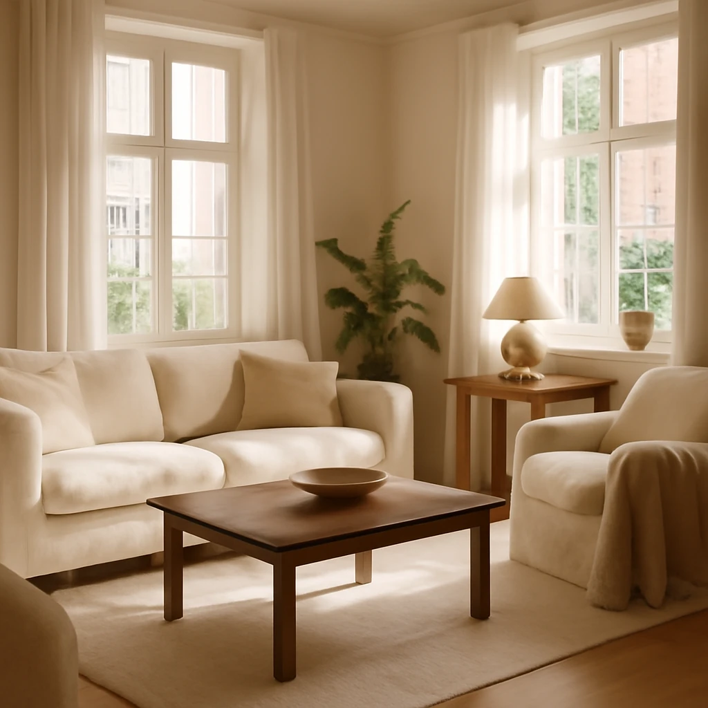
Light Tones for European Interiors
Bleached and bleached-out shades have become a defining move in contemporary European design. Light tones bring a sense of air, elegance and cosiness, proving equally suited to compact city flats and generous family apartments. They offer a versatile backdrop that supports a wide spectrum of styles - from refined classical to pared-back modernism - while emphasising natural light and architectural details. This article examines how pale palettes can transform space, mood and functionality in homes across Europe, with practical guidance on materials, textures and finishing choices that stay relevant for years to come.
Pros and Cons of Light Finishes
Choosing light finishes is as much about philosophy as about colour. Here are the core advantages and the few pitfalls to anticipate, with strategies to make light finishes perform brilliantly in everyday living.
- Visual space and buoyancy. Lighter colours tend to “read” as more expansive, particularly in rooms with limited square footage. They reflect daylight, reduce the visual weight of furniture, and help a room feel more open, even when the floor area is modest.
- Celebratory and timeless mood. Pale palettes can feel celebratory and refined without being fussy. When paired with the right textures and materials, light interiors convey luxury and comfort that remains current across seasons and trends.
- Stylistic universality. A light-coloured backdrop is highly adaptable, supporting a wide range of aesthetics - from neoclassical and traditional to contemporary minimalism and high-tech schemes.
- Extensive material and textile options. The spectrum of light finishes spans timber, stone, ceramic, textiles and paints, providing abundant opportunities to craft depth through tactility and weave rather than colour alone.
- Timeless appeal. Light tones endure beyond fashion, offering a resilient foundation that can be refreshed with accents and textures to stay contemporary for five to seven years or more.
Of course, there is a practical trade-off. The principal drawback of light finishes is their tendency to show dirt and wear more readily than darker tones. This can be mitigated by choosing textiles and coatings that resist staining and water, and by planning for easier cleaning regimes. Flexible materials - such as washable paints, stain-resistant upholstery and textured wallpapers - support easier upkeep without compromising the look.
Light Tones Across European Interiors
A wide palette of light hues offers endless composition options. The following sections present common temperaments and how they can shape living, cooking and sleeping spaces across European homes.
Blue - cooling and crisp
Soft blues introduce a refreshing, spring-like atmosphere. They pair naturally with pastels and white, and are particularly suitable for rooms that receive abundant natural light from south-facing windows. In modern city apartments, cool blues can soften the rigidity of architectural lines while maintaining a clean, contemporary edge.
- Use blue as an overall backdrop in living rooms or kitchens with high daylight exposure, allowing white trims and light timber to speak softly against the tint.
- Balance with textures such as linen, wool and subtly textured wallpapers to prevent the palette from feeling clinical.
Pearl - relaxing and refined
Pearl and pearl-white combinations exude an effortless, aristocratic calm. This palette sits well in both classical and neoclassical schemes, and can be enriched with warm metallic accents and reflective surfaces to enhance savoury light without overpowering the space.
In practical terms, pearl works beautifully for living rooms, bedrooms and corridors where you want a serenity that still carries presence. Use soft velvets, satin sheers and warm woods to stop the space becoming clinical.
Yellow - warming and energetic
Soft yellows add a gentle lift to pale interiors, acting as a natural brightness booster. Designers favour a restrained approach - up to five shades within a single project - to avoid clashing warm and cool tones. A lively yellow can act as an energising accent, drawing attention to a specific feature without dominating the room.
When used in living spaces or kitchens, yellow can harmonise with pale neutrals and light timber, creating a welcoming, sunlit vibe even in rooms with limited direct sun.
White - airy and flexible
White is the ultimate neutral. In its many forms - from pure, cool whites to warmer warm whites - it acts as a versatile canvas, pairing well with both dark and bright accents. In traditional settings it can heighten formality and elegance, in contemporary layouts it supports an ultra-clean, luminous feel.
White interiors frequently rely on contrast or texture rather than bold colour to keep spaces lively. High ceilings and large windows benefit most from white palettes, as natural light is amplified and architectural features can take centre stage.
Beige - cosy and inclusive
Beige is a favourite for those aiming to evoke warmth without overpowering space. Across Europe, a well-considered beige scheme often leans on a sandy base and can incorporate up to seven tones to create subtle depth. Beige works across living rooms, bedrooms and entryways, especially when paired with textures such as woven fabrics, brushed wood and stone.
- Beige palettes are particularly effective in open-plan living zones where the seamless flow of colour supports coherent zoning and furniture placement.
- When used at scale, bring in cooler whites or greys in upholstery or rugs to prevent the space from feeling monotonous.
Mocha - organic and earthy
The Mocha family, including soft coffee-brown hues, remains popular for those seeking warmth with a touch of earthiness. These tones perform well in both classic and contemporary contexts and integrate easily with copper, brass and natural wood finishes. Mocha works across living rooms, dining areas and bedrooms, creating a harmonious, inviting atmosphere.
Pair mocha with pale stone or ivory and a touch of greenery to maintain a light, breathable feel while preserving depth and character.
Grey - versatile and urban
Grey is the universal backdrop for urban living. It suits urban apartments, neo-classical reinterpretations, art-deco influences and minimalism alike. A mid-tone grey can anchor a room, while lighter greys invite daylight and soften architectural forms. When used as a primary palette, grey is best balanced with metallics, glass, or wood textures to prevent the space from feeling flat.
- In living rooms and bedrooms, a grey scale can be punctuated with black, white or metallic accents to create sophisticated contrast.
- Grey is particularly effective in spaces with abundant glass and steel elements, where it acts as a calm, stabilising background.
Green - calming and restorative
Soft greens - think pale turquoise, mint and pistachio - are ideal for creating a tranquil backdrop. These hues blend well with creams and off-whites, and are easy to layer with natural textures such as linen, wool and cork. Deeper greens can be employed in detail or accents to bring vitality to a pale scheme without overwhelming the room.
Cream - neutral and versatile
Cream tones function as a universal base for classic and neoclassical schemes while also supporting contemporary aesthetics. They pair beautifully with blues, chocolates and burgundies, and provide a gentle warmth that is less clinical than pure white.
- In kitchens and living areas, cream walls serve as a dependable stage for furniture and textiles in blue, charcoal or caramel hues.
- Mix several cream shades to achieve subtle depth without introducing a disruptive contrast.
Finishes for Light-Lined Flats
Manufacturers provide a broad spectrum of products in pastel, grey and beige, simplifying the search for suitable solutions. The following finishes are widely used across European apartments to create a refined, cohesive look.
Walls - textured and tactile
Popular wall finishes include a spectrum of options designed to add tactile interest and light-reflective qualities:
- Mineral or acrylic decorative plaster with a subtle sparkle or pearl-like glow.
- Acrylic or water-based paints in a broad range of light tones.
- Paper, vinyl, fabric, or reed wallpapers - solid, striped, geometric, abstract or florals.
- Frescoes or large-format murals on feature walls, niches or partitions to create mood and perspective.
- PVC or wood panels - smooth, textured, carved or perforated, used as decorative wall accents or panels.
- Tiled surfaces - ceramic, porcelain, marble, or mosaic to add shimmer and durability.
- Decorative brick or stone veneers for a soft industrial or rustic touch.
Floors - durable and beautiful
Light flooring options span both traditional and modern materials, each with its own character and maintenance profile:
- Engineered wood or solid parquet - high-quality natural wood with rich patina and a long-term appeal.
- Laminate - affordable, versatile, available in a wide range of grain patterns.
- Linoleum - cost-effective and hard-wearing, with a warm, natural look.
- Quartz vinyl or PVC tiles - modular, easy to install, and resilient, suitable for frequent renovations by replacing sections rather than entire floors.
Ceilings - every approach is possible
From simple plastered ceilings painted in the chosen light hue to more elaborate solutions, there are several routes to a bright, airy ceiling space:
- Painted plaster in a single tone or subtle shade variants.
- Stretch ceilings - single or multi-level, with gloss or matt finishes, integrated with LED or spot lighting.
- Exposed beams painted in a pale colour to bring architectural interest without visually darkening the room.
Light-toned interiors thrive on thoughtful material choices and a confident balance between softness and structure, ensuring living spaces feel both welcoming and refined.
Decor and Accessories in Light Tones
Decor should reflect the project’s chosen style while remaining mindful of the colour base. Consider three layers of detail: wall art and installations, tabletop objects and sculptural pieces, and floor-facing elements such as screens, throws and baskets. Textiles play a crucial role in anchoring colour and texture - cushions, rugs, throws and drapery can redefine the look without a radical colour shift.
- Wall accents include paintings, prints, engravings, and soft neon features or wall panels that emphasise the space.
- Tabletop items - statues, vases, trays, candle holders, boxes, and frames - bring personality and tactility to a scheme.
- Floor decor includes screens, throws, baskets and magazine holders to create rhythm and layering.
When choosing textiles, consider the room’s function. For classical interiors, opt for dense, plush fabrics, for Provencal-inspired spaces, natural flax and hemp textures add colour and warmth, for contemporary schemes, solid-toned furnishings with plain or subtly textured surfaces help maintain a calm, uncluttered look.
Decor in contemporary European style favours restraint combined with tactile richness. A well-chosen mix of materials - velvets, wools, leathers and metallics - provides depth without overpowering the space.
Furniture in Light Tones
Light furniture lends the illusion of airiness, even when the pieces are substantial. To ensure the arrangement feels light rather than suspended, follow these guidelines:
- In a monochrome space, choose furniture that is one or two tones lighter or darker than the walls to create subtle contrast.
- Pair pale hues with light timber or pale stone for warmth and texture.
- For classical spaces, white-painted furniture with refined patina can feel elegant and timeless.
- In compact homes, curate a pared-down selection of essential pieces, in larger homes, build a more nuanced ensemble with distinctive items that add character.
- Avoid matching every element to a single set, instead assemble a cohesive collection of pieces that share a concept while offering individual appeal.
For reference, a typical light-toned living environment includes a modular sofa, a sculptural coffee table, a comfortable armchair, and suitably understated storage as a basis for a well-balanced, elegant space.
Lighting, Layer by Layer
Multi-level lighting is essential in light interiors. It helps you sculpt space and mood, and it avoids a flat, clinical look. Consider a layered approach with several light types that work together to create warmth and depth.
- Chandeliers or pendant fixtures. Choose fixtures that align with the room’s style and place them to offer both illumination and ambience. Where symmetry matters, consider pairs or evenly spaced arrangements in dining or living zones.
- Ceiling-mounted and pendant lighting. Use pendant lights to highlight functional zones such as a bar, island or dining table, especially in rooms with high ceilings.
- Wall lights (applied or sconces). They provide a balanced level of illumination in corridors and high-traffic zones while contributing to the ambience of the space.
- Table lamps. Ideal for task lighting in study corners or beside beds, enabling cosy, intimate corners and practical light for reading.
- Floor lamps and ambient uplights. These can frame seating areas or add a sculptural note in larger rooms.
- LED strips and concealed lighting. Use discreet strips to accent architectural features, shelves or alcoves, or to softly define pathways at night.
In well-lit European residences, carefully placed lighting supports a sense of calm while enhancing texture and colour nuances across materials and textiles.
Rooms in Light Tones
Kitchen
A light kitchen is intuitive to maintain and feels more spacious. Light-coloured cabinets, a pale stone or ceramic worktop, and a complementary splashback set the tone. Consider combining matte cabinet fronts with a glossy or textured splashback to create depth. A pale palette allows you to experiment with tactile surfaces: softly brushed timber panels, a stone mosaic, or a honed marble-like tile provide contrast without colour overload.
- Maintain a practical yet refined look by selecting durable, easy-clean finishes for the surfaces you touch daily.
- Use white or pale cabinetry with warm hardware to introduce subtle warmth without compromising clarity.
- Incorporate natural wood and gentle textures to keep the space inviting and friendly for everyday cooking and dining.
Living Room
In living rooms, light tones create an ideal base for a diverse range of furnishings and decor. A beige or pale stone backdrop can host rich textiles, a warm wood coffee table, and metallic accents to add a touch of glamour. Incorporate an accent piece - a sculptural rug, a standout chair or a glass-topped table - to prevent the space from feeling too uniform.
By selecting soft, adaptable furnishings and complementary textures, you can craft a living room that feels sophisticated, not clinical, while remaining highly flexible for seasonal style updates.
Bedroom
Bedrooms benefit from a soothing, restful palette. Creams, off-whites and pale beiges, combined with a generous headboard and soft textiles, create a luxurious, quiet atmosphere conducive to relaxation. Introduce warmth with wood textures on furniture or flooring, and consider light, breathable curtains to maintain a serene glow in the morning and evening.
Children’s Room
In children’s spaces, a light palette supports brightness and clarity while offering room for growth. A neutral base can be layered with gentle colour accents - pale greens, soft yellows or powdery blues - through textiles and accessories that are easy to change as tastes evolve. Keep surfaces durable and easy to clean, prioritising materials that can withstand the daily wears of busy lives.
Home Office
A light, uncluttered workspace promotes focus and calm. Pair pale walls with warm wood tones and ergonomic furniture. Subtle texture on a feature wall or a cleverly placed rug can reduce glare from screens while maintaining a bright, energised atmosphere during long work hours.
Bathroom
Light-toned bathrooms feel spa-like and uplifting. White marble-inspired surfaces, pebble-textured floors or soft ivory tiling create a sense of luxury and cleanliness. Introduce warmth with timber accents, soft towels and natural textures to avoid a sterile, hospital-like impression. Consider long mirrors and glass elements to amplify light further.
Entrance and Hallways
In tighter entry zones, pale walls with a well-considered wardrobe system or built-in storage helps keep space feeling open. A mirror-lined or light-reflective hallway can expand the sense of depth, while a carefully chosen console or bench adds function without crowding the space.
Ideas for Styling: Light-Forward Living
Light, Modern Interiors
Modern interiors favour clean lines, simple shapes and a restrained palette. Neutral canvas with carefully selected pastel or earthy accents allows architecture to breathe. Layer texture through fabrics, rugs and wall coverings to avoid a flat, clinical outcome.
Minimalism
Minimalism thrives on light, subdued palettes. Introduce warm timber, soft textiles and a few sculptural objects to create visual interest without clutter. Lighting plays a crucial role in softening edges and adding warmth to an otherwise restrained scheme.
High-Tech
High-tech interiors rely on precision and a cool optimism. A light colour base provides a crisp stage for metal surfaces and glass, while warm lighting and natural textures temper the starkness of steel and concrete.
Loft
Loft spaces in a pale palette can feel remarkably inviting when combined with pale concrete or brick textures, light timber boards, and softly finished metal fixtures. Avoid overpowering the space with too many dark elements, instead, harness light to sculpt volume and atmosphere.
Scandinavian Style
Nordic-inspired interiors embrace the light and tactile. Natural timbers, cosy textiles, and light walls create a sense of calm, while carefully selected black or charcoal accents provide depth and contrast.
Contemporary
Contemporary light interiors blend modern forms with textural richness. A pale palette serves as a flexible foundation for bold furniture silhouettes, soft upholstery and statement lighting, ensuring spaces feel polished rather than sterile.
Eco-Style
Eco-design emphasises natural materials and subdued palettes. Textured plaster, linen, wool, cork and responsibly sourced timber create a warmth and authenticity that resonate in light-toned interiors across Europe.
Classic
Classical interiors in pale tones can feel airy and refined. Symmetry, balanced lighting, and delicately carved furniture pieces combined with soft textiles create timeless elegance while keeping the rooms luminous.
Neoclassical
Neoclassical interpretations use light shades to highlight architectural details such as mouldings, columns and cornices. Pair pale walls with gilded accents and refined fabrics to achieve a refined, museum-like serenity.
Provence
Provence-inspired spaces in light tones rely on linen textures, soft florals, distressed wood and warm, sun-kissed patinas. The goal is to evoke the light, breezy atmosphere of the South of France while maintaining comfort and practicality.
In Conclusion
Contemporary interiors in light tones offer a powerful combination of practicality and aesthetic appeal. They visually enlarge spaces, support a broad range of styles, and create serene environments conducive to daily life. To realise their potential, designers should focus on natural materials, rich textures, and layered lighting that adds warmth without compromising the sense of airiness. By balancing colour, texture and scale, European homes can enjoy light-toned interiors that feel welcoming, timeless and distinctly contemporary.
- Preserve warmth in light spaces by mixing natural materials with soft textiles and subtle wood tones.
- Keep lines clean, but introduce gentle curves and tactile surfaces to prevent sterility and add comfort.
- Choose easy-to-clean surfaces and coatings to ensure light interiors remain pristine with minimal effort.
You may also like these articles
 Renovation
Two-Bedroom Renovation in Europe: Planning, Style and Smart Living
Smart planning, flexible spaces and timeless style for European two-bedroom flats.
Tips & How-To
Smart Power: How to plan kitchen outlets for a safe, efficient European kitchen
Practical guide to planning kitchen outlets across three levels.
Small Spaces
Small-space Mastery: European apartments redefined for city living
Ten compact European homes show how small spaces can feel expansive.