
Explore interior trends, AI design insights, styling guides and real transformations
Blue in the Interior: Eight Winning Colour Pairings for European Homes
Blue in the interior: a versatile core for European homes
Blue continues to be one of the most influential colours in contemporary European interiors. Its cool clarity can deepen a space, extend light, and bring a refined sense of calm. From sunlit Mediterranean apartments to sleek northern city flats, blue adapts to varied architectural languages and material palettes. Used thoughtfully, it reveals different moods - from contemplative and serene to energised and sophisticated - depending on its shade, its companions, and the quality of daylight that enters the room.
In many European homes, blue is not merely a colour choice but a tonal strategy: it can act as a neutral backdrop for bold statements, or as a stabilising counterpoint to warmer accents. The goal is to strike a balance that respects the room’s natural light, the texture of floor and upholstery, and the character of the architecture. Below you will find eight reliable blue pairings, with practical tips, a clear framework, and a table that helps visualise harmonious and challenging combinations.
Best blue pairings: an overview
When crafting a colour strategy around blue, several classic companions consistently prove their worth. Start with a neutral base and then layer in accents that either harmonise with the blue scale or provide a deliberate contrast. The following pairings work across a range of European contexts - from coastal villas to urban lofts:
- White: the timeless, crisp partner that amplifies light and clarity.
- Beige: a warm, sandy counterpoint that softens blue’s coolness.
- Grey: a sophisticated, restrained balance that emphasises depth and texture.
- Orange and red: a bold, energising counterpoint for vivid, high-impact rooms.
- Yellow: a sunny, uplifting pairing that creates cheerful spaces.
- Green and blue: a natural analogue pairing that evokes air and landscapes.
These pairings align with a practical design approach: apply a 60/30/10 ratio to maintain harmony, use the Itten colour wheel to guide relationships, and ensure the room’s temperature feels coherent rather than conflicting. The following sections explore each pairing in detail, with recommendations for rooms and architectural contexts common across Europe.
Key principles for blue in European interiors
Before diving into individual pairings, it helps to keep a few guiding principles in view. They translate well to various European climates, light conditions, and flooring choices:
- Temperature balance: blue has a cool core, but its perceived temperature shifts with surrounding colours and light. In bright, south-facing rooms, deeper blues can read as grounding, in north-facing spaces, lighter blues can feel breezier and more expansive.
- One dominant hue, multiple tones: within the blue family, vary the shade to avoid visual monotony. Deep navies, medium teals, or pale sky blues can co-exist on walls, textiles, and accessories if used in measured proportions.
- 60/30/10 rule: aim for around 60% primary colour (dominant blue tone or a blue-dominated neutral), 30% secondary colour (a supporting shade), and roughly 10% accent colour (often a brighter or warmer hue).
- Texture and materiality: blue reads differently on matte plaster, glossy ceramic, or linen upholstery. Pair cool tones with tactile textures (wood, wool, jute) to avoid a cold, flat ambience.
- Itten colour wheel: use analogous (nearby) blue-green or blue-purple tones for a serene scheme, or complementary pairs (blue with orange) for a dynamic look. Two to three components are usually enough to create coherence.
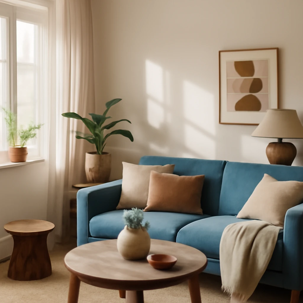
White with blue: the classic crisp pairing
White remains the most universal counterpoint to blue. It acts as a universal solvent, brightening spaces while preserving architectural clarity. The white backdrop is especially effective in rooms with strong architectural features - arched doorways, whitewashed walls, or timber ceilings.
In European interiors, white can be used for walls and ceilings while the blue appears in soft furnishings, tiles, or a single blue wall for depth. A light indigo on a feature wall paired with white walls and ceiling gives a sense of calm spaciousness, ideal for living rooms and bathrooms where serenity is desired. When space is limited, white walls expand the perception of space, while a restrained blue focal point keeps the eye engaged without overwhelming the senses.
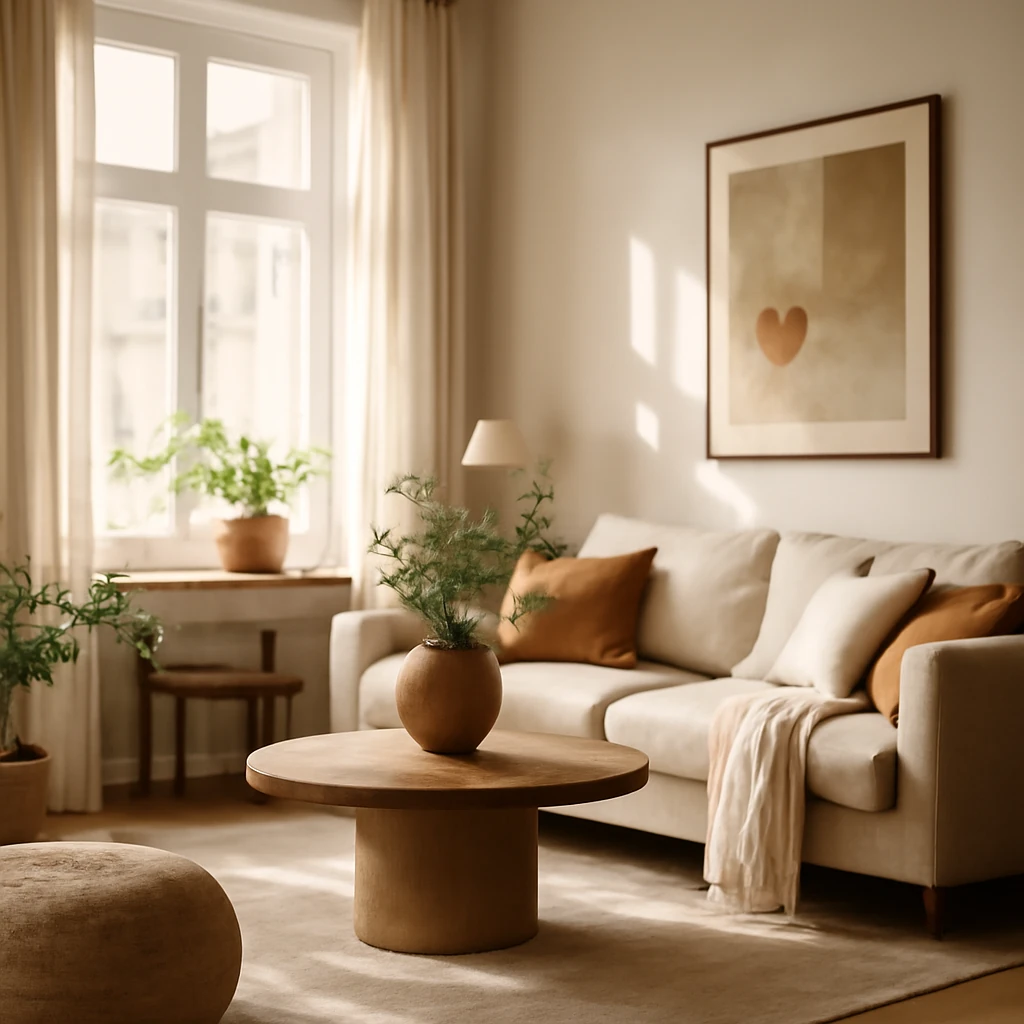
Beige and warm neutrals with blue
Beige or warm neutrals have a natural affinity with blue. The pairing mirrors landscapes of sand, sea, and stone, creating interiors that feel grounded and civilised. Beige softens the coolness of blue and anchors the space in warmth, making it suitable for open-plan living areas, bedrooms, and kitchens where family life unfolds. In European settings with timber floors or stone tiles, beige acts as a harmonious bridge between blue and natural materials, ensuring a cohesive palette across different rooms.
Grey: sophistication with quiet depth
Grey is a masterpartner for blue, offering depth without stealing attention. In a blue-grey palette, the room can feel elegant and restrained, with the possibility to stage stronger accents through textiles or art. Light grey walls with cerulean or powder-blue accents evoke a fresh, contemporary mood, while a deeper navy in furniture or cabinetry adds gravitas for dining rooms and studies. In bathrooms, a slate or charcoal grey base with pale blue highlights can feel spa-like and serene.
Orange and red: blue’s bold companions
Blue paired with warm oranges and reds creates a contrasting, energetic mood. This combination works best in spaces where you want to spark vitality - kitchens, family rooms, or vibrant entryways. To prevent fatigue, balance is essential: keep the ratio around 60/30/10, where the blue remains dominant and the orange or red serves as a measured accent. In European kitchens, a soft cobalt or navy backdrop with terracotta accents or sunlit brick tones can feel both inviting and modern.
Yellow: sunshine against blue
Yellow and blue is a classic combination that communicates optimism and clarity. The pairing is well suited to kitchens, living rooms, and children’s spaces. A pale or lemon-yellow works beautifully with light sky blues for a cheerful scheme, while a deeper mustard can ground the blues in more formal settings. When using yellow as the accent, ensure the blue remains legible and not overwhelmed by the warm hue, a careful balance maintains a light, airy atmosphere.
Green and blue: nature-inspired harmony
Blue’s closest natural companions are green tones, which create a tranquil, outdoorsy feel. Analogue colour schemes - where blue sits next to green on the colour wheel - often feel harmonious and refreshing. This pairing works well across bedrooms, living rooms, kitchens, and bathrooms, especially in homes surrounded by gardens or near water. To avoid an overly saturated look, temper the palette with neutrals such as white, grey, or soft beige, and select two to three blue-green tones rather than many competing shades.
Towards a practical palette: the blue colour wheel and a table of pairings
To simplify decision-making, refer to a compact guide that summarises how blue behaves with common European palette partners. The Itten colour wheel remains a practical tool for designers, helping to identify complementary, analogous, and triadic schemes. Below is a concise table that captures typical relationships for widely used blue shades. Use it as a quick reference when planning walls, textiles, and furniture finishes.
| Shade | Successful companions | Challenging combinations |
|---|---|---|
| Sapphire | Beige, light grey, neutral grey, sunny yellow, terracotta, wine, cranberry | Dark brown, black, mint, peach |
| Indigo | Grey, white, beige, taupe-grey, emerald, gold | Pink, black, olive, ochre, bright red, mint |
| Blueberry | Mint, raspberry, sand, white, light grey, coral, lemon | Brown, purple, magenta, mustard |
| Denim | White, vanilla, canary, coffee with milk, carrot, pomegranate, lime | Mahogany, black, grey-green, watermelon, violet |
| Slate | Blue, light grey, white, ivory, pomegranate, canary, terracotta | Dark grey, cappuccino, mint, salmon, pink |
| Sky | White, black, grey, mint, emerald, pistachio, sunny yellow, red-violet | Straw, orange, olive |
| Soft slate | Yellow, orange, white, black, beige | Green, purple |
Applying the palette in European homes: practical guidelines
With the colour relationships in mind, translate theory into room-scale decisions. Here are practical guidelines aligned with European architectural realities - from apartments with compact footprints to larger, lighter spaces:
- Living rooms and open-plan spaces: start with a predominant blue tone on walls or soft furnishings, introduce beige or warm greys for the larger areas, and pepper with yellow or orange accents in cushions or vases to inject warmth without overpowering the blue.
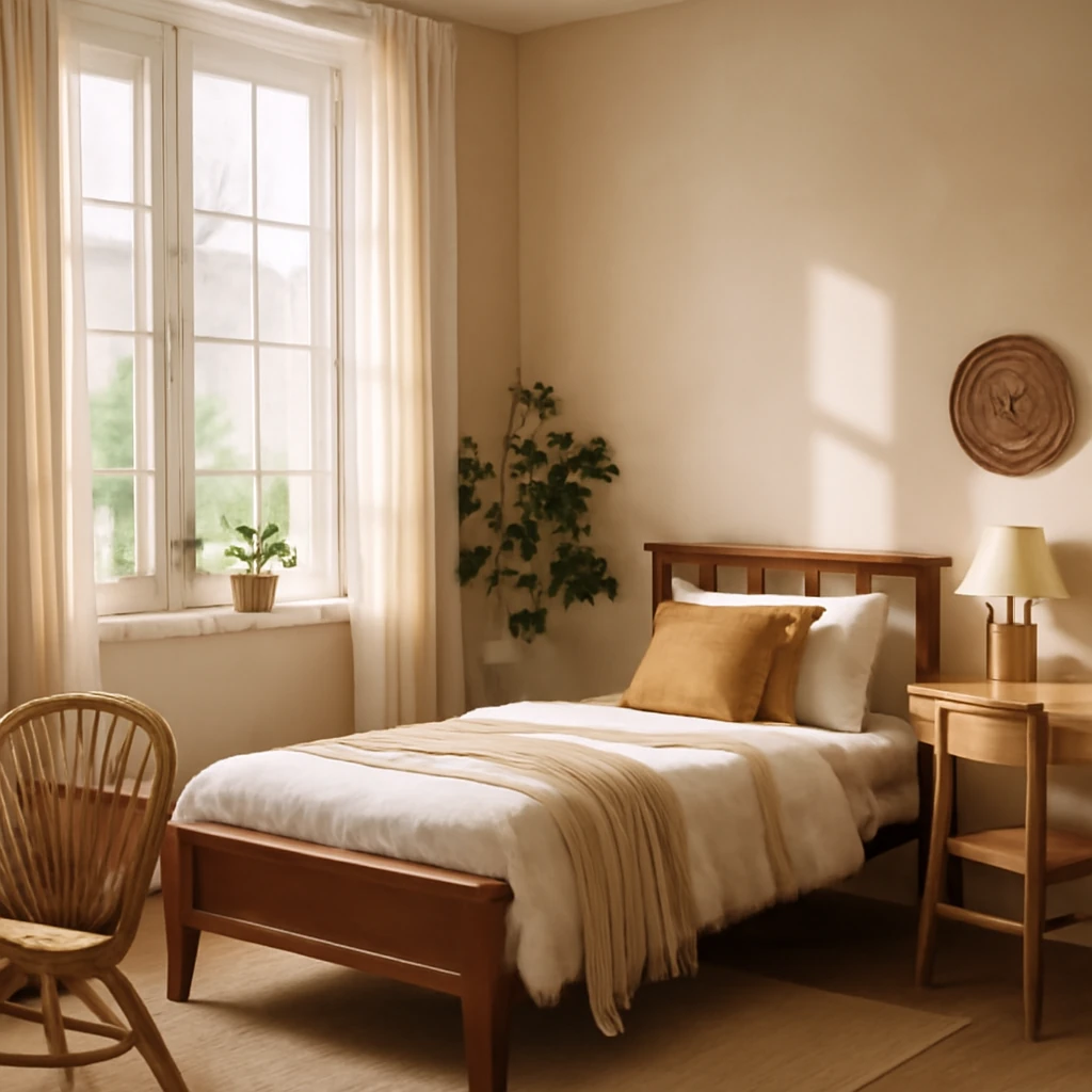
- Bedrooms: a calmer approach works best. Use a pale blue on walls paired with white or light beige textiles, and a deeper blue for a feature headboard or a throw. Soft, natural fabrics such as linen and cotton enhance the sense of calm while maintaining visual interest.
- Kitchens and dining zones: blue cabinetry or tiles can be energising when balanced with warm neutrals. If the space receives abundant daylight, deeper blues can be used strategically on islands or the end wall to create a focal point without feeling heavy.
- Bathrooms: cool blues with white porcelain and stone textures evoke a spa-like atmosphere. Consider light blue walls with white fittings and a slate floor to achieve a grounded yet refreshing effect.
- Small spaces: lean into white walls and ceilings with blue accents. The aim is to maximise perceived space while preventing the room from feeling clinical, textiles, glass, and reflective surfaces can amplify light.
- Light and climate: in northern climates with longer winters, softer blues and warm neutrals help create a cosy ambience. In warmer southern climates, richer blues paired with sun-warmed accents reproduce a Mediterranean serenity.
Practical tips for a coherent European colour strategy
Colour management across rooms is essential to maintain a coherent look. Consider the following prácticas, which are particularly relevant for European homes with mixed architectural styles and diverse lighting conditions:
- Consistency of temperature: avoid mixing too many cool and warm colours across adjacent spaces. If you begin with a cool blue canvas, offset with warm neutrals or wood tones to create a human-scale, comfortable environment.
- Texture and finish: use matte finishes on walls to soften blue’s intensity, then employ gloss or satin textures for accents such as tiles, cushions, or cabinetry to add dimensionality.
- Lighting planning: ensure daylight and artificial lighting render the blue as intended. Neutral LED temperatures (4000–5000K) are versatile, but you may need warmer bulbs in living rooms to soften midnight-blue walls or cooler lighting for very bright white-blue walls.
- Fabrics and upholstery: mix solids with subtle patterns to avoid visual heaviness. Linen, wool, and cotton bring warmth and tactility that balance cool blue tones.
- Flooring compatibility: blue reads differently on wood, stone, or tiled floors. Pair with warm wood tones or warm-grey tiles to prevent a cold, disconnected look.
Final thoughts: blue as a flexible, modern core
Blue remains a cornerstone of contemporary European design because it offers an adaptable framework. It can be restrained and elegant in a minimalist setting or bold and lively when paired with saturated hues. The key is to approach blue as part of a controlled palette: define your main blue, select two or three supporting colours, and reserve one or two accent hues to carry energy into the room. By applying the 60/30/10 rule and consulting the colour wheel, you’ll create a cohesive, sophisticated space that feels both timeless and refreshingly current.
Concluding guidance for designers and homeowners
For those planning a blue-led palette in a European context, here is a practical checklist to take into the project brief:
- Decide the primary blue family for the space (navy, cobalt, sky, or teal) based on light availability and the architectural character of the room.
- Choose two complementary or analogous colours to support blue, ensuring a clear hierarchy within a 60/30/10 distribution.
- Incorporate natural materials (wood, stone, linen) to temper blue’s coolness and add tactile warmth.
- Test the colour at scale with painted boards or sample fabrics to observe how the shade shifts under different daylight conditions.
- Plan for longevity: select blue tones that remain versatile over time, while using brighter accents for personality that can be updated with textiles or accessories.
More reading on blue: a glossary for designers
To support ongoing projects, consider building a small reference library of blue-inspired palettes. Create a mood board featuring swatches of sapphire, indigo, denim, slate, and sky, then overlay textures - porcelain tiles, wool rugs, oak furniture, and ceramic vessels. This practical approach helps articulate the relationship between colour, materiality, and light, allowing for a confident realisation of the space you envision.
For ongoing inspiration and refreshed ideas on materials and finishes for blue-led interiors, consider subscribing to professional design resources and curated newsletters that focus on European interiors. They often feature practical colour studies, case studies, and swatch data to inform decisions across climates and building typologies.
Table of examples: a quick editorial reference
The following table summarises common Blue shades and their typical companions and challenges. Use it as a practical checklist during material selection, furniture sourcing, and wall finish decisions.
| Shade | Successful companions | Challenging combinations |
|---|---|---|
| Sapphire | Beige, light grey, neutral grey, sunny yellow, terracotta, wine, cranberry | Dark brown, black, mint, peach |
| Indigo | Grey, white, beige, taupe-grey, emerald, gold | Pink, black, olive, ochre, bright red, mint |
| Blueberry | Mint, raspberry, sand, white, light grey, coral, lemon | Brown, purple, magenta, mustard |
| Denim | White, vanilla, canary, coffee with milk, carrot, pomegranate, lime | Mahogany, black, grey-green, watermelon, violet |
| Slate | Blue, light grey, white, ivory, pomegranate, canary, terracotta | Dark grey, cappuccino, mint, salmon, pink |
| Sky | White, black, grey, mint, emerald, pistachio, sunny yellow, red-violet | Straw, orange, olive |
| Soft slate | Yellow, orange, white, black, beige | Green, purple |
In summary, blue offers a robust toolkit for European interiors: it can be relaxed or expansive, formal or playful, depending on how you align temperature, texture, and light. By embracing thoughtful pairings - white for crisp contrast, beige for warmth, grey for depth, and well-chosen orange, yellow, and green accents - you’ll craft spaces that feel both contemporary and deeply comfortable. The European home, with its varied climates and architectural legacies, benefits from blue’s versatility when applied with care and a clear design objective.
You may also like these articles
30 m², Made Brilliant: Design Strategies for Compact European Homes
Smart storage, zoning, and lighting ideas that transform 30 m² into comfortable, stylish living.
Eight clever storage ideas for small European flats
Smart storage ideas to reclaim space in compact European homes.
Creating a Teenager’s Bedroom: European Styles, Zoning and Comfort
Smart, stylish ideas for a teenage girl’s European bedroom.