
Explore interior trends, AI design insights, styling guides and real transformations
Blue in Contemporary European Interiors: Mood, Shades and 2025 Trends
Blue in Interiors: mood, shades and 2025 trends
Blue is often dismissed as chilly or too formal. Yet in contemporary European interiors it functions as a nuanced instrument for shaping atmosphere. Used thoughtfully, blue can cradle a restful night in the bedroom, sharpen focus in a home office, or visually expand a compact entrance. In 2025 blue continues to evolve - soft, maritime, deep and even matte - delivering versatility across styles from Scandi to modern classic, from urban loft to family apartment. This feature unpacks how to select the right shade, pair it with materials, and apply it with restraint to avoid gloom.
Blue’s impact on mood and atmosphere
At a subconscious level blue is linked with sky and sea. Light, airy blues such as aquamarine, pale turquoise and powder blue evoke openness, calm and clarity. They can make a small room feel larger and less oppressive, a property especially valuable in northern European apartments with limited daylight. In bedrooms, light blues promote relaxation and better sleep by reducing sensory intensity while still feeling uplifting. In bathrooms, a watery blue can translate into a spa-like sanctuary with a sense of cool freshness.
In contrast, deeper blues - ultramarine, sapphire or ink - intensify focus and mental engagement. They are ideal in work zones or study corners, where concentration matters. A deep blue wall behind a desk acts as a visual frame for tasks and devices, often improving perceived organisation. Yet the mood of blue is not simply “cold” or “serious.” When paired with warmer textures and lighting, dark blues can feel opulent and inviting rather than austere.
A word of caution: in spaces with limited natural light, too much cold blue can feel austere or melancholic. The key is balance with texture, warm undertones, and daylight-simulating lighting. When blues are used as accents against warm neutrals, the result is sophisticated, contemporary and comfortable rather than clinical.
From sky to sapphire: choosing blue shades and ideal pairings
Blue comes in a wide spectrum - from pale, airy hues to saturated marine blues and near-black charcoals. Rather than chasing a universal “blue rule,” design success lies in temperature, context and texture. The following groupings help you navigate choices and assemble harmonious palettes.
Light and airy
- Examples: sky blue, powder blue, turquoise.
- Effect: lightness, freshness, sense of space.
What works well with these blues? Classic pairings are white and pale grey for walls, with white architectural mouldings for a crisp, elegant feel. A light oak or ash floor anchors the palette and adds warmth. For rooms that require tenderness - bedrooms or nurseries - introduce soft pastels such as peach, mint or dusty pink. The result is gentle, soothing and inherently European in its refined simplicity.
Vibrant and confident blues
- Examples: ultramarine, cornflower, marine blue.
- Effect: energy, brightness, Mediterranean vitality.
Pair with earthy terracotta or ochre tones, and metals in gold or brass. A monochrome scheme - blue with white or light grey - can feel energetic without becoming overpowering. In bathrooms or kitchens, a blue-and-white tile pattern offers dynamism with a timeless nod to coastal Mediterranean design. A breathable second palette - sage green with blue - brings nature indoors and tempers intensity.
Deep and dramatic blues
- Examples: sapphire, indigo, midnight blue.
- Effect: luxury, drama, intellectual depth.
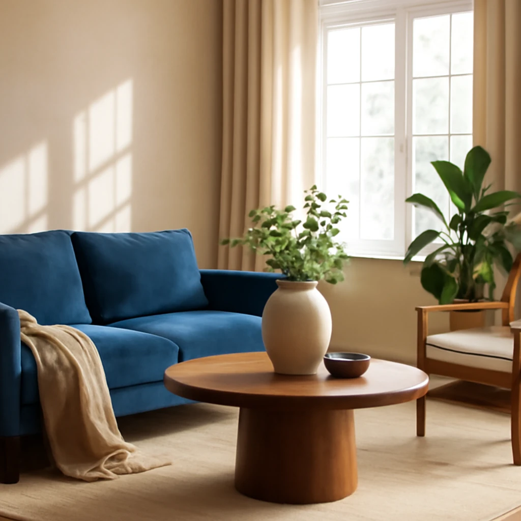
These shades shine when paired with rich materials: vellum textures, aged brass or brushed nickel, and natural stone. A velvet navy sofa against pale plaster walls creates a regal, contemporary focal point. A deeper blue wall can be balanced by warm timber furniture and soft lighting, ensuring the room remains inviting rather than imposing. A gold-framed mirror or a hint of bronze adds luxury without ostentation.
Complex blue-greys
- Examples: steel blue, denim, marengo (slate blue).
- Effect: calm modernity, versatility, timeless style.
These are some of the most adaptable blues for European interiors. They work beautifully with textured wood, leather accents and layered textiles in beige, taupe and soft greys. For those seeking contrast, combine with white or near-white ceilings to emphasise the blue as a refined, architectural statement rather than a loud colour block.
Blue in the bedroom, kitchen, living room: applying colour across the home
The guiding principle is moderation. Even the deepest hues will perform well if you plan the space with intent and consider each room’s function, light and traffic.
Bedroom
The most reliable approach is an accent wall behind the bed in a saturated sapphire or soft indigo. A wall painted in a rich blue can ground the space and create a cosy, cocoon-like feel. If a bold tone feels intimidating, apply the colour to a door, a ceiling edge, or a single panel within a mural or wallpaper while keeping the majority of walls a lighter, warmer neutral. For a restful ambience, all walls in a muted smoky blue are particularly effective when the ceiling and furniture are lighter to maintain airiness.
In bedrooms the texture matters: layer with tactile textiles - linen drapes, wool throws, sheepskins - and introduce warmth with timber floors or a light wood bed frame. The goal is a balanced, soft environment that invites relaxation rather than visual fatigue.
Children’s rooms
Children respond well to colour when it informs activity and learning. Opt for soft, low-saturation blues for walls to create a calm base. Use lighter tones on larger surfaces and reserve richer hues for zones dedicated to study or play. Blues pair well with a spectrum of friendly colours - poppy red for accents or mint for calmer corners - and with durable materials such as vinyl flooring or washable textiles for practicality.
Furniture in gentle blues - beds, storage units, seating - helps to unify the space. Textiles, carpets and wall charts can reinforce educational cues and imaginative play without overloading the senses.
Living room
In living spaces, blue makes a strong statement when used on a sofa or armchair, or as part of a tailored window treatment. A deep blue sofa can anchor the scheme and form the focal point of the room. Alternatively, blue can appear as an accent wall behind the media console or as a built-in shelving unit painted in a contrasting light tone. When the space is smaller or has lower natural light, keep the remaining walls in pale neutrals and let blue appear in textiles or accessories to avoid absorbing light.
Shades of blue can pair with natural materials - oak, rattan, stone - to create a warm, welcoming atmosphere. A blue rug with a soft pile or a velvet cushion cluster in a corner can transform the room’s sense of scale and tactility.
Kitchen
In modern European kitchens, blue is a refined choice for lower cabinetry or island modules with a lighter upper cabinetry. Matte blue cabinet fronts convey sophistication and durability, especially when matched with a light-coloured, matte-plastered wall or white quartz worktops. A tiled splashback in a blue pattern - think geometric or floral-inspired motifs - adds energy without overwhelming the space. For diagonal flow, consider a blue island against a warm white kitchen, this combination feels both contemporary and timeless.
Ensure the blue surface is finished in a resistant, easy-clean coating suitable for daily use. Accessories - dishes, vases, or a limited selection of blue ceramics - can reinforce the palette without competing with the structure of the kitchen.
Bathroom
Blue is practically native to bathrooms. It evokes freshness and cleanliness and can be used in tile work, wet areas or solid-surface vanities. A single feature wall in a mid to dark blue, paired with white sanitaryware and chrome or brass fixtures, can look exceptionally high-end. For a spa-like aesthetic, combine pale blue on wall surfaces with natural stone floors and timber accents, such as a dark wood vanity or slate shelving.
Consider glass or ceramics with a slight gloss to reflect light, and balance with ample ambient lighting to avoid a cold feel. Soft towels in complementary tones can soften the boldness of blue and maintain harmony with the rest of the scheme.
Home office
Blue in a workspace is a proven catalyst for concentration. Choose a deeper blue on one wall behind the desk to create a visual frame for screens. Alternatively, a blue shelf feature or a chair in navy or mid-blue can consolidate the palette while leaving the majority of walls in lighter neutrals to prevent fatigue. Combine with high-quality task lighting and a balanced mix of soft and hard textures to maintain comfort during long work sessions.
Entryway
Entry zones benefit from reinforced colour strategy as they set the mood for the entire home. A blue interior door, a blue tiled floor, or a blue storage unit can create a bold yet cohesive introduction. If a full blue wall feels too strong, try a blue ceiling or a blue tiling border to evoke sophistication without overpowering the hall. Pair with warm metallic accents and well-lit mirrors to enhance perception of space and reflectivity.
Blue in interiors 2025: five major trends
For the coming seasons, designers prioritise bold individuality and a sense of warmth, moving away from the stereotype of blue as merely cool or clinical. Here are the five trends shaping blue in 2025.
- Return of brightness and denim nostalgia. Electric blues are re-emerging in contemporary spaces, injecting energy into minimalist interiors. Meanwhile, denim-inspired blues offer a relaxed, friendly quality that reads as approachable rather than austere. The combination suits open-plan homes, studios and family spaces where vitality is as important as comfort.
- Bold duo: blue and purple. Violet-inflected blues create mysterious, creative atmospheres - particularly apt for studies, media rooms or bespoke dressing areas. This pairing invites texture and depth, with ultraviolet accents used sparingly to avoid visual overload.
- Accent ceiling. The fifth wall returns. A deep blue ceiling can conjure a night-sky effect, especially in rooms with modest heights. In European homes with ceilings around 2.5 to 3.0 metres, the result is dramatic yet intimate, offering a surprising design twist rather than a gimmick.
- Biophilia in blue tones. When blue is combined with natural materials - timber panels, stone textures, and plenty of daylight - the effect is calming and restorative. Imagine dark navy walls framed by warm timber, with plants and soft natural fabrics creating a serene, nature-inspired retreat.
- Totally matte finish. Matte blue surfaces - paints with refined sheens, plaster finishes and matte cabinetry - read as contemporary and sophisticated. The absence of gloss emphasises depth and texture, making blue feel refined rather than loud.
In practice, a well-considered design project can showcase blue across rooms without overpowering the plan. If you are planning a blue-forward renovation in a European city - whether compact or airy - collaboration with a skilled practice will help you identify the precise shade and material mix that makes the space feel both stylish and liveable.
How not to make a blue interior feel gloomy
Fear of darkness is the main obstacle to using blue well. The antidote lies in balance, lighting, and texture. A practical rule of thumb is the 60/30/10 principle: ensure blue occupies no more than 30% of the room, keep the majority of surfaces in light neutrals, and reserve 10% for accents in warm tones such as ochre, mustard or terracotta. This combination produces depth and character without heaviness.
Light as ally
Blue is inherently a cool colour. To counterbalance, introduce warm lighting and daylight-simulating lamps. Lighting layering matters: perimetral recessed lights for a soft wash, a centre pendant, wall lamps near seating, and accent lighting on architectural features. This layered approach breaks up the colour field and-heightens the blue’s refinement. Aim for a mix of 2,700–3,000 Kelvin for cosy warmth and 3,500–4,000 Kelvin for daylight-like clarity, depending on the room and the mood you want to cultivate.
Texture as a saviour
Flat, single-tone surfaces can feel sterile in blue. Introduce texture through materials: timber floors or wall panels (unfinished or with visible grain), textiles with depth (velvet, bouclé, linen), tactile rugs, leather seating, stone or ceramic surfaces. These elements create a layered, high-end aesthetic that prevents blue from appearing flat or “cold.” In modest spaces, select a handful of textures to avoid visual clutter and maintain a calm, sophisticated backdrop.
In short, blue is not a single hue but a spectrum of moods that respond to light, texture and scale. A carefully curated mix of blues with warmth and texture yields interiors that are serene, inviting and observably European in spirit.
If you would like to explore blue in greater depth for your home, professional designers can tailor a palette to your space, light conditions and lifestyle. Between measurement surveys and material samples, they will craft a palette that respects architectural constraints and enhances room proportions. A well-executed blue scheme can transform volumes, elevate materials, and create a sense of cohesion across an apartment or house.
Historically, thinkers and artists - from painters to composers - have observed how colour influences perception. The metaphorical connections between blue and music, such as the way certain blues align with rhythm and harmony, remind us that interior design is a form of visual composition. In European homes, where daylight varies with latitude and climate, blue can be an especially potent tool for orchestrating atmosphere across seasons and functions.
You may also like these articles
 Interior Design
Teenage Rooms: Space, Style and Growth in European Homes
Multifunctional teen rooms across Europe that grow with him.
Small Spaces
Wardrobe partitions: smart zoning for European homes
Smart wardrobe partitions transform small European homes.
Kitchen Design
The Kitchen Island: A Complete Guide to Planning, Layouts and Styles Across Europe
A practical guide to planning and styling kitchen islands in European homes.