
Explore interior trends, AI design insights, styling guides and real transformations
Blue for Bright Minds: Designing Timeless Children's Rooms in Europe
Blue in the Children s Room: ideas, palettes and timeless design
Blue is one of the most versatile colours for a child s space. Soft blues provide a calm backdrop for play and study, while deeper tones add depth without overwhelming the room. In European homes with varied daylight, blue can visually expand walls and balance spaces that may receive limited natural light. This guide explores which shades work best for different ages, how to pair blue with other colours, and practical layouts that can grow with a child from infancy through adolescence.
Understanding blue shades
Blue sits in the cool segment of the colour spectrum and is associated with clarity, calm and spaciousness. Lighter sky blues help slow the heart rate and facilitate relaxation after a busy day. They do not suppress energy in the way a very saturated ultramarine might, instead they stabilise mood with a gentle touch. In a child s room blue can be used as a wall colour or as an accent backdrop to white, timber and other neutrals. When daylight is northern or limited, an excess of cold blue can feel chilly unless balanced with warm textures and thoughtful lighting.
Blue palettes are diverse and contemporary across Europe. Here are several hues that translate well into residential design for children of different ages:
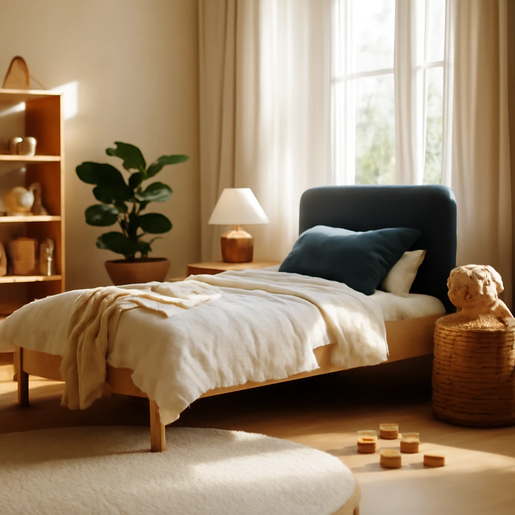
- Slate blue - a tempered blue with a touch of grey. Ideal for older children and teenagers as a calm backdrop that supports vibrant furniture and artwork.
- Azure or sky blue - bright and clean, best used as an accent within a restrained scheme.
- Mint blue - a pale blue with a hint of green, bringing a fresh, gentle mood to the room.
- Dusty blue - a soft matte shade with a trace of grey, sophisticated and timeless, pairs beautifully with natural timber.
- Cornflower or cobalt variants - deeper tones that can anchor a corner or feature wall without dominating the space.
- Arctic blue - almost white with a delicate blue undertone, enhances space but benefits from warm accents to prevent a sterile feel.
How to pair blue with other colours
White and grey (achromatics)
White with blue is a timeless pairing that suits a range of styles from coastal to modern Nordic. Grey tones soften the coolness and create a refined, contemporary atmosphere. Use black sparingly for graphic detail on frames, lamp bases, or furniture hardware to introduce contrast and structure without overpowering the softness of blue.
Beige and brown
Beige, sand and light timber tones bring warmth into a blue child s room. They echo natural landscapes and create a comfortable, universally appealing base. A pale blue wall with light wood furniture maintains a calm environment, deeper browns, including chocolate or terracotta, add depth for older children. A leather chair or a wooden bookcase against a pale blue wall remains a reliable, grown-up solution that still suits a child s room.
Yellow
Yellow injects energy and helps compensate for low daylight. Lemon, mustard or narcissus tones work well as accents in textiles, decor or a single piece of furniture. To avoid a space becoming too busy, apply a 60/30/10 rule: 60 per cent blue base, 30 per cent neutral background, and 10 per cent bright yellow for emphasis.
Pink and peach
Pink and peach offer a refined counterpoint to blue, especially in rooms for daughters or shared spaces. Dusty pink or soft peach with blue evokes sunset or dawn tones, creating a calm yet contemporary atmosphere that is not overtly girly. This palette adapts well as a child grows and can be used across ages.
Green
Green and blue together evoke sky, water and foliage. The result is energising yet peaceful. Choose muted greens such as olive, sage, pistachio or mint to keep the combination harmonious. Walls can be blue while textiles or upholstery carry green tones, or vice versa. This pairing is versatile for all ages and helps sustain concentration during study and reading time.
Applying blue in the child s room
Blue is uniquely versatile. The shade you select and the surroundings determine its role in the space. The following sections offer practical guidance on three core aspects of child room design with a focus on European homes.
Finishes
Delicate light blue makes an excellent backdrop for furniture and decorative items. Use it as the main colour on walls, and even on the ceiling in small rooms to create a sense of height and airiness. If the room is compact, consider tinted pastels that keep things light. Painting remains a straightforward solution, wall coverings with a subtle pattern or a single feature panel are effective too. One wall can be highlighted with a deeper or warmer blue such as cornflower, mint or azure for visual interest.
For flooring, opt for natural timber or its equivalents, such as engineered wood, laminate, luxury vinyl tile or cork. The warmth of timber balances the cool wall colour. Ceilings are typically left white to preserve openness, though a pale tint that echoes the wall colour can create a cohesive feel.
Furniture
When walls are white, grey or another neutral shade, blue furniture can act as bold, characterful features. A blue bookcase, bed frame or dresser introduces colour that can be swapped as the child grows. Light blue works well for work zones, a blue chair and coordinating storage systems create a focused environment without excessive decoration.
Decor and textiles
Textiles are the simplest way to inject colour and texture. Blue curtains, a throw or decorative cushions help tie the room together. Choose fabrics with tactile surfaces such as linen, velvet or boucle to soften the cool tone. In school-age rooms, posters and rugs with geometric patterns can add energy, while nautical motifs suit sea-themed schemes.
Lighting
Blue responds strongly to lighting. In cool white light the space can feel clinical, while warm white brings warmth to the blue. Plan layered lighting with:
- Colour temperature: neutral white light around 3000 to 4000 Kelvin supports reading and activities without distorting colours.
- Layering: combine ambient lighting with a bedside wall light and a task lamp for the desk to create depth and dimension.
- Accent lighting: LED strips in niches or under shelves add dimensional light after dusk, making the room feel cosy and conducive to winding down before sleep.
Storage, layout and growth planning
European homes frequently feature compact bedrooms serving multiple roles as children grow. A thoughtfully designed blue scheme can adapt across ages. Use modular storage that can be reconfigured as needs change. Examples include low benches with integrated baskets, tall storage towers and modular shelving. Consider built-in combinations that merge a desk, wardrobe and bed within a compact footprint to maximise floor space while keeping clear zones for play and study.
Small spaces and light management
Many European cities feature apartments with limited daylight. Slightly warmer and lighter blues can visually enlarge a room. Pair white or pale timber furniture with blue walls to reflect light. If a darker feature wall is necessary for visual drama, balance with bright textiles in white or cream and ensure ample daylight or layered lighting to avoid a cave-like atmosphere.
Longevity and adaptability
Design for growth. Select structural elements and finishes that endure. A soft blue wall can remain almost neutral as trends evolve, textiles and accessories are easier to update with the seasons or as tastes change. A well chosen bed, durable storage and a comfortable study chair will carry a child s room through multiple age stages with minimal updates.
Palette guides and example configurations
Here are three practical configurations that illustrate blue in a European context. Each uses pale timber flooring, white walls and clever storage to create a space that feels serene yet ready for play and learning.
-
Classic Nordic blue with white and light wood
A soft sky blue on the walls with white ceilings and trim creates a crisp, airy backdrop. Light oak or ash furniture complements the blue without competing for attention. Accessorise with navy or cobalt accents in textiles or wall art to introduce depth while keeping the space bright.
-
Sea inspired calm with pale greens
Use a slightly desaturated azure or dusty blue as the base. Introduce soft greens inspired by seaweed or sage for textiles and occasional furniture. White cabinetry and timber floors keep the palette grounded. Consider a feature wall in a deeper blue for a subtle focal point aimed at older children.
-
Pastel mix for a shared space
A blend of pink peach, dusty blue and pale yellow creates a gentle, contemporary vibe suitable for a shared room. Keep the dominant wall colour blue and use soft pastel accents in textiles and décor. This approach works well in rooms where siblings share a single area yet still desire individual zones for study and sleeping.
Practical tips for selecting products in Europe
From paints to surfaces, choose products that meet European safety standards and have low volatile organic compound (VOC) emissions. Look for durable, washable paints and coatings suitable for children s rooms. For furniture, select pieces with rounded edges and non slip hardware. For textiles, opt for fabrics that are easy to clean, with fade resistant colours and safe dye standards. Choose energy efficient lighting with warm to neutral white temperatures and long life LED sources. When planning storage, consider modular options that can be reconfigured as the child grows and the room usage evolves.
Step by step design process for blue rooms
- Define the purpose and age range Identify whether the room will function as a nursery, a study zone for school age, or a shared space for siblings. Consider long term needs for growing children and adapt the palette accordingly.
- Assess natural light and spatial constraints Note how daylight changes through the day and across seasons. Choose blue shades that feel warm or cool depending on the light and select white or light timber for ceilings and furniture to maximise luminosity.
- Establish a primary colour story Pick a dominant shade of blue and a neutral base. Decide which age range will experience more visible shifts and plan the accent colours for later updates.
- Plan zones for play, learning and rest Use room layout to create clear areas: a sleeping area, a study desk, and a play corner. Ensure safe storage and accessible storage for toys, books and clothes.
- Choose finishes and materials with longevity Prioritise durable, washable paints, non slippery floors, rounded furniture edges and flexible storage modules.
- Layer lighting thoughtfully Combine ambient, task and accent lighting. A desk lamp with warm white light supports concentration, bedside lighting helps wind down in the evening.
- Test and refine Before committing, test paint swatches in different rooms or walls to see how the colour interacts with light at various times of day.
Environmental and safety considerations
In European homes, selecting products with low emissions is essential for a healthy living environment. Look for paints and finishes that meet local safety standards and carry official certifications. Choose textiles with easy care credentials and fabrics that resist fading under daily use. When planning for growth, prioritise non toxic finishes and furniture with rounded corners and non slip finishes to enhance safety for active children.
Case for blue in Europe: cohesion with architecture and daylight
European interiors frequently combine historic architectural features with contemporary materials. A blue palette can harmonise with exposed timber beams, stone floors or plaster walls, while offering the flexibility to introduce modern storage and ergonomic desks. In northern climates, blue walls paired with warm lighting and natural textures can create inviting rooms that feel generous in size even when space is limited. In warmer southern climates, blue can recede to keep interiors cool and calm, leaving room for outdoor connections on sunny days.
Conclusion: blue as an enduring, adaptable choice
Blue is a robust and adaptable choice for a child s room. Its shade determines its mood, while its pairing with neutrals, warm woods and lively textiles creates spaces that are serene for rest and energising for play. In European homes with diverse daylight and architectural character, a balanced blue palette - anchored by warm textures and layered lighting - produces spaces that inspire rest, focus and imaginative activity. By selecting the shade with intention, pairing it thoughtfully with other colours, and designing layouts that grow with the child, designers and parents can craft blue rooms that remain engaging, age appropriate and timeless for years to come.
You may also like these articles
Mastering shoe storage in European homes: practical design solutions
Smart, stylish ways to store shoes across European homes.
Hallway Wallpapers for 2025: Trends, textures and practical guidance
Discover 2025 hallway wallpaper trends, materials and practical tips for durable, stylish entrances.
Smart, Budget-Friendly Kitchen Renovation: Seven Practical Strategies
Smart, budget-friendly strategies transform European kitchens.