
Explore interior trends, AI design insights, styling guides and real transformations
Colour in interiors: a definitive guide to palettes and schemes
Why colour matters in interiors
Colour is not merely decorative, it defines mood, scale and the way spaces read. For European homes, where layouts vary from compact city apartments to generous open-plan living areas, a thoughtful colour strategy can unify rooms, enhance daylight, and support a comfortable, personalised atmosphere. A practical approach begins with a clear framework: establish a base colour for major surfaces, introduce a complementary or supporting colour, and reserve a distinct accent to punctuate the scheme. A widely used guideline suggests allocating roughly 60 per cent to the base, 30 per cent to the secondary colour, and 10 per cent to accents. This 60/30/10 principle helps ensure balance, legibility and calm, while still allowing room for expressive details. It’s important to note that this is a framework, not a rigid rule, most schemes feature more than three tones, but they are deliberately organised within colour families to maintain cohesion.
Choosing a palette: core principles and practicalities
When formulating a palette, consider several core factors: the size and orientation of the room, the quality of daylight, furniture and finishes planned for the space, and how the palette will age over time. For most European homes, a neutral base - often in soft beiges, greys, or stone tones - provides longevity and flexibility. Neutral bases allow you to swap textiles, accessories or accent pieces without a full renovation, while still keeping the overall look contemporary and calm. In smaller rooms, a lighter base can visually expand the space, whereas in larger rooms a deeper base can add character and depth.
Texture and material play a crucial role in colour perception. The same colour can read very differently on plaster, wallpaper, wood, stone, concrete or fabric. Layering textures - such as natural timber, woven textiles, leather, or matte plaster - adds depth and keeps the palette interesting without relying on colour alone.
Before committing, test colours in situ. Paint swatches on multiple wall areas and observe how they shift with changing light throughout the day and across seasons. Small swatches won’t always reveal how a colour behaves across a whole wall or in combination with furniture and flooring. If possible, paint larger sample boards or temporary panels to compare alongside your lighting, flooring and furniture choices.
Palette types
There are three overarching palette families that professional designers use as starting points. Each can be adapted to suit various European contexts - from urban apartments to coastal villas.
Monochrome
Monochrome interiors stay within a single colour family, typically exploring varying lightness, saturation and texture. The most popular monochrome bases are beige and grey, as they provide versatility and a serene backdrop for expressive textures and materials. A monochrome scheme can be lit and decorated with different textures - e.g., light timber, concrete surfaces, and textiles in soft bouclé or suede - so the space remains dynamic and never flat.
| Element | Base colour | Texture |
|---|---|---|
| Floor | Deep taupe or warm grey | Textured tile, stone, timber planks |
| Walls | Warm mid-grey or warm beige | Matte plaster, micro-textured wallpaper, wood panels |
| Furniture | Milk-white, light oak, or warm brown | Leather, bouclé, natural fabrics |
To soften a monochrome, introduce a single, mid-tone accent colour through a mid-sized piece or a surprising texture - think a statement chair, a bold rug, or a vivid textile - while keeping the overall palette cohesive.
Achromats
Achromatic palettes - based on black, white and grey - offer contrast without chromatic distraction. They read as timeless and adaptable across styles, from minimalist to industrial, and they particularly suit interiors where longevity and resale value are priorities. When used thoughtfully, black accents can ground a space, while white and greys create airiness and clarity. In busy rooms, limit accent pieces to a few carefully chosen items to prevent a clinical feel. Dark walls can be dramatic in well-lit rooms or with ample natural light, otherwise, reserve them for feature walls or architectural zones such as a fireplace surround or kitchen cabinetry.
How to balance proportions:
- In smaller rooms, lean toward more light and texture, avoid saturating the space with too many dark surfaces.
- Use black sparingly as an accent on furniture or hardware to preserve space perception.
- Employ multiple greys or contrast with a warmer beige to add warmth without losing the neutrality.
Chromatic palettes
Chromatic palettes are versatile and expressive. They work well in contemporary homes and in spaces designed for socialising. When using multiple colours, consider the well-known colour wheel principles to avoid visual chaos: complementary pairs (opposite on the wheel), analogous schemes (neighbouring colours), triadic combinations (evenly spaced hues), and split-complementary arrangements (one colour plus two adjacent hues of its opposite).
How to choose proportions
- Smaller spaces benefit from a lighter base with brighter accents to keep the room feeling open.
- Black is powerful, use it as an accent on no more than a few items to prevent it from overwhelming the room.
- Grey makes an excellent secondary colour, using several grey tones creates subtle depth and continuity.
When layering chromatic palettes, start with a dominant neutral base and build with one or two supporting hues, reserving a bright or saturated tone for accents such as cushions, a lampshade, or a gallery wall. Balanced combinations help maintain a calm, collected aesthetic even in lively living spaces.
Colour schemes by tone: how to mix intelligently
Beyond the three basic categories, designers use structured approaches to create harmonious schemes. The following outlines offer a practical framework for Europe-wide homes, where daylight quality and architectural variety differ widely.
Two-tone schemes
Two-tone palettes can be surprisingly sophisticated. A common approach is a light, neutral base with a richer, saturated companion colour. The trick is to maintain clear separation between tones and ensure the palette remains coherent via textures and materials. For instance, cool greys paired with warm timber, or a soft taupe combined with a charcoal accent, can feel timeless and refined.
- Choose a neutral base for walls and ceiling, use the second tone for major furniture or architectural details.
- Keep the palette controlled by repeating the same hue family across textiles and accessories.
- Test combinations with large swatches to ensure the transition between tones reads smoothly in daylight.
Multitone palettes: a structured approach to multiple hues
When several colours are combined, it’s essential to orchestrate them using well-defined roles. The classic approach includes a base tone, a supporting colour and an accent hue. A more advanced approach uses two complementary pairs or a triadic arrangement for richer, more dynamic spaces. The critical principle remains: avoid colour chaos by grouping tones into families and clamping their saturation to maintain legibility and harmony.
- Complementary (contrasting) schemes pair colours opposite on the wheel to create vibrant energy, use them sparingly as accents or in small areas to avoid visual fatigue.
- Analogous (adjacent) schemes use nearby colours for a cohesive, restful appearance. They are ideal for walls, textiles and soft furnishings in bedrooms and living areas.
- Triadic schemes balance three hues evenly spaced around the wheel, they work well in rooms dedicated to socialising or creative work.
- Split-complementary schemes use one colour with two adjacent hues of its opposite. They provide high contrast without the intensity of a direct complementary pairing.
As a rule of thumb, avoid four or more dominant hues in a single room unless you’re working with a professional, as excessive variety can undermine cohesion. Instead, use one or two primary colours, and introduce the rest through accessories, textiles and art to keep the space lively but controlled.
Current tonal variations: practical palette examples
To translate these ideas into concrete choices, designers often refer to tonal families rather than individual shades. The following table presents a practical guide to common variations, helping you select layered hues that stay fresh year after year.
| Hue family | Variants |
|---|---|
| Yellow | Mustard, lemon, pale yellow |
| Orange | Ochre, clay, copper, grey-orange, brick |
| Red | Terracotta, burgundy, coral, wine |
| Purple | Lavender, blueberry, aubergine, blackberry, dusty |
| Blue | Dusty turquoise, faded azure, blue-green, navy, natural light blue |
| Green | Emerald, khaki, grey-green, herbaceous, mint |
Note that base tones - such as white, plaster or stone - are timeless and not tied to trends. The way you light a space, the amount of daylight it receives, and the architectural style all influence how a colour reads. For example, high-tech or loft-inspired interiors often lean towards cooler greys, contemporary schemes may welcome ochre or warm neutrals, minimalism tends to favour light neutrals and natural tones, while Scandinavian or eclectically green spaces often showcase whites and pale woods.
Room-by-room colour guidance
The function of each room shapes colour decisions. While the overarching rules apply, practical considerations such as lighting, the amount of traffic, and the desired mood vary by space.
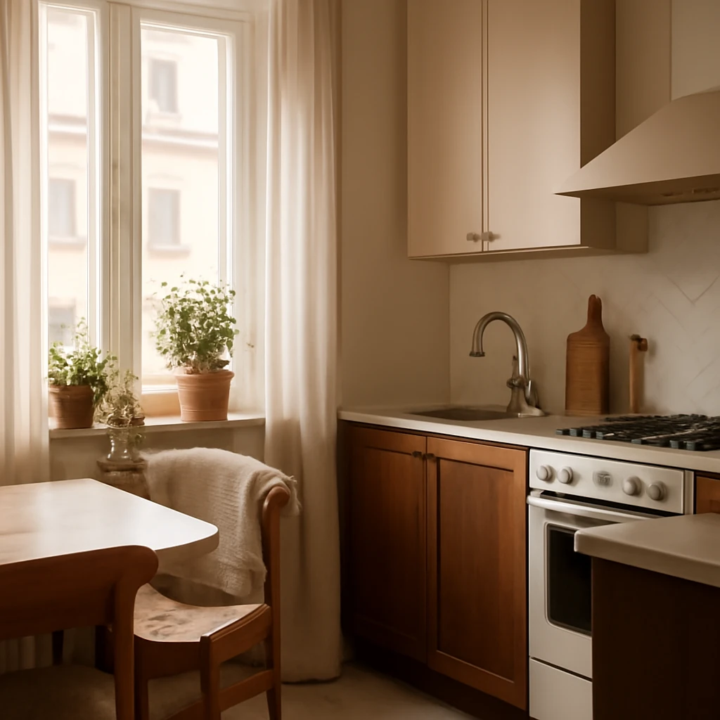
Colour ideas for the kitchen
In kitchens, colour can influence appetite and energy levels. Warmer hues - reds, oranges and warm browns - tique energy and sociability, which can be beneficial in dining zones. If the kitchen is compact or receives limited natural light, a lighter base with restrained accent colours helps maintain a sense of openness. In open-plan layouts, a darker kitchen can serve as a visual anchor, while the living area stays lighter, reducing competition for attention. Consider combining durable, easy-clean surfaces with tactile textiles and natural materials to add warmth and tactility without increasing glare.
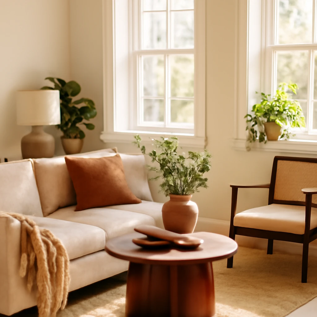
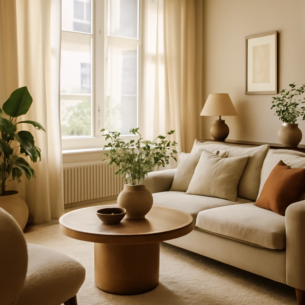
Colour in the living room
The living room is a natural testing ground for colour experiments. Because it is a central, shared space, you can introduce more varied tones here - provided you maintain a cohesive core through neutrals and textures. If the palette is multi-tonal, apply the 60/30/10 rule to guide distribution: base on the walls and floors, secondary in upholstered furniture or cabinetry, and a vivid accent in cushions, artwork or a statement sofa. If the room has architectural features such as exposed brick, timber beams or glass walls, use those elements to punctuate the palette rather than adding competing colours on top.
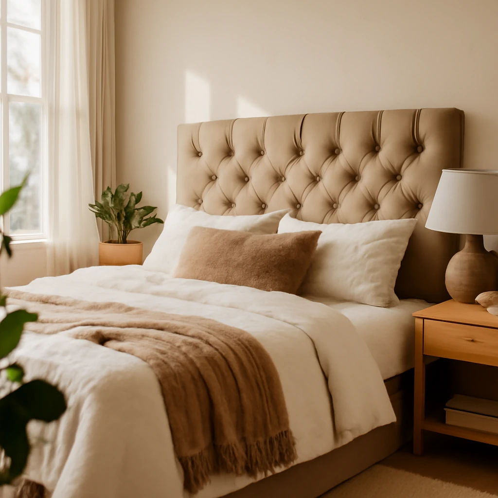
Colour in the bedroom
Bedrooms benefit from a calm, relaxing palette. Neutral bases in warm greys, soft beiges or gentle taupes create a soothing backdrop, while restrained pops of colour - such as a pair of cushions, a throw, or a lamp - bring personality without disrupting rest. For a more dramatic mood, deeper tones such as plum, charcoal or espresso can be used thoughtfully, ensuring sufficient lighting and contrast to avoid a gloomy feel. Pastel variations also work well in bedrooms, especially when paired with white or pale timber for a soft, restful ambience.
Children’s rooms
In children’s spaces, the approach remains similar but with additional emphasis on cheerfulness and age-appropriateness. Gentle, light neutrals paired with soft pastel tones tend to be more conducive to calm sleep and focus. If a child expresses a preference for a particular colour, incorporate it in limited doses - through textiles, storage bins or small furniture pieces - so the room remains adaptable as tastes evolve. Durable finishes and washable surfaces are practical considerations in any colour decision for a child’s room.
Bathrooms and sanitary spaces
Bathrooms welcome a wide spectrum of hues, from crisply white to deep blues and greens that evoke water and freshness. Light bases combined with watery blues or seafoam greens create an airy feel, while darker tones can add drama in larger bathrooms with ample daylight or well-planned lighting. Textures and materials - such as ceramic tiles, stone, glass, and metals - play a crucial role in how the colour is perceived, so plan your palette to harmonise with these finishes.
Hallways and entrances
Your entrance is the first impression of your home. Neutral, light walls can help make a narrow corridor feel more expansive, while a carefully chosen accent wall or a striking door colour can create a sense of arrival. In small vestibules, consider a calm, light base and one bold accent, which could be a built‑in cabinet colour, a rug, or a piece of wall art. For those who enjoy a more theatrical effect, a darker, jewel-toned entrance can be paired with bright lighting and mirrors to bounce light and enlarge the perception of space.
A practical framework: a final reference table for room colour strategy
The following compact table summarises a common, safe approach for interiors that works across European contexts. It is designed to help you plan base, secondary and accent tones by room type, while keeping the palette cohesive and adaptable.
| Base tone (floor, walls, ceiling) | Complement (furniture, textiles, soft furnishings) | Accent (art, cushions, lighting, small pieces) |
|---|---|---|
| Neutral beige or soft grey | Warm wood, stone textures, charcoal or navy textiles | Mustard or teal accents, a single bold statement piece |
| Cool grey or blue-grey | Warm timber, natural linen, white ceramic | Sunny yellow or coral accents, small metallic details |
| Soft white with warm undertones | Natural fibre textures, stone, light wood | Deep blue, emerald or black accents for contrast |
These guidelines are intentionally flexible. In spaces with abundant daylight, you can experiment with deeper tones and richer materials. In darker rooms, rely on lighter bases with brighter accents to keep the space inviting. The most important principle is harmony: ensure that every colour you introduce relates back to the base and is echoed by at least one other element in the room.
Final thoughts: building a palette that ages gracefully
Colour choice should be forward-looking as well as aesthetically pleasing today. A well-considered palette supports how you live, how you entertain, and how you feel when you return home. It should be resilient to changes in furniture, textiles and accessories. By favouring neutrals for large areas and treating stronger colours as accents, you create spaces that feel coherent this season and the next. Use texture and material to bring depth, rather than relying solely on hue to excite the senses. In Europe’s diverse architectural landscape, this approach allows you to maintain a timeless aesthetic while still allowing for personal expression through tactile details and well-chosen furnishings.
Whether you’re renovating a compact city apartment, a light-filled loft, or a classic European villa, the art of colour is the art of balance. Begin with a thoughtful base, introduce a complementary layer, and celebrate an accent that reveals your personality. With patience, swatches, and careful testing, you’ll unlock a palette that feels both sophisticated and uniquely yours.
You may also like these articles
Crafting a functional 5 m² kitchen: layout strategies for European homes
Smart ways to outfit a 5 m² kitchen with clever storage and style.
Capitonné Headboard: A DIY Guide to Luxurious Tufted Upholstery
Transform an old frame into a luxe capitonné headboard with foam, fabric and tufting.
How to Create a Full Design Project Yourself: A Practical Guide for European Homes
From first measurements to final drawings: a complete DIY design roadmap.