
Explore interior trends, AI design insights, styling guides and real transformations
Emerald Green Interiors: Mastering Emerald Across Europe
Emerald Green Interiors: Mastering Emerald Across Europe
Emerald green is among the most captivating greens, associated with luxury, nature and calm. Used thoughtfully, it can define a space, set a mood, adjust proportions and direct attention across living rooms, kitchens, bedrooms and bathrooms.
With depth and shimmer, emerald brings tactile richness to fabrics and surfaces alike. The shade responds to lighting and material: glossy surfaces amplify drama while matte textures soften intensity.
- Glossy or reflective finishes such as velvet, satin, glass or glazed ceramics deepen the colour and enhance form as light glides over contours.
- Matte surfaces such as paint and low-pile textiles diffuse light, making emerald appear calmer and slightly less saturated.
The choice of emerald tone should match the desired mood and architectural style of the project.
Consider the difference between deep emerald upholstery in a classic silhouette and lighter emerald accents in a contemporary setting.
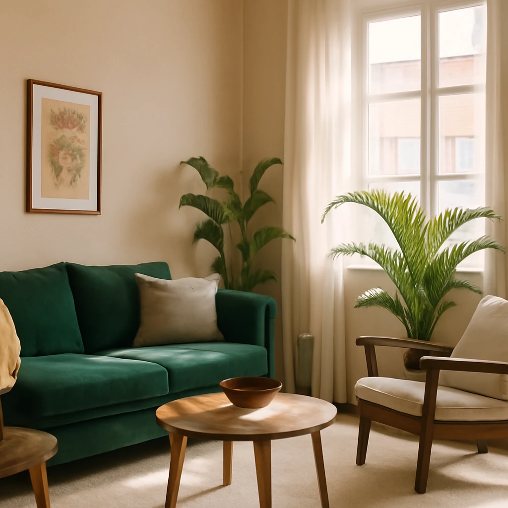
Rich emerald - luxury and refinement
Rich emerald suits traditional opulent interiors or modern schemes that mix old and new. It works beautifully with gilded metals, brass, dark wood, and jewel-tone accents such as rose quartz, ruby or amethyst. Velvet and satin bring out its luxurious character, while hardwood floors root the colour in warmth.
- A deep emerald sofa or armchair can become a strong focal point in a living room with warm metallic accessories and antique-inspired details.
- In European apartments that blend classical architecture with contemporary furnishings, emerald reads as sophisticated and timeless.
Light emerald - emphasising nature and ease
Light emerald reads as fresh and natural, ideal for calmer daylight-filled spaces. It pairs well with white, cream or light timber, and is equally at home in more expensive schemes when balanced with restrained metalwork and soft textures. It transitions well into Art Deco contexts when paired with gold and marble finishes.
In a compact city apartment, a light emerald sofa or cushions can inject colour without overpowering the space.
Furniture in emerald upholstery
Upholstered pieces in emerald velvet or chenille provide a tactile focal point without dominating the room. Pair with light walls and warm wood furniture to maintain balance, then layer with textures velvet linen and wool for depth.
Combining emerald with other colours in interiors
A surplus of blue-greens can visually compress a room, making it feel smaller or moodier. Moderation is key: harmonise emerald with neutrals and lighter palettes to maintain air and brightness.
- With white - a timeless crisp combination that brightens the emerald and enlarges the perception of space.
- With grey - a noble pairing that suits minimalist and industrial styles, emerald appears more luminous against a neutral backdrop.
- With gold - a quintessential luxury mix that heightens warmth and depth.
- With pink - a romantic soft contrast that softens intensity of the green.
- With burgundy or wine - a bold sophisticated pairing for dining rooms and living areas in classic or modern historic-influenced interiors.
- With black - a dramatic contemporary contrast for bold furniture and accents.
- With complementary greens - lime, mint or olive tones create layered nature-inspired palettes.
- With wood tones - natural wood grounds emerald and adds warmth to both large and small spaces.
- With blue - deep blue-green duets convey calm confidence in living rooms and studies.
- With mustard or warm yellows - energise the palette for kitchens or children's spaces.
Where to use emerald in interiors
Deciding where to apply emerald depends on the effect you want - from visual adjustment of proportions to creating focal zones. Here are practical guidelines for European homes of various scales.
On a rear wall to adjust proportions
A bold emerald wall can visually shorten an elongated room while leaving the rest of the perimeter light. The rest of the space should remain pale to maintain balance and avoid overpowering the eye.
In a typical city apartment painting a single wall in emerald creates a strong focal plane while preserving air throughout the room.
As a room divider in open plan layouts
In open plan living areas emerald walls or large panels can delineate cooking from dining and living zones. The colour acts as a sculptural divider while airy gaps above keep the space visually connected.
An emerald feature can visually separate cooking and living zones without closing the plan.
On an accent wall - a focal point
An accent wall is one of the simplest ways to decorate. Emerald can anchor a seating area or highlight a gallery wall. When applied in bands, either on the upper or lower portion of the walls, you control where the eye lands and how the space feels - cosier or more expansive.
In bedrooms or work zones, the accent can be placed to direct attention where it matters most.
On floors - offset a monochrome scheme
Flooring in emerald, or a ceramic tile with the hue, introduces colour with subtlety. Pair it with neutral walls and natural materials to preserve legibility and warmth, particularly in kitchens, hallways or bathrooms.
Perimeter treatments - the jewel box approach
For intimate cocooning interiors, apply emerald along the perimeter of a space walls, built in cabinetry or panelling and balance with lighter central zones. The effect is akin to a jewel box, rich yet not oppressive.
In soft furnishings - zoning through textiles
A statement emerald sofa or a set of cushions can anchor a lounge area and define seating without overwhelming the room. Keep surrounding furniture neutral to preserve balance, then layer with textures velvet linen and wool for depth.
In built-in cabinetry - background or accent
Matching wall colour or using a slightly different emerald on cabinetry can help the storage units blend into the wall or stand out as an intentional feature. Either approach adds character without visual bulk.
With greenery - for cosy warmth
Fresh greenery in emerald-adjacent tones think eucalyptus blue greens or olive stems complements the emerald palette, enhancing warmth and bringing a botanical vibe to kitchens living rooms and bathrooms.
Emerald in different rooms
Here are pragmatic ideas for applying emerald across common European spaces.
In the living room
Use emerald on a sofa or armchair as a striking focal point. Pair with matching cushions a rug with a quiet geometric or plant motif and wooden furniture with a warm finish to achieve a cosy yet sophisticated ambience. Consider a restrained metallic palette brass antique gold or bronze to frame the emerald gracefully.
In the kitchen
Emerald is especially effective on cabinet fronts an emerald tiled splashback or a bold bar stool. To avoid a heavy look combine emerald with light stone worktops white or pale grey walls and timber accents. Introduce warm metallic details to reinforce luxury.
In the bedroom
Soft emerald textiles cushions or upholstered headboard create a tranquil retreat. A deeper emerald wall behind the bed can provide drama balanced by light bedding and soft lighting to sustain serenity.
In the child’s room
Choose a light friendly emerald for walls or textiles paired with soft neutrals and playful accents. The aim is a space that feels energising yet calm for study and rest alike.
In the study
Emerald accents in a study convey focus and sophistication when paired with warm wood and structured lines. Consider an emerald chair or a set of shelves with a matte green finish balanced by a neutral desk and blue textured textiles for depth.
In the bathroom
Emerald tile or wallpaper can deliver a contemporary spa like feel especially with white sanitaryware and brass fittings and lush greenery for a luxurious atmosphere.
In the hallway or entry
A bold emerald wall or a vibrant console can set the tone from the moment you enter. Pair with mirrors and soft lighting to enhance perceived space and depth.
In place of conclusions
- Emerald whether deep or light suits almost every European style offering restrained luxury or bold modernism depending on how it is used.
- Blue greens can adjust proportions visually conceal flaws and add decorative interest when applied thoughtfully.
- Emerald can create both cocooning and airy spaces the key is choosing the right shade and pairing it with the surrounding palette.
- There are many harmonious pairings for emerald jewel toned metals and greens with a base of neutrals like white grey or wood tones. Bold accent combinations can work beautifully but require a measured touch.
Q and A
How to use a saturated emerald colour in small and large spaces?
In compact rooms emerald is best introduced as an accent through cushions throws small furniture items or a single feature wall. Keep surrounding surfaces light and neutral to avoid a cramped feel white grey or pale timber tones help balance the colour and maximise daylight.
In larger rooms emerald can be embraced more fully used on a large wall a major piece of furniture or across textiles and decor to create depth and richness. When used generously ensure there is enough light and that there are light reflective surfaces to prevent heaviness.
Tip curtains in emerald or a rug with a subtle emerald motif can tie the room together without overpowering it.
Which decor elements best suit an emerald interior?
- Velvet upholstery sofas chairs cushions and throws
- Ceramics and glass vases candlesticks tableware
- Artworks or posters in complementary colours
- Rugs with understated geometric or botanical motifs
- Metallic hardware in gold brass or bronze to enhance depth and luxury
For offices emerald can foster focus and confidence when paired with natural wood and neutral finishes.
You may also like these articles
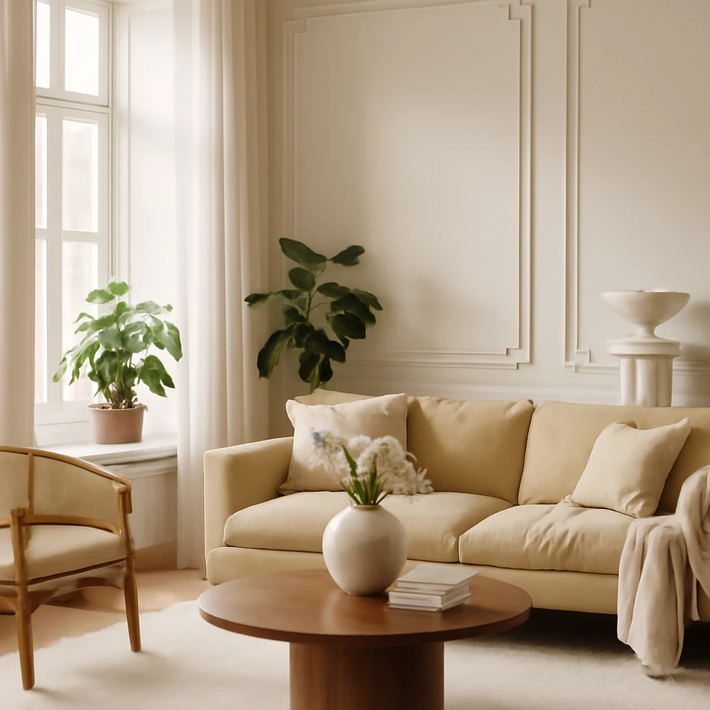
Modern Classic: Reimagining Neoclassical Interiors for European Homes
Modern neoclassical design for European homes: timeless elegance meets contemporary living.
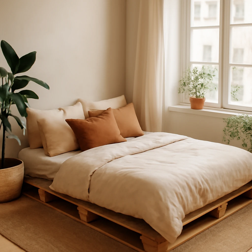
DIY Pallet Bed: A European Guide to Sustainable Sleep
Create a stylish, affordable pallet bed with smart finishing and storage ideas for European homes.
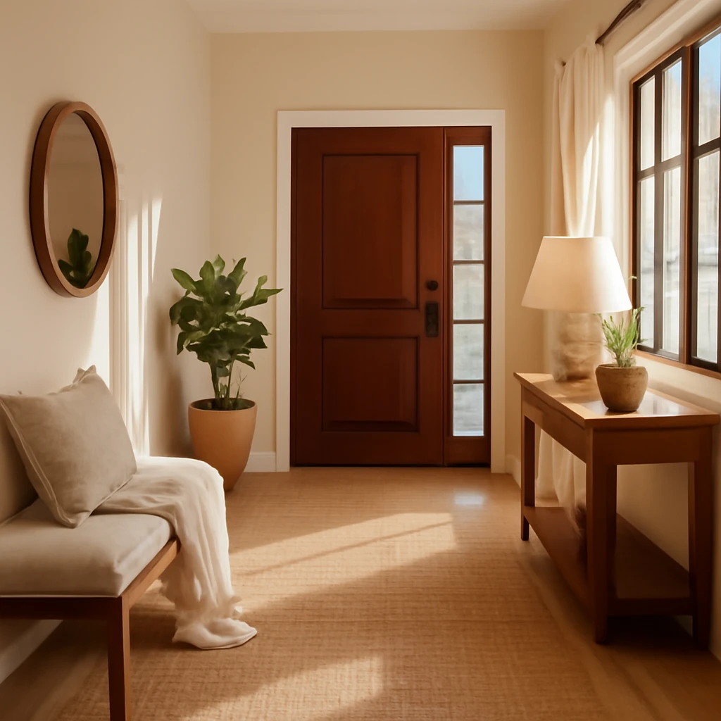
Entrance Hall Design 2026: Trends, Colours & Ideas
European guide to hallway redesign: style, storage and textures.