
Explore interior trends, AI design insights, styling guides and real transformations
Green Interiors: A European Guide to Palettes, Psychology and Mood
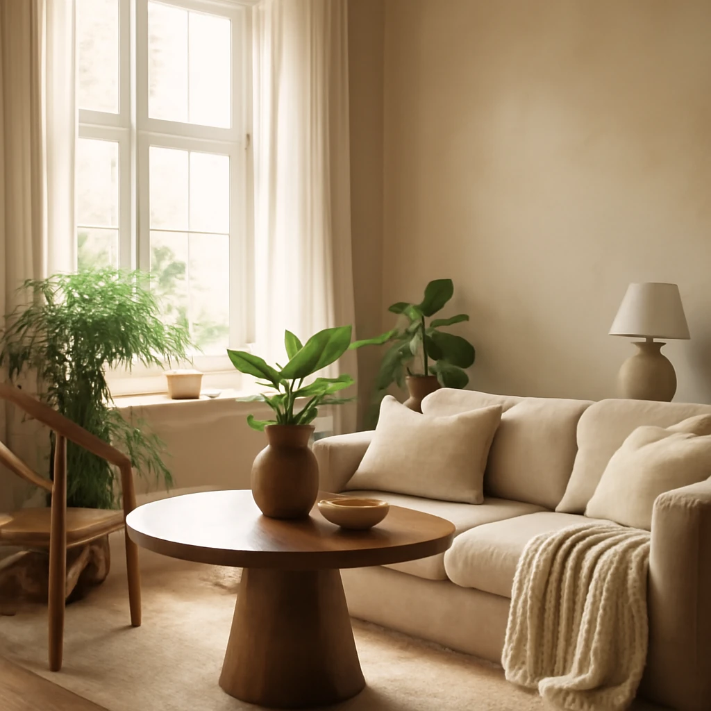
Green has long been recognised as a colour that can anchor a space with calm and vitality alike. In European homes, where light varies across latitudes and urban layouts range from compact apartments to airy period flats, green can read as soothing or invigorating depending on shade, material, and texture. This feature explores how to harness the power of green in interior design, offering practical guidance for building balanced palettes that feel elegant, contemporary and truly European.
The psychology of green
Natural tones are inherently soothing to the eye. Green evokes associations with growth, renewal and life, and in busy urban settings it has a moderating effect on stress. A room painted or finished in green can feel restorative without turning into a sanctuary of imitation nature. In work zones, living spaces or leisure zones, the colour offers a versatile mood that can be energising or retreat-like, depending on the amount of daylight and the surrounding palette.
When selecting greens for an interior, think about how the shade interacts with light. Light greens often create a sense of height and airiness, making rooms feel more expansive. Rich greens bring depth and warmth, emphasising architectural details and furniture. The same colour can look cool in the morning and warm in the late afternoon, so consider dynamic daylight when planning paint finishes, textiles and accessories.
Across Europe, the most successful green schemes balance colour with natural materials such as timber, flax textiles, wool, stone and ceramic finishes. These textures reinforce the connection to nature while delivering a sophisticated, contemporary ambience that works in both urban lofts and more traditional homes.
The green palette
Choosing a green shade involves considering depth, temperature and the intended atmosphere. The palette below provides a framework for a cohesive scheme, with name suggestions that reflect common European associations with flora and landscape. While many greens are named after plants or minerals, the aim is to curate a coherent sequence from light to deep, warm to cool, and from subtle to statement-making.
To avoid a space feeling commuter-bright or hall-like, limit the room to two or three greens and introduce contrasting neutrals and accents through textiles and furniture. For larger areas, you can introduce a third tone as an accent to avoid monotony. A well-balanced green interior often combines a main shade with one lighter and one deeper complementary tone.
Pure green
The colour of fresh growth in bright daylight, used judiciously as an accent wall or architectural feature. It pairs well with white or pale blue accents, and can be framed by natural wood and warm textiles to prevent sterility. A fresh pure green is ideal for spring-like schemes in living rooms and kitchens where daylight is abundant.
Dark green
Forest or pine-inspired greens offer depth and luxury. They harmonise with warm neutrals such as sand, taupe and stone, as well as with brass or brushed gold for a refined look. Dark greens are especially effective in dining rooms, home offices and feature walls where mood and drama are desirable without overpowering other elements.
Blue-green
Aquamarine and turquoise tones introduce cool clarity, ideal for bathrooms or kitchens with strong daylight. These shades work beautifully with cool greys, white joinery and chrome fittings, or with warm wood accents to soften the contrast.
Lime and chartreuse
Vibrant lime-inspired greens inject energy and playfulness. Use sparingly as accents in children’s rooms, contemporary kitchens or contemporary living spaces. Pair with pale neutrals, soft pinks or muted blues to prevent the palette from feeling too electric.
Olive
Olive greens read as timeless, elegant and versatile. They pair seamlessly with warm browns, camel, and indigo blue, as well as with stone textures. Olive walls can create a cohesive backdrop for an entire living area while allowing textiles and furniture to define the space.
Pistachio
Light and friendly, pistachio is a forgiving tone that works well on walls or upholstery in living spaces and bedrooms. It naturally complements creams, soft browns and sage greens, creating a relaxed yet contemporary mood.
Mint
Mint brings a light, fresh feel that can stimulate a sense of calm. It is particularly effective in bedrooms and nurseries when paired with white, pale grey or warm wood textures. In open-plan spaces, a mint accent can illuminate seating areas without overwhelming them.
Emerald
Emerald is a confident, opulent shade that can serve as a focal point in an interior. Use emerald for cushions, a statement sofa in a velvet or bouclé fabric, or decorative accessories against a black, charcoal or ivory backdrop for maximum impact.
Malachite
A richer, mineral-inspired green with mineral veining imagery. Malachite works best as artful accents or small upholstered pieces, pair with warm metallics and dark timber for a luxe, daring look.
Herbal and conifer greens
Herbal greens such as basil, thyme and sage sit between olive and mint, while conifer or evergreen greens reinforce a grounded, nature-forward aesthetic. These tones are well suited to living rooms and studies where a calm but present atmosphere is desired. Combine with natural stone surfaces, cork or rattan for a tactile European vibe.
Optimal pairings
Green rarely exists in isolation. It behaves best when paired with complementary neutrals and carefully chosen accents. Here are three classic pairings that consistently deliver balanced, sophisticated results.
Black and green
Black provides a strong stage for greens to perform. Use black in furniture silhouettes, frames or hardware, and keep the surrounding field light or mid-toned to avoid over-saturation. The combination can feel contemporary and bold, suitable for modern living rooms and high-end dining areas.
White and green
A white backdrop clarifies greens, allowing them to shift with the natural light. This pairing is particularly effective in kitchens and bathrooms, where white sanitaryware and cabinetry create a crisp, hygienic canvas for the greens to sing.
Yellow and green
Yellow-green pairings reference sunlight and springtime. This combination energises spaces such as kitchens and family rooms, but should be used with restraint in bedrooms or darker rooms to maintain restful sleep zones. Use yellow accents through textiles, ceramics or artwork against a green base.
Greens in furniture and textiles: practical integration
Greens are versatile across furniture and textiles, from wall paint to upholstery and soft furnishings. In European interiors, it is common to mix a larger neutral base - such as ivory, warm grey or stone - with one or two greens. Introduce texture with fabrics such as bouclé, linen or velvet, and ensure each colour has a defined role within the space.
When selecting upholstery, test how the fabric reacts to light at different times of day. A sofa in emerald velvet can become a visual anchor, while pistachio or mint seating integrates more softly with mid-toned walls. Rugs, cushions and throws are economical and flexible means to experiment with greens without committing to a large surface area. A rug around 120x180 cm or 180x250 cm can anchor a seating arrangement and set the tone for the room.
Feature areas in green interiors
Across Europe, green is used to enhance key living zones while respecting architectural constraints and daylight patterns. Here is a practical guide to applying greens in common rooms.
Kitchen and dining
Green kitchens and dining spaces align well with principles of well-being and conviviality. Light green cabinet fronts paired with white worktops can create a fresh, airy experience. For a more dramatic look, consider a dark green island or a bold backsplash in emerald or olive. In city apartments with compact layouts, a green framed dining nook can become a focal point without overpowering the space. When choosing finishes, consider low-VOC paints and durable, wipeable surfaces that withstand daily use.
Living room
The living room is a natural arena for green to shine. A predominant olive or sage wall brings warmth, while emerald accents in cushions or a single armchair add theatre. If the room receives abundant daylight, braver greens work well, if light is scarce, lean towards lighter or mid-tone greens to avoid a damp or heavy feel. Wooden floors, stone surfaces and metal hardware create a harmonious counterpoint to greens, as does a soft, neutral textile base in ivory or pale grey.
Bedroom
Green bedrooms promote restfulness and focus. Pale greens combined with warm neutrals create a serene sanctuary, while deeper greens can ground the space for better sleep quality. Consider a feature wall behind the headboard in a cool olive or sage, with white or sand-coloured bedding to balance the look. Textiles in natural fibres such as cotton and linen amplify comfort, with heavyweight blankets adding tactile warmth.
Bathroom
Bathrooms benefit from moisture-tolerant greens such as moss, teal and sea greens. Pair with natural stone tiles, matte brass or brushed nickel fixtures, and white sanitaryware for a spa-like effect. A larger format tile in a deep green can read as a grounding centre piece, while lighter greens in wall panels or cabinetry keep the space feeling refreshed.
Children or family rooms
Greens in family spaces can support focus and play. Softer greens with balanced neutrals create a welcoming environment for children while remaining sophisticated for adults. Use plant-inspired motifs in wallpapers or textiles, and integrate storage in neutral tones to maintain visual calm amid activity. For very young children, avoid overly bright saturated greens in large areas, reserve them for accents and accessories to prevent overstimulation.
Materials, textures and sustainability
Green interiors thrive when paired with natural materials. Wood remains the most versatile partner, from light ash to warm walnut, providing an organic counterpoint to greens. Stone, ceramic and terracotta add tactile depth, while textiles such as linen, wool and cotton bring softness and temperature balance. In contemporary European homes, sustainable practices are valued: low-VOC paints, responsibly sourced wood and fabrics with natural dye processes can enhance both aesthetics and wellbeing.
Textures matter as much as colour. A green scheme gains dimension when the surfaces against which it is displayed vary in tone and finish. A smooth plaster wall in a pale olive will feel restrained, while a rugged lime-washed wall in a deeper shade can offer a rustic yet refined backdrop to modern furniture. Metallic accents in brass or brushed nickel illuminate greens, especially when paired with warm wood tones and natural textiles.
Practical steps to implement green in European homes
- Start with a neutral base: white, cream, or stone to give greens room to breathe and to prevent the space from feeling overwhelmed.
- Choose a primary green that suits the room's purpose, then add a lighter and a darker companion for depth.
- Test greens in controlled lighting: observe how the colour shifts from morning to afternoon and adjust the palette accordingly.
- Integrate natural materials: timber, wool, linen, and stone to reinforce the nature-inspired mood.
- Use textiles to experiment: cushions, throws and curtains are easy to swap as trends evolve.
- Keep a balance between green and neutrals, avoid saturating a room with more than two or three greens to maintain legibility and calm.
- In smaller spaces, limit large green surfaces and employ green accents through accessories to preserve a sense of openness.
Concluding thoughts
Green is a versatile, inclusive colour that can anchor a European interior with quiet sophistication or provide the spark of vitality a space needs. The key lies in choosing the shade thoughtfully, pairing it with materials that feel tactile and authentic, and designing the room with daylight, proportion and ergonomics in mind. Whether you are refreshing a compact city flat, reimagining a light-filled loft or updating a bedroom in a period home, a well-considered green palette offers countless possibilities. By combining plant-inspired hues with natural textures and thoughtful lighting, you can craft spaces that feel intimately European, timelessly stylish and wonderfully welcoming.
You may also like these articles
 Colour & Materials
Bedroom Wallpapers 2025: Trends and Antitrends Across Europe
A European guide to 2025 bedroom wallpapers: trends, textures and antitrends.
Tips & How-To
Eight Online Interior Planning Tools for Realistic Design
Plan with confidence: eight online tools to design, budget, and tour your future spaces.
Bathroom Design
Five design concepts for European bathrooms: partitions, niches and tile patterns
Five stylish bathroom ideas blending light, texture and clever zoning.