
Explore interior trends, AI design insights, styling guides and real transformations
Grey Essentials for European Interiors: Colour, Texture and Light
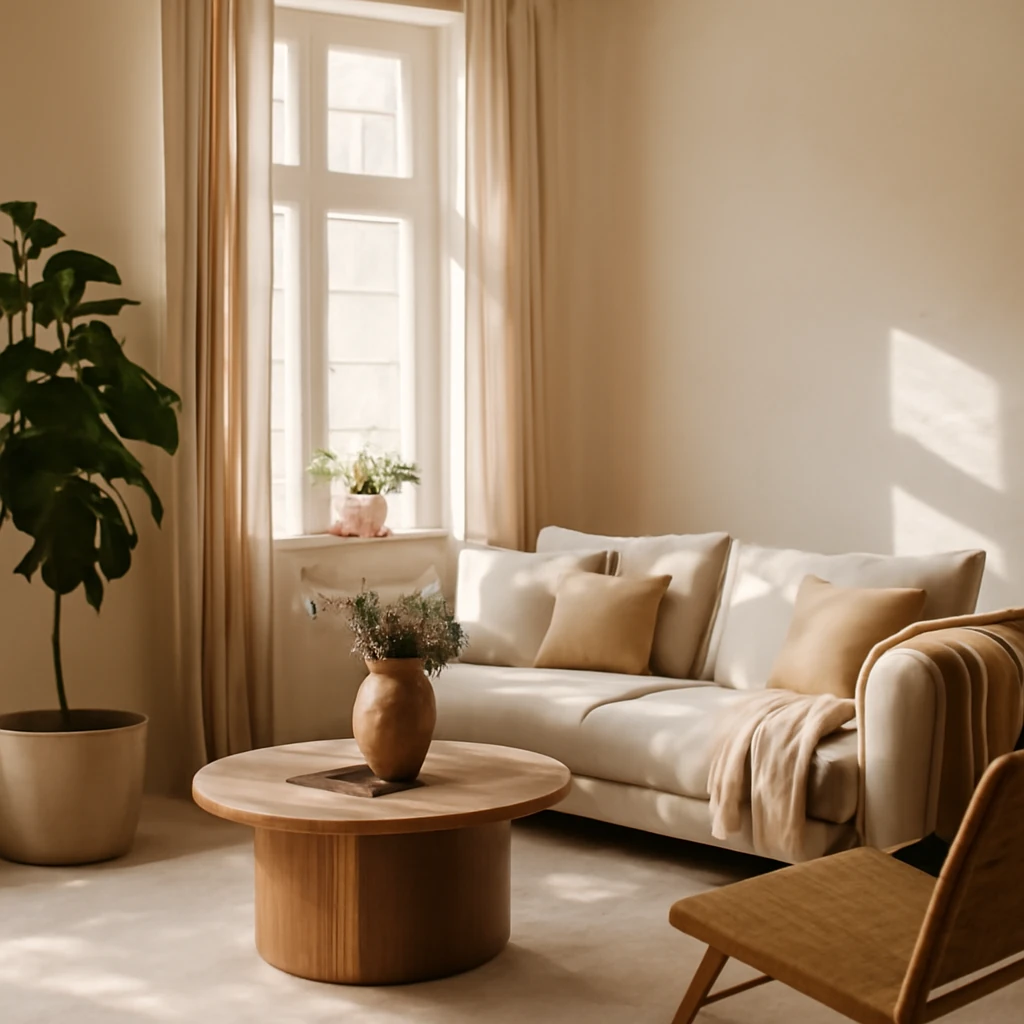
Grey has long been a staple in European interiors, translating across city apartments, coastal homes, and refined townhouses alike. Its versatility allows it to function as a soothing backdrop, a bold stage for accents, or a sophisticated bridge between light and texture. In this feature we explore why grey remains compelling, how to deploy it thoughtfully, and practical guidance for room by room design that feels both contemporary and timeless.
From loft apartments to seafront flats, grey can adapt to different luminosities, materials and furniture strategies. The key lies in balancing undertones, scale and lighting, so the colour supports human comfort while supporting a modern aesthetic. The following sections translate these ideas into actionable guidance for European homes, with clear rules, palettes and room by room suggestions.
Advantages of grey interiors
- Rich palette and flexible pairings. Grey offers a broad spectrum of undertones, from pale alabaster to deep graphite, allowing easy coordination with timber, ceramics, fabrics and metallics. The result is a versatile backdrop that can soften or sharpen a space as desired.
- Neutrality with personality. As a neutral, grey acts as a calm canvas that can accommodate bold accents without competing with them. It provides a coherent backdrop for evolving colour schemes over time.
- Elegant accent opportunities. When a room feels monotone, introducing saturated accents in red, mustard, teal or navy can create drama without overpowering the overall calm of the scheme.
- Practicality and longevity. Grey textiles and surfaces tend to wear well in daily life, hiding minor wear and blending with changing seasons and trends. This makes it particularly well suited to family homes and busy urban living.
- Simple and rapid transformations. Because the base is quiet, changing cushions, throws, curtains or a rug can refresh the space quickly and cost-effectively without a full redesign.
- Stimulation and focus. Psychologists note that a well-balanced grey environment can support concentration and mental clarity, particularly when paired with appropriate lighting and texture.
Drawbacks of grey interiors
- Potential for coldness or clinical associations. In some settings, a predominately grey palette can feel austere or reminiscent of institutional spaces if not carefully tempered with warmth and texture.
- Requires thoughtful lighting. Grey surfaces reflect light differently depending on undertone and material, so layered lighting is essential to avoid a flat or dull appearance.
- Risk of visual fatigue. Prolonged exposure to large expanses of grey can fatigue the eye if contrast, texture or scale is absent. Accent colours and sculptural furniture help mitigate this.
Psychology of grey
Grey often carries associations of formality, restraint and modern sophistication. In some contexts it can be perceived as impersonal or chilly. However, when employed with warmth and tact, grey supports calm while enabling the human brain to focus. In practice, its psychological impact depends on the balance of light, texture and colour companions.
- Calm and security. Lighter greys with soft textures can create a serene ambience that reduces visual noise and promotes relaxation.
- Enhanced focus. Greys with cooler undertones can sharpen perception and aid in concentration when paired with adequate task lighting and organised spaces.
Guidelines for applying grey interiors
To realise the potential of grey in European homes, designers follow a set of practical principles that ensure warmth, depth and longevity rather than a flat, everyday look.
- Lighting is essential. A well-planned mix of daylight, ambient illumination and task lighting prevents grey from appearing flat or dull. Consider layered lighting with ceiling luminaires, wall washers and adjustable task lights to sculpt space by time of day.
- Grey as a background. Treat grey as a background colour that can absorb or reflect other colours. Choose furniture and textiles in one or two darker or lighter tones to create depth without visual chaos.
- Plan a full design before the makeover. Whether renovating or re-decorating, align wallpaper, textiles and furniture so they harmonise with the chosen grey undertone. Mismatched undertones can make the palette feel disjointed.
- Texture is essential. Introduce warmth and tactility through wood, stone, textiles and surfaces. A mix of matte, satin and subtle gloss finishes adds depth to grey schemes.
- Balance dark and light. Pair light greys with darker accents to avoid a space feeling heavy. Conversely, a predominantly pale grey scheme can benefit from a touch of warmth via timber or textured fabrics.
Shades of grey
The grey family is rich with variants that suit different rooms and light conditions. Common European palettes include:
- Pale greys such as dove or linen – soft, airy and ideal for small spaces or northern light.
- Mid greys such as ash or stone – versatile between warm and cool lighting, work well with natural wood and metal accents.
- Warm greys with undertones of beige or pink – behave like neutrals that feel inviting and cosy.
- Cool greys with blue or green undertones – suit modern, crisp interiors and pair well with colder light or glass and steel elements.
- Dark greys and charcoals – create dramatic backdrops for dramatic lighting or high contrast schemes with white or warm timber.
Beyond plain paints, grey can be explored through textures and patterns. Wallpaper featuring subtle tonal motifs, concrete-effect finishes or stone-inspired tiles can add depth without overpowering the room.
Furniture and finishes
Pieces selected to complement grey tend to be lightweight and refined rather than heavy and ornate. The emphasis is on clean lines, modern silhouettes and carefully chosen finishes.
Furniture is commonly finished in white, black or timber tones, with metallic accents in brushed nickel, brass or matte chrome. It is important to avoid a riot of colours that compete with grey, instead, let textiles and accessories carry colour in a controlled, cohesive way.
Textiles
Textiles are the primary tool for adding warmth and personality to grey interiors. They offer a practical and affordable route to update the mood with minimal upheaval. When the base palette is grey, textiles in rich or vivid colours can transform the perception of the space.
Effective strategies include layering with light and dark drapery, throws and cushions, and introducing textiles in accent colours to create focal points. Blackout curtains, velvet cushions, and textured weaves are particularly effective for adding depth and comfort.
Finishes and materials
Grey interiors accommodate a broad range of finishes and materials. The aim is to build a tactile, layered environment rather than a flat, monochrome surface.
- Wall coverings range from grey-painted walls to patterned wallpapers with tonal reliefs or metallic sheens.
- Brick effect or natural stone can be used for feature walls, either real or simulated, to add character without abandoning grey’s elegance.
- Wood finishes, including oak, ash or walnut, introduce warmth and contrast, consider lighter timbers to keep spaces airy.
- Metallic and glass elements provide a contemporary edge and reflect light, enhancing the luminosity of the scheme.
Flooring choices include tile, vinyl, laminate or timber. In some schemes a pale wood floor or a light stone tile helps balance the gravity of dark greys, while parquet adds warmth in traditional or transitional spaces.
Choosing a style for grey interiors
Grey adapts to a wide range of design directions. The following are among the most effective in contemporary European homes:
- Minimalism. Grey shines when pared back to essentials. White and pale timber soften the look, while clean lines and uncluttered spaces emphasise form and material quality.
- Hi tech. A restrained greys palette complements technological materials and finishes. Limit the colour range to two or three tones and let metal, glass and lacquered surfaces do the talking.
- Loft. A practical, urban aesthetic works beautifully with grey as a backdrop for brick, timber, and industrial lighting.
- Country and Scandinavian. Warmer greys with beige undertones integrate well with natural materials, soft textiles and light timber, creating cosy, inviting spaces.
- Coastal and Mediterranean. Grey paired with blues, whites and sandy tones evokes sea air and sunlit rooms without overpowering light.
- Art Deco and Classical. Grey can be a sophisticated foil for bold geometry, metallic accents and refined furnishings that characterise these styles.
Pragmatic practice shows that successful grey interiors often blend styles. A touch of warmth from timber or soft texture can bridge modern and traditional aesthetics, yielding spaces that feel coherent rather than contrived.
Rooms in grey tones
Each room presents its own design considerations. The following guidance reflects practical European living, with emphasis on light, proportion and comfort.
Kitchen
The kitchen is a versatile testing ground for grey schemes. A well-lit kitchen benefits from layered lighting to emphasise work zones and dining areas. In general, grey cabinetry paired with warm or cool accents works well, consider light benches or timber surfaces to soften the look. For colour accents, small elements in yellow or green provide freshness without overpowering the grey base. Wooden countertops or breakfast bars offer a refined contrast that remains timeless.
Living room
In living spaces, grey is a natural backdrop for a curated palette of warm browns, beige, or blue undertones. A range of textures - from wool to linen, from velvet to boucle - helps negate any monotony. If the room benefits from bolder colour, use it sparingly in cushions, a rug or a single accent chair. This approach sustains elegance while allowing personality to emerge.
Bedroom
The bedroom benefits from softer greys that promote restfulness. Combine pale greys with mint, sage or pale blue textiles to evoke tranquillity. Lighting should be gentle and layered, with a dedicated reading light near the bed and dimmable ambient sources to adapt to different moods.
Children’s room
Children’s spaces in grey require vibrant accents to stimulate creativity. Include bold beds, rugs or curtains in pink, lime, teal or primary colours, but ensure the overall scheme remains balanced. Practical considerations include washable finishes, soft textures and ample storage to maintain order.
Bathroom
Grey bathrooms benefit from veined or patterned tiles that echo natural stone, combined with white sanitaryware for a fresh, spa-like feel. A restrained palette with natural materials such as timber or stone adds warmth, while metal fixtures bring modern edge. Textiles such as towels in blue, green or warm neutrals can finish the space tastefully.
Hallway
Entrances often benefit from light greys with a touch of texture, such as brick-effect wallpaper or a stone-look tiling. A well-lit hallway with mirrors and soft, warm lighting can counter any potential gloom and create an inviting first impression.
Decor and lighting
Decoration should support the chosen mood and scale. If the space is entirely grey, decorative elements - vases, art panels, sculptural objects - should be chosen for contrast or tactility. Conversely, rooms with a vivid accent colour can feature smaller, carefully chosen decor items that echo the hue in textiles or finishes. Lighting should be zone-oriented, with a mix of ambient, task and decorative luminaires. Because grey can darken a space, generous lighting and reflective surfaces help maintain airiness and readability of the space.
Colours that pair with grey
Grey pairs well with a broad spectrum of colours. Consider the following as starting points for palettes that feel cohesive and refined throughout a home:
- Orange. Use sparingly to avoid overpowering the grey base, think accents such as a vase, a lampshade or a small rug.
- Lilac and soft purples. Ideal for bedrooms or children's rooms, offering a gentle contrast without harshness.
- Navy blue. A classic pairing that adds depth, integrate with white, silver or soft yellows for balance.
- Soft greens. Particularly effective in bedrooms and kitchens to evoke calm and freshness.
- Blue and turquoise. Introduce via textiles or small decor items to enliven blue-toned schemes, especially in coastal-inspired interiors.
- Rich reds. When used with pale greys, creates a sophisticated, high-contrast effect without dominating the room.
- Pink. Subtle pink accents can add warmth and romance to bedrooms or living spaces.
- Bright yellow. Best used sparingly as accent notes to avoid overwhelming the grey base, such as cushions or a small chair.
- Beige and warm browns. Soften greys and lower the perceived temperature of the space, creating a cohesive, inviting palette.
- Wood tones. Natural wood in light to medium shades grounds the palette and adds tactile warmth.
As with any colour strategy, the key is restraint and balance. The lighter the grey, the more space it feels, the darker the grey, the more atmospheric the room - provided there is sufficient light and texture to counteract heaviness.
Grey in different design styles
Grey supports a wide range of design directions. Here is a compact guide to how it performs in several popular European styles:
- Minimalism. Grey is at home here, especially in cooler schemes with white or pale timber. Clean lines and a limited material palette highlight form and function.
- Hi tech. The interplay of grey with metal, glass and lacquer creates a clean, futuristic feel. Keep the palette tight and allow technology to express itself through finishes and lighting.
- Loft. An urban aesthetic thrives on exposed textures and industrial finishes, grey acts as a unifying backdrop for brick, metal and reclaimed wood.
- Country and Scandinavian. Warmer greys with beige undertones bring warmth and hygge, pairing well with soft textiles and light timber for a cosy, inviting space.
- Coastal and Mediterranean. Grey with blues and whites evokes sea air and sunlit spaces, maintaining brightness while providing a contemporary edge.
- Art Deco. Grey can serve as a sophisticated counterpoint to bold geometry, lacquer and metallic accents.
- Classical. Traditional spaces can be modernised with grey by using restrained palettes, antique silhouettes in grey graphite or stone-like textures.
Practical experience shows that the strongest grey interiors merge ideas from several styles. The result is a space that feels deliberately curated rather than simply styled, with a sense of coherence and personality.
Conclusion
Grey is a durable, adaptable choice for European interiors when approached with intention. By attending to lighting, texture and proportion, you can create spaces that feel calm, refined and endlessly adaptable to changing lives and tastes. Far from being a dull default, grey offers a sophisticated vehicle for warmth, character and timeless style across kitchens, living rooms, bedrooms and beyond.
You may also like these articles
 Trends
Eight contemporary interior directions redefining European homes in 2024
Eight modern interior directions shaping European homes in 2024.
 Tips & How-To
Digital room planning: four online tools for European homes
Four top online planners to map, visualise and refine your European home renovation.
Colour & Materials
Colour in the European Kitchen: six best combinations and a practical table
Six top kitchen colour pairings for European homes, with a compact reference table.