
Explore interior trends, AI design insights, styling guides and real transformations
Grey Wallpaper: Turning 'Grey' into Subtle Luxury Across European Homes
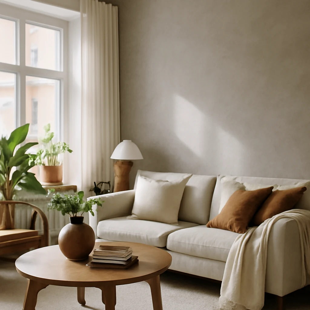
Introduction: The appeal of grey wallpapers in modern European homes
Grey wallpaper has moved beyond a quiet backdrop to a deliberate design statement. Across European interiors, grey is valued for its versatility: it anchors bold architectural ideas, softens dramatic furniture, and acts as a reliable canvas for seasonal palettes. In professional practice, grey is treated as a strategic tool that adapts to both compact city flats and light-filled continental homes, offering a calm, flexible stage for ever-changing moods and trends. When chosen with care, a grey wall can unify a scheme, balance contrasting finishes, and provide a sense of rhythm that guides the eye through a room or an entire apartment.
From cool, blue-tinged greys that echo granite to warm, taupe-inflected greys that hint at shelter and comfort, the hue can be sculpted with texture and sheen. The surface finish - matte, lightly embossed, or subtly metallic - adds tactile depth without shouting for attention. And because grey sits in the centre of the colour spectrum, it can accommodate a restrained modernist impulse or a more expressive, textile-forward approach. In European homes, where spaces range from compact urban dwellings to airy coastal residences, grey wallpaper is a unifying device that respects history while inviting contemporary interpretation.
Choosing the right shade involves considering natural light, room proportion, and the atmosphere you want to create. Lighter greys tend to enlarge spaces and feel bright, while mid-tones can anchor a scheme with a sense of dignity. Cooler greys pair well with blue or white accents for a crisp contemporary look, whereas warmer greys harmonise with wood tones and creamy whites for a cosy, timeless feel. Texture matters too: a softly textured wallpaper can add warmth and depth even when the colour remains understated.
Pros and cons of grey wallpaper in interiors
Grey wallpaper is a designer favourite for its versatility, but like any material choice it has its caveats. The most frequent concern is the risk of dullness if the tone is too flat or the space lacks adequate light. However, when used thoughtfully, grey becomes a stabilising, adaptable backdrop that supports change over time - the kind of foundation that remains relevant as trends shift.
Key advantages include its neutral but expressive potential, the ease with which it can be refreshed with textiles and accessories, and its ability to anchor a wide range of styles - from minimal and modern to classic and romantic. A well-chosen grey can unify diverse elements in a room, from architectural detailing to soft furnishings, while still leaving room for bold accents elsewhere in the home.
Possible drawbacks centre on lighting and scale. In small, north-facing rooms, a very dark grey can feel absorbing rather than inviting, in such cases, opting for a lighter shade or adding reflective surfaces helps mitigate the effect. Similarly, a heavily patterned grey wallpaper can overwhelm a modest space if the pattern competes with furniture and art. The remedy is to balance texture with lightness elsewhere and to reserve stronger patterns for feature walls or larger rooms where the scale can breathe.
- Neutral versatility: grey acts as a stabilising backdrop for bold art, fabrics, and architectural features.
- Timelessness: a well-chosen grey remains chic across seasons and trends.
- Light-smart opportunities: lighter greys reflect daylight and brighten even darker rooms.
- Design flexibility: textures and finishes allow the ambience to shift without repainting.
Practical guidelines to avoid common missteps include selecting warm greys for spaces with limited daylight, balancing with bright ceilings and mirrors, and using patterns sparingly to maintain legibility of the space. In European contexts, greys work beautifully with the region’s diverse materials - stone, timber, brick - allowing a refined synthesis of old and new.
Grey wallpapers in design across Europe: room by room
Kitchen
Grey wallpaper in kitchens can be sophisticated and practical, provided the space is well lit and properly ventilated. In compact European kitchens with limited daylight, very dark greys should be avoided as they can feel absorbed by the walls and shrink the room further. Instead, opt for mid-tones or warm greys with a gentle warmth that complements natural light and timber or stone surfaces.
To prevent the atmosphere from turning gloomy, introduce complementary wall colours in warm whites, pale yellows, or soft blues. These hues lift grey without competing with it, and they help in defining zones, such as a dining nook or a breakfast area. For kitchens with dining corners or service counters, wallpapered panels can delineate the area without the need for heavy dividers. Consider a wallpaper with a subtle pattern or a textured finish to add visual interest while staying calm.
Practical notes for kitchens include choosing washable, humidity‑resistant wallpaper, ensuring the wallpaper is rated for kitchens or damp environments, and installing with appropriate lining and sealing to withstand regular cleaning. Typical wallpaper rolls measure around 0.52 m in width and up to 10 m in length, plan for pattern repeats and matching where necessary, especially on longer walls. A single feature wall behind a cooker hood or along a dining area can be a restrained yet striking choice, while the rest of the cabinetry and tiles remain neutral to maintain balance.
Living room
In living spaces, grey wallpaper offers a refined, flexible backdrop that supports a wide range of styles - from minimalism to mid‑century modern and industrial lofts. Monochrome schemes with a touch of metallic sheen can create a chic, cosmopolitan atmosphere, while patterned greys add depth without overwhelming the space.
When the room receives plenty of daylight, silver‑toned or subtly metallic greys work well with chrome and glass accents, creating a modern, polished vibe. In traditional or rustic-inspired spaces such as scandi or country living rooms, a wallpaper with a delicate pattern - geometric, botanical, or fine damask - can anchor furniture and define seating zones. To bring the room to life, select furniture in lighter tones or in pale oiled woods, if a brighter colour is desired, choose hues like olive, teal, or burnt orange as accents in cushions and drapery. A carefully curated mix of textures - velvet, boucle, wool - ensures depth even with a restrained palette.
Architectural features such as a fireplace surround, built‑in shelving, or an accent wall can be highlighted with a patterned wallpaper to create rhythm in an open‑plan space. In larger rooms, a larger scale pattern can introduce drama without visually reducing space, while a smaller scale pattern keeps the room feeling intimate and refined. In Europe, where living rooms often serve as multifunctional hubs, wallpaper can help delineate zones for seating, reading, or entertaining without the need for heavy partitions.
Bedroom
Bedrooms benefit from a calm mood and a sense of privacy. Grey wallpapers can be a sophisticated choice, but tone matters: very dark or cool greys may feel imposing in smaller bedrooms. In master bedrooms and guest suites, opt for lighter to mid‑toned greys with warm undertones to cultivate a serene atmosphere that remains contemporary.
In larger sleeping areas, deeper greys can be used strategically - behind the bed, for instance - while the remaining walls stay light to preserve airiness. Wallpapers with soft textures, such as linen‑like or velour finishes, add coziness to the wall surface, which benefits a restful environment. To soften the grey, introduce gentle colours through textiles: beige, warm pinks, sage green, or pale blue. Subtle tonal shifts help avoid a monotonous feel and contribute to a holistic, soothing ambience. For children’s bedrooms or study nooks, pale greys can act as a flexible base for evolving colour ideas and imaginative play.
Hallway and entrance
Corridors and entryways benefit from greys that lift the space rather than absorb it. Choose light to mid greys that brighten the walls while adding texture through subtle motifs such as a fine geometric or trellis pattern. Textured wallpapers with a gentle sheen can bounce light and make long corridors feel more welcoming without overwhelming the senses.
A hallway is a design opportunity: wallpapered panels at intervals, paired with layered lighting and mirrors, can create a sense of progression as you move from one area to another. A bold but tasteful pattern on a single long wall can break repetition, while the remaining walls stay plainer to maintain balance and elegance. In European urban residences, a strong corridor treatment can also become a feature, guiding visitors through the home with a refined rhythm.
Children’s room and study
Grey in children’s spaces is not a prohibition but a starting point. A pale grey base creates an adaptable background that allows bright accents to flourish as tastes change. In shared homes, ensure wallpapers used in children’s spaces are durable and easy to clean, selecting wipeable vinyl-coated options for high‑traffic play areas and study corners.
Pair light greys with gentle colours - soft yellows, lilacs, mint greens, or powder blues - to foster a cheerful, imaginative atmosphere. If the room doubles as a study, combine the wallpaper with a calm palette that supports concentration: cool greys with white trim and minimal clutter. A modular approach to furniture allows for easy reconfiguration as the child grows, while the wallpaper remains a constant, unifying element in the space.
Dining room and home office
A dining room can benefit from a wallpaper with understated elegance, helping to focus conversation and create a sense of refined restraint. In open‑plan layouts, wallpaper can delineate the dining area without heavy partitions, establishing a visual transition between spaces. For home offices, a neutral yet characterful backdrop can enhance focus, pair with warm wood furniture and layered lighting to avoid glare on screens.
When choosing scale, consider room size: smaller spaces benefit from smaller motifs that do not overwhelm, larger rooms can handle a more generous pattern. Remember that wallpaper can influence perceived temperature: cooler greys feel refreshing in summer, while warmer greys bring cosiness in winter. Integrating natural materials such as timber and stone anchors the scheme, preventing the wall from feeling clinical and ensuring the space remains human and inviting.
Colour and pattern pairings with grey
Before committing to a shade of grey, assess saturation and the amount of natural light. Dark greys can constrict a space, light greys tend to expand. The interaction between wall colour, lighting, and texture is what makes grey so versatile, rather than monotonous.
Warm greys harmonise with warm whites and creams, soft ochres, and natural wood tones. Cool greys pair well with crisp whites, navy, charcoal, and pastel blues. Many European projects blend two or three complementary colours to prevent the space from feeling flat, particularly in rooms with varied lighting conditions throughout the day.
- White and black create a high‑contrast, minimalist look, especially in contemporary interiors.
- Purple and red accents can be surprising when used sparingly, allowing grey to remain dominant.
- Soft pinks or rose tones introduce warmth and gentleness, especially in bedrooms and living rooms where a wearable, lived‑in feel is desired.
- Blue and grey together form a calm, cohesive environment, to add warmth, introduce beige or natural wood in furniture and textiles.
- Greens such as olive or sage bring life to a grey palette without overwhelming it.
- Gold or brass accents elevate the space with a touch of luxury when used in light fittings or frames.
Furniture and textiles to complement grey walls
When choosing furniture, consider the intensity of the grey walls. Deeper greys typically require lighter, brighter furniture to prevent the room from feeling heavy, while lighter greys can accommodate saturated colours in upholstery and décor. Wood tones play a crucial role: light oak, bleached ash, or pale walnut can soften the palette and introduce warmth without clashing with cool wall tones.
For upholstery, mix textures to preserve depth: velvet, bouclé, wool, or linen fabrics in complementary hues. If a bold contrast is desired, select a standout colour for cushions and throws, rather than applying it across large furniture. This approach preserves cohesion and allows the wallpaper to remain the quiet star of the room.
Consider the scale of furniture patterns relative to the wallpaper. In compact rooms, avoid oversized prints on upholstery that compete with wall texture, in larger spaces, bolder upholstery can anchor the scheme. A balance of matte and slightly glossy surfaces - walls, sofas, cushions, and curtains - adds sophistication and keeps the room lively without shouting.
Choosing curtains and soft furnishings
Grey is an inherently adaptable base for textiles. The curtain option can either soften or sharpen the room’s mood, depending on light and function. Lighter, airy fabrics in pastel tones contribute to a sense of airiness, particularly in rooms with limited daylight. Traditional partners to grey walls include sheer whites, pale blues, and delicate lilac shades.
For contrast and drama, darker, heavier fabrics in navy, charcoal, or burgundy can frame windows and create a focal point. In more contemporary schemes, consider bold colour blocks or metallic threads woven into the fabric for texture and depth. The key is to ensure textile palette echoes the wall undertones and lighting conditions. Use multiple tones in soft furnishings to create depth without overwhelming the wallpaper.
When selecting blinds, consider options that modulate light - lightweight linens for bright rooms or layered fabrics for bedrooms. The rhythm created by wallpaper patterns and curtain weaves can guide the eye across spaces, enhancing spatial experience and comfort.
Bold accents in a grey room
Once the soft base is established, carefully chosen accents inject life and personality. The simplest tactic is to use colour in textiles, decor items, and artwork. A single, well-chosen accent colour tends to feel cohesive and deliberate, rather than scattershot.
Metallic tones such as silver or brushed metal can elevate grey interiors with a sense of luxury, cushions, vases, and lighting fixtures in these finishes are effective tools. A tasteful bouquet or seasonal botanicals offer an easy, updateable way to refresh a room without expensive changes. Textiles are particularly versatile for experimentation: swap cushion covers or throws to shift the mood with the seasons or trends. Decorative elements such as wall-based art or textiles can also become a strategy for adding character while keeping the walls as a refined backdrop.
In many European projects, designers employ understated wall decoration or framed textiles as a flexible alternative to large wall art - allowing the wallpaper to remain the backdrop while accents tell the room’s story.
Practical guidelines for installation and maintenance
Wallpaper selection involves more than colour. Consider texture, pattern scale, and the room’s function. For high‑traffic spaces, choose washable or wipeable finishes. For damp areas, select wallpaper with moisture resistance and install with appropriate liners and sealants to protect the substrate and preserve colour integrity over time.
General installation tips include proper surface preparation, including thorough cleaning, smoothing, and ensuring the wall is completely dry before applying paste. When pattern matching is required, plan ahead by calculating the number of drops needed per wall and maintaining pattern continuity across joints. Typical European wallpaper rolls are about 0.52 m in width and 10 m in length, weigh up the pattern repeat and the required waste when budgeting for the wall area. Some designs employ straight matching, others offer drop or offset matching, this influences installation duration and the amount of waste material.
Maintenance involves regular dusting with a soft cloth and using mild, non‑abrasive cleaners suitable for the wallpaper finish. Avoid harsh solvents or abrasive scrubbing that can wear the surface. In kitchens and entrance corridors, consider protective panels behind high‑contact zones to extend wallpaper life and protect against scuffs and stains. For seasonal refreshes, change the textile layer rather than the wall to maintain a fresh look without major work.
Practical case studies: European canvases transformed by grey wallpaper
Across Europe, thoughtfully applied grey wallpapers have refreshed spaces from compact city dwellings to airy coastal residences. The most successful projects share several core attributes: the wallpaper provides a flexible base that supports changes in furniture and textiles, lighting is carefully planned to enhance the wall colour, and the palette for textiles and decorative items echoes the undertones of the wall, ensuring a cohesive atmosphere. Below are anonymised scenarios reflecting common European contexts:
- A compact city flat with an open‑plan living and kitchen area used a light grey wall with a fine texture to anchor the space. The furniture was chosen in white and pale oak, with textiles in metallic silver and soft blue to create contrast and depth. The result was a serene, airy feel that expanded the sense of space while maintaining warmth and tactility.
- A coastal apartment employed mid‑grey tones on the main walls, paired with pale neutrals in upholstery and whitewashed timber furniture. The coastal light emphasised the grey’s cool undertones, producing a calm, contemporary look with a subtle maritime character that remains timeless rather than gimmicky.
- A traditional European apartment with high ceilings used a refined grey damask wallpaper on an accent wall, complemented by soft beige and creamy whites in decorative elements, delivering a timeless, elegant ambience for a formal living room suited to both everyday living and formal gatherings.
Conclusion: Grey wallpaper as a versatile design instrument
Grey wallpaper offers a sophisticated, flexible platform for European interiors. It can anchor a modern, high‑contrast space or soften a grand, classical scheme. By selecting the right shade, texture, and scale, and by balancing it with lighting and textiles, designers can create rooms that feel both timeless and contemporary. The key is to treat grey as a deliberate strategy rather than a constraint, using it to shape ambience, define zones, and celebrate the beauty of understated colour. In a Europe of varied climates, architectures and lifestyles, grey wallpaper stands out as a quiet hero - reborn with texture, light, and the right companion elements.
You may also like these articles
 Tips & How-To
Cleaning Wallpaper in Europe: A practical guide to safe maintenance
A practical European guide to cleaning wallpaper without damage.
Bedroom
How to Choose the Right Mattress for Your European Bedroom
A practical guide to selecting the perfect European mattress for comfort and support.
 Trends
Hi-Tech Living: Comfort meets cutting-edge technology in European homes
Future-ready spaces where comfort and smart tech join.