
Explore interior trends, AI design insights, styling guides and real transformations
Grey Walls in European Interiors: How to Select Shades and Finishes
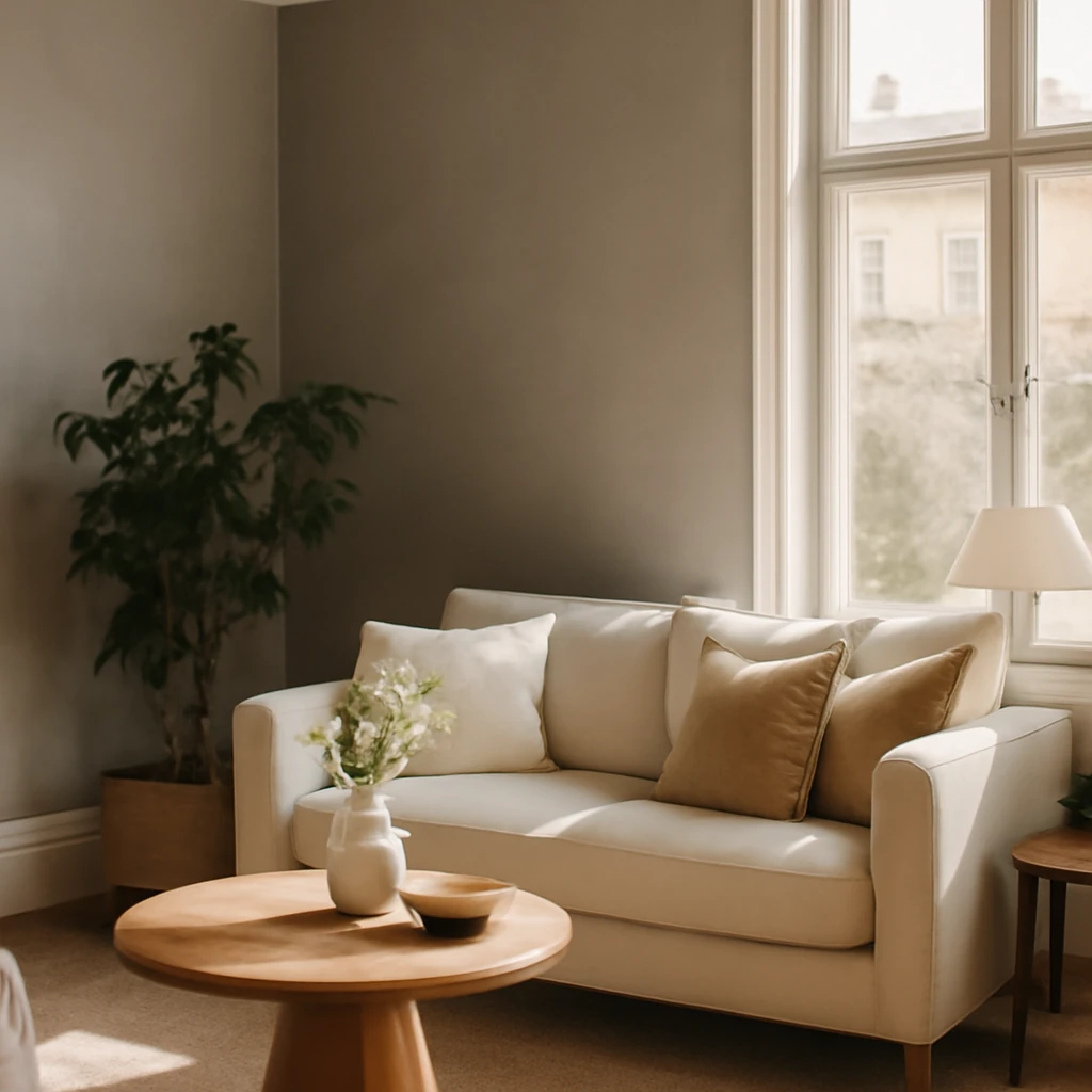
Grey walls as a timeless canvas
Grey has long been a favourite of designers across Europe for its quiet authority and versatility. It acts as a stabilising backbone for a room, allowing textiles, furniture and art to take the lead without competing for attention. The challenge lies not in choosing grey itself but in selecting the right shade, finish and pairing that will endure as trends shift and daylight changes through the seasons. From the sunlit apartments of the Mediterranean to the cool, contemporary homes of the Nordic region, grey walls offer a neutral stage that can be dressed up or dialled down with texture and colour.
Because wall finishes are less readily changed than furniture or soft furnishings, it pays to invest in universal tones and durable materials. This guide draws on European experience and practical design approaches to help you craft interiors that feel timeless, cohesive and alive for years to come.
All about grey walls
Choosing a shade is the first and most influential decision. Grey derives its character from undertones such as blue, green or warm brown. A blue-leaning grey feels cool and contemporary, a greenish grey brings calm and nature, while warm greys with golden or beige notes convey cosiness. The orientation of a room and the quality of daylight dramatically affect perceived colour. In northern or east-facing spaces, a touch of warmth can prevent a room from feeling chilly, in southern or west-facing rooms, cooler greys can stay crisp and fresh even in bright sun.
When evaluating samples, place them on the walls you intend to paint or wallpaper and observe under different light: morning sun, late afternoon glass, and artificial lighting at night. Small panels around the room will help you compare undertones more reliably than a single swatch pinned to a wall. If you favour a minimalist, cohesive look, you may opt for a single, unifying shade across walls with deliberate textural contrast in the ceiling, joinery and flooring.
Neutral greys are inherently flexible, but the real richness comes from how you apply texture, how light flows through the space, and how the wall interacts with other finishes such as timber, stone, metal or fabric.
Shades and moods by tone
Here are commonly considered categories, described in broad terms so you can translate them across European markets:
- Pearl grey: a light, near-white grey with silver flecks. It opens spaces, softens glare and pairs beautifully with navy, deep burgundy or warm beiges, and it harmonises with marble and warm metallics.
- Graphite and charcoal: dark, architectural greys that create a cosy, intimate ambience when paired with rough textures like concrete, stone or brick and with metallic in black, brass or brushed nickel.
- Steel grey: a mid-toned, balanced shade that sits well beside chrome, steel, and black and white combinations. It responds well to cool blues and crisp whites, creating a modern, elevator-like feel.
- Marengo: a deep grey with a subtle blue undertone, evocative of stormy sea or slate. It works superbly in compact spaces such as bedrooms or reading corners, particularly when complemented by emerald, bottle-green or cool graphite accents.
- Warm greys: greys with brown, taupe or yellow-based undertones. They read comfortable and cosy, ideal in traditional or transitional interiors where timber, leather and woven textures predominate.
In European contexts, consider how a given shade will look with natural materials such as oak, limestone, or travertine, and how it will interact with floor finishes, ceilings and cabinetry. The goal is a balanced palette where the wall colour enhances rather than competes with other surfaces.
Colour pairings with grey
Grey as a backdrop offers enormous flexibility. The ahromistic nature of grey makes it an ideal neutral background that can bring out other colours or act as a cohesive element in a diverse palette. Below are widely used pairings and the mood they create.
- Blue and grey - a classic cool combination that evokes skies and sea. It enlarges spaces visually and works well in rooms with limited natural light, such as kitchens and compact living areas, especially when ceilings remain light.
- Purple tones - lavender to deep aubergine can be striking, but use sparingly. Too much purple can dominate mood, balance with a restrained palette of greys and neutrals.
- Yellow accents - adds warmth and brightness, a familiar pairing in contemporary and Nordic-inspired spaces. This is a practical trick for rooms with little natural light.
- Beige and stone tones - a timeless neutral combo. Grey with beige creates warmth and softness without sacrificing sophistication.
- Black and white - a classic monochrome approach. Layer several greys between black and white and introduce texture to maintain visual interest.
- Pink and rose-tinted greys - a gentle, contemporary pairing for bedrooms or bathrooms. Choose dusted pinks with muted greys to keep the atmosphere calm and refined.
When pairing, think in terms of temperature and texture rather than brightness alone. In a European apartment, a cool grey can be grounded with warm timber and linen, a warm grey can be lifted by crisp white millwork and cool stone.
Materials and finishes for grey walls
While paint remains the most versatile and accessible option, several other materials can deliver depth, texture and durability in European homes. Each material interacts with grey differently, so understanding their characteristics helps you design spaces that remain fresh for years.
Paint
Paint offers the greatest flexibility for a living room, hallway or bedroom. You can paint entire walls or create feature walls with a second or third shade. Modern paints come in matt, satin and subtle gloss finishes, and many are washable or stain-resistant, suitable for kitchens and bathrooms. For damp zones or high-traffic corridors, choose a moisture-resistant formulation. In neoclassical or contemporary interiors, introduce mouldings or decorative panels to add architectural interest without cluttering the space.
Practical tips:
- Test several shades on large wall panels under both daylight and artificial light before committing.
- Pair matte walls with polished wood or metal accents to create a layered, tactile effect.
- Consider the ceiling finish, a slightly lighter or brighter ceiling can make the room feel taller and more open.
Wallpaper
Wallpaper offers texture and pattern that paint alone cannot replicate. Modern wallpapers range from smooth, washable vinyls to textured grasscloths and photographic or geometric designs. When used with grey walls, wallpaper can create a subtle order or a bold focal point, depending on scale and contrast. In corridors or entryways, consider durable, wipeable finishes that withstand traffic and scuffing. For living rooms and bedrooms, a feature wallpaper in a coordinated palette can anchor the space without overpowering it.
Guidance for choosing wallpaper with grey:
- Opt for textures or patterns that echo other materials in the room, such as linen, herringbone, or architectural geometric motifs.
- Keep the overall palette cohesive, if the wallpaper is bold, balance with neutrals on the adjacent walls.
- In smaller rooms, use smaller-scale patterns to avoid visual clutter, in larger spaces, bigger patterns can read as a design statement.
Tile and stone finishes
In bathrooms and kitchens, tile or stone provides durability and a tactile contrast to grey walls. Large-format porcelain or ceramic tiles in grey tones can emulate natural stone or concrete, creating a sleek, contemporary backdrop. For wet areas, select water-resistant grouts and sealants to preserve the finish. Textured or veined finishes in grey can mimic marble, granite or concrete, lending ripples of interest without shouting for attention.
Other considerations:
- Use wall tiles with larger formats to minimise joints and create a seamless look that enhances light reflection.
- Combine matte wall surfaces with polished or honed tiles to add a subtle hierarchy of texture.
Plaster and decorative finishes
Decorative plaster brings depth and relief to walls, offering a refined alternative to flat paint. Venetian plaster, textured plaster, or plaster with a light stucco texture can give a space a tactile, tactile sophistication that ages gracefully. These finishes work especially well in living rooms and bedrooms where natural light can sculpt the surface, revealing the material’s nuance as the day progresses. In damp zones, select plaster systems designed for humidity and moisture resistance.
Practical notes:
- Work with a skilled professional to ensure an even application and a durable sealant finish where required.
- Choose plaster colours that complement existing timber and stone hues to maintain cohesion.
Practical ideas for different rooms
Grey walls offer a flexible canvas for European homes. Here are practical strategies for common spaces, focusing on light, scale and texture to achieve a timeless look.
Grey walls in the kitchen
Grey kitchens present a pragmatic and stylish foundation for a culinary hub. Light walls with a grey undertone can visually enlarge a compact kitchen, while darker greys offer sophistication and depth for larger spaces. Consider the following guidelines:
- Light walls or pale greys on the walls reflect more light, making small kitchens feel larger and more inviting.
- Ceilings should generally be lighter than the wall colour, with a neutral or warm white to keep the space luminous.
- Flooring in a slightly darker shade creates a natural vertical gradient from top to bottom, enriching the sense of depth.
- Classic cabinet pairings span beige, blue, green, and yellow greys, as well as bold black and white combinations. The emphasis should be on the cabinetry’s finish and hardware rather than the walls alone.
In European kitchens, you might pair pale grey walls with a light timber island or a white marble worktop to maintain a fresh, culinary atmosphere. If your space benefits from a contemporary vibe, contrast with sleek black or cobalt accents and matte metal fittings.
Grey walls in the living room
The living room is where grey walls truly shine, offering a canvas for texture and light to create atmosphere. Consider these approaches:
- The floor can be any neutral tone, but a medium to dark wood or steel-grey tile grounds the room and helps the walls feel grounded.
- Where a completely monochrome scheme feels too austere, introduce an accent wall with a deeper grey or with a contrasting wallpaper pattern to add depth without overwhelming the space.
- Combine with soft furnishings in warm textiles such as wool, velvet and linen. A rug in a warmer tone or with subtle pattern will temper the coolness of the walls and add cosy rhythm.
- For ceilings, a subtly lighter finish enhances height and airiness, especially in rooms with limited daylight.
Grey walls in the bedroom
In bedrooms, the choice of grey can influence restfulness and warmth. A cool grey can feel serene, while a warmer grey offers welcoming comfort. Practical tips include:
- Choose undertones that harmonise with natural textures such as timber bed frames, wool throws and linen sheets.
- If windows face north, lean towards creamy or slightly amber greys to counteract the cooler light and create a snug feel.
- In smaller bedrooms, keep large furniture pieces in similar hues to blur lines and maximise perceived space, reflect light with mirrored or high-gloss surfaces sparingly to avoid glare.
Grey walls in the bathroom
Bathrooms benefit from hard-wearing, moisture-resistant finishes. Large-format greys can resemble stone or concrete and create a spa-like ambience when paired with natural textures and warm metals. Consider these ideas:
- Large porcelain tiles in grey with a matte finish evoke stone and resist staining or moisture more effectively than painted walls in humid areas.
- For a decorative touch, introduce a single feature wall with a veined, marble-inspired tile or a subtle pattern that stays calm and elegant.
- Use light ceiling tones to prevent the space from feeling oppressive, soft lighting and well-placed mirrors will amplify the sense of space.
Grey walls in the hallway and entrance
Entry zones benefit from a calm, durable palette. Grey walls create instant balance with other materials such as stone floors, timber cabinetry and metal hardware. Practical considerations include:
- Choose a eo-friendly, wipeable paint or wallpaper for high-traffic walls prone to scuffs.
- Keep the ceiling lighter than the walls to preserve a feeling of height and openness, especially in narrower corridors.
- In hallways, a brighter accent colour in soft furnishings, artwork or a rug can help guide visitors and energise the transition between rooms.
Practical design tips for longevity
Grey is sturdy, but the long-term success of your scheme depends on details beyond the wall colour. Consider the following to ensure the design remains fresh and timeless:
- Lighting strategy: combine ambient, task and accent lighting to modulate the mood. A well-balanced mix of warm and cool white light enhances the undertone of grey and frames textures beautifully.
- Texture as a protagonist: incorporate rich textiles, woven surfaces, brick or stone, and natural wood to create a tactile narrative that keeps the space engaging.
- Durability and maintenance: choose wall finishes and coverings that withstand frequent cleaning in busy zones. For kitchens and bathrooms, moisture-resistant paints and wipeable wallpapers are practical choices.
- Sustainability: favour natural or low-VOC paints and wallpapers, and opt for long-lasting materials that reduce the need for frequent replacement.
A European approach to daylight and climate
Across Europe, daylight quality varies with latitude, climate and urban planning. When planning grey walls, consider how the room receives daylight throughout the day and across seasons. In southern Europe, abundant sunlight can keep greys feeling crisp and contemporary, so deeper shades may be used with restraint or limited to focal walls. In northern Europe, cooler light can render greys slightly underscored by blue, warm undertones in paint or textile selections can counterbalance this effect and create a cosy, inviting atmosphere.
In open-plan homes, ensure that the wall colour is coherent with adjoining spaces. A single, well-chosen shade extended across multiple zones can unify disparate areas, while carefully placed accents in colour or texture prevent monotony.
Final thoughts
Grey walls are not a trend but a practical, long-term design instrument. They offer a sophisticated foundation for varied European interiors, respond gracefully to changing lighting and wear, and pair well with materials ranging from timber and stone to metal and ceramic. By selecting the right shade, balancing texture, and thoughtfully integrating lighting and furnishings, you can create spaces that feel both contemporary and timeless.
Remember that the most successful grey schemes are built on intentional contrasts and a clear design hierarchy. Start with a core hue, then layer texture and warmth through textiles, furniture and lighting. In doing so, you will craft interiors that remain stylish and liveable across generations and across the diverse climates of Europe.
You may also like these articles
 Small Spaces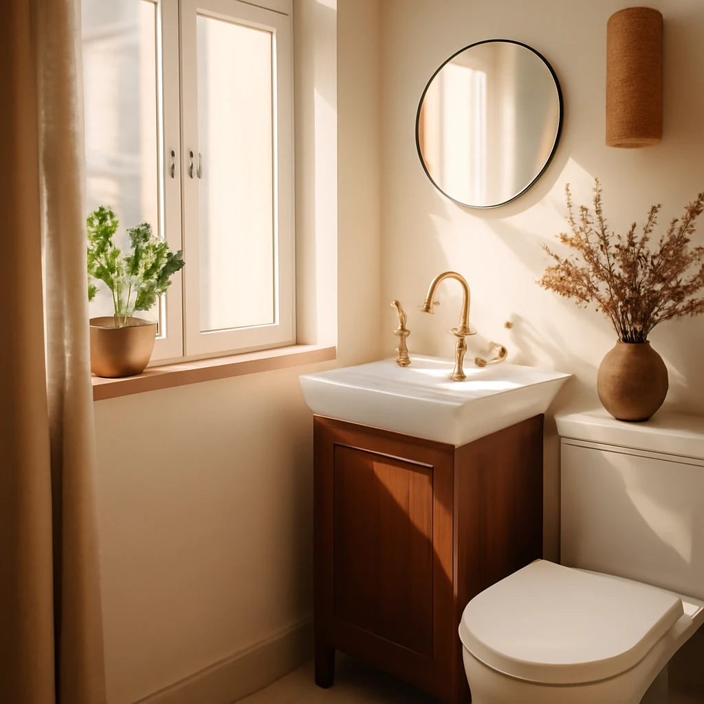
Designing a Small Bathroom: Practical Ideas for Compact European Homes
Smart layouts, light-filled rooms and clever storage for tiny baths.
Small Spaces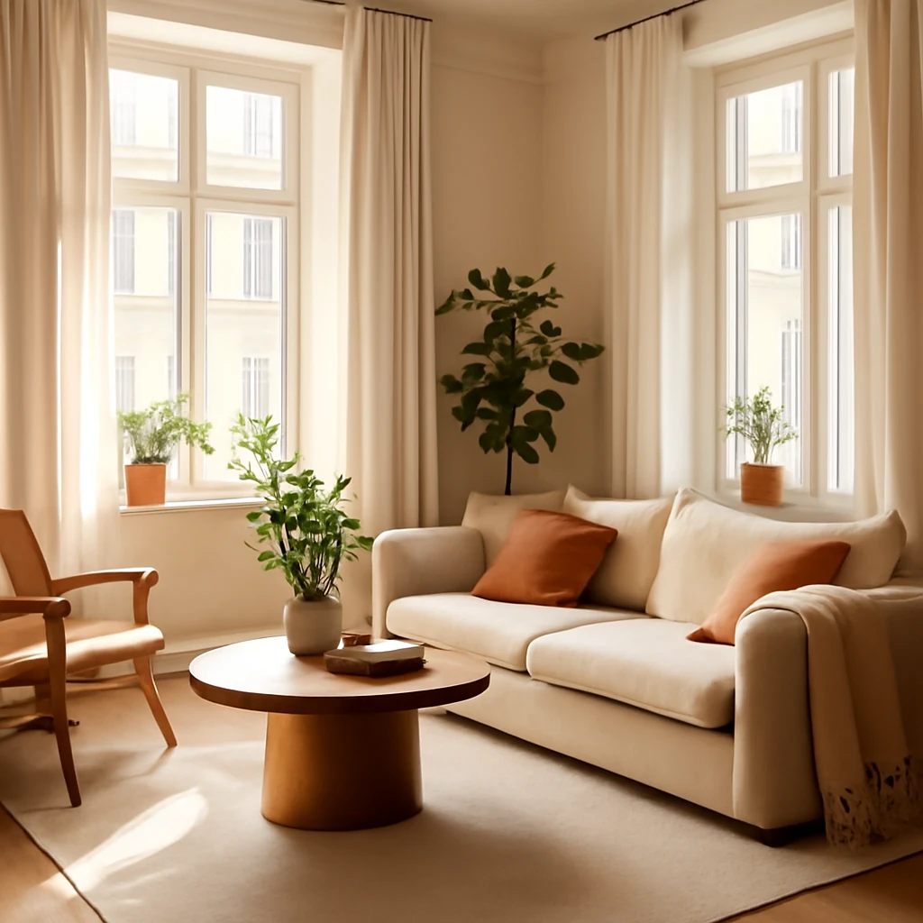
Compact Living, Grand Comfort: Designing European One-Bedroom Flats
Master small-space living with smart zoning, light and multifunction furniture across Europe.
Tips & How-To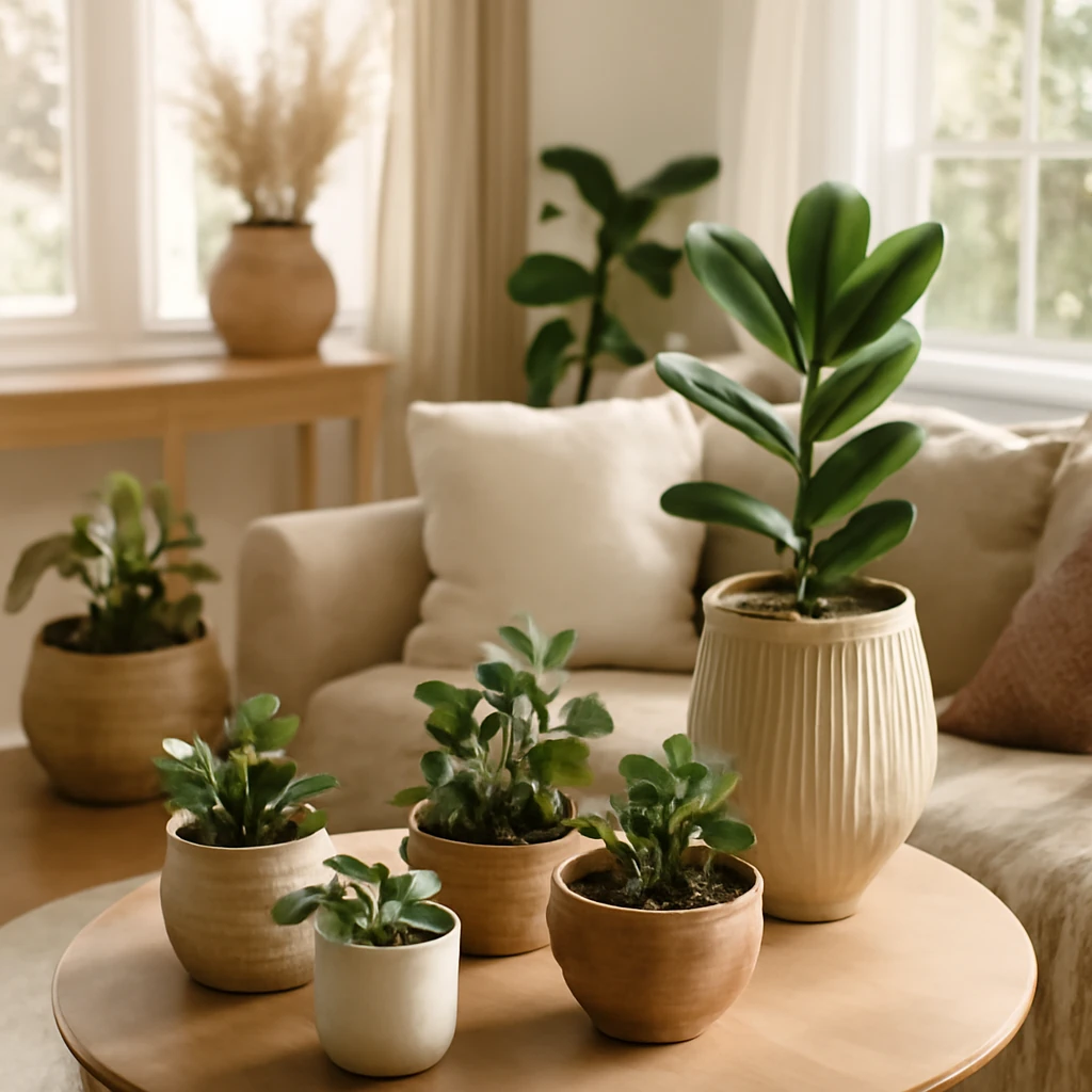
Handmade Planters: Five Simple DIY Ideas for Stylish Pots
Craft chic planters from everyday favourites with five easy DIY ideas.