
Explore interior trends, AI design insights, styling guides and real transformations
Wall Colour Made Simple: Rules and Room-by-Room Guidance for European Homes
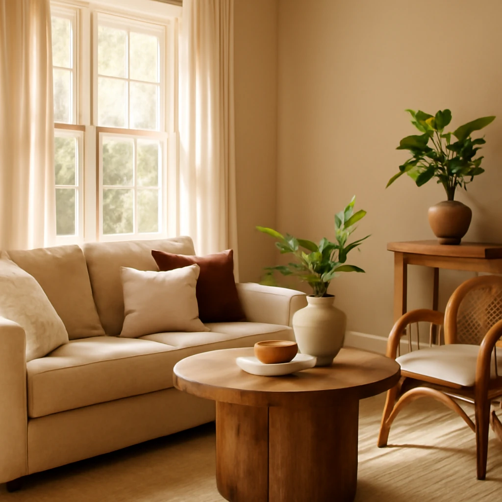
How to choose wall colour: rules for every room in Europe
Colour is a powerful design tool that shapes mood, light perception and the sense of space in European homes. The right wall colour can calm a space, energise a morning routine, or visually expand a compact apartment. This guide distils timeless principles for selecting wall colours, with room‑by‑room guidance for kitchens, living rooms, bedrooms, children’s rooms, bathrooms and hallways. It emphasises practical methods, tested palettes and how to test colours in real daylight and artificial light across different European climates.
General colour principles for interiors
When choosing a primary colour for a room, taste is important, but foundational colour theory helps ensure harmony even when a designer isn’t present. Below are the principles that consistently deliver balanced, timeless interiors.
- 60/30/10 rule. The main colour should cover about 60% of the space (typically the walls), the secondary colour about 30%, and an accent colour around 10%. This ratio creates visual harmony and a clear colour hierarchy.
- Light and space. Lighter tones visually expand small rooms, darker tones add depth and a sense of cocooning. In the right context, dark walls can create striking, intimate atmospheres, especially in larger rooms with ample daylighting or strategic lighting.
- Cool versus warm. Cool colours (blue, grey-blue, blue-grey) read as calm and expansive, warm tones (creamy whites, warm greys, taupe, sand) feel inviting and sunlit. Consider the exposure of the room (south-facing light is warmer, north-facing light tends to be cooler) and adjust your palette accordingly.
- Contrast and rhythm. Do not fear contrast. Pairing light walls with darker furniture or a deeper accent wall creates visual interest and perception of space. The opposite - uniform colour everywhere - can feel flat unless texture and light variation are introduced.
- Finish matters. Matte surfaces absorb light for a subdued, sophisticated feel, gloss or satin occasionally reflect light, making surfaces feel larger and brighter. Use textures to soften a bold colour or to add reflective highlights in small rooms.
- Lighting matters. Natural daylight and artificial lighting dramatically shift colour perception. Test paint samples in the actual room at different times of day and under artificial light to understand how the colour behaves morning, noon and evening.
To keep the palette cohesive across a European home, start from a neutral base - often a greige, warm grey, or soft ivory - and introduce colour through accents, textiles, and artwork. The goal is a colour story that flows from room to room, even as individual spaces express their function.
Coordinating wall colour with floor and furniture
Paint does not exist in isolation. The floor and furniture define a room’s character and strongly influence colour choices. Here are practical guidelines to harmonise walls with floor and furnishings.
With the floor
One of the simplest rules is to ensure a tonal difference of about two to three shades between wall colour and floor tone. If the floor is dark - think deep oak, walnut, or charcoal tile - walls in lighter or mid-tones help air the space and prevent it from feeling heavy. Conversely, if the floor is light (pale oak, plaster, or light stone), wall colours can be a touch deeper or moodier to create visual warmth without overpowering the room.
In a monochrome scheme, keep to a controlled set of base colours (for example, two neutral tones such as beige and grey) and vary their lightness and finish to preserve depth without creating a flat plane. In terms of colour temperature, cool floors (wood with a cooler undertone, grey tiling) pair well with cooler wall tones, warm floors (honeyed wood, terracotta tiles) are better balanced by wall colours with a touch of warmth to avoid an unbalanced coldness.
Accent walls or panelled areas offer a way to introduce colour without overwhelming the room. Choose one wall to carry a deeper shade or a saturated texture while keeping the remaining walls in a lighter, more neutral base.
With furniture
For many households, furniture often dictates the direction of the palette. If seating or cabinetry is bold or dark, neutral wall finishes help the room breathe and keep attention on the furniture. Light furniture against dark walls creates a striking, contemporary contrast, while a fully dark wall landscape can feel luxurious in larger rooms with ample lighting. In general, the 60/30/10 principle still applies: let the furniture be the accent or secondary colour, and use wall finishes to stage the composition.
In monochrome schemes, play with texture and subtle tonal shifts to create visual interest. Matte walls paired with glossy furnishings or textiles with a tactile weave can lift a restrained palette. For spaces that are frequently used for living and working, consider materials and finishes that hide wear while maintaining a refined look.
Room-by-room colour guidance
Every room has unique demands - function, privacy, daylight, and daily rhythms. The following recommendations provide practical starting points that can be refined to suit your local climate and architectural style.
Kitchen
Kitchens should feel welcoming and easy to maintain. Practical considerations - durability, stain resistance, and cleanability - often drive material choices, colour plays a supporting role in creating a calm, productive environment. For most European kitchens, opt for low-maintenance hues that hide minor splashes and wear. Neutral palettes in beige, taupe, stone, soft greys, olive greens, or sage can pair beautifully with natural timber worktops and ceramic backsplashes.
Bright white walls are fashionable in ledgers and small spaces but require robust materials and ongoing care. If you love white, choose washable paints or paints with a satin finish and couple them with a durable splashback (ceramic, glass, or porcelain tile) to resist staining. For a subtle spark, introduce colour in accents - perimeter cabinetry, a decorative tile band, or a cantilevered feature island in a muted green, blue-grey, or terracotta.
When selecting wall colours, consider the surrounding surfaces: cabinetry, countertops, and flooring. For example, if your floor features warm beige ceramic tiles or oak flooring, a soft warm grey or greige can align with the natural warmth. If the flooring is cooler - grey tile or pale concrete - cooler wall shades (greys with blue undertones, or soft blue-grey) can create a harmonious, contemporary kitchen.
Living Room
The living room is typically the most multi-functional space - relaxing, entertaining, working, and sometimes dining. Because of this, a versatile palette that remains stylish through changing seasons and life stages is essential.
- Base: light neutrals such as warm white, soft beige, or greige provide a calm backdrop for diverse furnishings and art.
- Accent ideas: deepen the room with a single feature wall in a rich tone - olive, charcoal, navy, or deep plum works well when balanced with lighter neutrals.
- Depth and texture: mix matte walls with textiles in velvets, boucle, or woven fabrics to add tactile richness without overpowering the space.
- Natural daylight: homes on the south or west often benefit from slightly cooler or more balanced wall tones to counteract late-afternoon warmth, north-facing spaces may welcome warmer neutrals to counteract natural coolness.
For large living rooms, you can experiment with a darker feature wall or a pair of complementary colours on adjacent walls, ensuring the ceiling remains lighter to keep the space feeling open. In smaller living rooms, avoid multiple intense colours, instead, use a single accent on a narrow wall and keep the others in lighter neutrals to preserve airiness.
Bedroom
Bedrooms are spaces for rest, intimacy and personal retreat. The palette should support relaxation, with volatility kept to a minimum. Soft, muted tones in creams, warm greys, and gentle pastels create a soothing backdrop that helps sleep and reduces visual noise.
A common guideline is to keep walls in light, enveloping tones - off-white, ivory, eggshell, sand - or a soft, warm grey. If you wish to introduce colour, reserve a single wall behind the bed for a deeper shade such as sage, dusty blue, or a warm terracotta. For those drawn to drama, a single accent wall in a muted wine or deep blue can be effective when balanced with neutral bedding and light-reflective surfaces to avoid a cave-like atmosphere.
Be mindful of the room’s natural daylight and the mood you want to cultivate. Cool blues can promote calm but may feel chilly in rooms with limited daylight, while warm neutrals maintain warmth without energising the space too much. If you want energy for morning routines, consider a restrained, softened accent colour that appears only in textiles and accessories rather than on every wall.
Children’s Room
When designing colour in a child’s room, two factors matter most: age and growth potential. If the plan is a long-term arrangement, a neutral base - beige, soft grey, white, or pale taupe - provides flexibility as tastes and hobbies evolve. Introduce colour through furniture, textiles, rugs, and wall decals that can be updated as the child grows.
In younger rooms, bolder colours are acceptable through furniture or decorative elements, but walls should generally remain calmer to avoid overstimulation. If you prefer a more dynamic scheme, consider a soft, heritage-inspired palette - sage green, powder blue, or dusty pink - as a backdrop, with bright accents in textiles and toys. For a room that supports concentration and energy for study, a light wall with a slightly energised accent can be helpful, but avoid saturating walls with too many competing colours at once.
Bathroom
Bathrooms are moist environments where durability and moisture resistance matter as much as aesthetics. Light, reflective surfaces brighten small spaces and keep them feeling clean and fresh. A classic approach uses white or off-white walls with a soft grey or stone-toned tile, creating a spa-like atmosphere. For a contemporary twist, try a restrained duo of colour: pale blue or green on the walls with white or pale natural stone tiling.
Darker walls in bathrooms can create a luxurious mood, provided the room has adequate lighting and at least one light surface (floor or ceiling) to prevent the space from feeling closing in. If you opt for darker walls, balance with a lighter ceiling, large-format glossy tiles, and mirrored surfaces to preserve brightness. Use finishes that resist moisture, such as washable paints or specialised bathroom paints, and consider a mix of textures - matte walls with glossy tiling - to add depth without sacrificing practicality.
Hallway and Entrance
The hallway is the first impression of a home and often a high-traffic zone. Practicality rules here: choose durable, washable finishes and tones that hide wear. Light neutrals - creamy whites, warm greys, pale taupe - help corridors feel longer and more welcoming. If the space is narrow, a coherent colour flow with lighter ceilings and walls can visually elongate the passage.
You can also use a single bold wall or a doorway in a contrasting colour to introduce personality without sacrificing the sense of space. Pair intense halls with subdued adjacent rooms to avoid visual fatigue as you move through the home. Textural interest through wall panels, subtle cladding, or a sculptural light feature can make a practical corridor feel refined rather than utilitarian.
Practical steps to test and implement colour choices
Choosing wall colours is as much about testing as it is about theory. Here is a straightforward process to verify your choices before committing to a full repaint.
- Collect physical swatches. Gather swatches or sample pots in your shortlisted colours. Place them on the wall you plan to paint, not on a piece of paper, to see how they read with existing lighting and room reflections.
- Test at multiple times of day. Observe the samples in morning, midday, and late afternoon to understand how daylight shifts the colour. In European homes, daylight can vary significantly with latitude and climate, so testing under natural light is essential.
- Consider lighting fixtures. Incandescent, fluorescent, and LED lighting render colours differently. Use warm white and cool white bulbs to observe how the colour changes with lighting temperature, and consider the impact on wallpaper, textiles, and artwork.
- Evaluate in relation to floor and furniture. Bring in quick mock-ups of furniture pieces or textiles to judge how the wall colour interacts with the room’s primary materials. It’s common for a wall colour to appear different once furniture and decor are present.
- Create a mood board. Assemble samples, fabric swatches and paint chips into a physical or digital mood board to assess overall harmony across spaces and facilitation of a cohesive look.
- Test practical finishes. If you are choosing white or pale colours, consider finishes with higher washability (eggshell or satin) rather than matte, to ensure easy maintenance in kitchens, hallways and bathrooms.
- Plan for longevity. Remember that children’s rooms and frequently changing spaces may require periodic updates. Use flexible colour strategies - neutral walls with removable textiles and decor - so you can refresh without repainting walls frequently.
Finally, document your plan. A simple wall-by-wall colour schedule helps you keep track of choices and ensures easy touch-ups in the future.
Colour psychology and climate considerations across Europe
Colour choices are affected by climate, daylight patterns, and cultural context. Northern Europe’s cooler, dimmer light can benefit from slightly warmer neutrals or softened blues to counteract the chill, while southern regions with stronger sun can tolerate deeper hues on accent walls or in rooms with abundant shade to prevent glare. European interior design often uses a layered palette: a reliable base of neutrals, a compatible secondary palette, and subtle, well-chosen accents that can be updated with textiles and decor without a full renovation.
Beyond aesthetics, consider sustainability and indoor air quality. Look for low-VOC paints, durable finishes suitable for humid environments like kitchens and bathrooms, and coatings that minimise odour during application. Thoughtful material selection and careful maintenance will help maintain the integrity of your colour choices for years to come.
Putting it all together: a sample European palette strategy
To illustrate how these principles translate into a coherent home, consider a practical palette framework that works across most European interiors. Start with a warm grey or greige base for walls (eggshell or satin finish) and use a lighter ivory or plaster shade on ceilings to maximise perceived height. Choose a natural wood floor or tile in a mid-toned beige as the grounding element. For accents, incorporate one deeper colour per living area: an olive or sage for the living room, a muted navy or charcoal for the bedroom, and a soft terracotta or ochre for a kitchen island or hallway focal point. Textiles, artwork and soft furnishings provide the flexible, changeable layer that keeps the home fresh without repainting the walls.
Final considerations for a timeless European colour strategy
Whether you live in a compact city apartment, a traditional townhouse or a bright contemporary flat, the core ideas remain universal: build from a neutral base, plan for daylight and traffic, and use colour to support function and mood. Allow room for evolution - your home should adapt as life changes. By applying the 60/30/10 rule, thoughtful coordination with floors and furniture, and careful room-by-room testing, you’ll craft a versatile, durable colour language that feels both modern and timeless in any European setting.
You may also like these articles
 Colour & Materials
Wardrobe Materials: A European Guide to Longevity, Form and Finish
A European guide to wardrobe materials for durability and style.
Kitchen Design
The Timeless Allure of Provencal Kitchens: A European Guide to Rustic Elegance
Sunlit Provencal kitchen design for European homes: rustic charm meets modern living.
Tips & How-To
Smart Power: How to plan kitchen outlets for a safe, efficient European kitchen
Practical guide to planning kitchen outlets across three levels.