
Explore interior trends, AI design insights, styling guides and real transformations
Ivory Interiors: A Warm White Guide for European Homes
What is ivory?
Ivory is a soft, complex tone based on white with warm undertones - yellow, cream or even pink hints. It resembles cream, melted milk or aged parchment, and offers light, airy spaces without the starkness of pure white.
The advantages of ivory for homes
Universality
Ivory works across architectural styles - from contemporary city apartments to refined classical interiors. It serves as a flexible backdrop that lets textures, timber grains and fabrics shine.
Aesthetic quality
Ivory conveys quiet luxury. It reads as refined rather than flashy, and with the right surroundings it feels sophisticated and timeless.
Expanding space
As a light tone with warm undertones, ivory reflects daylight and helps smaller rooms feel more generous. It hides fingerprints and dust more effectively than pure white, making it practical for daily living in European flats and family homes.
Softness
Unlike stark white, ivory carries warmth that makes bedrooms and living spaces more welcoming, ideal for rest and relaxation or a cosy family zone.
How to use ivory effectively
In finishes
Walls painted or wallpapered in ivory form a neutral canvas that supports any furniture or art. A ceiling in the same shade can visually lift the room and create continuity.
In furniture
Large pieces in ivory, such as sofas or storage units, act as light anchors in a room and pair beautifully with darker walls or natural textures like wood and stone.
In decor
Ivory works with a wide range of materials: stone, linen, wool and ceramic. Small decorative items in ivory bring warmth without overpowering the space.
Ivory shades
To pick the right ivory, understand its family: beige, cream, and warm whites. Each undertone subtly shifts the mood of a room.
Beige
A warm, sandy undertone that feels cosy and classic, ideal for traditional interiors with wood panelling or stone features.
Cream
A rich, soft base with a creamy undertone, adds warmth and brightness simultaneously.
Ivory
A pale base with the characteristic ivory nuance, closest to studied elegance and subtlety.
Peach
A gentle peachy tint that adds warmth and a touch of playfulness, good for spaces where softness and lightness are desired.
Pink
A delicate, powdery pink-tinge that yields a soft glow in morning light, used sparingly in feminine or romantic schemes.
When choosing ivory, avoid relying on a single photo. See how it behaves in real rooms and at different times of day to understand its true undertone.
What ivory pairs with
One of ivory’s greatest strengths is its versatility. Here’s how to craft different moods.
With pastel tones
Pair ivory with mint green, powder blue, lavender or pale pink to create a soft, airy palette - perfect for bedrooms and nurseries.
With dark tones
Combine ivory with chocolate-brown, deep navy, emerald or wine to achieve depth and drama while ivory remains a calming backdrop.
Monochrome approaches
Stay within a gentle spectrum by pairing ivory with deeper beiges and creams, add texture through timber, linen, stone to maintain depth and interest.
With cool tones
Ivory softens steel, cool greys or sage greens, balancing modernity with warmth, ensure undertones stay cohesive for a harmonious scheme.
With black
Black accents - frames, fittings or furniture legs - create a sharp, elegant contrast that sharpens the design without overpowering the space.
Ivory in interiors across rooms
Consider how ivory works in different spaces and how to apply it to achieve the desired mood.
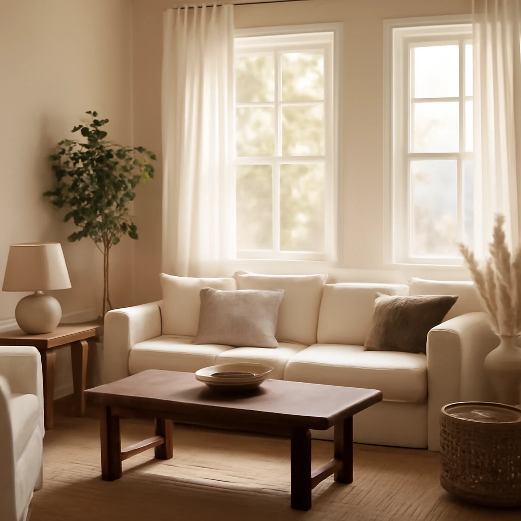
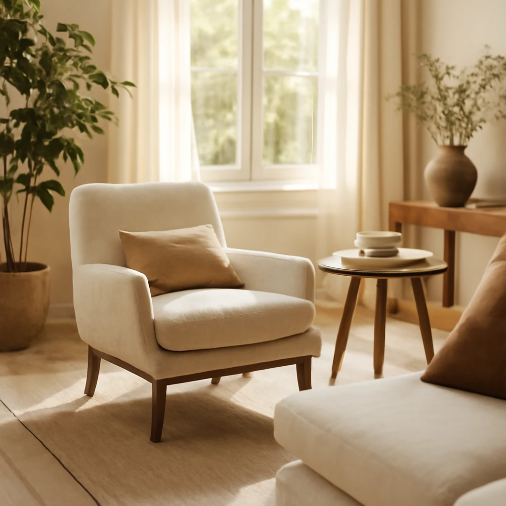
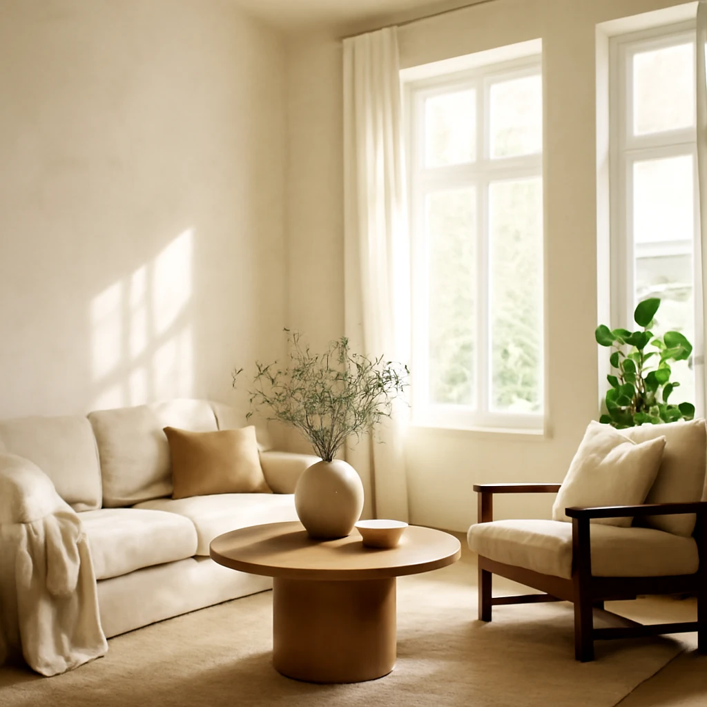
Living room
Ivory provides an inviting backdrop for sofas, armchairs and art, in traditional settings it highlights mouldings, and in contemporary spaces it supports bold shapes and textures.
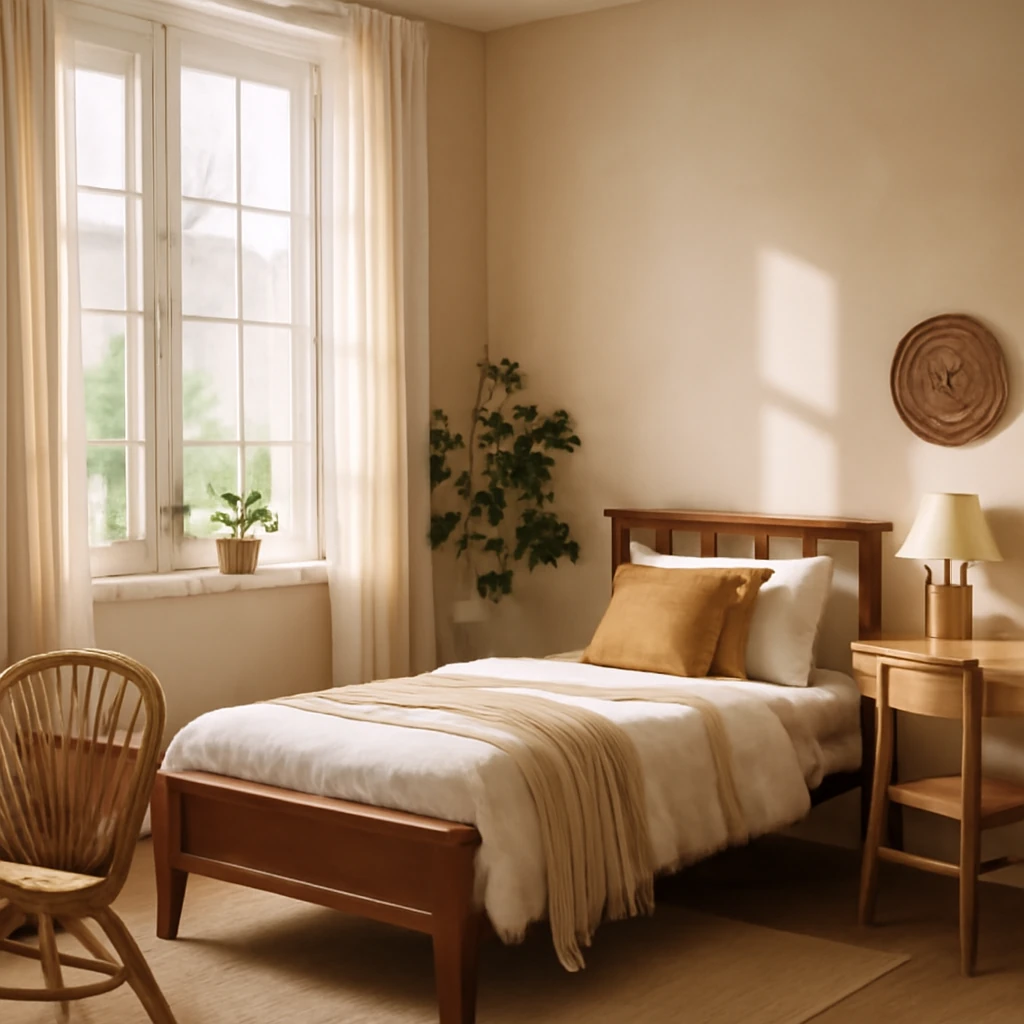
Bedroom
In bedrooms, ivory’s warmth fosters calm. Pair with soft textiles and natural fibres for cosy, cocooning comfort.
Nursery / children’s room
Ivory is a safe, neutral palette that supports playful accents - bright toys and textiles - without clashing with furniture designed to grow with the child.
Kitchen
Ivory surfaces with wood or stone countertops present a timeless, premium kitchen atmosphere, consider hardware in brass or brushed metal to add understated luxury.
Bathroom
Ivory bathrooms feel spa-like when paired with natural stone or marble, combine warm lighting with soft textiles for a serene retreat.
Hallway / entrance
In narrow corridors, ivory walls reflect light, while a darker floor adds depth, keep trim and doors in crisp contrast for definition.
Home office
A light ivory backdrop reduces glare and supports focus, combine with textured surfaces or a splash of colour in accessories to maintain energy.
Designer tips for working with ivory
- Play with textures. To prevent a monochrome space from feeling flat, mix gloss, satin, relief and smooth finishes: timber, linen, velvet, stone and metal.
- Mind the lighting. Warm artificial light makes ivory more creamy and cosy, while abundant daylight cools the tone, balance is key.
- Don’t fear accents. Ivory makes a versatile backdrop. Introduce a few bold or contrasting elements, such as turquoise vessels or a dark timber shelf, to enliven the space.
- Consider a dark floor. A richly coloured floor - walnut, dark oak or ebony - accentuates light walls and furniture and creates a clear vertical anchor.
In contemporary interiors, ivory can be a unifying thread across an apartment’s different zones, from the living area to the bedroom and kitchen, while remaining respectful of natural light, architectural details and the owners’ lifestyle.
Summary: key takeaways
- Ivory is a warm, sophisticated off-white that adds comfort and elegance to any space.
- It is highly versatile, expanding spaces visually and adapting to diverse styles - from classic to modern.
- Ivory works with a broad palette, from pastels to deep, rich tones, texture and lighting are essential to avoid flatness.
- Texture variety, thoughtful lighting and restrained use of contrasting accents are the secret to successful ivory interiors.
Trends in interiors are enduring when built on timeless palettes. Ivory remains a trusted foundation for European homes seeking warmth, tactility and lasting charm.
FAQ
Which textures best enhance ivory?
Natural materials elevate ivory: warm woods (oak, walnut), linen and cotton textiles, textured plaster, marble or travertine, and soft velvets add depth and tactility.
What accents pair well with ivory?
Consider adding coloured accents through textiles, art, and occasional furniture in tones like teal, emerald, or charcoal. Use accents sparingly to preserve the calm, refined character of ivory.
How can ivory make a space feel cosier?
Combine ivory with other warm hues such as beigey browns, sand, or milk-chocolate tones. Layer lighting with floor lamps, wall lights and candles, and add textiles - throws, rugs and cushions - in wool, velvet or cashmere.
Should floors be dark with ivory walls?
Dark floors create a strong contrast that grounds the light palette and add architectural sharpness, especially in open-plan layouts where zones require definition.
You may also like these articles
Reading chairs for European living rooms: comfort, style and a practical guide
Find the perfect reading chair for European living rooms.
Decorative plaster: textures and finishes for European interiors
A definitive guide to decorative plaster finishes, textures and care for European homes.
Creating a Teenager’s Bedroom: European Styles, Zoning and Comfort
Smart, stylish ideas for a teenage girl’s European bedroom.