
Explore interior trends, AI design insights, styling guides and real transformations
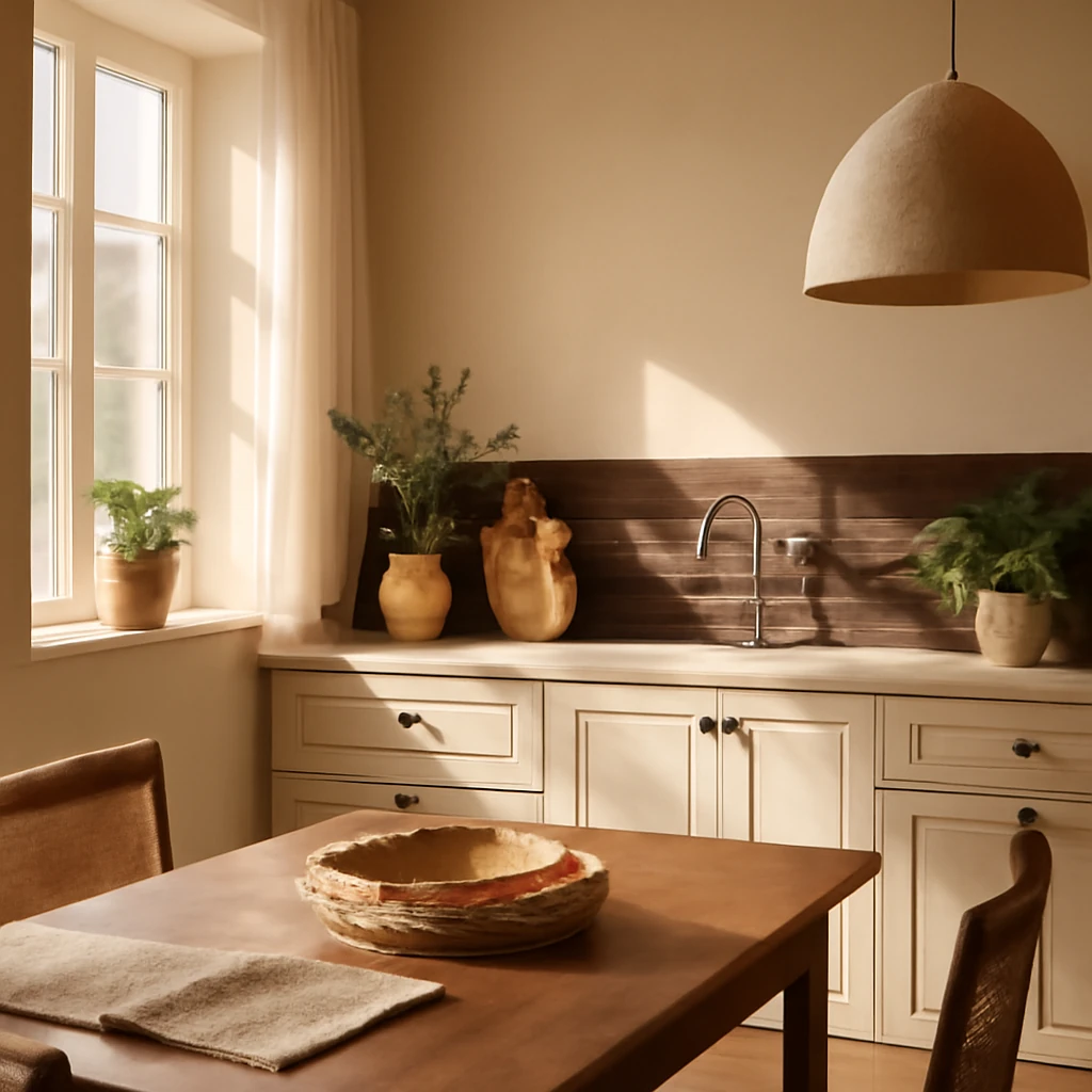
Colour-smart kitchens: nine wall palettes for European homes
Why wall colour matters in the kitchen
The kitchen is a central hub in European homes, where family and friends gather, meals are prepared, and conversations flow. The colour of the walls is more than a surface finish, it shapes mood, reflects light, and influences how furniture, textiles, and lighting interact within the space. Selecting the right kitchen wall colour requires balancing practicality with atmosphere, ensuring the palette supports both daily use and longer-term trends. This guide distils universal rules and presents nine palettes that work across diverse European contexts, from compact city kitchens to open-plan living spaces in new-build apartments and renovated homes.
Universal rules for choosing kitchen wall colours
Colour in the kitchen can alter perceived size, tone, and warmth. When selecting wall colours, bear in mind how light enters the room, the style of cabinetry, the colour of floors, and the texture of countertop surfaces. Here are practical guidelines that translate well across European settings:
-
Light colours visually expand small spaces, while dark hues tend to recede. This can be used intentionally to delineate zones in open-plan arrangements, such as separating a cooking area from a dining space.
-
Cool colour palettes convey elegance and modernity but can feel less cosy, warm tones create a sense of intimacy and tactility. Consider the climate, daylight hours, and personal preference when choosing between cool and warm families of colour.
-
For rooms with limited daylight or small windows, lean towards sun-inspired yellows or warm oranges to simulate daylight and lift the atmosphere. These tones can energise the space without overwhelming it.
-
In compact kitchens, resist high-contrast schemes on every wall. A monochromatic approach with a slightly varied shade is often more visually enlarging than a bold, multi-tonal surface.
Where a colour multiple palette is used, a balanced approach like 60/30/10 can help maintain harmony. The walls (60%) form the base, the cabinetry or islands (30%) contribute the character, and accents (10%) add personality without clutter.
Nine wall colour palettes for European kitchens
Below are nine palettes designed to work across European interiors, from the north’s bright winters to the warmer southern homes. Each palette outlines core neutrals, supporting shades, and practical pairing suggestions for cabinetry, floors, and lighting.
Palette 1: Light and airy neutrals
Light, breathable walls create a clean background that enlarges small kitchens and complements a wide range of materials – from marble to timber, from stainless surfaces to matte ceramics.
Core choices: pure white, soft off-white, pale stone, and warm grey-beige neutrals.
- White: a crisp option for narrow kitchens or spaces with low ceilings, helps reflect daylight and makes dark cabinetry stand out beautifully.
- Beige and warm greys: offer warmth without overpowering the room, ideal with natural wood accents.
- Texture and finish: opt for a matte or eggshell finish to avoid glare, particularly in rooms with strong overhead lighting or chrome hardware.
Pairing tips: white walls with pale timber or light stone floors, and mid-tone cabinetry can create a calm, timeless kitchen. If your furniture is dark, white walls will brighten the space, while soft greys prevent the scheme from feeling clinical.
Palette 2: Soft neutrals with a cosy edge
Beige-based schemes that embrace warmth without drifting into heavy earth tones are particularly versatile in European homes across climates.
Core choices: warm beige, pale taupe, chalky grey, light greige.
- Beige: timeless and adaptable, lends a contemporary warmth when paired with ash- or butter-toned woods.
- Greige: a balanced compromise between grey and beige that seats well with both modern and rustic elements.
- Finish: choose a satin or satin-matt finish for walls to withstand splashes while keeping the surface soft to the touch.
Pairing tips: blend with natural materials such as oak flooring or limestone tiles to reinforce a cohesive, grounded aesthetic. Accent textiles in warmer hues can bring depth without dominating the room.
Palette 3: Soft grey with warmth
Grey walls can provide a sophisticated backdrop that highlights colour in furniture and accessories. Subtle warmth keeps the space inviting rather than clinical.
Core choices: warm light grey, greige with pink undertone, silvery stone, and ivory accents.
- Grey tones: select lighter greys with a gentle warmth to avoid coldness in north-facing kitchens.
- Complementary materials: timber, brass, or copper details work well against grey walls and add tactile contrast.
- Finishes: a low-sheen or eggshell finish reduces glare and is easier to maintain in kitchens with busy activity.
Pairing tips: pair with white cabinetry and a stone countertop for a crisp, contemporary look, or warm timber for a more homely feel.
Palette 4: Bold accents on a neutral base
Accent walls or a single focal panel can create visual interest without overwhelming a compact kitchen. Neutral backdrops allow bolder colours to shine when needed.
Core choices: off-white or warm grey with accents in olive, mustard, teal, or terracotta.
- Accent wall: choose a kitchen backsplash or a feature panel in a saturated hue to define zones.
- Balance: ensure remaining walls remain light to keep the space visually open and cohesive.
- Care considerations: gloss or semi-gloss surfaces for feature areas can enhance durability for splash-prone zones.
Pairing tips: a neutral base makes it easier to swap textiles or artwork seasonally, keeping interiors fresh with minimal changes.
Palette 5: Dark drama with light balance
Dark walls in a kitchen can be striking when balanced with light ceilings and floors, as well as bright, reflective surfaces.
Core choices: charcoal, deep navy, espresso brown, graphite.
- Selective darkness: use dark walls on a single wall or behind the cooking area to create a strong, intimate mood.
- Counterpoints: light countertops, white or pale cabinets, and high-contrast floors prevent the room from feeling closed in.
- Lighting: ensure layered lighting (ambient, task, accent) to keep the space legible and welcoming.
Pairing tips: incorporate metal finishes and glass, which reflect light and add brightness to a moody backdrop.
Palette 6: Rich browns and wood-inspired warmth
Brown and wood tones are a reliable route to warmth and depth, especially in European kitchens that feature timber cabinetry or timber floors.
Core choices: warm taupe, chocolate, walnut-inspired browns, and soft creams.
- Wood harmony: walls in a complementary neutral allow timber to be the highlight of the space.
- Texture: consider a slight texture or horizontal grain in wall surfaces for subtle character.
- Balance: avoid matching dark walls with equally dark cabinets, instead, balance with lighter worktops or a lighter floor.
Pairing tips: use ceramic or stone tiles with a natural finish to echo the warmth of wood without creating a monochrome effect.
Palette 7: Colourful, optimistic environments
Vibrant kitchens can feel uplifting and energising, especially in climates with long winters or where daylight is limited for part of the year.
Core choices: olive, sage, soft coral, kiwi, terracotta, or lime accents on a pale background.
- Selective saturation: keep walls mostly pale and reserve stronger colour for a feature wall or a splashback.
- Furnishings: limit pattern and ornamentation on walls to avoid visual clashing with lively colour on cabinetry or tiles.
- Durability: choose semi-gloss finishes for easier cleaning in kitchens that see frequent cooking splashes.
Pairing tips: pair bright walls with cool-toned white cabinets and natural stone countertops to prevent the space from feeling chaotic.
Palette 8: Pastel tenderness for soft charm
Pastels can soften a kitchen while maintaining clarity and modernity. They work beautifully with light timber accents and white or pale stone surfaces.
Core choices: mint, powder blue, blush pink, soft lemon, and seafoam.
- Soft anchoring: use slightly deeper pastels on cabinetry or a feature panel to avoid a wall-dominated room.
- Texture and material: combine with matte or satin finishes for a refined, contemporary feel.
- Lighting: ensure natural daylight or well-designed artificial lighting to avoid the space appearing washed out.
Pairing tips: pastels pair well with white countertops and light wood floors, producing a gentle, timeless kitchen aesthetic.
Palette 9: High-contrast contemporary
A modern, graphic approach often uses stark contrasts while staying within a curated colour family. This is ideal for urban kitchens with a minimalist or industrial mood.
Core choices: white or ivory walls with black or charcoal accents, or deep blue ones paired with pale neutrals.
- Proportions: limit bold walls to one area (an island backdrop or a single panel) to avoid visual fatigue.
- Hardware: matte black or brushed chrome hardware can reinforce the contemporary feel without overpowering the space.
- Flooring: a light, neutral floor helps to keep the room from feeling weighted by the walls.
Pairing tips: maintain a calm ceiling and a light floor to keep the room feeling open, even with strong wall colour decisions.
Practical considerations for selecting kitchen wall colours
Turning palettes into lived spaces requires attention to how colour interacts with light, materials, and human behaviour. The following considerations help translate palette choices into durable, beautiful kitchens across Europe:
-
Lighting and daylight: In northern Europe, daylight hours vary seasonally. Warmer wall colours can compensate for shorter winter days, while cooler tones may feel refreshing in sun-drenched southern abodes. If a kitchen faces north, lean into warms, if it enjoys generous sun, cooler neutrals can prevent glare.
-
Cabinetry colour and finish: With high-gloss cabinets, a lighter wall can create a crisp, modern look, with matte or timber cabinets, warmer walls often feel more cohesive.
-
Flooring synergy: The floor’s colour and texture influence how vibrant or muted the walls appear. Light floors reflect more light and can support a broader palette, dark floors tend to ground a room and pair well with mid-toned or light walls.
-
Backsplash and worktop coordination: The wall behind the cooker often becomes a focal point. A contrasting backsplash can anchor a palette, while a wall in harmony with the worktop unifies the space.
-
Durability and maintenance: Kitchens demand washable wall finishes. Satin or eggshell sheens provide a balance between wipeability and softness, high-gloss finishes require careful maintenance but offer easy cleaning in zones prone to splashes.
-
Texture and patina: Subtle textures on walls, such as a fine plaster or moulded panels, can add depth to neutral palettes without introducing busy patterns that clash with cabinetry.
How to test colours before committing
A reliable testing process helps avoid costly missteps. In practice, test tiles or poster-sized paint swatches on multiple wall areas, including near windows and along the kitchen’s work zones. Colour changes under different lighting conditions can be striking. Do not rely on swatches alone, observe the colour under morning, afternoon, and artificial lighting. In European homes with varying daylight, it is essential to observe how a sample behaves in daylight versus artificial illumination during the evening.
- Apply small samples on large patches of wall that receive varying light throughout the day.
- Observe how the colour shifts with different textures nearby (wood, stone, metal) and how it interacts with existing fixtures.
- Consider mockups for cabinets and countertops in the same palette to visualise the overall harmony.
Strategies for open-plan kitchens
Open-plan layouts across Europe frequently combine cooking, dining, and living areas. In such spaces, a unified palette across walls, cabinetry, and furniture helps maintain a coherent flow. A practical approach is to select a neutral wall colour that carries through the entire zone, then use accents and textiles to signal different functions. If you desire a more pronounced separation, add a feature wall or a backsplash in a contrasting hue that complements the dominant palette.
How to apply palettes in practice: kitchen typologies
Different kitchen typologies respond uniquely to colour strategies. Here are common European configurations and the palettes that work well within them:
-
Small, narrow kitchen with limited daylight: favour light neutrals with a warm undertone to reflect light. Use a single accent colour sparingly to avoid crowding the space.
-
Compact urban kitchen with integrated dining: a soft neutral base with a bold panel or splashback can define the cooking zone without visually closing the room.
-
Open-plan kitchen-dining-living: maintain continuity with a consistent neutrals across walls while permitting individual areas to express character through furniture finishes and textiles.
-
Renovation projects where existing cabinetry is fixed: choose wall colours that harmonise with current cabinetry and floors, focusing on introducing warmth or brightness through textiles and lighting instead of major rework.
Case for European versatility: sustainability and timelessness
European interiors increasingly prioritise timelessness and sustainability. Neutral bases paired with carefully chosen accent colours reduce the frequency of complete overhauls while adapting to evolving trends. When designing a kitchen with a view to long-term use, it is prudent to select durable finishes, washable paints, and paints with low volatile organic compounds (VOCs). A palette that can be refreshed through textiles, tiling, or hardware rather than walls alone is both economical and environmentally responsible.
Frequently asked questions
What is the best colour for a small kitchen? In most cases, light neutrals - white, ivory, light beige, or pale grey - help maximise perceived space and reflect light. How do I choose a colour that complements my flooring? Start with a base neutral that harmonises with the floor’s undertone, then incorporate accents in complementary hues via cabinetry, tiles, or decor. Can I paint around the entire kitchen with bold colour? It is possible, but reserve bold colour for a feature wall or a splashback to avoid overpowering the space.
Closing thoughts
The most successful kitchen colour schemes in European homes strike a balance between light, warmth, and function. By understanding how light, materials, and space interact, you can select a palette that remains visually appealing while standing up to daily use. The nine palettes outlined here offer a structured starting point, adaptable to different room sizes, architectural styles, and personal preferences. Remember that colour is not merely a decorative choice, but a tool to shape mood, enhance practicality, and create a space where cooking, dining, and socialising feel naturally enjoyable.
You may also like these articles
Self-levelling floors: a seamless canvas for modern European interiors
The practical guide to seamless self-levelling floors for stylish European homes.
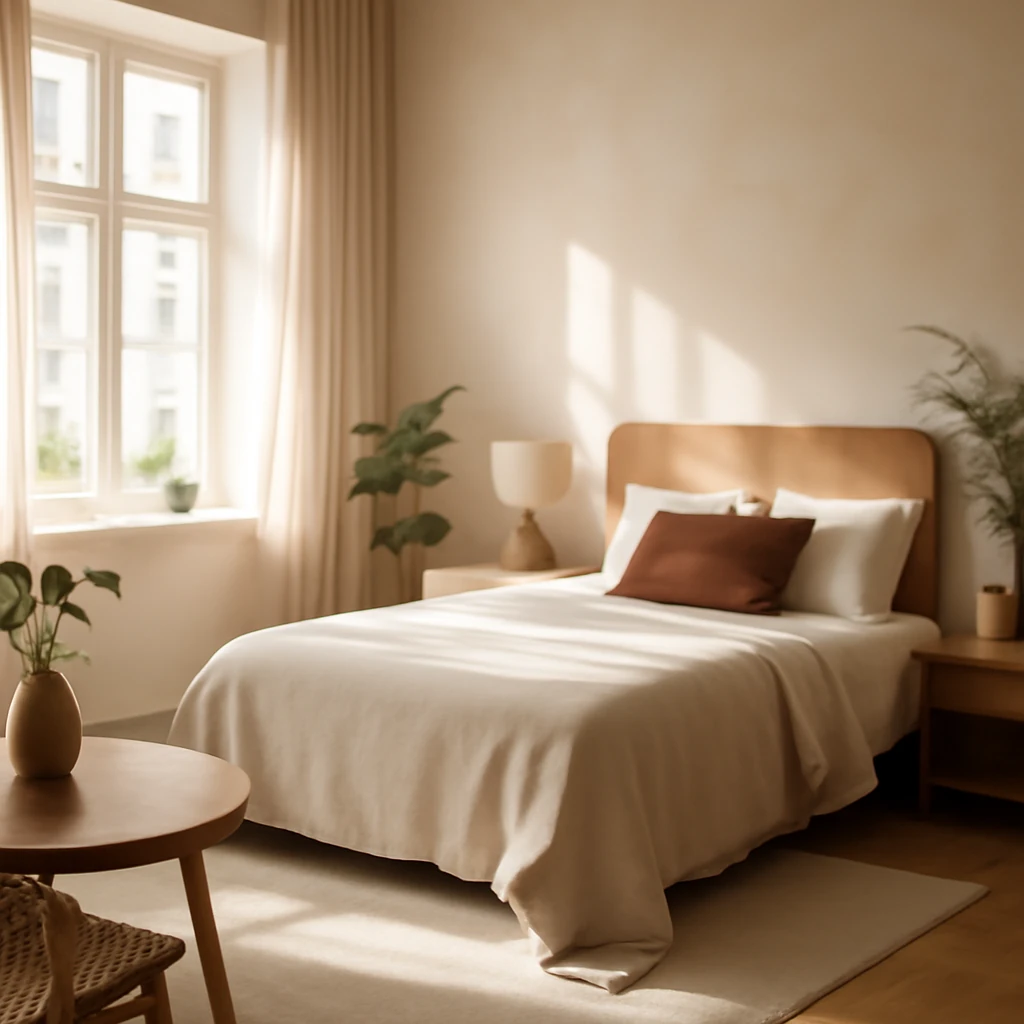
Bedroom trends for 2026: calm, colour and clever layouts across Europe
Timeless, restful European bedrooms: trends, palettes and smart layouts.
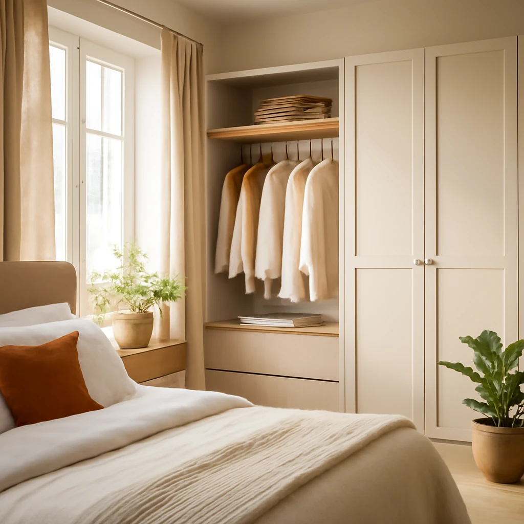
Smart Wardrobe Solutions for Modern European Bedrooms
Smart wardrobe ideas to maximise European bedroom space.