
Explore interior trends, AI design insights, styling guides and real transformations
Colour, Circles and Calm: The Itten Wheel in European Interiors
Introduction: colour as a design language for European living spaces
Colour has a powerful role in shaping mood, perception, and the everyday experience of a home. For designers across Europe, the Itten colour wheel remains a dependable framework for creating harmonious palettes that feel timeless yet contemporary. Originating from the early 20th century, this tool translates complex ideas about colour into practical guidance for interiors - from compact city flats to brighter, daylight-filled living rooms in Eurocentric homes. In this guide, we explore how the wheel works, what it means for the way spaces are furnished, and six dependable schemes that designers use to craft satisfying colour stories.
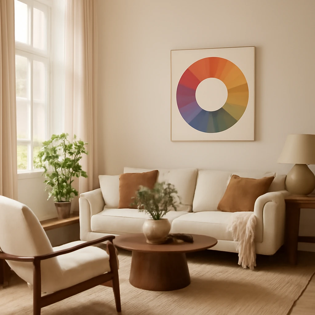
Who was Itten and what is the colour circle?
Johannes Itten was a Swiss painter and a key figure at the Bauhaus, the celebrated design school that helped define modern European aesthetics. In his influential book on colour, Itten introduced a circular model that groups colours by relations rather than by mere preference. The core idea is simple: some colours harmonise naturally when placed together, while others create deliberate contrast. The wheel distinguishes two broad families: chromatic colours, which cover the spectrum from red to violet, and achromatic colours, which are black, white and their greys. This separation helps designers predict how combinations will feel in a space and how they respond to light throughout the day.
The anatomy of the Itten wheel: chromatic and achromatic colours
In practical terms, the wheel presents:
- Achromatics - black, white and grey tones. These shades are versatile and often serve as stabilisers or background values in interiors.
- Chromatics - the full spectrum of hues: red, yellow, green, blue and violet, plus countless tints, tones and shades.
The distinction matters because it guides how people mix and match. Achromatic tones can anchor a room and let chromatic colours breathe. Conversely, bold chromatic choices rely on careful balancing with neutrals to stay serene rather than chaotic.
In European practice, the wheel is frequently taught as a practical language for combining fabrics, paints, wallpapers and soft furnishings, enabling a seamless, well-considered colour grammar across rooms and lighting conditions.
How the wheel is structured: primary, secondary and tertiary colours
Primary colours
The wheel is built on three primary hues that cannot be created by mixing others: yellow, blue and red. These form the core from which all other colours are derived and provide the strongest, cleanest statements in a palette.
Secondary colours
When two primaries mix, they yield secondary colours: green (yellow + blue), violet (blue + red) and orange (yellow + red). On the wheel, these sit between their parent primaries, ready to blend into subtler tones for interiors requiring a little more nuance than pure primaries offer.
Tertiary colours
Mixing a primary with a nearby secondary produces tertiary colours, creating a broad continuum of hues. The result is a rich array of thousands of possible shades, offering designers a practically infinite palette to work with while maintaining coherence.
Why the wheel omits black and white
As an organising tool, the Itten wheel focuses on chromatic relationships. Black and white sit outside the chromatic circle as extreme ends of value, along with various greys. Designers often pair chromatic schemes with achromatic values to temper brightness, increase legibility, and keep spaces calm even when bold colours are used.
How to apply the six classic colour schemes from the Itten wheel
Using the basic wheel, six reliable schemes emerge. Each has a distinctive mood and is suitable for different European aesthetics - from the pared-back clarity of Bauhaus-inspired spaces to the warmth of mid-century modern interiors. Below are practical outlines with guidance for interiors, rather than model rooms.
1. The classical triad - equilateral triangle
This approach places three colours at equal intervals around the wheel, forming an equilateral triangle. It yields balanced, harmonious results where all three colours share equal emphasis. It’s particularly effective in spaces that mix diverse elements - architecture with sculptural furniture, art with craft, or a programme of textiles and surfaces with varied textures.
The balance of colour in this triad is typically even, with each colour occupying a similar share of surfaces in the room.
Ideal interiors: Bauhaus-inspired, vintage-modern blends, and bohemian schemes that celebrate diverse forms and textures in a cohesive palette.
Furniture and décor ideas using a classical triad
- Velvet upholstery in one of the triad colours matched with drapery in another
- A geometric rug that echoes the third hue to unite seating and textile textures
- Accent cushions and throws that repeat the triangle’s colours across cushions, lampshades and art frames
Note: In practice, the distribution tends to be balanced but with a touch more emphasis on the dominant element to prevent the space from feeling too equal.
2. Complementary pairing - colours on opposite sides
Complementary colours sit opposite each other on the wheel. When placed together, they create strong contrast and a dynamic energy. This scheme works well when you want a room to feel energetic without overwhelming the senses, especially in spaces with good natural light or where architectural details deserve emphasis.
Common complementary pairs include blue with orange, violet with yellow, and red with green.
Ideal interiors: Danish modern, mid-century-inspired interiors, and contemporary spaces that value crisp contrasts and clean lines.
Furniture and décor ideas using complementary colours
- A sofa in one chromatic, with a striking accent chair or ottoman in the opposite hue
- Contrasting curtains or a feature wall that mirrors the opposite hue for focal impact
- Artworks and cushions that repeat one hue while the room’s larger elements are in the other
In European projects, complementary schemes are often toned down with generous neutrals to maintain calm while preserving visual drama.
3. The contrasting triad - a bold, balanced mix
This scheme uses three colours positioned to create a strong focal point. One colour acts as the dominant, while the other two provide high-contrast support. The arrangement is not perfectly equilateral, rather, one colour sits as the anchor while the others play supportive, opposing roles.
The arrangement is high-contrast and energetic, but can be tempered with neutrals for hotel-like calm or family-friendly warmth.
Ideal interiors: Retro-inspired, Scandinavian, and flexible contemporary spaces that want a vivid but controlled palette.
Furniture and décor ideas for a contrasting triad
- A main sofa in a bold colour with cushions and a rug picking up the two contrast hues
- Themes across lighting, textiles and accessories that gently echo the triad for cohesion
Practical tip: distribute the dominant colour across larger areas, with the two contrasting hues appearing in smaller doses to avoid visual fatigue.
4. The analogue triad - 3–5 neighbouring colours
Neighbouring colours on the wheel share a common hue base. This analogue approach yields a harmonious, cohesive space with gentle transitions. Although the palette may feel bright, the proximity of hues helps maintain softness and continuity, making it ideal for contemporary interiors that favour warmth without loud contrasts.
Analogue schemes are flexible - two, three, four or five hues can be woven together to suit the room’s light and function.
Ideal interiors: Modern classical, contemporary, and bold, energetic rooms that still require balance.
Furniture and décor ideas for an analogue triad
- Woven textiles and upholstery in adjacent tones for a layered look
- Soft furnishings that step gradually through the palette, creating depth
- Wood finishes and metals that pick up hues from the palette to unify surfaces
Analogue schemes are particularly effective in bright spaces with plenty of daylight, where the gentle shifts in colour read as a sophisticated gradient rather than discrete bands.
5. The tetrad - four equally spaced colours
The tetrad places four colours at equal intervals around the wheel. This yields a vibrant, high-contrast palette that can feel daring. It is best used with restraint: limit the use of each colour to specific zones or objects to avoid visual clutter, and rely on neutrals to ground the scheme.
This arrangement is well suited to avant-garde, eclectic, or maximalist interiors where bold statements are embraced as personality rather than simply decoration.
Ideal interiors: Avant-garde, kitsch, or high-energy contemporary spaces that celebrate colour as a central character.
Furniture and décor ideas for a tetrad palette
- Accent cushions and a statement chair in one colour, balanced by a sofa and drapery in two others
- A feature wall or built-in unit painted in a fourth hue to anchor the room
Balance is key: vary the saturation and brightness across the four colours to avoid visual overload.
6. The “soft” tetrad - a rectangle of colour
The soft tetrad follows the idea that opposite colours on the wheel can also be grouped in a rectangle, creating a more relaxed four-colour scheme. It offers a less aggressive version of the tetrad, with smoother transitions and more room for nuanced shading. This approach is particularly effective in multi-colour interiors, where you want energy without constant colour clashes.
Applications include spaces with numerous decorative details, where the palette helps tie together textiles, furniture, and architectural features without shouting.
Ideal interiors: Arabic-influenced, art déco, and vibrant contemporary spaces that benefit from rich variety without harsh contrasts.
Furniture and décor ideas for a soft tetrad
- Layered fabrics in two or three hues that repeat across furniture and soft furnishings
- Decor accessories in the remaining hues to provide accents without dominating
In practice, the rectangle arrangement allows for four hues to circulate through cushions, throws, lighting, and small furniture pieces while keeping the space readable and inviting.
The extended circle: beyond the basics
Experienced designers often work with an extended colour circle, which introduces variations in saturation and lightness. This wider palette enables subtler transitions and more nuanced moods. Importantly, it opens the door to monochrome schemes built from a single hue, explored through multiple tones and intensities.
The extended circle becomes a practical tool for making strategic colour choices on walls, cabinetry, and large surface areas, while textiles and accessories pick up the variations in tone.
Monochrome - one colour, many tones
Monochrome palettes use variations of one hue across different levels of lightness and saturation. The result is a cohesive space that feels calm and sophisticated, yet never dull. Monochrome works particularly well in interiors with restrained architectural details or in spaces designed to feel expansive and serene.
Different shades of the same colour can be used across walls, upholstery, and objects to create depth and texture without introducing competing hues.
Ideal interiors: Contemporary and classic European spaces with an emphasis on form, materiality and understated elegance.
Practical examples of monochrome palettes
- Walls painted in a soft base hue with furnishings and textiles in progressively lighter or darker tones
- Wood and stone surfaces that pick up the hue’s tonal family for a coherent feel
- Metallic accents and occasional pops of texture to enhance interest without colour disruption
Monochrome can be extraordinarily versatile, from tranquil bedrooms to refined living rooms, as long as the lighting and texture variation keep the space lively.
What to do if you can’t find a shade on the wheel
Real-world projects don’t always deliver a perfect match on the wheel. In such cases, modern digital tools offer practical support. A widely used option is a colour-management platform that allows designers to explore harmonious combinations and save the exact colour codes for walls, furniture, and textiles. These tools help ensure consistency when ordering paints or fabric swatches and are valuable for coordinating across multiple suppliers in a European project.
Practical tip: build a small digital palette from the tool and take a deck of swatches to the site to compare under different lighting conditions before committing.
Putting the Itten wheel into practice: a step-by-step approach
Colour thinking should be practical, not prescriptive. Here’s a straightforward process to translate the wheel into real spaces across European contexts.
- Define the space and its function: Consider how the room will be used, the amount of natural light, and the architectural character. A sunlit kitchen-diner may invite a high-contrast palette, while a soft monochrome bedroom might prioritise calm and texture.
- Choose a base mood: Decide which of the six schemes aligns with the space’s purpose and the client’s preferences - bold, restrained, warm, or airy.
- Test the core trio or quartet: Select the main hue(s) to establish the room’s visual anchor. Reserve the rest as accents on textiles, furniture, and lighting.
- Balance with neutrals: Neutrals play a crucial role in tempering intensity. A carefully chosen neutral backdrop keeps the space legible and versatile.
- Consider light and materiality: The room’s light and the texture of surfaces affect how colours read. Warm woods and soft fabrics warm a palette, cool metals and stone add crispness.
- Iterate with swatches and lighting tests: Move through daylight and artificial light at different times of day to confirm the palette’s consistency.
- Document the palette: Create a colour guide with swatches, paint codes and textile references to guide procurement and avoid drift across trades.
European case considerations: adapting palettes to diverse contexts
Across Europe, interiors range from compact city flats to generous rural homes, often with volatile light levels and a mix of old and new architecture. When applying the Itten wheel, designers tailor palettes to the specific context:
: lean toward balanced triads or analogous schemes that read well in tighter plans. Use lighter neutrals to maximise perceived space, with colour accents on soft furnishings and one or two statement pieces. : embrace analogous or complementary palettes that celebrate natural light and materials - linen textures, timber, stone - and reflect the surrounding landscape. : integrate a restrained triad or monochrome base with modern fabrics and contemporary lighting to create a dialogue between old and new. : experiment with tetrads or soft tetrads to bring energy while keeping relationships between architectural form and furniture legible.
Beyond colour: tying the palette to materiality and texture
Colour never exists in isolation. The Itten wheel serves as a map for combining textures and materials so that the palette feels cohesive across walls, fabrics, furniture and surfaces. In European design practice, material choices are often the star of the room, with colour acting as the conductor that unifies the score. Consider:
: paint finishes (matte, satin, gloss), plaster, stone, and timber each reflect and absorb colour in unique ways, so test several samples in situ.
Closing thoughts: colour as a design language for European interiors
The Itten colour wheel remains a practical and flexible toolkit for interior design across Europe. Whether you are guiding a young professional couple through a compact flat or curating a mature, refined living space, the wheel supports thoughtful colour decisions that respect architectural fabric, client aspirations and daylight. By combining a clear understanding of colour relationships with a disciplined approach to testing, procurement and lighting, designers can unlock palettes that feel timeless, balanced and distinctly European.
In practice, most successful palettes rely on a core triad or complementary pairing, refined with analogue transitions and, when appropriate, a touch of contrast through a tetrad. The goal is not to reveal every colour at once, but to create a coherent story that evolves with use, light and season.
You may also like these articles
Small-space Mastery: European apartments redefined for city living
Ten compact European homes show how small spaces can feel expansive.
Mid-century modern interiors for European homes
Timeless mid-century modern design, tailored for European living
Crafting a functional 5 m² kitchen: layout strategies for European homes
Smart ways to outfit a 5 m² kitchen with clever storage and style.