
Explore interior trends, AI design insights, styling guides and real transformations
Pink Interiors: Colour, Style and European Trends for Homes
Introduction
Pink is traditionally associated with romance, softness and charm. Yet in contemporary European interiors the colour has shed some of its clichés and become a versatile tool for architecture, mood, and character. Used with intention, pink can illuminate a hall, calm a bedroom, or sharpen the edge of a modern kitchen. This article surveys the pink spectrum, the latest trends across European homes, and practical strategies to apply pink well - whether you are refreshing a compact city apartment, a light-filled loft, or a family home with varied daily rhythms.
Why choose pink in the interior?
Pink offers a set of distinctive advantages for interior design. Here are core reasons why designers and homeowners in Europe are turning to pink palettes more often:
- Universality and adaptability. Pink works across spaces with different functions - from entryways to living rooms and bedrooms - provided the shade is chosen with care and scale.
- Psychological impact. Softer pinks can promote calm, aid rest, and elevate mood, while saturated pinks inject energy and personality when used sparingly.
- Stylistic versatility. Pink can sit comfortably in classic, contemporary, or eclectic schemes, acting as a bridge between tonal families or as an accent that punctuates a restrained palette.
- Perfect companion for monochrome schemes. In white, grey, or beige interiors, pink acts like a colour insert - an architectural note that enlivens the space without overpowering it.
- Light and air. Lighter pinks help spaces feel more open and breezy. When combined with glass, translucent partitions or light-toned surfaces, pink contributes to a sense of airiness.
- Statement potential. Vivid pinks - such as fuchsia or magenta - can create memorable focal points when introduced in controlled doses, for example on a sofa, an accent wall, or a bold textile.
- Metallic pairings. Pink harmonises beautifully with warm metals - brass, copper, gold - creating luxurious, contemporary moments. Silver tones, conversely, can read cooler, use with intention.
Shades and variations
One of the key strengths of the pink palette is its breadth. Designers frequently harness a spectrum from whisper-soft to nearly saturated, each shade conveying a different mood. The following categories are particularly popular in European projects:
- Powder pink - light, airy, and refined, ideal as a backdrop in living spaces and bedrooms where elegance and restraint are prized.
- Pink in varying intensities - from pale blush to deep rose. Lighter tones visually expand spaces and pair well with cool neutrals, deeper pinks act as anchors or statement hues.
- Salmon - with a hint of warmth, salmon brings coziness to bedrooms and study areas without overpowering other tones.
- Crimson - rich and sophisticated, perfect for English-country or contemporary accent references, used sparingly as a statement colour.
- Coral - warms interiors and reads friendly, especially in kitchens and living zones that welcome sociability and warmth.
- Fuchsia - bold and energetic, best reserved for a feature piece or a dedicated mood zone in a modern space.
- Neon/pure pink - high-impact accents. Use very selectively to create moments of modern bravura in otherwise restrained interiors.
Colour combinations
Pink rarely stands alone. When paired with other colours, its character shifts dramatically. Here are tested European combinations that translate well across apartment, villa and showroom projects:
- Pastel blue - a soft, zesty combination, the result is light, airy and almost confectionery in mood.
- White - pink and white create a bright, clean contrast, the pink often reads as a warm glow against pristine surfaces.
- Cream - a sophisticated, timeless pairing with a touch of Rococo elegance in furniture forms or wall treatments.
- Lavender - a gentle, harmonious union that feels refined and restful, especially in bedrooms or relaxed living zones.
- Mint - a fresh, airy palette that evokes lightness and summery calm, ideal in kitchens, bathrooms and children’s rooms.
- Gold/bronze - metallic accents elevate pink to luxury territory, use on fixtures, trims or lighting to signal glamour.
- Deep orange - a dynamic, contemporary twist, works well in bold, fashion-forward interiors or Moroccan-inspired schemes.
- Grey and beige - a restrained, sophisticated duo that grounds pink and keeps the overall look modern and formal.
- Black - a high-contrast, risqué pairing. Best reserved for confident interiors and strong architectural statements.
In which styles is pink used?
Pink adapts across a spectrum of European styles, from delicate classicism to cutting-edge contemporary. The following are common configurations that designers frequently employ:
N delicate romance
Romantic interiors rely on soft, flattering pinks layered with ivory, cream and delicate textiles such as velvet, silk, and lush drapery. Texture is crucial: pairing plush fabrics with gentle florals or light marbles creates a sense of refined intimacy. Accessories in pale blue and pale lilac extend the mood without overpowering the softness of the pink base.
Non-traditional shabby chic
Shabby chic with a pink twist embraces light pinks combined with weathered wood, gentle patinas, and airy spaces. The palette favours transparency and translucence - glassy surfaces, pale plaster, pale timber, and soft textiles that catch the natural light. The look is relaxed yet deliberately curated, achieving a sense of comfort and whimsy.
Conservative minimalism
Pink need not contradict minimalist principles. In monochrome schemes, powder pink acts as a subtle softening counterpoint to greys and beiges. The key is restraint: avoid clutter, maintain clean lines, and select a single pink accent - whether a sofa, a rug, or a wall panel - in a space that otherwise communicates calm.
Airy Provence
Provençal-inspired spaces embrace pink with sunlit warmth, natural textures and rustic detailing. In this context pink coexists with whitewashed walls, aged timber, and ceramics. Subtle lilac or lavender accents can be introduced through textiles and ceramics to foster a light, buoyant atmosphere reminiscent of southern Europe.
Rules for applying pink effectively
To ensure a pink interior reads as considered rather than trivial, certain principles are widely observed by European designers:
- Maintain balance. Aim for colour harmony with no single hue dominating the room, pink should be used to enhance, not overwhelm.
- Blend pink with other colours carefully. Too much pink can suggest a nursery vibe unless tempered with neutrals or mature materials.
- Respect the project’s style. For Provence and classical schemes, opt for refined, restrained pinks, for modern interiors, bolder pinks can reclaim the edge when paired with neutral architectures.
- Employ multiple shades. A palette with two or three pink tones adds depth and reveals subtleties in lighting and material finishes.
- Consider colour temperature. Do not mix warm pinks with cold neutrals in the same space, align temperature to create a coherent mood.
- Be mindful of space. Bright pinks can visually reduce small rooms, in compact spaces, prefer lighter pinks or use pink as a detail rather than the dominant field.
- Gentleness of finish. Choose matt textures as a rule, gloss can read as too vibrant in large surfaces, while velvets and boucles read as luxurious and comforting.
- Prioritise tactile textiles. Velour, velvet and faux suede in pink tones offer warmth and depth, particularly in seating and soft furnishings.
- Dark accents for emphasis. Use the darkest shade from your palette to emphasise architectural features or to ground a space.
Finishes and surfaces in pink
Pink is widely represented across ceiling, wall and floor treatments. The following guidance helps integrate pink elegantly across rooms:
Ceiling
Ceilings in pink interiors are frequently kept white to preserve a sense of airiness. If choosing pink for ceilings, select high-reflectivity finishes or satin sheens to lift light, or opt for a soft, nuanced pink that reads as a tint rather than a full colour. Pale pink ceilings can surprisingly illuminate even a space with modest natural light.
Walls
Wall treatments offer the most visible canvas for pink. Practical options include:
- wallpapers - flat, textured, or patterned, with florals for Provencal settings, geometric motifs for contemporary spaces, or vertical stripes for classic interiors.
- paint - custom-coloured paints allow precise pink matching across walls and trim.
- ceramic tile - particularly in bathrooms and guest WC, including abstract or mood-rich motifs that echo the pink base.
- stone and marble - use pale pink marbles for drama and luxury, especially in entrance halls or spa-like bathrooms.
Floor
Flooring in pink interiors can be light or dark, depending on the design brief. Material choices include timber boards, engineered wood, porcelain, or quartz vinyl. For an accent, a small pink rug can anchor a seating arrangement without concealing the underlying floor. Useful approaches include:
- high-pile carpet for bedrooms or cosy living zones;
- vintage-effect rugs that develop character over time;
- decorative shapes and silhouettes for children’s rooms that add whimsy without overpowering the space.
Furniture and décor
When designing a pink-themed interior, furniture and décor should reinforce the overall concept. If the finish is pink, consider companion-colour furniture to preserve balance, and if the furniture is neutral, pink textiles and detailing can supply the colour punch. In décor, textiles are typically the most effective vehicle for pink - think about these elements:
- decorative cushions for sofas and armchairs;
- velvet or plush paneling and wall hangings that carry soft pink tones;
- textured drapery and curtains with subtle sheen to capture light without glare.
Room-by-room guidance
Living room
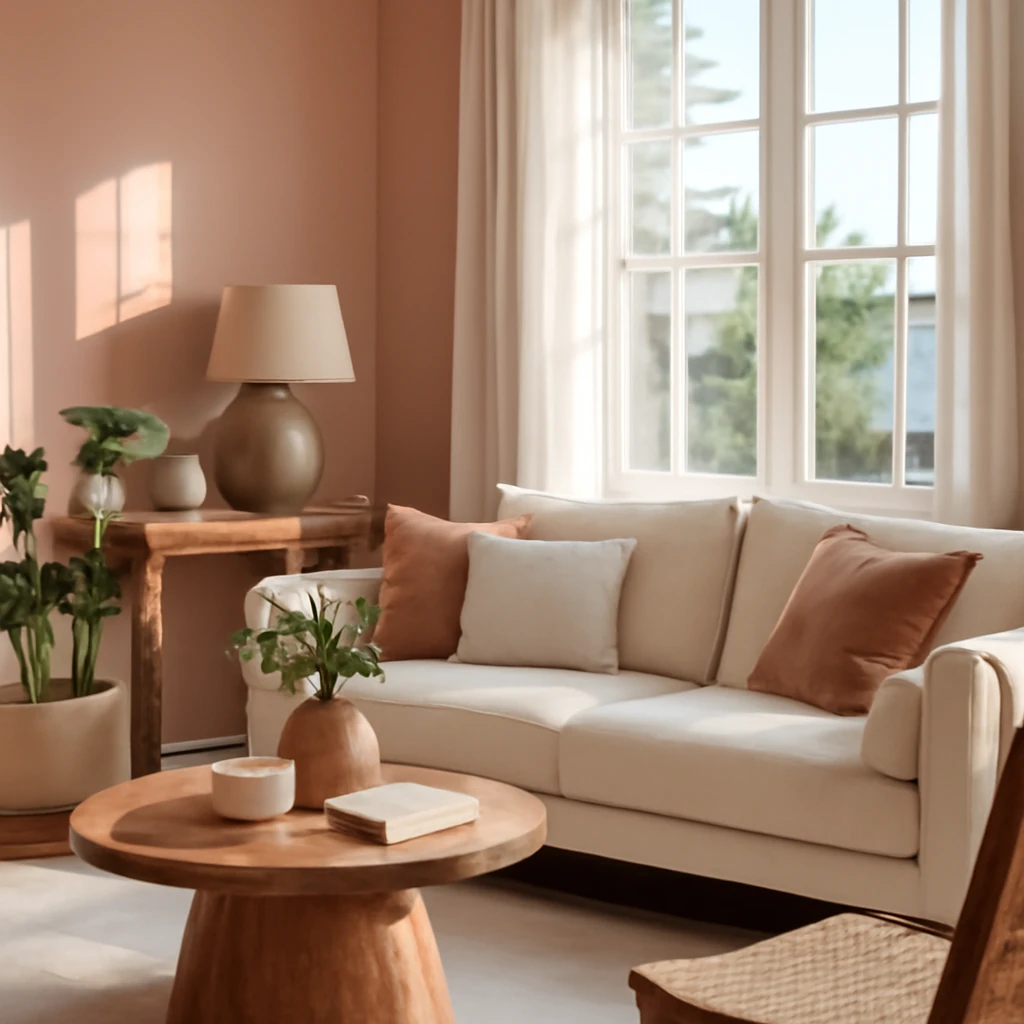
In contemporary European living rooms, a 6:3:1 proportion is a pragmatic guideline: six parts of classic neutrals (beige, stone, taupe), three parts white, and one part pink as a deliberate accent. This ratio helps to maintain a balanced, elegant space that feels timeless rather than trend-driven. Use pink for a statement sofa, a sculptural chair, or a large rug. The rest of the room - sofas, walls and flooring - should lean toward neutral hues, with textures (velvet, boucle) enhancing the tactile experience. Lighting plays a crucial role, choose warm, diffused light to soften pink and give the room a welcoming glow.
Bedroom
A pink bedroom is a canvas for serenity or romance, depending on the saturation and surface treatment. For a calmer retreat, opt for delicate blush or rose-tinted walls with muted textiles in greys, creams and pale greens. If you want a more feminine or fashion-forward mood, introduce a charcoal or navy bed frame in contrast with soft pink bedding and pale timber furniture. Consider a feature wall in a subtle texture - fibreboard panels, linen wallpaper, or plaster with a light patina - paired with linens that are smooth to the touch and acoustic-friendly.
Kitchen
Pink can brighten a kitchen, particularly in contemporary or retro-inspired schemes. Decide the level of visibility: pink cabinetry for a bold statement, pink splashbacks for a contemporary twist, or pink accents in small appliances and textiles for a more modest approach. The choice of counter materials and hardware influences the final tone. For a modern look, pair pink with warm neutrals or pale stone worktops, for a retro kiss, combine rose with mint or teal blues and white detailing. In all cases, ensure the pink integrates with the overall material language - stone, timber, ceramic tiles, and metallic finishes should stay coherent.
Bathroom and WC
A pink bathroom can feel fresh, stylish and spa-like. Neutral marble or large-format porcelain tiles provide a refined backdrop, allowing pale pink fittings or wall panels to take centre stage. Subtle patterns in the tiles can echo the softness of pink without competing with sanitaryware. When decorating in pink, favour wall-mounted storage and soft textiles in white, grey or cream to preserve a serene ambience. Metallic brass or gold fixtures enrich the space with a luxe note, silver is perfectly acceptable but tends to read cooler, so balance accordingly.
Children’s room
For a girl’s room and beyond, pink can be playful without being overpowering. Consider combining soft pink walls with mint, lavender or light blue accents, and incorporate durable, easy-care surfaces. A canopy bed or decorative banding can enhance the room’s magic, LED lighting behind furniture or within coves adds a gentle drama. When selecting furniture, prioritise ergonomic designs and longevity, choosing pieces that can evolve with the child’s needs.
Home office
Pink in a study or home office must be used with care to avoid reducing concentration. Warm pinks or pink-based neutrals, used sparingly, can support a calm, inviting environment. Consider a pink ottoman, a modest pink feature wall, or textiles like a pink-tinted rug and curtains to soften the space without affecting productivity. In English or modern-study styles, darker pinks can appear sophisticated when paired with oak, walnut or dark laminates and a restrained palette of greys.
Entrance hall and corridor
In low-light entryways, pale pinks with white or light timber can read as bright and welcoming. A pink accent panel or wallpaper in a powder room near the corridor can offer a moment of brightness as guests enter the home. In longer corridors, a gradient approach - progressively deepening pink along the run - can guide movement and create a subtle architectural narrative.
Practical considerations for spaces with pink
When integrating pink into real-world homes, a few practical considerations help ensure longevity and joy rather than saturation and fatigue:
- Natural light is your ally. Spaces with ample daylight benefit from pink tones that brighten rather than dull the room, darker pinks excel where light is abundant and design intent is bold.
- Material selection matters. Velvet, bouclé and wool-blend textiles in pinks register beautifully under natural and artificial light, avoid overly shiny surfaces that may clash with subdued lighting.
- Maintenance and durability. In high-traffic areas, choose wall finishes and textiles with durability and stain resistance, light pinks can be refreshing but require practical materials.
- Lighting strategy. Programme layered lighting - ambient, task and accent - to control the perception of pink under different times of day. Warmer light enhances warmth in pink interiors, cooler light can make pink feel more clinical.
- Colour psychology. Pink can affect perception of space and mood, use it with awareness in spaces dedicated to work, study or intensive activity where a calmer tone may be preferable.
Illustrative finishes: a quick reference
To help visualise how pink can surface across surfaces, here is concise guidance you can apply when briefing a project or selecting finishes:
- Ceiling: white or pale pink with a soft satin finish for a luminous, seamless look.
- Walls: paint or wallpaper in powder pink for a gentle backdrop, textured wallpapers add tactility and depth.
- Floor: light timber or pale stone to keep the space feeling open, pink rugs add warmth and define zones without overpowering.
- Furniture: play with colour-combination by pairing pink upholstery with neutral timber or metal accents, consider an accent chair or a sofa in a striking pink if the surrounding palette remains composed.
Final thoughts: a considered embrace of pink
Pink, in its many shades and textures, is not a one-note colour. When thoughtfully applied, it has the power to transform spaces, lending softness and sophistication to traditional layouts and injecting contemporary personality into modern interiors. The European design landscape continues to embrace pink as a versatile, emotionally engaging tool - capable of pairing with natural materials, restrained neutrals, or bold, fashion-forward accents. Whether you are refreshing a compact city apartment or reimagining a villa with generous volumes, pink can be the unifying thread that harmonises light, texture and form.
You may also like these articles
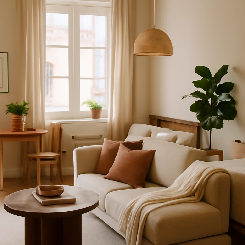
Smart Studio Design: Maximising Space in Small European Homes
Practical, stylish strategies to maximise space in European studio flats.
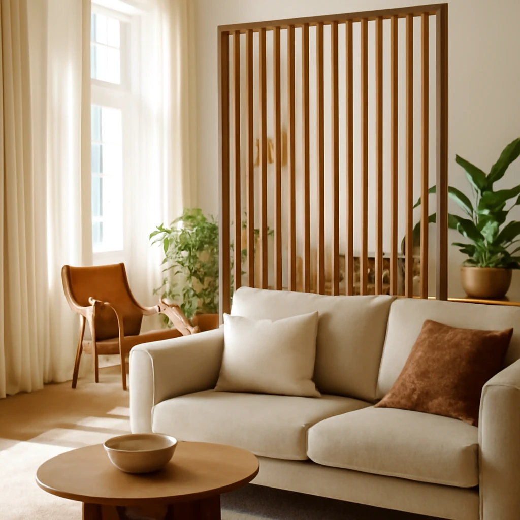
Room Dividers: Zoning Solutions for European Homes
Smart room dividers that transform open spaces into distinct, functional zones.
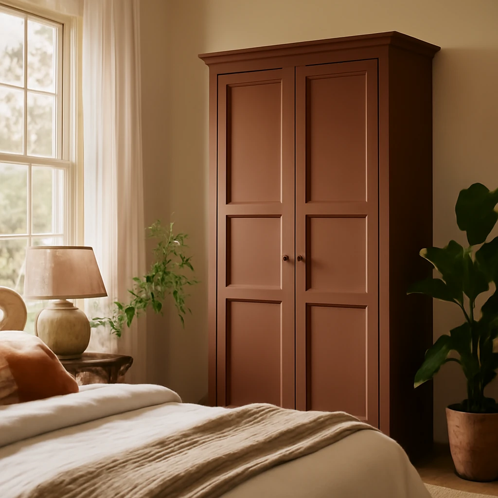
Colourful Wardrobes: A Practical Guide to Painting for Space and Style
Turn a plain wardrobe into a colour feature that enlarges space.