
Explore interior trends, AI design insights, styling guides and real transformations
Colour in the European Kitchen: six best combinations and a practical table
Introduction
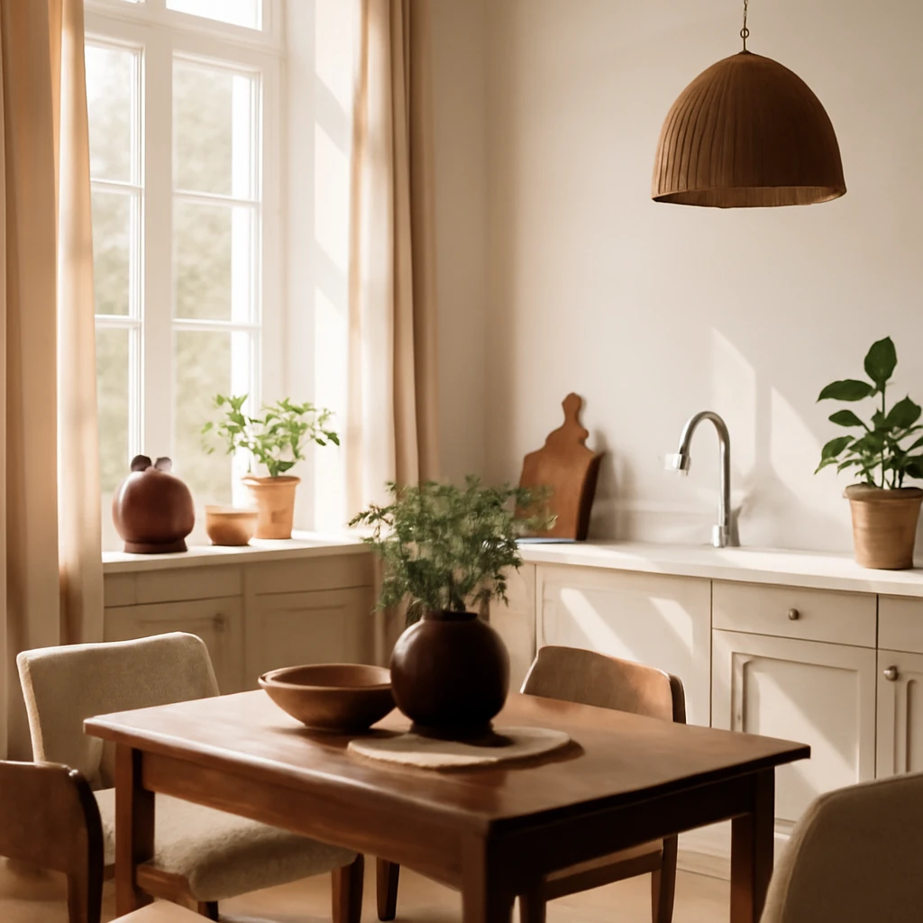
Colour is a decisive element in kitchen design across Europe. It can visually expand or compress space, set the mood, and influence how textures are perceived. A well chosen palette should reflect the architecture of the home, respond to climate, and align with the tastes of the occupants. In this article we explore how to select kitchen colours, present six reliable combinations, and translate palettes into cabinetry, surfaces and accessories in contemporary European homes. The guidance aims to be practical for homeowners and designers alike, offering lasting strategies rather than fleeting trends.
Best colour combinations for kitchens
Choosing a palette for the heart of the home means balancing light and shade, materiality and scale. Neutral bases create calm, while dark tones add depth, and vibrant accents inject personality. The following six combinations are widely successful across diverse European contexts, from Nordic inspired schemes to sunlit Mediterranean kitchens. Each pairing is discussed in detail with practical implications for cabinetry, backsplashes and worktops.
Guidelines for choosing the colour of main elements
- The cabinetry colour is usually the dominant element, occupying the largest surface area. It can be calm and close to the surrounding finish, or it can be bold and attention grabbing. Common choices include deep greens, rich blues, plum, burgundy, terracotta or chocolate tones.
- Major appliances may be concealed within the cabinetry or left as visible features. Decide whether to highlight or disguise them, colour options extend beyond white, black or chrome to bolder hues if desired, or to subtle tones that blend with the base palette.
- Finish and wall treatment define the background or the stage for an accent wall. Floors are typically two shades darker than the main palette, while ceilings stay lighter to maximise light reflection. In smaller kitchens a unified colour on walls and ceiling can visually enlarge the space.
- Turn to details for the accents: choose a backsplash with an interesting texture or pattern and select countertops with materials such as quartz, marble or stone with a tactile finish. If the palette is restrained, these details can carry personality as bright or textured focal points.
Understanding the colour wheel
Designers routinely consult the colour wheel, a 12 part spectrum popularised by a Swiss artist and colour theorist. It helps in identifying harmonious and high contrast combinations that work across European interiors.
All the core colours blue, red and yellow sit opposite neutrals like white, grey and ivory, while earth tones and saturated hues provide a wide spectrum to draw from. Neutrals such as white, grey, beige and black pair with almost any other colour, offering the most flexibility for long lasting schemes and reconciling the room with nearby living spaces.
Colour schemes
When building a palette, consider how many elements you want to include. Colour schemes commonly fall into four families:
- Monochrome: a single colour used in varying shades to create depth and cohesion.
- Achromatic: white, black and grey with possibly a small accent colour for warmth.
- Dual: two dominant colours share the space, creating a balanced but lively feel.
- Multicolour: three or more colours, with one as a base and the rest as gentle accents to avoid visual overload.
In practice, the kitchen should harmonise with the adjoining spaces. An open plan European home may benefit from a neutral base with a few expressive accents, while a compact kitchen might embrace a brighter base to energise the space without overwhelming it.
Table of kitchen colour combinations
Below is a concise reference table outlining popular kitchen palettes and how to pair them.
| Colour | How to pair |
|---|---|
| White | Beige, blue, grey, black |
| Grey | Blue, mint, beige, orange, black, white, brown, plum |
| Beige | Blue, light blue, brown, black, pink, orange, coral |
| Blue | Red, white, emerald, orange, yellow |
| Green | White, brown, sandy tones, dark blue |
| Red | Blue, White, Black, Grey |
| Yellow | Blue, Grey, White |
| Orange | Beige, purple, blue, brown |
| Light blue | Cream, White, Red, Pink, Peach, Yellow |
| Pink | Grey, Emerald, Mint, Blue, Beige |
| Brown | Black, Cream, Mint, Blue, Purple, Ochre |
| Black | Cream, Ivory, White, Green |
Best combinations in practice
Exploring reliable pairings that work in European homes, we can translate the ideas into practical layouts and material choices. Here are six practical duos and how to apply them in real kitchens.
Beige + Grey
Beige and grey is a pairing that earns its place at the top for good reasons. It is understated, versatile and enduring, and it aligns with contemporary preferences for natural, grounded palettes.
- It is forgiving and easy to get right, offering a wide range of tones from warm biscuit to cool dove depending on the moment.
- The combination is timeless, integrating well with timber, stone, fabric and metal textures common in European kitchens.
- Beige and grey also adapt to different climates and daylight patterns. In north facing rooms with limited sun, a warmer beige helps to create a cosy atmosphere, in sunlit spaces, cooler greys keep the scheme crisp and contemporary.
To avoid flatness, introduce variation in tone and texture. A matte taupe cabinet with a stone or quartz countertop, or a glossy tile backsplash with a tactile surface, prevents the palette from feeling dull.
If the room enjoys generous daylight, the combination can remain cool and refined. In a darker space, warm beige anchors the room and broadens the perceived space.
Blue + White
Blue and white is a timeless duet that communicates freshness and serenity. Cool tones evoke sky and sea, while white keeps the composition bright and airy.
- In well lit spaces with ample daylight, apply blue to cabinetry or splashbacks and use white for walls and worktops to maximise light.
- Mix textures to prevent a cold feel, a matte blue cabinet paired with polished white surfaces strikes balance. Consider a marble or quartz countertop to add luxury and depth.
- If daylight is limited, opt for warm white or ivory as the base to soften the blue and keep the space inviting.
Texture is key: matte finishes feel more traditional, while high gloss can feel contemporary. The furniture and accessories should echo the palette without overpowering it.
Green + Brown
Earthy greens and browns bring nature indoors and create a comforting, grounded atmosphere. The combination works well with timber details and stone worktops, producing a warm yet lively kitchen.
- Choose olive, sage or moss greens for a calm environment, pair with oak or walnut for warmth and natural texture.
- Use green accents in islands, stools or tiled backsplashes for a curated touch that remains easy to refresh with textiles and ceramics.
- A brown base or island anchors the space, green surfaces or cabinetry introduce energy without overstating the palette.
- In busy kitchens, maintain balance with plenty of neutral surfaces and natural materials to avoid visual fatigue.
Pink + Green
This is a refined pairing that can read as contemporary and chic when the tones are carefully balanced. The colours recall a cultivated garden and can work in both modern and country inspired spaces.
- Choose soft pinks such as blush or rose and balance with emerald or olive greens for contrast and depth.
- A pale pink island with green accents or tiles reads as warm and welcoming rather than overly feminine.
- In dining zones, edible pinks like peach or coral help keep the atmosphere appetising while avoiding overwhelming intensity.
Black + White + Grey
High contrast with elegance, this triad works best when accents are thoughtfully placed. Avoid a sterile feel in small spaces by distributing colour across surfaces.
- In compact kitchens, keep the base white and use grey and black for fixtures, appliances or a bold feature such as a ceramic backsplash or a statement exhaust hood.
- Play with textures: mix matte and polished finishes, stone and metal, timber and concrete to create depth and warmth.
- A few bright accents via tiles, hardware or furniture prevent the space from feeling cold or sterile.
Pastel tones together
Pastels offer a breathable and timeless approach to kitchen colour, particularly in spaces with abundant daylight or in coastal or Provence inspired interiors.
- Pair cool pastels such as pale blue with biscuit or lilac with stone and timber textures for a refined, salon like ambience.
- Pastels often suit open plan layouts, keep rest of the surrounding spaces in restrained neutrals and introduce contrast through furniture or textiles in deeper tones.
Practical steps to apply the palette
Turning an abstract palette into a real kitchen design requires a staged approach. Start with a mood board incorporating material samples, paint swatches and lighting strategies. Consider the room's daylight and how it changes through the day. Use large samples to test interactions with existing wood, stone and metal finishes.
Next, craft a simplified materials plan aligned with the palette. A common European tactic is to keep floors, walls and ceilings in two neutrals and apply the colour primarily to cabinetry, splashbacks or a feature wall. This ensures cohesion while enabling change through textiles and accessories at a lower cost.
Finally, plan lighting deliberately. Colour and light work in tandem, warm lighting can soften cool tones while cool lighting can sharpen warm ones. Layered lighting and under cabinet illumination help reveal texture and subtly adjust the palette as the space evolves.
Palette reference table
The compact reference below helps during shopping and design development by summarising common kitchen colours and their pairing options.
| Colour | How to pair |
|---|---|
| White | Beige, blue, grey, black |
| Grey | Blue, mint, beige, orange, black, white, brown, plum |
| Beige | Blue, light blue, brown, black, pink, orange, coral |
| Blue | Red, white, emerald, orange, yellow |
| Green | White, brown, sandy tones, dark blue |
| Red | Blue, White, Black, Grey |
| Yellow | Blue, Grey, White |
| Orange | Beige, purple, blue, brown |
| Light blue | Cream, White, Red, Pink, Peach, Yellow |
| Pink | Grey, Emerald, Mint, Blue, Beige |
| Brown | Black, Cream, Mint, Blue, Purple, Ochre |
| Black | Cream, Ivory, White, Green |
In practice keep exploring
To translate theory into real kitchen spaces, experiment in situ. Gather swatches, sample boards and fabric finishes, then assess how the palette behaves under different lighting and with the surrounding architecture. The European home often blends contemporary design with traditional materials, let this balance guide your palette decisions as you refine the final scheme.
You may also like these articles
 Renovation
From cramped to comfortable: twelve affordable apartment renovations across Europe
Smart, affordable makeovers show how to transform small flats.
Colour & Materials
A Practical Guide to Green Sofas for European Living Rooms
Why green sofas work beautifully in European living rooms.
Outdoor & Terrace
Finishing the balcony: materials and ideas to create a stylish, practical extension
Turn your balcony into a stylish, durable extension with expert material guidance.