
Explore interior trends, AI design insights, styling guides and real transformations
Six Colourful Bedroom Palettes for European Homes
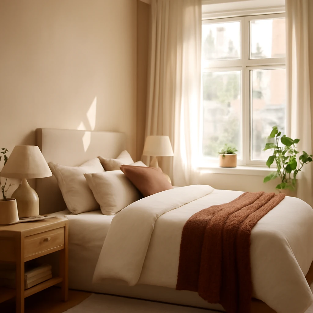
Colour in the bedroom is a powerful tool for mood, sleep quality and daily rituals. Across Europe, designers are moving away from sterile whiteness towards palettes that reflect nature, craft and daylight. A carefully chosen colour can transform a compact room into a warm sanctuary or a serene retreat, with textures and lighting playing a supporting role. In this feature we explore six versatile colour families that translate well across city apartments and family homes, with practical advice on finishes, textiles and layout to create spaces that feel both intimate and contemporary.
Terracotta
Terracotta is a warm, earthy hue that immediately adds character. In a room with northern light or limited daylight, the colour acts as a natural daylight amplifier, giving the space a cosy glow rather than a heavy saturation. The key to success is restraint: let terracotta bathe a single wall or a generous half-wall, while keeping the ceiling white and the remaining walls in a pale, neutral tone. This prevents the hue from dominating and helps the room stay breathable, even in smaller urban bedrooms.
To create a cohesive design, pair terracotta with natural materials: timber furniture in light oak or warm walnut, stone surfaces, and linen textiles. Texture is essential here: a wool rug, a boucle throw, or a woven blind will soften the colour and add depth. Subtle patterning - think a tonal geometric or a delicate weave - breathes life into the scheme without competing with the colour.
Practical considerations: a terracotta wall works beautifully with a unifying palette of creams, warm greys and pale greens. Use lighting with a warm colour temperature (around 2700–3000K) and dimmable options to modulate the intensity as daylight fades. For storage, choose furniture with light legs to keep the floor visually expansive, and prefer concealed storage to maintain a calm, uncluttered look.
- Feature wall approach: terracotta on one wall, lighter tones elsewhere.
- Textile layering: flax curtains, wool rugs, linen bedding.
- Wood and stone textures to echo the colour's mineral undertones.
- Warm, dimmable lighting to modulate mood.
- White ceilings and mouldings to amplify height.
Olive
Olive is a sophisticated mid-range green that brings a sense of quiet luxury to a bedroom. Its natural, earthy undertone makes it particularly suited to rooms with daylight that skims the walls rather than washing them evenly. In a minimalist setting the olive becomes the hero, in smaller spaces you may prefer olive on upholstery or a single wall rather than bathing the entire room.
To harmonise the hue, pair olive with warm creams, ivory, taupe and the soft browns of timber furniture. A white ceiling or pale plaster moulding helps create air and a sense of height. Keep decorative accents deliberately sparse, allowing the colour to breathe. If the room lacks natural warmth, introduce metallic accents - brushed brass, antique gold or warm brass hardware - to elevate the palette without overpowering it.
Texture and material ideas: consider rattan or wicker light fittings, stone or ceramic surfaces in warm neutrals, and natural fabrics such as linen and wool. A textured wall finish - matte with a soft sheen, or a delicate plaster texture - adds depth and keeps the olive from feeling flat.
- Olive on walls or upholstery as hero colour, balanced by light neutrals.
- Texture is key: combine linen, wool, and timber for depth.
- Keep decor simple to preserve a calm, refined look.
- White ceilings and light trimming visually raise the room height.
Blue
Blue is widely valued for its relaxing, sleep-friendly associations. In a long or narrow bedroom, a pale to mid-toned blue walls can visually widen the space and soften sharp angles. If you want a cohesive look, consider painting wardrobe doors or built-in panels in the same shade as the walls, this helps to dissolve the boundary between furniture and architecture, creating a more restful, unified line.
Pair blue with white or pale timber for crisp contrast, and use warmer textiles to avoid the space feeling cool. Lighting is crucial: warm white bulbs (around 2700–3000K) and layered lighting - from ceiling pendants to bedside lamps - bring warmth to a blue palette. Introduce texture through fabrics such as linen and velvet and through cushions or throws in complementary hues like cream, sand, or soft grey.
- Use blue as wall colour or on built-in panels to blend furniture with walls.
- Mix textures: velvet cushions, linen sheets, wool throws.
- Warm lighting and light timber help prevent the space from feeling chilly.
- Keep the overall palette muted and cohesive for a serene retreat.
Light Grey
Grey remains a versatile base in European bedrooms, offering calm and stability. A monochromatic grey scheme can feel sophisticated, but too much grey risks a flat, clinical mood. The antidote is texture: pair grey walls with timber furniture, linen textiles, wool rugs and soft, tactile surfaces. Introduce warmer greys or contrast with slightly lighter or darker tones to create depth, rather than a single flat shade.
Another effective strategy is to separate zones by finish and texture. For example a matte grey wall can be offset by a gloss-painted trim or a satin wardrobe door. Wood veneers and ceramic tiles can provide warmth and variation without breaking the overall calm. If you prefer to keep the space extremely light, use cooler greys on the walls and warm accents in the textiles and lighting to add life.
- Layer textures to avoid flatness: linen, wool, wood grains, soft ceramics.
- Vary finishes: matte walls with glossy furniture or trims.
- Introduce warmth with timber and warm textiles, light helps with perception of space.
- Limit the amount of fully grey decor, use one or two accent hues sparingly.
Evergreen
Deep greens inspired by pine or fir bring a sense of forest calm to the bedroom. They can feel intimate and cocooning, especially in rooms with natural light that softens the intensity of the colour. To avoid a dominating look, balance the evergreen walls with white or pale stone and with warm neutrals. Introduce decorative elements in soft ivory or pastel coral for a touch of warmth and to prevent the palette from feeling too rigid.
Accent with light-coloured fabrics and natural textures: cotton or wool bedding in off-white, a linen headboard, and a timber bed frame. A curved or arched white architectural detail - such as a doorway arch or a soft plaster cornice - can provide a gentle, romantic counterpoint to the depth of the green. Plants and natural materials reinforce the connection to nature and help soften the room’s atmosphere.
- Use evergreen on walls as a dominant backdrop or for upholstery to create depth.
- Balance with white, cream, and pale wood to keep the room welcoming.
- Introduce soft coral or ivory accents to warm the palette.
- Incorporate natural textures to soften the colour’s intensity.
Sandy
Beige and sand tones offer a versatile, warm backdrop that works with a wide range of European interiors. The softness of a sandy wall creates a serene canvas for other design elements. To keep the space from feeling washed out, introduce contrast through a white or pale blue ceiling border or crown moulding. Textiles in off-white, taupe, and ecru add tactile depth, while timber furniture and wicker or rattan accents bring warmth and natural appeal.
Texture is paramount here: a natural fibre rug, a woven blind, and a ceramic lamp in earthy tones will give the room a lived-in, cohesive feel. Avoid pure monochrome by selecting textiles with subtle patterns or tonal variations. The sand palette invites slow, quiet layering, so allow space for a few carefully chosen accessories rather than cluttering the surface.
- Gentle contrast between walls and ceiling helps create air and light.
- Layer textures with natural materials: linen, wool, rattan, ceramics.
- Keep furniture light in colour with simple, clean lines to maintain calm.
- Choose a restrained accessory palette to avoid visual noise.
Practical implementation guide
Choosing colour for a European bedroom begins with an honest assessment of daylight, room size, and how you want the space to feel on waking and before sleep. Start with a primary colour that will set the tone, and use lighter neutrals on the remaining walls to preserve a sense of air. Material and finish choices are as important as the paint colour, natural textures such as linen, wool, timber, stone and ceramics reinforce the colour's mood and help the room feel curated rather than saturated.
Lighting is essential to any coloured scheme. A layered plan - ambient light from ceiling fixtures, task lighting at the bedside, and a few accent lights - lets you modulate the mood. Warm white light will soften blues and greens, while cooler temperatures can accentuate a terracotta's warmth or bring out the malleability of greys. If the space is small, consider built-in storage and wall-mounted features to keep floor space free and maintain a sense of openness.
Finally, remember balance. A colour becomes more than a backdrop when textures and finishes are allowed to speak. The goal is a room that looks intentional, peaceful and timeless, with colour supporting the architecture and enriching the daily ritual of rest.
You may also like these articles
 Colour & Materials
Blue in Interiors: Balancing depth and light across European homes
A practical guide to using blue for depth, light and mood in European interiors.
Small Spaces
Small Spaces, Big Style: European Solutions for Compact Rooms
Smart strategies to transform tiny European rooms into elegant, functional spaces.
 Trends
Eight contemporary interior directions redefining European homes in 2024
Eight modern interior directions shaping European homes in 2024.