
Explore interior trends, AI design insights, styling guides and real transformations
Five refined pairings of countertops and splashbacks for European kitchens
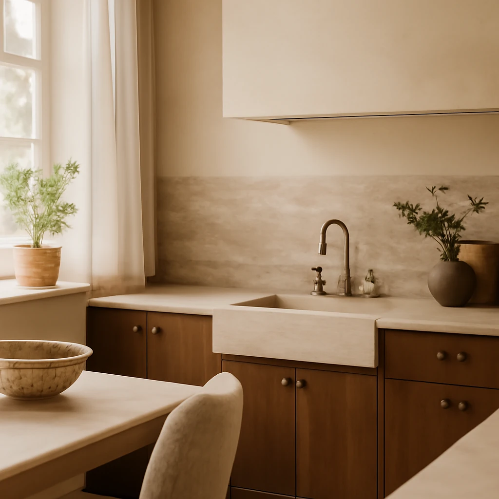
Introduction: the countertop and splashback as a dual design language
In European kitchens, the countertop and splashback form the essential duet that defines the room’s character. They are not simply two practical surfaces, together they establish texture, tone and rhythm, guiding how light plays across the space and how meals and conversations unfold. The most successful combinations strike a careful balance: one element acts as the quiet foundation, the other provides texture, colour or pattern without creating visual noise. Below are five tested pairings that work across a variety of European contexts - from compact city homes to open-plan family kitchens - each offering a distinct mood while remaining timeless and durable.
1. White quartz countertop with marble tile splashback
Why it works: White quartz is renowned for its calm, uniform appearance and high resistance to staining, scratches and heat. When paired with marble tile splashbacks - laid in a classic brick, herringbone, or vertical stack pattern - the overall look becomes elegant and serene. The variegated veining of marble introduces natural movement, while the white base of the quartz keeps the scene cohesive and bright, even in rooms with limited natural light. This combination reads as understated luxury, suitable for both modern minimalist schemes and more traditional interiors seeking a contemporary edge.
Practical considerations: Choose a white marble tile with a restrained veining pattern to avoid competing with the countertop. If the kitchen features frequent cooking splatters, a herringbone or brick-lay pattern can help disguise minor irregularities in the splashback. For maintenance, ensure the marble tile is sealed at installation, opt for a grout that matches the tile tone to maintain a seamless look. In terms of lighting, an integrated under-cabinet light plan will help the marble’s veining come alive without creating harsh reflections on the quartz surface.
2. Cream porcelain stoneware countertop with a graphic splashback
Why it works: Cream-toned porcelain stoneware provides a warm, architectural canvas that can anchor bold, graphic patterns on the splashback. A high-contrast black-and-cream motif, whether geometric or abstract, acts as a focal point while the countertop remains the neutral, cohesive base. This pairing is particularly effective in European kitchens that aim for contemporary drama without heavy ornamentation. The porcelain surface is highly durable and easy to maintain, which makes it ideal for busy family homes and open-plan spaces where cooking and entertaining happen side by side.
Practical considerations: Temperature control of the palette is crucial - keep warm tones for the countertop and ensure the splashback’s pattern is clearly legible from across the room. Material consistency matters: the porcelain should have a uniform smooth finish to contrast with the visual texture of the graphic tile. If you opt for a busy pattern, consider a lighter grout and a slightly textured tile surface to add tactility without creating visual clutter. Lighting should be even and shadow-free to preserve the legibility of the graphic design across the splashback.
3. Quartzite countertop with zellige splashback
Why it works: Quartzite is a natural material characterised by subtle movement and depth, bringing a tactile, organic feel to the kitchen. Pairing it with zellige - hand-cut, glossy or matte, Moroccan-inspired tile with irregular edges and varied glaze - introduces a crafted, artisan texture that adds warmth and personality. The combination reads as a layered, lived-in interior: the stone’s natural movement suggests a grounding presence while the zellige injects colour, glow and irregular charm. This pairing is particularly effective in open-plan spaces where the kitchen must feel connected to living and dining areas.
Practical considerations: Pay attention to the scale of the zellige tiles relative to the countertop width. Larger quartzite slabs pair well with mid-sized or small mosaic zellige to avoid overwhelming the space. Since both materials are distinctive, choose grout colours that harmonise with the stone’s veining and glaze tones. In terms of maintenance, quartzite requires proper sealing and periodic re-sealing, while zellige grouts may require more frequent cleaning to maintain the tile’s characteristic glow.
4. Marble countertop with white subway (metro) splashback
Why it works: Marble on the work surface with white subway tiles for the splashback is a classic pairing that never feels dated. Marble’s soft, luxurious surface is complemented by the clean, linear geometry of subway tiles, creating a look that is timeless, versatile and easy to adapt to evolving trends. This combination works particularly well in kitchens with light or pale cabinetry, as well as in rooms that aim for a refined, understated grandeur. The pairing exudes an inherited, enduring quality, suggesting a kitchen designed to stand the test of time.
Practical considerations: Consider the marble’s finish and sealing needs - brushed or honed finishes hide fingerprints better than polished ones, while the glossy subway tiles can reflect light and highlight any grout colour variations. A pure white subway tile with a white marble countertop offers a seamless, almost monolithic effect, alternatively, a pale grey grout can define the tile line without breaking the calm field. If your kitchen benefits from one strong texture, keep the rest of the palette deliberately restrained and cohesive.
5. Neutral porcelain countertop with coloured zellige splashback
Why it works: A neutral porcelain surface provides a calm, uniform plane that acts as a reliable backdrop for a vibrant splashback. Coloured zellige tiles introduce depth, warmth and personality through subtle glaze variations and rich tonal shifts. This pairing is particularly effective in contemporary European homes where the cabinetry and appliances favour restrained finishes, the coloured zellige becomes the focal accent, drawing the eye and creating a sense of energy without overpowering the space.
Practical considerations: When the splashback rises to ceiling height, the room gains a sense of verticality and scale, ensure that the colour story remains cohesive by selecting neutral tones in cabinetry and hardware. The grout between zellige tiles influences the overall effect - a slightly darker grout can ground the composition, while a lighter grout preserves the brightness of the tiles. For maintenance, porcelain is robust and easy to clean, which helps in kitchens with heavy use, while zellige requires occasional resealing at joints for longevity.
How not to make mistakes
- Choose a dominant element - if you opt for a busy splashback, let the countertop be calm and uniform. Conversely, a dramatic countertop deserves a subtler splashback to avoid competition for attention.
- Maintain colour temperature balance - warm-toned countertops pair best with warm-toned splashbacks, while cool bases require cooler accents to feel cohesive. This is especially important in European homes with a mix of daylight and artificial lighting.
- Scale and proportion - large-format tiles or expansive slabs can overwhelm small kitchens, use proportionate patterns and tile sizes that complement cabinet widths and island dimensions.
- Grout and edge detailing - grout colour can either blend or highlight the tile joint, for a seamless appearance, mirror the tile shade. Edge details on the countertop should harmonise with the splashback to create a unified silhouette.
- Maintenance and practicality - natural stones require sealing and periodic care, porcelain and quartz offer low maintenance. Consider how frequently the kitchen is used for heavy cooking or entertaining and choose materials accordingly.
- Lighting matters - plan layered lighting (ambient, task and accent) to bring out the best in textures and colours. In European homes, under-cabinet lighting can dramatically enhance the countertop’s character and the splashback’s pattern.
- Cabinetry as a unifier - ensure the cabinetry palette ties the two main surfaces together. A cohesive colour story across base units, wall units and islands creates a curated, timeless feel.
These guidelines help prevent design drift, ensuring that your kitchen presents a considered, durable aesthetic rather than a trend-led moment. The most successful configurations rely on a clear hierarchy: the countertop as the anchor, the splashback as the accent, and the cabinetry as the stage on which both perform. When executed with care, these pairings will age gracefully, remaining visually coherent as trends evolve and families grow into their spaces.
You may also like these articles
 Renovation
Understanding pre-finish in European homes: a practical guide to white box stages
A practical European guide to pre-finish apartments and the white box stage.
Small Spaces
Balcony Wardrobes: Design Ideas for European Homes
Smart balcony wardrobes maximise space and style across European homes.
Renovation
Smart, Budget-Friendly Kitchen Renovation: Seven Practical Strategies
Smart, budget-friendly strategies transform European kitchens.