
Explore interior trends, AI design insights, styling guides and real transformations
Choosing European Interior Styles: A Practical Guide
What is interior style
Interior style is the deliberate blend of elements and principles that shape the look and atmosphere of a room. Some approaches prioritise simplicity and function, such as Nordic minimalism, others embrace vibrant colours and vintage furniture, still others rely on carefully engineered geometry and luxurious materials. The choice depends on the inhabitants, the building’s architecture, layout and the climate in which a home sits. This article offers a wide-ranging tour of contemporary and timeless styles commonly used in European homes, with practical guidance on how to select and adapt them to different spaces.
English Style - restrained luxury
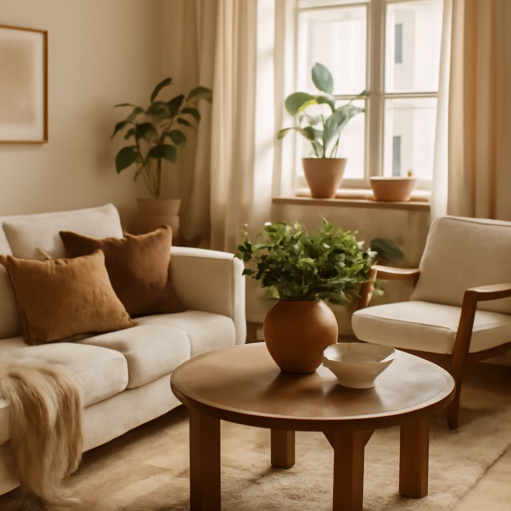
English style leans towards classic refinement in warm, nuanced tones. It honours heirloom quality, natural textures and elegant silhouettes. The mood is calm, collected and comfortable rather than overtly ornate.
Colour palette: natural neutrals with rich emphasises. Think amber, brick and stone tones, paired with deep greens, burgundy, mustard, warm oranges and yellows inspired by autumn foliage. Lighter options include cream, ivory and peach for balance.
Decor: mirrors, framed artworks, antique volumes, carved or turned furniture details, and textiles in natural, luxurious fabrics such as velvet, silk or wool. Plant motifs and botanical references are common, alongside restrained impression of formality.
In practical terms, English style often translates into layered fabrics, quality upholstery and carefully chosen architectural details such as mouldings or window coverings that lend a sense of timelessness to a contemporary plan.
Art Deco - glamorous luxury
Art Deco marks a celebration of glamour and high craft. It champions symmetry, bold contrasts and premium materials, steering clear of cheap or disposable finishes. Glossy surfaces, lacquered woods and metallic accents create a striking, timeless ambience.
Colour palette: high-contrast combinations built on black, white or ivory as a base, with vivid accents in red, blue, green, yellow or gold to punctuate the scheme.
Decor: oversized mirrors, framed art with ornate detailing, large vases and sculptural ornaments. Expect metallic details in door frames, radiators, vent grilles, fireplaces and textiles with metallic threads to translate the luxury into everyday life.
Boho - vibrant eclecticism
Boho is a celebration of colour, texture and variety. It thrives on a curated mix of fabrics, patterns and artefacts drawn from different cultures, creating a layered, expressive environment that feels personal and welcoming.
Colour palette: from soft neutrals to electric accents. The beauty of Boho lies in harmonious clashes rather than strict rules, often using more than three dominant hues in a single space.
Decor: a tapestry of textiles, woven rugs, ethnic prints, ceramic wares, artisan baskets and a seemingly casual abundance of cushions. The key is to push cohesion without tipping into visual chaos.
Boho remains a popular European choice for those who want a lived-in, globally inspired home with character and warmth.
Vintage - worn-in chic
Vintage interiors conjure the charm of well-loved finds and classic materials that have stood the test of time. The look is practical, approachable and nostalgic, often prioritising authenticity over perfection.
Colour palette: subdued and natural. Timber textures, pale walls and gentle, muted accents keep the atmosphere calm and timeless.
Decor: aged buffets, small antique tables with carved legs, dressers and shelving that carry marks of use. Accessories include decorative throws, faded linens, soft rugs and large crystal chandeliers to evoke a romantic, well-curated past.
Japandi - a calm fusion
Japandi blends Japanese minimalism with Scandinavian functionality. The result is a minimalist, warm, and highly liveable space defined by natural materials, simple silhouettes and quiet beauty. The emphasis is on quality over quantity, texture over decoration.
Colour palette: restrained natural hues - creams, soft greys, sand, ivory and warm stone - often with a touch of pale pink or sage. Contrast may be provided by darker timber or charcoal elements.
Decor: almost no ornamentation, live plants provide subtle life. The furniture prioritises tactile comfort and durability, with solid wood tables and clean-lined seating on a light, uncluttered floor.
- In a typical 37 m2 apartment, a Japandi approach might combine a sofa on pale legs with a light timber dining table and a few well-chosen plants.
- In a larger 70 m2 or more home, an open-plan scheme can maintain flow through a restrained palette and clearly defined zones.
Country - provincial warmth
Country style embodies rustic, outdoor-inspired comfort. It emphasises natural materials, simple construction and a sense of homely practicality. The look can feel cosy and timeless, with a gentle nod to regional traditions.
Colour palette: earth-tones - ochre, terracotta, sage, ochre, soft greens and woodland browns - paired with pale wall colours to enhance light and airiness.
Decor: sturdy wooden furniture, handmade textiles, pottery and artisanal patterns. Accessories may include woven baskets, craftwork and country florals, contributing to a timeless, family-friendly mood.
Country interiors translate well to European homes with abundance of natural light and accessible materials, from northern cottages to alpine chalets.
Kitsch - irony and playfulness
Kitsch mixes unexpected pairings with a wink. It revels in bold combinations and a sense of humour, balancing irony with warmth and colour.
Colour palette: a wide spectrum, from bright primaries to gentle pastels. The key is intentional contrast rather than accidental clash.
Decor: plentiful textiles, quirky furniture, retro pieces and posters or nostalgic motifs. The aim is exuberant joy rather than restraint, with an eye to playful cohesion.
Classic - refined symmetry
Classic interiors emphasise symmetry, proportion and timeless elegance. The room organises around a statement piece or architectural feature, with carefully chosen materials and traditional craftsmanship.
Decor: mouldings, plasterwork, grand chandeliers and heavy drapery. The colour story tends toward soft neutrals, enriched with deeper browns, ambers and greens for warmth and depth.
Within a European context, classic interiors translate across royal houses, city apartments and country houses alike, offering enduring sophistication that ages gracefully.
Contemporary - current, yet versatile
Contemporary design is not a single historical movement but a fluid synthesis of today’s trends. It is often calm, restrained and sophisticated, with a preference for honest materials and clean lines.
Colour palette: natural greys, beiges and whites form the base, with restrained accents in black or navy. Occasional vibrant highlights can appear as fashion-driven details.
Decor: textures and finishes are used to create interest - concrete, timber, stone or metal - without overwhelming the senses. Lighting plays a pivotal role in shaping the mood.
Loft - industrial edge
Loft interiors celebrate exposed structure and raw materials. Originally born from adapting industrial buildings, it remains a bold, urban aesthetic that can be softened for residential comfort.
Colour palette: deep, earthy tones such as black, charcoal and brown, often tempered with terracotta and muted greens to echo brick and timber.
Decor: utilitarian furniture, metal accents, stone, glass and timber, plus pared-back lighting and simple plan layouts. The signature look is a balance between rugged honesty and domestic comfort.
Minimalism - essential clarity
Minimalism champions proportion, straight lines, and a sense of order. Surfaces are uncluttered, materials are honest, and the space is defined by light and air rather than ornament.
Colour palette: monochrome with restrained use of warm or cool tones. Textiles and furniture may introduce a soft texture but keep to a restrained palette overall.
Decor: restrained or non-existent. Light is paramount, windows are maximised and artificial lighting is layered for depth without clutter.
Minimalism is often most effective in compact European homes where every square metre must earn its keep, from micro-apartments to 50–60 m2 city flats.
Modern - evolving practicality
Modern interiors reflect contemporary life, often bridging historical references with fresh constructions. It can be historical modernism or a pragmatic, sofa-to-table modern aesthetic that suits varied spaces.
Colour palette: a neutral base - grays, whites, beiges - with potential inky or blue‑black accents. Textures and sculptural forms provide interest rather than ornament.
Decor: bold furniture silhouettes, integrated storage and modular systems. Lighting is used to sculpt space and add drama without overwhelming the senses.
Pop Art - exuberant energy
Pop Art interiors celebrate colour, graphic forms and bold expression. It tends to use affordable materials and high-contrast surfaces to create a theatre-like atmosphere.
Colour palette: bright, saturated hues on walls, floors or furniture, balanced by quieter base tones to prevent overload.
Decor: playful upholstery, plastic or acrylic accents, posters and collage-style wall art, with vibrant accessories and a sense of fun.
Provence - rustic charm
Provence is the sunlit village look from the south of France, characterised by pale finishes, rough textures and floral motifs. It feels light, airy and gently nostalgic, with a distinctly Mediterranean warmth.
Colour palette: predominantly white with soft greens, pale blues and dusty pinks as gentle accents. Warm, sunlit ambience is essential.
Decor: painted wooden furniture with weathered surfaces, terracotta pottery, floral fabrics and plenty of natural cottons and linens. Greenery and fresh flowers are staples.
Scandinavian - space and light
Scandinavian interiors prioritise light, space and functional beauty. Hygge, the Danish concept of comfort, guides the mood, with high-quality materials and simple craftsmanship creating a cosy, breathable environment.
Colour palette: white, light greys and beiges form a calm base, with soft accents in muted blues, greens or pinks. The emphasis is on lightness and clarity.
Decor: abundant lighting, practical storage, natural textures and furniture on slim legs to allow floor space to read as larger. Plants and textiles add warmth without clutter.
Hi-Tech - glass and steel
Hi‑Tech embraces technology and precision in materials and forms. It uses metal, glass and porcelain surfaces with an emphasis on function, efficiency and clean, futuristic lines.
Colour palette: cool, mono-chrome tones - white, grey and black - with metallic accents. Bright colours appear only as design details or as illuminated elements.
Decor: lighting systems that create a dynamic rhythm, streamlined furniture, seamless storage and architectural features that integrate technology into daily living.
Chalet - Alpine warmth
Chalet style evokes cosy mountain lodges: timber, stone, generous volume, and a fire-driven heart. It blends rustic charm with modern comfort for a snug, outdoorsy atmosphere.
Colour palette: natural timber, whites, greys and greens with wine-red or burnt-orange accents for contrast and warmth.
Decor: exposed beams, stone fireplaces, plush textiles and substantial wooden furniture. Textiles such as throws and sheepskin add tactile warmth, while artefacts speak of mountain living.
Shabby Chic - romantic vintage
Shabby Chic embraces romantic, vintage-inspired living. It layers soft textures, distressed finishes and delicate details to create a light, feminine mood.
Colour palette: pastel and creamy tones - white, ivory, blush, powder blue, soft pinks and sage greens - creating a soft, airy backdrop.
Decor: lace, ruffles, embroidered textiles, vintage mirrors and antique lighting, with florals and soft layers to convey a gentle, nostalgic charm.
Eclectic - curated mix of eras
Eclectic design harmonises objects from different periods and cultures. The trick is to establish common threads - colour, texture or form - that knit diverse elements into a cohesive whole.
Colour palette: variable, typically anchored in a neutral base with selective saturated accents drawn from the combined styles in play.
Decor: bold statements alongside delicate pieces. The room balances paintings, mirrors, lamps and textiles to create a narrative rather than a uniform theme.
Tip: key to successful eclectic spaces is to ensure every chosen piece echoes a shared language, whether it be colour, texture or silhouette, so the collection feels intentional rather than random.
Eco Style - nature within
Eco Style foregrounds sustainability and natural materials. The aim is to create calm, breathable spaces that connect with the outdoors and use resources responsibly.
Colour palette: light, natural tones with whites, creams, greens, ochres and slate blues. Timber and stone textures bring warmth and authenticity.
Decor: plants, organic fabrics, handcrafted objects, and furnishings that prioritise longevity over trend. The emphasis is on reducing waste and selecting materials with low environmental impact.
Japanese - simplicity and restraint
Japanese design embraces wabi-sabi, the beauty of imperfection, and a quiet, refined aesthetic. It seeks harmony with nature through restrained forms and careful material choices.
Colour palette: muted whites, beiges, browns and greens, with black accents used sparingly for emphasis. Red appears as a deliberate highlight in decor or art.
Decor: plants, ikebana arrangements, minimal wall art, shoji screens or light wooden partitions, and ceramics with understated decoration. Textiles favour subtle patterns and natural textures.
Across Europe, Japanese-inspired interiors work well in smaller spaces where calm, orderly layouts support easy living and a sense of openness.
How to choose a style for your home
With many styles on the table, how do you begin? Start by listening to the architecture and light of your space. A light-filled, open-plan apartment with generous ceilings may welcome contemporary or Scandinavian warmth, while a compact, characterful flat with timber floors can embrace a refined classic or a gentle Provence vibe. Consider these practical steps to find the right match.
- Assess the architecture: are there preserved mouldings, high ceilings, or timber beams? Preserve or echo these features in your chosen style to maintain authenticity.
- Evaluate light and orientation: south-facing rooms respond well to lighter, reflective finishes, darker rooms benefit from warmer palettes and layered lighting.
- Define mood first: decide whether you want calm and restrained, or lively and expressive. Mood guides material choices and the balance of texture and colour.
- Start with a focal point: a fireplace, a view, or a statement piece of furniture can anchor a scheme and guide the rest of the room.
- Build a palette with a single base: choose a neutral base and add two or three harmonious accents. A cohesive palette makes mixing styles feel deliberate rather than random.
- Layer texture and light: fabrics, textures and layered lighting are the cheapest and most transformative tools for achieving depth in any style.
- Plan for scale and proportion: European homes vary widely in size and ceiling height. Adapt furniture scale to avoid overcrowding small spaces or under-furnishing larger rooms.
- Think sustainably: material choices, finishes and sourcing impact long-term appeal and environmental footprint. Prioritise durable, repairable pieces and quality finishes that age gracefully.
Applying a style across spaces
Most European homes blend elements from several styles to create a personalised environment. The key is to assign each room a dominant mood while ensuring consistency through shared materials, a common palette and coherent lighting strategies. For example, a living room might anchor a calm Scandinavian framework with a single art deco light fixture and a vintage rug to add character. A kitchen may combine contemporary cabinets with warm wood tones and period-leaning hardware for comfort and function. Below are a few practical guidance points to apply a chosen style across an apartment or house.
- Plan zones with intention: even in open-plan spaces, designate areas by cues such as rug boundaries, lighting clusters or furniture grouping rather than walls.
- Choose durable, well-made fundamentals: invest in a high-quality sofa, a sturdy dining table and reliable storage. These anchor the room and endure styles that shift over time.
- Balance ornament and space: in styles with strong identity, avoid over-decorating. Allow negative space to let rooms breathe and highlight key pieces.
- Lighting as an instrument: layer general, task and accent lighting to shape mood and function. A well-lit space can feel larger and more welcoming no matter the palette.
- Materials matter: natural materials such as timber, stone, linen and wool bring warmth and texture that transcend trends.
- Sustainability as a design principle: source materials responsibly, favour repairability over disposal, and consider energy-efficient solutions for lighting and climate control.
Putting it into practice: a compact European apartment example
Imagine a 40–45 m2 city apartment with a bright living space, a compact kitchen, a bedroom and a bathroom. A practical approach would be to choose a dominant style - say Scandi for its light and calm - and introduce touches from another style to personalise the space. White walls, pale timber floors and furniture on slender legs create a sense of openness. A soft grey sofa, a natural wool rug and a linen-draped window treatment reinforce the Nordic mood. Add a single statement light in an architectural form inspired by Art Deco or Hi-Tech to create a focal point without clutter. Textiles with subtle texture, a few carefully chosen plants and one or two vintage accessories provide character without compromising an airy feel.
Conclusion: designing with intention
European interiors benefit from flexibility and a sense of place. The strongest designs arise when you understand the building, light, climate and daily routines, then select a style - or a fusion of styles - that complements those realities. A well-considered palette, quality materials, and a calm lighting strategy can turn any space into a coherent, durable statement of personal taste. Whether you favour the timeless elegance of English or Classic styles, the modular practicality of Scandinavian, or the bold drama of Art Deco and Loft, a thoughtful, layered approach will help you realise a home that remains beautiful year after year.
You may also like these articles
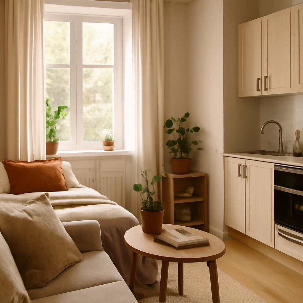
A compact 21m² studio: functional design and cosy comfort for a student home
A compact 21m² studio reimagined with smart zoning and green accents.
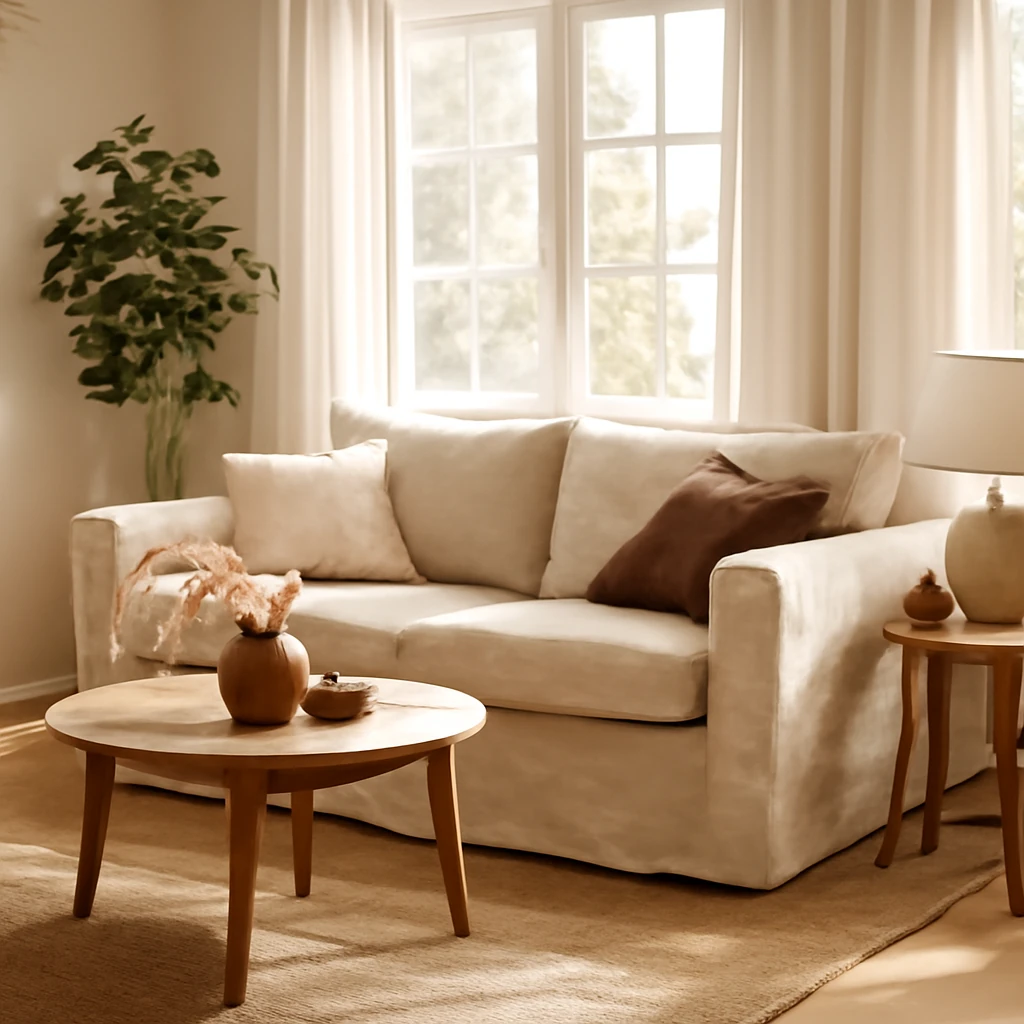
The DIY Sofa Slipcover Guide for European Homes
Refresh seating with durable, stylish sofa slipcovers—easy to fit and care for.
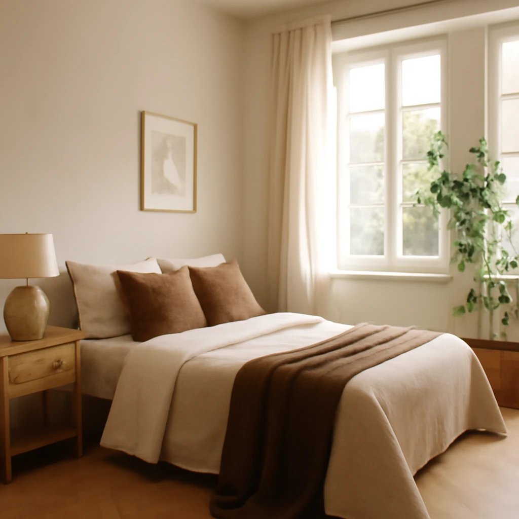
How to Design a 12 m2 Bedroom: Five Layouts for European Homes
Five layout ideas to optimise a 12 m2 European bedroom.