
Explore interior trends, AI design insights, styling guides and real transformations
Kitchens and Backsplashes: Five Striking Pairings from European Designers
Introduction
Colour is a powerful design tool in contemporary European kitchens. While timeless neutrals - such as white, stone, and soft greys - continue to perform, a well‑chosen splashback offers a stage for personality without compromising practicality. Across compact city flats, generous open‑plan homes, and everything in between, designers are mixing materials, textures, and tones to create spaces that feel both contemporary and lived‑in. Here we explore five striking colour pairings observed in European practice, with practical guidance on scale, materials, and how to balance bold backsplashes with cabinetry, worktops, and lighting.
Red and Black-and-White
This pairing works particularly well in homes where the kitchen reads as a focal point rather than a purely utilitarian workspace. A kitchen with deep red lower cabinetry or island, paired with black upper storage or a vintage infill piece, creates a confident, theatre‑like stage for everyday cooking. The splashback plays a pivotal role: a black‑and‑white mosaic or geometric tile can introduce graphic rhythm that anchors the colour story. Against light walls and a pale worktop, the red hue reads as a refined accent rather than a loud statement. In practice, keep the red in a desaturated or brick‑toned spectrum to avoid fatigue, and ensure the black elements are not overwhelming by maintaining generous negative space around the cabinetry and appliances.
Material and finish considerations include using a low‑polish or satin surface for the red cabinetry to soften reflections, while the splashback could be porcelain, ceramic, or glass mosaic depending on budget and maintenance expectations. A white or light grey quartz worktop typically complements this palette, ensuring clear visual separation between surfaces. For smaller spaces, maintain a simple layout with clean lines and avoid busy countertop clutter to preserve an air of spaciousness.
Practical tips: choose a muted red or terracotta shade to keep warmth without overpowering the room, coordinate fixtures with brushed nickel or matte black hardware, and select a mosaic or tile pattern with a scale that mirrors the room size - larger patterns for larger kitchens, smaller mosaics for compact spaces.
In European projects, this combination often appears in compact urban apartments where the design challenge is to inject personality while preserving a sense of openness. The balance is achieved by restraint in the surrounding surfaces and a deliberate focus on texture and material assortment rather than sheer colour brightness.
Green and Pink
Green paired with pink might seem unconventional, yet it can read as fresh, sophisticated, and unexpectedly soothing when used with care. In a recent European studio project intended for rental or long‑term lease, a soft sage or olive green kitchen was paired with pink tiles on the splashback and a warm wooden worktop. The pink acts as a gentle counterpoint to the green, avoiding clashing hues because both tones sit within a muted, nature‑inspired family. The cabinet colour remains light or neutral, allowing the pink backsplash to be the hero element without dominating the space. The result is a calm, uplifting environment suitable for daily cooking and socialising alike.
Materials to consider include ceramic or porcelain tiles with a subtle glaze, or glass tiles that mimic the softness of a pastel paint finish. Wood accents - in the form of a shelf, a small open cabinet, or a matching wooden edge on the splashback - reinforce the natural feel. In small spaces, ensure that the pink is delivered through a restrained tile scale, such as a small‑format mosaic or a shallow brick pattern, to avoid visual heaviness. Lighting plays a crucial role, warm white or golden tones help the pink stay gentle rather than sugary.
Practical tips: keep the surrounding wall colour in a light beige or off‑white to sustain brightness, use soft, tactile textures for textiles and seating to harmonise with the soft palette, and consider a matte finish on the green cabinets to minimise glare and maintain elegance.
Grey and Mint
The combination of grey with mint offers a refined contemporary look, especially effective in European apartments that emphasise monochrome foundations with a touch of colour. In practice, a grey kitchen - where the cabinets, walls, or even the paneled fronts are rendered in subtle grey - creates a versatile canvas. A mint splashback with a slightly elongated tile shape (for instance, diamond or rhomboid forms) introduces colour in a controlled manner. The mint hue has a cooling effect that complements stainless steel appliances and natural stone worktops, producing a palette that feels calm yet distinctly contemporary.
Material choices for the mint splashback include glass for a glossy touch that reflects light, or matte ceramic tile for reduced glare and a softer appearance. To keep the space uncluttered, coordinate with light, natural textures such as linen or cotton in upholstery and window treatments. A common European tactic is to echo the mint tone in a small display shelf or a single furniture piece in the adjoining dining area, creating a cohesive flow between rooms.
Practical tips: align grout colour with the mint tile to achieve a seamless field, prefer a satin or matte tile finish to reduce shine, ensure the ceiling and skirting boards are lighter to enhance perceived height and space.
Green and Orange
Orange is a challenging hue in interior design due to its energy and brightness. When used sparingly as an accent, however, it can inject warmth and personality without overwhelming a kitchen. A European studio project demonstrated this by placing orange splashback tiles alongside muted green lower cabinets and a column cabinet, the upper cabinets remain the same colour as the walls to keep the scheme cohesive and calm. The orange is also echoed in soft furnishings - such as chairs or a rug - woven or chosen by the client to maintain a multi‑sensory, curated feel. The overall effect is lively but balanced, ideal for open‑plan kitchens that open into living or dining zones.
Materials to explore include bold ceramic or porcelain tiles in a terracotta or tangerine shade with a durable, easy‑to‑clean glaze. The green cabinetry can be a sage or muted olive, preferably with a matte finish to reduce reflection. Lighting is critical: ensure warm tonal lighting to enrich the warmth of the orange while preventing the palette from feeling clinical. Consider a neutral worktop that anchors the space.
Practical tips: choose a slightly darker or muted orange to prevent eye fatigue, ensure consistent rhythm by repeating orange accents in textiles or accessories, and balance with natural wood textures to soften the palette.
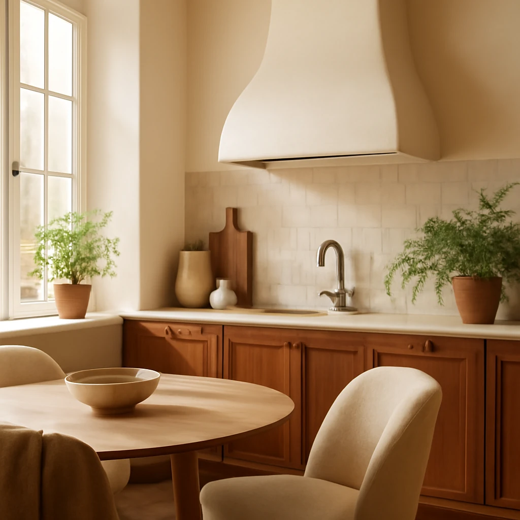
Beige and Burgundy
A beige kitchen - whether in a light, creamy tone or a warmer sand shade - offers a timeless backdrop that reads as serene and flexible. In a contemporary European home, the beige cabinetry can align with the walls to create an almost seamless field, while a burgundy or wine‑toned splashback delivers a bold focal point without overpowering the room. This combination works well in larger kitchens or in spaces with generous daylight, where the burgundy can be rendered in glazed tiles that catch light differently as the day progresses. Burgundy can also be echoed in adjacent spaces, such as a hallway or living area, to create visual continuity across the home.
Materials to consider include high‑gloss burgundy glass tiles or a ceramic tile with a satin glaze to achieve depth without glare. For the beige, natural materials like light timber, linen textiles, or a stone countertop can add tactile warmth. This palette is particularly forgiving in European homes where energy efficiency and natural materials are valued, it gives the kitchen a classic‑meets‑modern appeal that ages well over time.
Practical tips: ensure the beige surface has a slight warmth (cream, honey undertone) to prevent the space from appearing flat, use burgundy as a precise accent rather than a broad surface, and consider anti‑fingerprint finishes for hardware and splashback areas to maintain a pristine look in high‑traffic kitchens.
Practical guidance for choosing splashbacks
Selecting a splashback is about more than colour. It is about scale, material, maintenance, and how the surface will interact with light, cabinetry, and worktops. Here are practical guidelines to help you translate these five pairings into durable, beautiful kitchens across Europe.
- Scale and proportion: For small kitchens, opt for smaller tile patterns (mosaic or 10×20 cm formats) that create a sense of depth without overwhelming the space. In larger kitchens, you can opt for larger format tiles (30×60 cm or larger) that read as a continuous surface and reduce grout lines.
- Material choices: Porcelain and ceramic tiles offer durability and wide colour options, glass tiles provide reflections that can enhance daylight, enamel steel or metal‑faced panels bring a sleek, contemporary edge, natural stone slabs or quartz surfaces deliver premium resilience and a calm, solid backdrop.
- Finish and maintenance: Matte finishes minimise glare and fingerprints, while glossy finishes reflect light and make a space feel larger. Consider grout colour carefully, a grout that closely matches the tile creates a seamless field, whereas a contrasting grout emphasises pattern and geometry.
- Light and ambience: The splashback is a key lighting surface. In darker rooms, lighter splashbacks or glass tiles can help brighten the space, in sunlit rooms, warmer tones or slightly darker tiles prevent visual heat gain in summer.
- Coordination with hardware and appliances: Brushed nickel, matte black, or brass hardware can harmonise with a wide range of splashback tones. Stainless steel appliances pair well with cooler greys and greens, while brass or gold accents harmonise with warm burgundies and oranges.
- Budget and longevity: Tile splashbacks offer flexibility and cost efficiency, especially with mid‑range formats and standard patterns. A panel or slab splashback (glass, enamel, or quartz) can be more expensive but provides a seamless, wipeable surface with fewer joints, ideal for high‑use kitchens.
Across European homes, the most successful kitchen‑and‑backsplash stories are those in which the colour story is deliberate, the materials are fit for purpose, and the scale supports the room's size and flow. Bold colour should feel intentional, not accidental, textures should invite touch, not require constant maintenance, and lighting must be chosen to complement, not fight, the palette.
From concept to execution: a practical checklist
To help you realise one of these five pairings in your own kitchen, use this concise checklist as you plan:
- Assess the space: Measure the kitchen, note window placements, and determine how much glare you can tolerate. For compact spaces, prefer lighter backgrounds with a restrained accent colour on the splashback.
- Define the main surface: Decide whether the splashback will be the hero (bold tile or glass) or a supporting actor (subtle mosaic that harmonises with cabinetry).
- Choose a material family: Tiles for versatility, glass for reflection and ease of cleaning, or slabs for a seamless, premium look. Align the material with daily use and maintenance expectations.
- Plan the pattern: A straight‑lay pattern for a calm look, a herringbone or chevron for a dynamic vibe, a mosaic for texture. Ensure alignment with cabinet joins and electrical outlets.
- Coordinate with lighting: Plan under‑cabinet lighting to enhance the splashback’s colour and finish. Warm lighting supports burgundy and orange tones, cooler lighting enhances mint and olive greens.
- Integrate with adjacent spaces: In open‑plan layouts, ensure the kitchen palette ties into the dining or living areas with shared materials or corresponding accessories.
- Budget and timeline: Establish a clear budget, allowance for extra tiles or panels, and a realistic installation window that minimises disruption to daily life.
In summary, a well‑chosen splashback is not merely a surface to protect walls, it is a design instrument that defines the atmosphere, scales the space, and anchors the collection of materials in the room. Whether you favour the drama of red, the quiet confidence of grey, or the playful energy of green and orange, the key to success lies in proportion, finish, and a clear vision carried through every surface and detail.
You may also like these articles
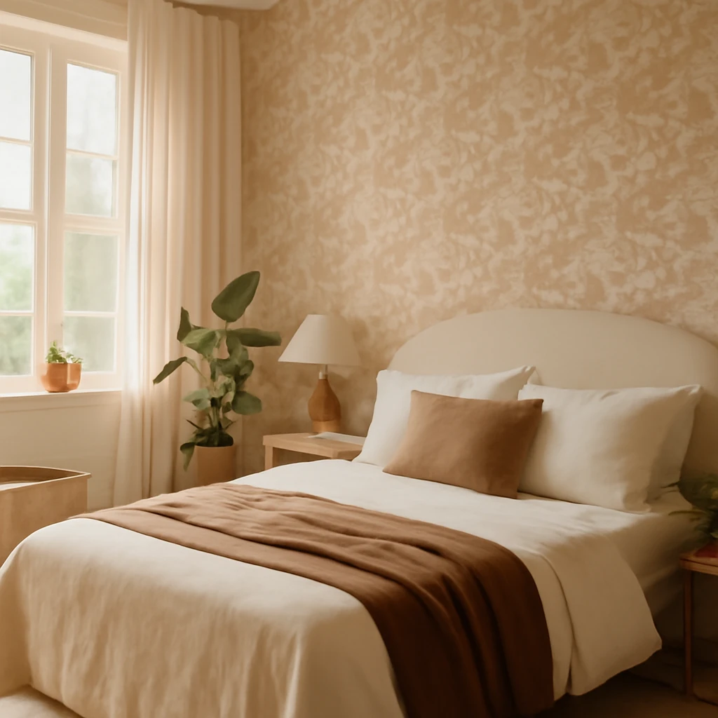
Six Beautiful Bedroom Wallpapers to Create Calm, Characterful Interiors
Six stylish bedroom wallpaper ideas to craft calm, characterful spaces.
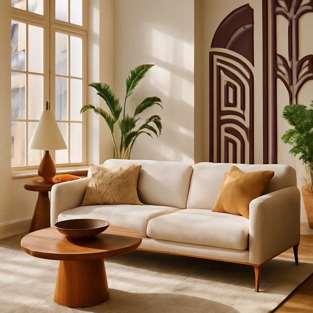
Art Deco Interiors: The Timeless Allure of Geometry and Glamour
Uncover how Art Deco luxury translates into modern European homes.
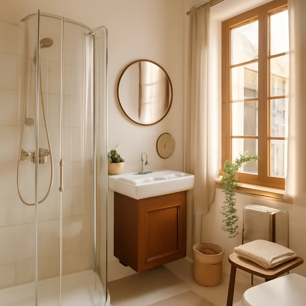
Smart design for compact European bathrooms: space-saving solutions
Smart strategies for tiny European bathrooms: maximise space with layout, light and durable finishes.