
Explore interior trends, AI design insights, styling guides and real transformations
Calm, open-plan two-bedroom: a modern European renovation
In Brief
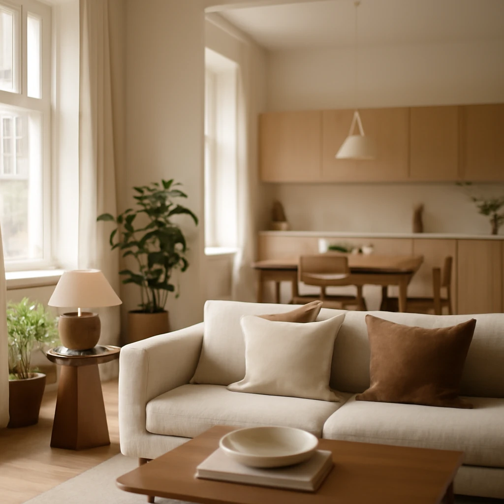
In a compact two-bedroom apartment within a contemporary European development, a self-directed renovation has transformed a raw, concrete-edged shell into a calm, light-filled home. The owner, a financial analyst by trade, sought a design that is precise, restrained, and comfortable. The result is an open-plan living area, a carefully planned kitchen with an island, and storage solutions that disappear into the architecture while remaining highly functional.
The Project
The project emerged from a desire to maximise space and daylight. The owner worked with designers as the project progressed, but the core decisions were taken in-house during the latter stages of construction. The palette remained neutral to serve as a backdrop for a future collection of contemporary art, to be displayed along a long, uninterrupted wall in the living room. The design intentionally embraces a minimalist language, while ensuring warmth and tactility through materials and textures.
One of the early choices was the door system: the initial plan was for completely flush-mounted doors with a paintable surface. That idea was replaced by ready-made, factory-finished doors, with the paint colour chosen to complement them. This ensured a clean, cohesive surface that is easy to maintain in daily life.
The kitchen is a standout zone: a compact layout built around a continuous cabinet run, with a dedicated column for integrated appliances, and a central island that provides generous work surface. The island includes a hob and an integrated dishwasher, and features a dedicated island hood. The surrounding workspace is clad in a quartz composite, which creates a visually light, seamless edge that also serves as a practical prep zone.
"Originally we planned to place bar stools along the overhand of the island," the owner notes, "but as we settled in, we realised that a continuous work surface offered more flexibility, so that portion now serves as extra plain workspace." The surface is same quartz plus it helps define the edge of a wall shaft where services run, giving the plan a neat vertical rhythm.
The floor finishes were chosen to translate between zones: the kitchen floor uses large-format porcelain tile for durability and ease of cleaning, while the living area transitions to a timber veneer on a high-density fibre board (HDF) base, installed as a floating floor. The timber alternative has the warmth of real wood with the resilience required for a compact European home. A note from the homeowners: during installation the team used an adhesive approach near a tile boundary, which caused some minor swelling during humid weather. It was rectified promptly, and the result is stable and comfortable underfoot.
Layout and space planning
The apartment’s core is an expansive, open-plan living space where the kitchen, dining, and lounge flow into one another. The aim was to create airiness without sacrificing intimacy. Large windows flood the space with daylight, while the furniture palette stays deliberately quiet to let potential art collections stand out on the long wall in the living room. The overall geometry relies on simple lines, with a handful of carefully selected black accents to ground the palette and create a cohesive, modern aesthetic.
Living area and media
For the media zone, the homeowner selected a design-forward television that doubles as a sculptural object. The screen sits on four slender legs, with the cables neatly concealed within one leg, so the device appears to hover and blend with the room. The display can be used to present daily information or, when off, to act as a blank canvas or digital artwork, depending on mood and season. The intention was to have the TV recede into the interior rather than commandeer space with a bulky cabinet.
The TV stands on four slender legs, with concealed cabling so that it appears to float, a detail that maintains a clean, gallery-like atmosphere in the living space. The screen can display selected imagery, from art reproductions to weather and date displays, depending on mood and season.
Storage, joinery, and detailing
Storage is integrated into the architecture via a considered joinery system. In the entry area, two wardrobes accommodate short and long garments respectively, a pantograph mechanism lowers the rail to a comfortable working height for easy access. The walls, interior finishes of doors, and furniture frames are finished in a single hue, ensuring a seamless backdrop. A bold accent appears in the form of a black granite shelf and a veneered panel along the rear wall of a built-in display area. The contrast between the matte paint and the dark stone and timber details adds depth to the minimalist scheme.
Bedroom and private zones
The bedrooms follow the restrained palette, designed to promote rest. The wardrobe solutions are practical and flexible, with a focus on easy access and tidy concealment. The master bedroom includes an area allocated for a dressing space, the plan was adapted to fit standard fittings available commercially, avoiding bespoke solutions that were not feasible in this compact footprint. A curtain was considered to separate sleeping and dressing zones, but this element was not included to maintain open shelves and quick access to storage drawers. The result is a quiet, relaxing space with daylight and soft textures that invite retreat and reflection.
Materials, finishes, and lighting
Throughout the home, a quiet, tonal palette of neutrals - soft beiges, warm greys, and off-whites - serves as the canvas for texture. The kitchen countertops are a robust quartz composite, while the floors in living areas are veneered timber on an HDF base, laid as a floating floor. Surfaces are finished with a restrained lustre that reduces glare and provides a subtle warmth. Lighting is layered to sculpt space: recessed ceiling fittings for general light, wall wash lighting to accentuate architectural lines, and intelligent controls to adjust ambience. In circulation zones, lighting is low and practical, ensuring a welcoming mood from morning through evening.
Entryway and circulation
The entry area combines seating and storage for outerwear, with two wardrobes arranged to manage coats efficiently. A pantograph-lowered rail system lets occupants adjust the hanging height to suit their needs. The walls and doors are finished in a single tone to maintain a calm, uninterrupted first impression as you enter the apartment.
Sourcing and approach to budgets
To inform materials and finishes, the owner visited several European showrooms and studied craft across a range of price points. The aim was to understand what characterises well-made cabinetry and joinery, what makes a surface feel premium, and how to achieve the look with practical, budget-conscious choices. The result is a thoughtful mix of pieces from premium manufacturers and robust, affordable lines that share a consistent design language. A small but meaningful detail is the smoky-glass doors on some cabinets, this choice adds depth and a modern edge without overpowering the restrained palette.
- Prioritising the quality of joints, seams, and connections
- Choosing textures that read as premium in different lights
- Balancing price with longevity to ensure lasting value
- Maintaining a coherent colour language across spaces
Materials at a glance
| Area | Flooring | Countertops | Cabinetry & Doors |
|---|---|---|---|
| Kitchen | Porcelain tile | Quartz composite | Factory-finished doors on solid frames |
| Living | Veneered timber on HDF (floating) | - | Light-coloured panels |
| Entrance | Composite tile | - | Unified finish to walls and doors |
Conclusion
The finished home is calm, functional, and elegantly contemporary. It demonstrates how a disciplined, self-guided renovation can deliver interiors that feel stylish and comfortable in a European city. A restrained colour story, a tactile material mix, and thoughtfully integrated storage create a backdrop ready for art, music, and daily life. The project also shows that a careful approach to sourcing, a willingness to adapt during construction, and a deliberate combination of premium and accessible pieces can produce a sophisticated result in a compact footprint.
You may also like these articles
 Interior Design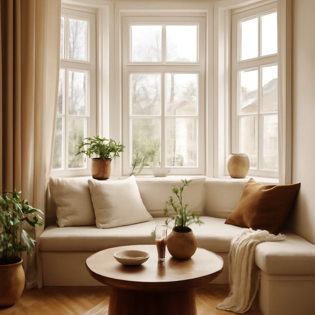
Bay Windows: Design Focal Points for European Homes
Turn bay windows into light-filled, flexible spaces with clever layouts.
Small Spaces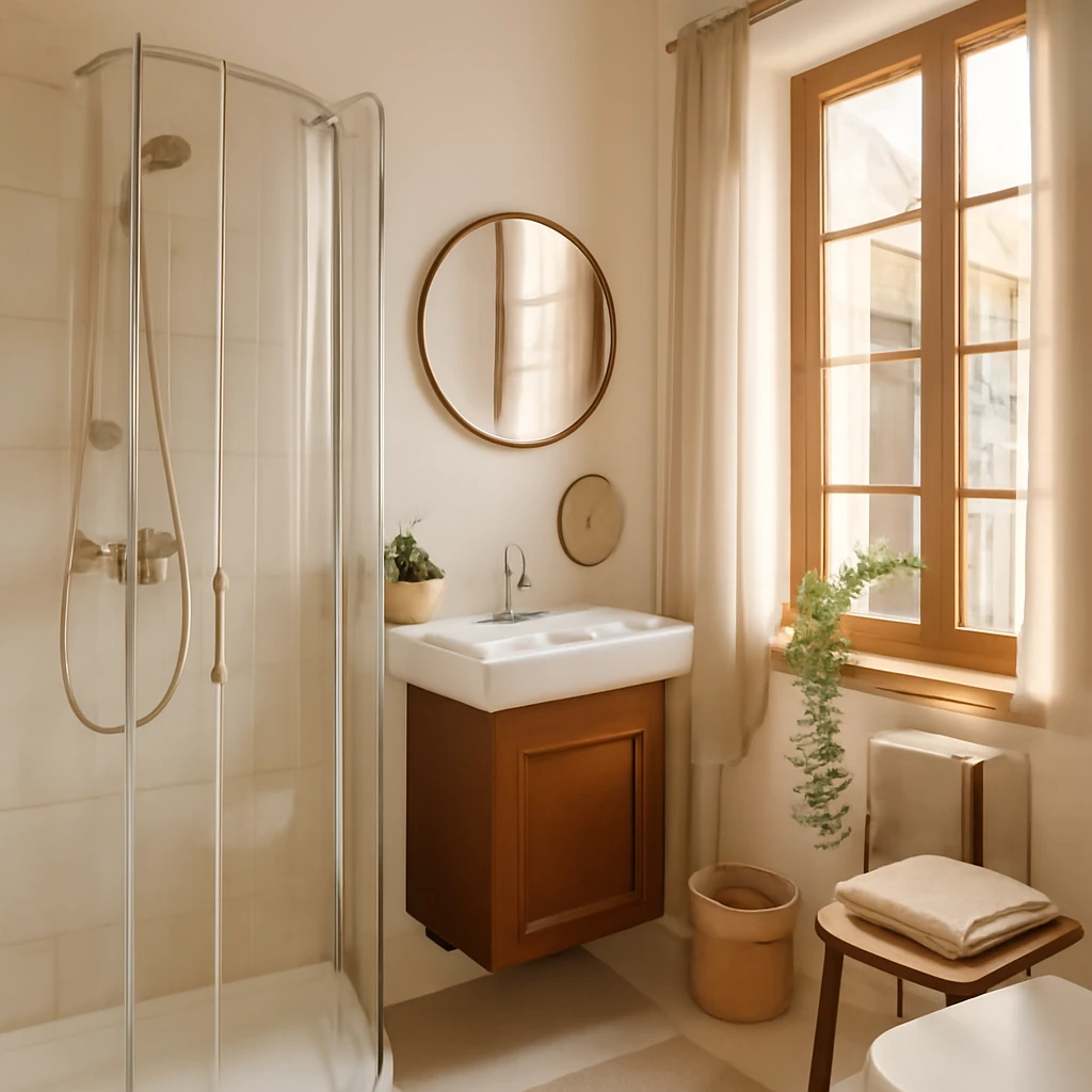
Smart design for compact European bathrooms: space-saving solutions
Smart strategies for tiny European bathrooms: maximise space with layout, light and durable finishes.
Colour & Materials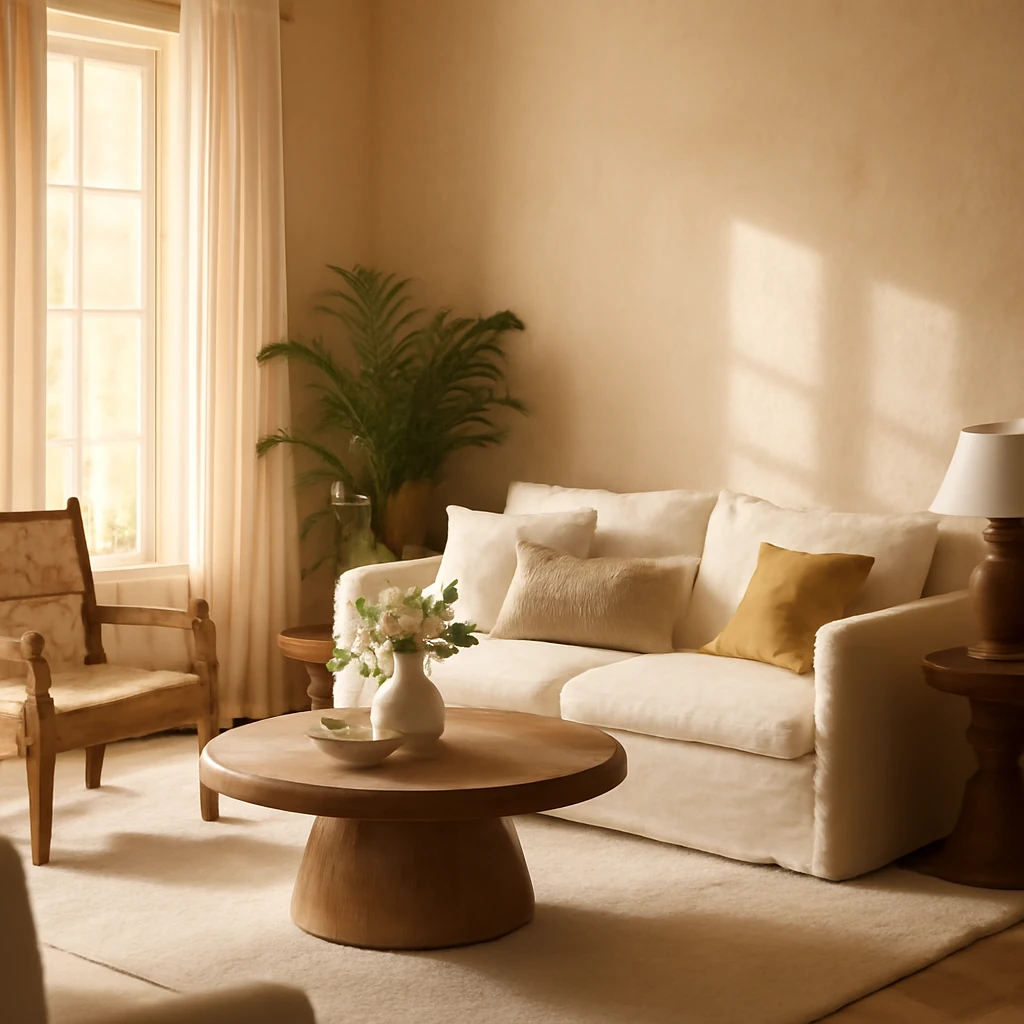
Eight durable wall coverings that elevate European interiors
Eight durable wall coverings to withstand busy European homes and still look luxe.