
Explore interior trends, AI design insights, styling guides and real transformations
Colourful small-hallway makeovers: five European entrances
In many European homes, the entrance is more than a mere corridor - it is the threshold between street and living. For compact apartments in cities across the continent, a well-considered hallway can establish mood, regulate traffic patterns, and enhance daily routines. A well-chosen palette, tactile materials, and clever storage transform this utilitarian space into a welcoming, functional zone that mirrors the rest of the home. Below are five colour-forward hallway transformations from diverse European contexts, illustrating how designers balance scale, light, and personality in small spaces.
Blue hallway with a sink and a bookcase
In many city flats, the corridor is the least prioritised space - often windowless, squeezing daylight into the shortest possible time frame. The challenge is to create a sense of airiness while accommodating practical tasks on the way in and out. The approach here began with removing heavy partitions, allowing daylight from adjacent rooms to permeate the hallway and bounce off a single, saturated blue throughout walls and ceiling. This colour strategy visually raises the ceiling and unifies the space into a coherent gallery that welcomes you from the moment you step inside.
A practical, compact sink was introduced along one wall to facilitate quick handwashing after a commute or a muddy walk with a pet. Positioning it at arm’s reach avoids blocking traffic flow and keeps the focus on daily convenience rather than maintenance concerns. The sink completed the routine hygienic needs without necessitating a separate bathroom visit before exiting to the street.
To keep the corridor from feeling clinical or solitary, an open bookcase runs along one side. It serves multiple roles: a storage zone for books, keys, and daily reminders, a display for objects with personal meaning, and a light, vertical reference that planes the expanse of space. The shelving system is intentionally low- to mid-height, so it doesn’t interrupt sightlines or create visual clutter. The blue backdrop provides contrast with the timber, ceramic and metal finishes used at the threshold.
Materials and finishes are chosen for durability and ease of maintenance. The walls and ceiling are finished in a satin‑finish acrylic for wipeability, while the sink is clad in a matte, slip-resistant ceramic. The floor is a robust, neutral-toned tile with a subtle texture to minimise noise and scuffing. Lighting is integrated: recessed LED strips illuminate the base of the bookcase and cast a gentle glow onto the blue plane, enhancing the colour while preventing harsh spotlights from fragmenting the space.
The palette - blue grounded by warm terracotta tones, punctuated with yellow and green accents - binds the hallway to the rest of the home. This approach avoids a “one-room-only” feeling, creating a through-line from entry to living areas. The design team emphasised flexibility: the bookcase can adapt to seasonal decor, and the sink can be upgraded or moved if the layout needs to adapt to a new home arrangement or pet-care routine.
Olive hallway with thoughtfully planned storage
In a contemporary one-bedroom European flat of approximately 35 m², the entrance zone had to serve daily routines while remaining visually calm. The solution involved constructing a deliberate partition to demarcate the entry from the open-plan living area. The olive colour was chosen to create a warm, cocooning atmosphere that visually anchors the entry and connects with the adjoining rooms.
Walls and ceiling were painted in a deep olive shade that absorbs noise and creates a human-scale environment. The door opening to the main living area is framed with a ceramic-look trim and a floor laid with ceramic porcelain imitating a subtle grey stone with light veining. This pairing provides a tactile, durable surface that’s ideal for high-traffic zones and for daily wear-and-tear from outdoor footwear.
Storage is the hero here: a tall built‑in wardrobe offers generous space for outerwear and footwear, while a compact console with a large mirror sits at the threshold. The console functions as a landing area for mail, keys, and small items, and its mirror visually enlarges the space. To keep the entry uncluttered, a small laundry area is tucked away behind a concealed door or within a dedicated utility nook beyond the hall, ensuring that everyday mess remains out of sight de facto.
The colour story continues across the apartment: olive walls connect with kitchen accents and decorative touches elsewhere, weaving a unified colour narrative. The material choices are deliberately practical: ceramic flooring with a matt finish resists scuffs and moisture, while the wardrobe interior lines are organised with adjustable shelving and integrated drawers to maintain order with minimal effort.
The result is a calm, purposeful entry that feels larger than its footprint. The olive palette acts as a bridge between the utility of the space and the warmth of the home, allowing the foyer to function as a true welcome rather than a meagre corridor.
Hallway with symmetrical lavender columns
In a 40 m² flat, the architects faced the typical European challenge: how to maximise space without sacrificing character. The plan involved removing a wall that separated the corridor from the living area, creating a more generous flow between zones. The central architectural move was to introduce symmetrical columns - painted in a soft lavender - to frame the kitchen zone. These columns perform a dual role: they visually expand the space and, at the same time, act as a light architectural storage system along the corridor side.
The columns’ gentle lavender tone supports a larger scheme of pale walls, allowing light to bounce through the hall and into the kitchen, adding a subtle vibrancy to the overall mood. In combination with hidden flush-fit doors and a minimalist baseboard trim, the space reads as continuous rather than segmented, a critical effect for smaller layouts where every centimetre counts.
An understated colour on the walls anchors the room while the architectural features do the heavy lifting. The baseboard is integrated flush with the floor, avoiding any protrusion that would interrupt sightlines. The colour palette is layered with cool neutrals that keep the space from feeling saturated yet ensure the lavender columns read as refined accents rather than decoration for decoration’s sake.
To keep costs proportionate, the project employed a modular storage strategy: built-in cabinets along the corridor wall hold outerwear, accessories, and bags, while a shallow floating shelf above the wardrobe offers a perch for small decor items. The aim was a practical, elegant threshold that feels more expansive because the architecture does the talking, not an excess of furnishings.
Terracotta hallway with vintage-inspired furnishings
A 42 m² apartment used the entrance zone as a focal point with a bold, celebratory mood. The designers painted the walls in a rich terracotta, creating an instant sense of warmth and energy. This choice sets a confident tone for the entire flat - an anchor for a space that would otherwise be quickly overlooked as a transit area.
To reinforce the vintage vibe, the decor team selected a carved wooden console that functions as a console table for keys, mail, and decorative objects. A retro tile floor with a geometric pattern grounds the space in a sense of history while remaining perfectly compatible with contemporary living. The contrast between the terracotta walls and the tile’s cool tones brings about visual interest without overpowering the senses.
Storage is cleverly integrated into a niche: an open wardrobe is concealed by a mustard-coloured textile curtain. This soft, flexible enclosure hides outerwear, bags, and seasonal items, while preserving a sense of airiness and warmth. The curtain’s hue echoes other mustard accents in the home, tying the entrance to the broader palette with subtleness and tact.
Materials throughout emphasise practicality: the terracotta wall finish is durable and easy to wipe clean, the wooden console is solid and repaired with traditional joinery, and the tiled floor resists scuffs common to high-traffic entryways. The overall effect is a hallway that feels both nostalgic and fresh - an inviting introduction to a well-loved home.
Wine-coloured hallway with graphic tiling
In a 41 m² apartment, the original entry zone was underused and visually flat. The design team chose a dramatic, wine-inspired palette across walls and the front door in dusty rose. The intention was not merely aesthetics but to create a sense of arrival - a refined threshold that signals a thoughtful interior beyond.
The floor features a ceramic tile with a bold geometric pattern in dark hues, introducing motion and energy to the corridor. Black-framed doors and mirrors provide a striking contrast to the wine-toned walls, intensifying the room’s drama while maintaining a cohesive, sophisticated look.
Along the hall length, built-in storage units are painted to match the walls, effectively dissolving the furniture into the architecture. The wardrobe doors are nearly invisible, producing a blank canvas that makes the space feel larger and less busy. A small console and a pouffe with slender black legs complete the functional zone, offering a landing spot for dispatching items and a moment of rest as you enter or depart the home.
The overall strategy blends bold colour with precise detailing: the wall colour creates atmosphere, the tiles introduce pattern and texture, and the concealed storage keeps clutter at bay. The result is a hall that acts as a confident prologue to the interior, establishing style while satisfying the practical demands of daily life in a compact European home.
Practical takeaways for readers aiming to apply these ideas in their own spaces include: selecting a dominant colour to unify multiple zones, using architectural elements to create storage without overwhelming the footprint, and choosing durable finishes appropriate for high-traffic entrances. Each project demonstrates that small spaces can be expressive, with colour used to guide movement and mood rather than simply decorate.
Guidance for implementing colour-forward hallways in European homes
- Define a through-line: choose a dominant colour and repeat it through adjoining rooms to create coherence and a sense of flow.
- Maximise light: where possible remove partitions, use reflective surfaces and light-coloured ceilings to bounce daylight into the corridor.
- Prioritise storage: integrate built‑ins and concealed compartments at the threshold to maintain a neat, navigable entrance.
- Invest in durable materials: consider ceramic or porcelain tiles for floors, with easy-clean paints or finishes on walls.
- Introduce texture and warmth: use textiles, timber and soft furnishings to balance bold colours and prevent the space from feeling overpowering.
In each of these European examples, the hallway is no longer a mere passage but a compact stage for personality, practicality, and daily comfort. With intention and a careful balance of colour, material, and storage, even a tight entrance can make a lasting impression.
You may also like these articles
Kitchen niche in European homes: planning rules and practical layouts
A guide to European kitchen niches: planning, rules, and compact layouts for small spaces.
The Subtle Power of Wood Veneer: Craft, Care and Practical Applications for European Homes
A practical guide to wood veneer for stylish, sustainable interiors.
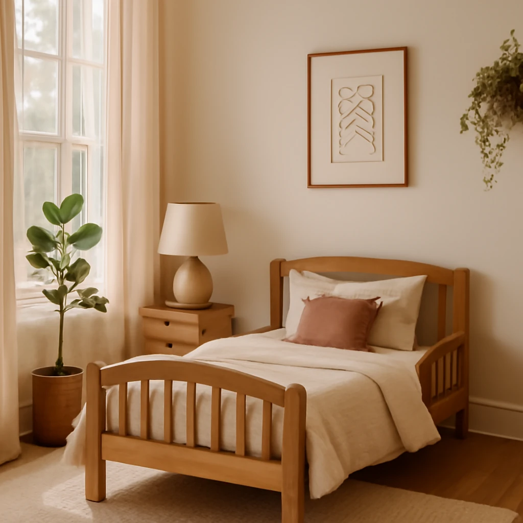
Growing with grace: how to choose a child bed that fits your European home
A practical guide to sizing, safety, and styling for children's beds across Europe.