
Explore interior trends, AI design insights, styling guides and real transformations
Hidden bedroom, bold accents and a compact kitchen: designing a 25 m² European micro-studio
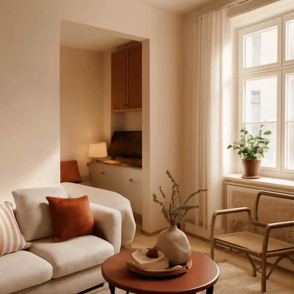
Introduction: rethinking micro-living in European cities
Across Europe, the rise of compact city living is challenging designers to redefine what a home can offer in modest footprints. This micro-studio, measuring 25 m² (27 m² with a balcony) in a contemporary European development, demonstrates how zoning, discreet storage, and carefully chosen finishes can transform a small shell into a warm, functional habitat for one or two residents. With a ceiling height of 2.78 m, the project proves that verticality and clever partitioning are powerful allies in the quest for space without compromise.
Unlike traditional, spacious flats, micro-homes demand a holistic approach where every centimetre is purposeful. The design team operating remotely across Europe embraced modular, multi-use solutions, prioritised durability and ease of maintenance, and engineered a colour and material palette that reads as calm and cohesive from doorway to window. The guiding principle was simple: create spaces that feel generous, while preserving the visual tranquillity essential to daily living.
In this feature we unpack how the studio achieved a fully lived-in environment within a tight envelope - how a hidden bedroom, a generous kitchen-living zone, a practical workspace, and a spacious shower come together without creating visual noise. The ideas are transferable to many European cities where rental markets push for compact, efficient design that remains stylish and comfortable over time.
“For me, spaces should be thoughtful, beautiful, and cosy,” explains the lead designer. “Nature inspires our palettes and helps create interiors that feel harmonised and enduring. Our studio works remotely with clients across borders, understands the nuances of renovation budgets, and focuses on delivering functional rooms that respond to real living patterns.”
Zoning challenges in a compact footprint
The client purchased the studio with long-term rental in mind, targeting a comfortable home for one to two occupants. The task was to carve out multiple functions within a single, square area without ever making the space feel cramped. The zoning list looked straightforward on paper, but required a sophisticated approach in practice:
- a separate sleeping zone with a full-size bed to avoid a perpetual “sleeping on the kitchen” sensation;
- a living area with a sofa that can double as an extra bed;
- a fully equipped kitchen that is discreet and non-dominant in the room’s composition;
- a dedicated working spot with adequate daylight and an ergonomic setup;
- a generous shower room with practical, durable finishes and smart storage.
Beyond functional zoning, the brief called for the maximum possible concealed storage. In micro apartments, closed storage is a quiet hero: it keeps the space legible and uncluttered, which is essential when the eye doesn’t have room to rest on piles of everyday items.
Layout philosophy: a calm, square kitchen-living zone and a hidden bedroom
The final plan places the concealed bedroom by the window, creating a calm retreat that can be closed off from daily activity. A large, wall-to-wall wardrobe system sits at the heart of the storage strategy, knitting together the corridor, bedroom and living area so that clothes, coats and personal effects stay out of sight yet are always accessible. The kitchen and living area form a near-square core: the kitchen is compact but fully equipped, and the living zone sits opposite the entrance, organised so that the eye moves naturally through the flat without abrupt stops.
In this configuration, the living zone is anchored by a sofa with a deep seat and a modest footprint. When needed, it converts into a comfortable bed, providing an extra sleeping option without sacrificing day-time functionality. A TV on a rotating arm can be aimed towards the sofa or towards the kitchen zone, depending on activity, which helps maintain a quiet, uncluttered atmosphere when the television is not in use.
The design team emphasised symmetry as a visual strategy. A carefully balanced composition - sofa facing a neutral wall with a single, bold accent - helps to stabilise the space emotionally, making it feel more generous than its 25 m² might suggest. An abstract canvas on the wall ties the palette together and reinforces the sense of a curated, intentional interior rather than a collection of borrowed pieces.
Where once a plan might have relied on a separate dining alcove, this studio uses a compact dining setup within the kitchen envelope. A solid timber tabletop mounted on a metal base serves as the dining surface for two, its presence defines the kitchen zone while remaining visually light. The overhead lighting above the table is deliberately minimal, ensuring the space remains uncluttered and ready for other uses after meals.
The foyer: warmth and light in the first moment
Entering the apartment, warm terracotta tones greet visitors, instantly charging the space with energy. The choice of colour here is purposeful: in Europe’s climate zones, where months can be overcast, a warm palette in transitional zones creates a welcoming impression. The terracotta acts as a gentle counterpoint to the cooler neutrals used in the living area, while remaining practical in high-traffic areas prone to scuffs and dirt.
To preserve daylight and perceived airiness, the door frame was finished to blend with the wall colour, avoiding a stark black frame that could visually shorten the corridor. The hallway employs a combination of mirrored panels and a slender, closed storage unit, which bounces light deeper into the apartment and doubles as a practical point for keys and small items on arrival.
The “clean threshold” principle governs the foyer: a deduced dirty area is delineated by ceramic tiles and a robust, easily-cleaned surface for shoes and outerwear. A compact shoe cabinet conceals clutter and provides a convenient spot for everyday essentials. A wall of mirrors further multiplies daylight and visually enlarges the entry sequence, so visitors experience an immediate sense of space rather than a narrow corridor.
The functional kitchen-living area: a calm, efficient core
The living room’s walls are grounded in a soft neutral, while a wall-backed by mirrors in the foyer creates a warm echo of terracotta throughout the space. A vertical partition, finished in a deep, verdant green, creates depth and a sense of architecture - framing the TV and anchoring the seating arrangement. It also serves a practical purpose: it visually separates the living area from the kitchen without closing off the space entirely, preserving a light, open feel while still defining zones.
The television is mounted on a rotating bracket, allowing the screen to face the sofa for evenings in, or to pivot toward the kitchen when entertaining or cooking. This flexibility means the apartment can adapt to different routines without requiring additional furniture or room divisions that would eat into floor space.
The sofa itself is a colour-driven protagonist: a muted green tone that harmonises with the green partition and the brass and black metal accents scattered throughout the interior. When extended into a bed, the sofa becomes an extra sleeping area - an essential feature in compact living where guests are a possibility, not a plan-set-back. The cushions and upholstery are designed for durability and ease of cleaning, acknowledging that a small space demands practical materials with a long life span.
Artwork on the wall above the sofa is deliberately abstract and colour-coordinated, chosen to unify the room’s palette without competing with the room’s other features. The design team emphasises that art should be part of the interior's language, not a separate showpiece that competes for attention. These canvases - created specifically for the project - add personality while reinforcing the room’s cohesive mood.
Natural light travels from the window opposite the kitchen, creating a rhythm of light and shade that makes the space feel larger. The window reveals and sills were treated with careful finishes to ensure the light is soft but persistent throughout the day. The frame and hardware were selected to complement the room’s overall aesthetic - black matte and brass touches that echo the metal details elsewhere in the interior.
Workspace by the window: productivity with a view
A compact, glass-topped desk sits by the window, offering a clean, contemporary look that keeps the visual weight low. The desk’s metal frame provides stability while maintaining a lightweight profile, making it easy to move if layouts need to shift in future years. A slim, floating shelf above the desk holds reference materials and decorative objects without crowding the surface.
The workspace is deliberately simple: one high-quality chair, carefully chosen for comfort during long sessions, and a power supply integrated into the wall to keep the desk uncluttered. The proximity to natural light is intentional: daylight reduces eye strain and improves mood, especially in winter months when northern European climates often feel gloomier. The arrangement keeps wires tamed and outlets concealed behind the wall finish, preserving a minimalist aesthetic that isn’t compromised by technology.
Bedroom in the niche: privacy, light and storage at the edge of the day
The sleeping area is tucked into a dedicated niche, which provides privacy while keeping the rest of the living area uninterrupted. A light, sheer curtain can be drawn to soften the view while preserving daylight and a sense of openness. The headboard and side panels are painted in a vivid terracotta, which creates a warm backdrop against the neutral wall plane and helps delineate the space even when the bed is not lit by ambient lighting.
The bed itself is a custom-made standard 140 × 200 cm with a mid-height frame and a front-lilling drawer system for breathable under-bed storage. The alcove behind the bed functions as nightstands, with built-in shelving that holds essentials within arm’s reach. A circular art piece above the headboard introduces a touch of whimsy and a contrasting texture that catches the eye without overwhelming the field of view.
In the evenings, warm lighting is used to create a cocoon-like atmosphere that encourages restful sleep. A discreet pair of wall lamps flank the alcove, while the ceiling’s diffuse illumination provides a soft, even glow. The result is a sanctuary that feels larger than its footprint because it is self-contained and visually calm.
Bold colour in the bathroom: warmth, energy and practicality
The bathroom embraces bold, saturated colours to energise the routine of daily cleansing. A frosted glass door guarantees privacy while admitting daylight into the space. The lower portion of the walls is clad in white tiles for practicality and easy maintenance, while the upper walls are painted in a warm, rich hue that reads as hospitality and vitality. The contrast between surfaces helps the room feel substantial yet not oppressive, a crucial balance in a compact bathroom.
The decision to forgo a traditional bathtub in favour of a spacious shower reflects both practicality and style. A transparent partition keeps the shower area visually connected to the rest of the bathroom, preventing the room from feeling cut off. A wall-hung basin and a slim vanity unit are tucked under a one-metre counter, providing essential storage space without crowding the floor. A mirror cabinet behind the mirror surface expands storage for toiletries while multiplying the perceived space through reflected light.
Even the laundry solution is designed with micro-living in mind. In place of a separate laundry room, a compact washing machine sits beneath a slim countertop, leaving room for linen, detergents and a tidy under-counter area. The result is a bathroom that feels practical and generous, with no compromise on daily rituals.
Materials, finishes and the language of a European micro-home
Material choices weave a slow, cohesive story across the interior. A warm terracotta palette in the foyer and bedroom anchors the space, while a soft neutral field on the walls in the living room allows green accents and brass fittings to shine. Natural timber elements - such as the kitchen island or table top - add texture and a sense of everyday luxury. Dark green, almost forest-like, partitions introduce depth, with reflective surfaces and mirrors used judiciously to bounce light and expand perception.
Metal finishes - matte black and brushed brass - act as visual punctuation, defining corners and drawing attention to subtle details without shouting. Wood and stone textures are used sparingly but with intention, ensuring a tactile richness that makes the space feel well-crafted rather than clinical. The design team emphasises that the material palette should be durable and easy to maintain in a rental context, where repeated tenants may bring different colours and levels of care.
Finishes were chosen to balance durability with beauty. Painted elements, moisture-resistant coatings, and sealed timber ensure longevity in a European climate that can range from damp winters to bright summers. The materials were selected to respond gracefully to daily activity - cooking, cleaning, working, sleeping - without appearing worn or out of date after a few years.
Lighting strategy: layers of light for a flexible environment
Lighting is treated as a critical architecture in the space. The plan uses a layered approach: ambient ceiling lighting provides general illumination, task lighting is installed at the work desk and kitchen counters, and accent lighting highlights artwork, the headboard panel, and the vertical green partition. In a small home, lighting can either shrink or expand the perceived space, so brightness levels are thoughtfully controlled with dimmable fittings and warm colour temperatures to preserve a welcoming atmosphere after sundown.
Daylight is carefully harnessed through the window positions. Even when curtains are drawn for privacy, the room remains readable and alive, thanks to reflective surfaces and light wall colours. The result is a living environment that breathes during the day and retreats gracefully at night.
Practical strategies for readers: applying the model to your own space
The project offers a set of transferable strategies for anyone planning a compact European home:
- zone by purpose, not by rigid walls. Use sliding doors or smart partitions to maintain openness when needed and privacy when necessary.
- prioritise concealed storage. Closed wardrobes and integrated cabinetry keep daily life tidy, especially in rental properties where multiple occupants may rotate through the space.
- select a cohesive, durable palette. A restrained base with a few bold accents prevents colour clashes and makes the space feel cohesive over time.
- let light travel. Mirrors and reflective surfaces amplify daylight, while lighter walls and window sills keep the room feeling airy even on cloudy days.
- make multi-use furniture your friend. A sofa that converts to a bed and a dining table that doubles as a compact work surface maximise functionality without crowding the floor.
- engineer practical, human-scale details. Proper seating depth, accessible storage heights, and ergonomic desk placement create daily comfort that endures.
For readers considering a similar route, the guidance is universal: begin with a robust plan, respect the rhythm of daily life, and choose materials and finishes that will stand the test of time in a European climate and accommodation market.
Conclusion: space, light and intention make a generous micro-home
This 25 m² studio demonstrates that generous living is less about size and more about how space is choreographed. A hidden bedroom, a square kitchen-living core, and a thoughtfully lit foyer can transform a compact footprint into a coherent, liveable home. The approach respects the realities of European rental markets while offering a model that is adaptable to different cities, layouts and budgets. It’s a reminder that good design doesn’t require an expansive canvas, it requires clarity of purpose, well-considered details, and a touch of creativity in how space is perceived, used and enjoyed.
“A well-planned micro-space shows that the greatest luxury is lived experience: order, warmth and flexibility.”
You may also like these articles
 Colour & Materials
Pink Interiors: Colour, Style and European Trends for Homes
A comprehensive guide to using pink in European interiors—from subtle elegance to bold statements.
Kitchen Design
Provencal Kitchens: Rustic European Charm for Modern Homes
A guide to Provencal kitchen design across Europe, blending rustic charm with modern living.
Tips & How-To
Handmade Planters: Five Simple DIY Ideas for Stylish Pots
Craft chic planters from everyday favourites with five easy DIY ideas.