
Explore interior trends, AI design insights, styling guides and real transformations
Smart Studio Living: Designing a 20 m² European Apartment
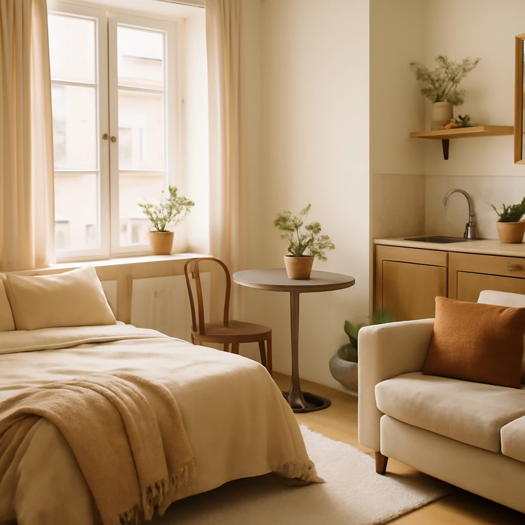
Introduction: the appeal of compact studio living across Europe
In many European cities, compact studio apartments have become a staple of urban living. A 20 m² studio can function as a kitchen, dining area, lounge and sleeping zone all in one, provided the space is planned with intention. The goal is to achieve calm, cohesive interiors where every centimetre serves a purpose. With careful zoning, modular furniture and a considered colour palette, a small footprint can feel generous, organised and comfortable rather than cramped.
Ideally suited layouts for a 20 m² studio
A typical 20 m² studio is often rectangular, with a compact bathroom tucked inside. The main room usually ranges from 14–16 m², a footprint that can accommodate a combined kitchenette and dining space, or a kitchenette with a living area that doubles as a sleeping space at night. European in-situ planning tends to favour open-plan arrangements that prioritise flow, daylight and ease of movement.
When planning, it is essential to consider how many people will share the space. In many European households, this means one or two adults, or a young family with a small child. For a single occupant, there is value in preserving openness: fewer internal walls create generous, adaptable space, allowing furniture to float and zones to form organically. For two residents, private zones become important, the interior should accommodate distinct retreat areas while maintaining a coherent overall aesthetic.
Designer principles: visual expansion, function and cohesion
Designing a modern studio is about balancing four aims:
Visually enlarge the space
Choose furniture with reflective or glossy facades to bounce light around the room.
Highlight dining or work zones with dedicated lighting to create depth and perception of distance.
Use flooring and wall finishes in a consistent tone to unify the space from edge to edge.
Limit visual clutter: use concealed or integrated storage and doors that sit flush with walls.
Consider linear ceiling lighting or recessed fixtures to elevate the perceived height of the room.
Make the space as functional as possible
Incorporate transformable furniture - sofa beds, wall beds, fold-down tables, and stowaway chairs - to maximise flexible use of the same footprint.
Prioritise integrated appliances and custom storage that fits within cabinetry or within alcoves to avoid visual bulk.
Use built-in storage within sofa plinths, window seats, or under-bed drawers to keep floors clear.
Hide large items such as laundry and cleaning equipment in dedicated cabinetry to preserve a clean, uncluttered look.
Create cohesive zones on one plane
Repeat materials across zones - same timber for kitchen surfaces, TV battens, and wardrobe fronts - to reduce visual fragmentation.
Echo colour accents between kitchen and living areas (textiles, curtains, cushions) to reinforce a single design language.
Materials, finishes and colour for a modern studio
Contemporary European interiors favour natural, honest materials and a restrained palette. Minimalism is less about cold surfaces and more about purposeful choices: materials that wear well, textures that add warmth, and colours that calm the eye. In a 20 m² studio, finishes should be durable and easy to maintain, yet visually rich enough to sustain long-term appeal.
Key principles include subtle contrasts, tactile textures, and a light, neutral base that acts as a stage for occasional colour bursts. Natural stone, timber veneers, linoleum or porous ceramic tiles can be used alongside soft textiles to avoid a sterile feel. When selecting colours, aim for neutrals with warm undertones - creamy whites, warm greys, soft taupe, and earthy accents - then introduce accent colours sparingly through textiles, artwork and small furniture pieces. The emphasis is on harmony and coherence, a palette that adapts with the seasons makes a small home feel timeless.
In this context, the floor plan should guide the finishes. A continuous floor (for example, a light wood or a restrained tiled surface) across living and kitchen zones visually unifies the space. Walls in cooler or neutral tones recede, while a single feature wall can carry a restrained colour or textured wallpaper to anchor a zone without breaking the overall flow. The goal is to achieve a calm backdrop that spotlights content - furniture, textiles and architectural details - rather than competing with them.
Studio design for a single occupant
When the space serves one person, the approach emphasises openness and flexibility. Options include:
An open-plan arrangement where zones gently overlap through colour, texture and furniture placement, with no hard partitions that interrupt sightlines.
Alternatively, a light, unobtrusive divider - such as a floor-to-ceiling screen, frosted glass panel or a slender bookshelf - can create a sense of separation without closing off the space.
In practice, an uncluttered studio with a modest sleeping area placed away from the entry creates a sense of calm as soon as one enters. A compact kitchen island or a slim peninsula can serve as both work surface and dining area, while a sofa or banquette can offer seating and an occasional guest bed with minimal intrusion when not in use.
High ceilings, where available, should be emphasised with vertical storage and tall, slim wardrobes. Mirrors or glossy surfaces can also enhance light and maximise the perception of space. The aim is to maintain a light, airy atmosphere that feels larger than its real dimensions.
Studio design for a family or two residents
Designing for two means negotiating privacy and shared living. Strategies include:
Lightweight, movable screens or glass partitions that can be repositioned as needed to create a sleeping area separated from the living zone.
Compact, containment-focused furniture such as a wardrobe wall that also functions as a room divider.
Flexible sleeping arrangements - such as a wall bed or bed integrated into a storage module - that can lie out of sight during the day.
Dedicated corners for work, study or hobbies that do not visually encroach on the living space.
A small balcony or loggia can provide a useful extension, serving as a quiet workspace or retreat. If the layout features a sleeping alcove, a frosted-glass screen or a light textile panel can offer privacy while keeping light intact. When designing for two, ensure there is enough room for movement around the bed, and keep the traffic routes clear to prevent a congested feel.
Planning and zoning: making the most of a single space
In many European studios, the space forms an L or a shallow footprint due to the bathroom’s location and the position of windows. Zoning should emerge from the plan rather than be forced by walls. Consider these practical questions:
Should there be a windowed zone for the kitchen, the living area, or the sleeping area?
Will the room include a dedicated sleeping zone?
Which interior style aligns with day-to-day life and long-term comfort?
Will zones have clearly defined boundaries or be softly blended?
With two windows, one commonly sits in the kitchen area, while the other’s position depends on occupant preference. Placing the living area after a small entry makes sense if the bedroom is to be tucked away, though this may leave the living room without direct external light. A light partition or a movable screen between living and sleeping areas can offer a practical compromise. When the bedroom is situated closer to the kitchen, a freestanding wardrobe or a glass wall can reconfigure the space while maintaining transparency and daylight.
Kitchen
Despite the appeal of a fully separated kitchen, constructing walls to enclose it often compromises the openness of the studio. A well-chosen boundary using materials, colour and texture is more effective. Consider the following ideas:
Define the kitchen area with a distinct material or finish - perhaps a continuation of the floor with a slight elevation at the boundary to signal a different zone.
Use a raised floor or a small step to mark the transition between kitchen and living space, without sacrificing airiness.
Keep appliances integrated into cabinetry with clean lines and modest hardware to minimise visual noise.
A light-toned island or peninsula can act as both workspace and dining area, visually separating the spaces without imposing physical walls.
When possible, position the dining area near the window to take advantage of natural light during meals.
The kitchen floor finish should harmonise with the living area. If the room is square or nearly square, a low plinth or change in material at the edge of the kitchen can clearly delineate zones while preserving a cohesive overall look. The design should prioritise ergonomic layouts, ensuring clear circulation between cooking, seating and storage zones.
Sleeping area
In a compact studio, the sleeping zone benefits from a sense of retreat. Options include a fold-down bed concealed within cabinetry or a freestanding screen that can be closed at night. Light, breathable textiles help to soften the space and avoid a barrier-like feel. If space permits, a partial enclosure with a slim wall, a glass partition or a fabric drape can offer privacy without visually shrinking the room by interrupting sightlines.
Working area
A small home office can be supported by the balcony or a compact interior niche. A minimal, well-lit desk, a comfortable chair, and shelving for documents are enough for most tasks. If a dedicated room isn’t available, a modular workstation that can be folded away or reconfigured alongside the living area will keep the space flexible for guests. For those who work from home regularly, ensuring easy access to power and data connections is essential, preferably hidden within floor or wall cavities to maintain cleanliness and calm in the main living area.
Bathroom
A typical European studio bathroom ranges from 4–6 m². Functionality and light are key. Use a glass shower enclosure to create a sense of openness, and opt for light-coloured tiling with gentle colour transitions to subtly raise the perceived ceiling height. Light-reflective materials, wall-mounted vanity units and compact storage help keep the space both practical and serene. When possible, plan for plumbing and concealed wiring to be contained within wall cavities or the floor slab, so that the bathroom remains bright and easy to clean.
Choosing a style for a 20–25 m² studio
Style is a personal statement, but a studio should always prioritise comfort, ergonomics and efficiency. A 20–25 m² space can be remarkably cosy and refined when guided by clear priorities. Common, well-considered directions include:
Scandinavian-inspired minimalism: light wood tones, pale walls, and restrained colour accents create a tranquil, functional environment that easily adapts over time.
Minimalist modern: a pared-back palette, clean lines, and high-quality materials that weather well and remain timeless.
Urban loft influence: a slightly industrial edge with exposed textures, glass partitions, and tactile fabrics, the emphasis remains on openness and practicality.
Transitional suites: a balanced mix of soft, comfortable textures with architectural clarity - ideal for homeowners who value warmth alongside structure.
For a studio of 24–25 m², combining a calm base with well-chosen accents can create a comfortable, stylish home. The right style should support the occupant’s daily routines and future plans, rather than dictate a rigid layout. The overarching objective is a space that feels effortless, inviting, and genuinely easy to live in.
Concealing services and planning for the future
Thoughtful services planning pays dividends in smaller spaces. On the drawing board, consider:
Routing electrical and data cabling through the floor slab and within wall channels where feasible. This keeps surfaces clean and makes future changes simpler.
Underfloor heating as an alternative to radiators on walls, which preserves vertical surfaces for storage and reduces visual clutter.
Ventilation systems designed to be compact and visually discreet, with ducting hidden behind false ceilings or within cabinetry.
Consider a modular, non-permanent approach to any ventilation or heating strategy if you anticipate reconfigurations in the future.
In a loft-inspired or contemporary European interior, a concealed services strategy helps maintain the sense of light and air. If a studio has a loft character, designers may introduce a faux stratified ceiling or an architectural feature to accommodate ducts without breaking the visual openness.
Colour, lighting and ambience
Lighting is a fundamental tool in small spaces. Layered lighting - ambient, task and accent - ensures the room is practical by day and welcoming by night. In all cases, plan lighting to suit the occupant’s routines and preferred mood, with dimmable options to adjust volumes of light as needed.
The kitchen requires focused, functional illumination on work surfaces, while the living and sleeping zones benefit from softer, warmer light for relaxation. One effective strategy is to use wall wash lighting or track lighting to illuminate furniture without creating harsh hotspots. Daylight, when available, should be maximised through unobstructed windows and sheer or light fabrics that diffuse rather than block light.
Colour should be a calm, stabilising influence. Neutrals with warm undertones create an inviting base, while an accent colour - applied sparingly through cushions, textiles or a single piece of furniture - provides personality without overwhelming the space. The palette should support a sense of continuity across zones, so avoid abrupt shifts that can feel disjointed in a compact layout.
Furniture arrangement for a tight studio
In small apartments, every piece of furniture must earn its keep. Thoughtful layout and multipurpose pieces are essential. Practical ideas include:
A sofa that converts to a bed or a concealed sofa bed with a slim profile, to free floor space at day and provide sleeping comfort at night.
A tall wardrobe that doubles as a room divider, creating a sense of depth without compressing the room.
A wall-mounted desk or fold-down table that tucks away when not in use, preventing obstruction of movement around the room.
A compact dining area integrated with the kitchen, such as a slender peninsula or a petite extendable table that seats two without dominating the space.
Storage integrated into seating, window seats, or bed frames, with pull-out drawers and hidden compartments to maximise efficiency.
When arranging furniture, prioritise sightlines and circulation. Avoid stacking heavy objects in the room’s centre, instead, position larger pieces against walls to maintain openness. A well-considered arrangement can make a 20 m² space feel calm, ordered and surprisingly generous.
Design tricks to visually enlarge the space
There are several psychological tricks interior designers use to make a small space feel larger. Here are practical guidelines that translate well across European contexts:
Keep walls in a continuous colour range to avoid visual breaks that cut the room into sections.
Horizontal or vertical stripes should be used sparingly and only where they enhance function or proportion, not to artificially shorten or widen the room.
Strategic use of mirrors - placed opposite windows or at the end of a corridor - can double the perceived light and depth.
Windows should remain unobstructed, light, sheer textiles maximise daylight while maintaining privacy.
Elevate seating and storage above eye level, tall, slim cupboards or wall-mounted wardrobes create a sense of height and airiness.
Glossy surfaces reflect light and movement, whereas matte finishes tend to absorb light - balance accordingly to achieve desired mood.
In addition to mirrors and surface finishes, consider using double-height elements or elevated platforms for subtle zoning that still leaves the ceiling visually expansive. A modest podium or stepped platform can delineate a sleeping area without creating a heavy, enclosed feeling.
Practical notes: finishing touches and maintenance
Good design stands the test of daily life. Choose durable materials with a robust warranty and a five- to ten-year aesthetic arc. In a European context, this often means natural woods, stone-like surfaces and textile choices that resist everyday wear. Ensure that fabrics are easy to clean and ideally removable for washing. Storage should be modular and relocatable to accommodate evolving needs - especially in a studio that may serve as a home office, a guest room, or a personal sanctuary over time.
Conclusion: making a 20 m² studio feel expansive and liveable
A well-planned 20 m² studio demonstrates that architectural restraint, thoughtful material choices and intentionally selected furniture can produce interiors that feel larger than their footprint. The most successful studios balance openness with cosy, human-scale details: light, texture, temperature and tactility. When zones flow naturally into one another and every piece earns its keep, a compact home becomes not merely a place to live but a space that supports a rhythm of life - quiet mornings, productive work moments, relaxed evenings and restorative nights.
You may also like these articles
 Renovation
Demolishing walls in a renovation: a practical European guide
A practical, regulator-friendly guide to planning, permits, and safely demolishing interior walls.
Kitchen Design
Loft Kitchen Design: Industrial Chic for European Homes
Industrial chic meets European homes: loft kitchens reimagined
Colour & Materials
Yellow as a Design Tool: Temperature, Tone and Timeless Combinations
Master yellow in European interiors with temperature, tone, and versatile pairings.