
Explore interior trends, AI design insights, styling guides and real transformations
Twelve design ideas for 12 m² kitchen–living spaces across Europe
Introduction
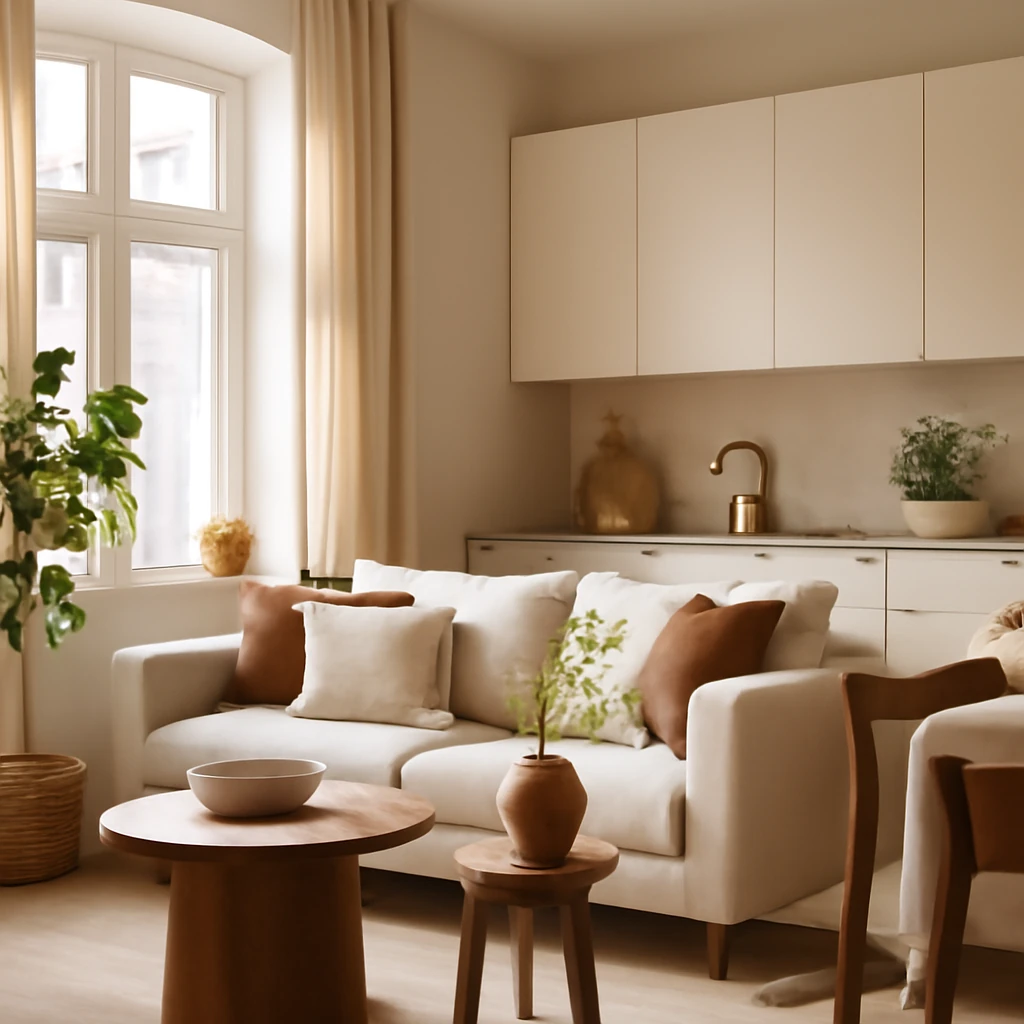
Maximising a compact footprint requires craft and strategy. A 12 m² kitchen–living space can comfortably host a cooking zone, a dining area and a cosy seating corner, provided designers exploit light, scale and smart storage. Across European homes from city flats to new build apartments, the most effective solutions balance openness with defined zones, and use materials that reflect light and texture without clutter. This feature presents twelve proven approaches used by contemporary designers to create calm, functional and stylish kitchen–living rooms in 12 m². Each concept emphasises practical layouts, storage cleverness and colour strategies that work in a European context.
In our compact tests, the aim is not to cram in as much as possible but to create spaces that feel larger, more coherent and genuinely comfortable for daily living. The following projects illustrate a spectrum of approaches - from balanced contrasts and metallic accents to open shelving and architectural zoning. They show how proportion, surface finishes and lighting can transform a narrow footprint into a refined living area.
Twelve kitchen–living room projects for 12 m² spaces
-
Balanced contrast
Even in a space of 12 m², a light base palette provides clarity and vitality. A neutrally light backdrop - often white or off-white - is paired with two bold accents that pull the room together. In this approach a lilac and a turquoise echo each other in tone, while white keeps surfaces airy and reflective, increasing perceived brightness.
To maximise daylight, designers frequently install reflective trims around the window, a technique that enhances natural light without increasing glare. When using high reflectivity in a small room, it is prudent to monitor heat build up and glare, ensuring window treatments soften sun without blocking daylight.
- Base lies in a light, neutral field
- Two complementary accent colours provide depth
- Reflective window returns amplify daylight
-
Brass and bold details
This design designates the living zone with a compact work area and a dining group while introducing a small sofa facing a wall-mounted screen. The palette remains restrained with a dominant neutral grey and beige, but the 60 30 10 rule is evident: 60 percent base, 30 percent accent in a rich colour, and 10 percent metallic detail in brass or gold tones.
Strategic use of brass adds warmth and a sense of luxury without overpowering the room. The key is restraint: small metal touches on lighting, handles or a slim shelf can elevate the scheme without clutter.
- 60 30 10 as a guiding palette rule
- Brass as a refined accent
- Compact dining and a modest sofa to define zones
-
Thoughtful storage system
In a slightly smaller 11 m² layout, clever planning minimises visual weight. The living area sits opposite the kitchen work zone, with a slim cluster of storage on the wall that acts as a buffer between zones. Open shelving replaces bulk cabinets to prevent the room from feeling closed in, while a tall appliance cabinet or a narrow fridge alcove keeps essential storage close at hand.
The goal is to avoid visual heaviness by distributing storage along the wall opposite the seating, keeping the horizontal plane open for movement and light.
- Open shelves heavy with carefully chosen objects
- Integrated appliances to reduce bulk
- Storage placed opposite the seating for balance
-
Open shelves as a feature
A kitchen–living area can read brighter when cabinets are replaced with open shelving. A bold red fridge acts as a focal point, while shelves above the work zone carry essential items and decorative touches. The resulting space feels lighter yet retains definition through shelving rhythm.
When wall cabinets are omitted, consider how the television or dining table can be positioned to avoid conflicting sightlines and keep the room cohesive. If the TV sits above the dining area, ensure there is adequate clearance for comfortable viewing and seating.
- Open shelving for a lightweight effect
- A single bold appliance as a focal point
- Thoughtful placement to maintain sightlines
-
Accent zoning
Here the room is visually carved into a cooking zone and a living corner using material and texture rather than solid partitions. A decorative plaster or timber screen marks the boundary, while varied finishes on the wall and floor reinforce each zone. The living area remains calm, with a sofa and TV positioned on a restrained palette, while the kitchen enjoys stronger texture and gloss on the surfaces.
- Zoning achieved through materials rather than walls
- Textured finishes for depth
- Calm living area balanced with a glossy kitchen
-
Elongated plan
A narrow, stretched plan allows for a long kitchen run with storage occupying half the space. The remaining length becomes a compact seating area with a small dining set and a TV. The design uses proportional lighting and linear furniture to maintain flow and avoid visual congestion.
Accent colours on the seating or artwork provide personality without breaking the sense of order. Lighting is essential here: track lighting or a row of ceiling pendants can unify the zone while assisting with task and ambient needs.
- Storage occupies one half of the plan
- Compact living zone with light, linear furniture
- Focused lighting to tie zones together
-
Compact space in calm colours
In a nearly square 12 m² space the design uses a restrained palette of greys and beiges, with a few deeper accents. The effect is achieved through a mix of textures - faux marble tile, pale timber flooring and matte mouldings - that echo the kitchen fronts and create a cohesive surface language. A statement pendant adds a focal point without visual heaviness.
- Monochrome base with texture variety
- Textured surfaces to read as depth
- A single design feature to unify the room
-
Calm minimalist interior
Another 12 m² project embraces minimalism with a cool grey–blue palette. The philosophy remains similar to the previous concept, yet the emphasis shifts to surface purity and refined lines. The kitchen front is intentionally simple, while the dining area is highlighted by a sculptural pendant or a slim chandelier that grounds the space.
- Minimalist cabinets with clean lines
- Muted palette with purposeful lighting
- Balance between kitchen function and living comfort
-
Bay window kitchen in a typical European flat
European flats often feature bay windows, which visually expand a compact space and invite daylight to the heart of the home. In this 12 m² layout the bay window becomes a throne for a cosy seating nook, while the kitchen line remains functional and neat. A subtle blue-grey cabinetry palette harmonises with warm wall tones and a light wood floor.
- Bay window as a design asset
- Balanced blue-grey cabinetry with warm walls
- Seating nook by the window for relaxed dining
-
Contrasting colours and textures
This space uses warm tones across the room with two dominant centres: a green work zone and a red lounge area. Timber elements, paired with sandstone or warm beige, form a strong base. Colour blocks help zone the space and create visual interest without clutter.
Two lighting zones emphasize the two activity areas: a wall sconce near the seating and an artful pendant over the dining area, keeping the room well lit for both tasks and relaxation.
- Warm colour blocks define zones
- Timber and stone textures as a unifying thread
- Dual lighting zones to aid functionality
-
Laconic suprematism in the kitchen
Geometric forms and bold colour accents are the hallmarks of a suprematist-inspired scheme. The cabinet fronts and media stand are highly simplified, allowing the architecture and primary shapes to communicate. The result is a striking yet restrained aesthetic that reads as modern art translated into daily living.
- Simple geometry in furniture fronts
- Bold colour as an accent rather than a feature
- Clean surfaces support a calm living zone
-
Chill-out zone by the window
The final concept places a comfortable seating area by the window, creating a natural resting spot within the kitchen–living space. A wide, low window sill doubles as extra seating or display space for textiles and plants. The approach emphasises a calm, comfortable atmosphere with a straightforward kitchen line and a restrained dining arrangement.
- Window seat as a multifunctional feature
- Low profile furniture for an airy feel
- Textiles and plants to soften the space
Practical takeaways for European homes
While each project has its unique character, several universal principles emerge for designing 12 m² kitchen–living spaces across Europe. Prioritise light, keep circulation clear, and choose storage strategies that hide clutter without sacrificing accessibility. Use finishes that reflect light and create perceived depth, and employ zoning tactics through materials, lighting and furniture arrangement rather than walls. Finally, let a single confident accent or texture guide the room to ensure cohesion across the entire footprint.
Closing thoughts
Small spaces demand thoughtful design, but they also offer exciting opportunities to experiment with proportion, materials and light. The twelve concepts outlined here demonstrate how European homes can achieve both practical functionality and refined aesthetics in a compact kitchen–living configuration. By combining strategic layouts, open shelving, subtle zoning and careful colour selection, any 12 m² space can become a bright, comfortable home hub rather than a constraint.
You may also like these articles
 Tips & How-To
Dressing a Sofa with Throws: A Modern European Guide
Master the art of layering throws on sofas for chic European interiors.
Bedroom
Bedroom Renovation in Europe: Colour, Styles and Finishes
Inspiring European bedrooms with colour, style and light ideas.
Small Spaces
Small spaces, big style: Essentials for European apartment design
Smart strategies to transform compact European homes into comfortable, stylish spaces.