
Explore interior trends, AI design insights, styling guides and real transformations
Accent walls for European homes: how colour, texture and proportion transform spaces
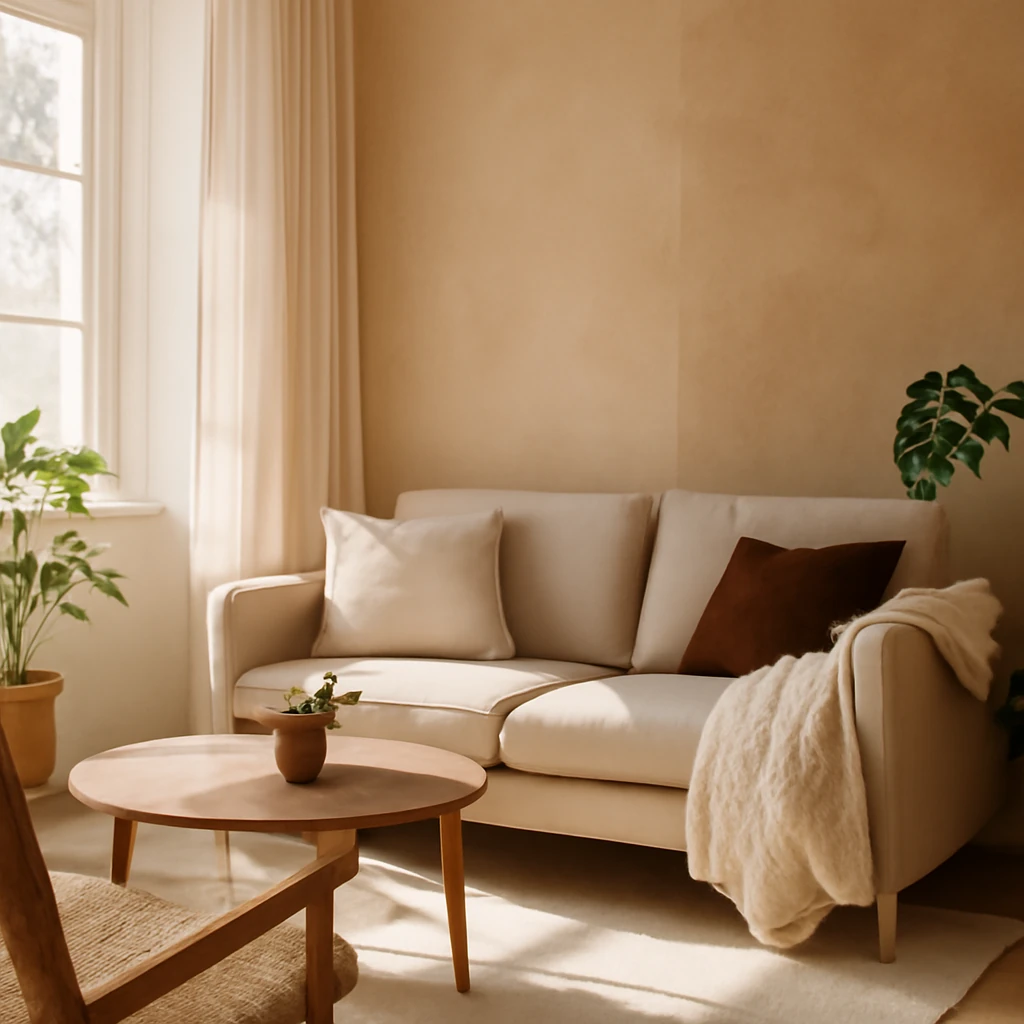
What is an accent wall
An accent wall is a wall or a portion of a wall that stands apart from the rest through colour, texture or pattern. The aim is to draw attention to a specific surface within a room, creating a focal point that anchors the space. A successful accent wall can:
- deliver a dramatic “wow” moment;
- distract from less-than-perfect design details elsewhere;
- define zones within an open plan;
- adjust perceived proportions of the room.
An accent can be a wall, a corner, or even a ceiling. The key condition is that the surface “solos” in the interior and commands attention without overwhelming the room.
Pros and considerations
An accent wall is one of the most budget‑friendly ways to refresh a home. Redesigning a single wall - whether by repainting or applying wallpaper - costs far less than redoing multiple walls. I often use this technique to maximise impact while keeping costs sensible: the majority of walls stay neutral, while one wall becomes a carefully chosen feature.
Of course, an accent wall can feel dated over time, just as any design choice can. Yet its core function - adding depth and visual interest - remains reliable, and it can be refreshed relatively easily.
One caveat is that a feature surface may not align with a new furniture layout if you reconfigure rooms later. If you anticipate frequent re‑organisation, consider a more adaptable approach, such as a reversible finish or a neutral backdrop with removable decor accents.
Which interiors suit an accent wall
The beauty of an accent wall is its versatility: it works with traditional, contemporary, Scandinavian, industrial and many other styles. The essential rule is that the chosen pattern or colour must read clearly from a distance and not be obscured by bulky furniture or oversized headboards. A large pattern requires space to appreciate it, in smaller rooms, scale the motif accordingly to avoid visual overload.
In practice, the impact of an accent should be considered in relation to lighting, furniture layout and the room’s primary function. If the pattern is bold, you’ll want complementary elements - soft textiles, restrained furniture silhouettes and carefully chosen lighting - to keep the space balanced.
How to choose the right accent
The decision of what to emphasise - colour, pattern or texture - depends largely on the room’s style and its architectural features.
- Classic interiors: consider wallpapers with refined motifs, decorative plasterwork, or subtle colour enhancements around mouldings. A restrained feature with a hint of sash‑weave or damask can elevate traditional spaces without shouting.
- Contemporary spaces: more often rely on solid colours or industrial textures (concrete-look finishes, panels, or wood slats) to maintain a clean, pared‑back feel. Geometric patterns or tactile surfaces such as brick‑slip panels can also work well when used sparingly.
Whichever route you choose, ensure the accent’s colour or pattern is echoed in other elements of the room - through soft furnishings, artwork, or ancillary accessories - to create a cohesive look.
For example, a natural motif repeated in cushions, vases and lighting can harmonise with an accent wall featuring a subtle botanical wallpaper, tying the room together without duplicating the motif excessively.
Lighting as a partner to the accent
Lighting plays a crucial role in how an accent reads. A warm pendant over a dining area can heighten a feature tile or a painted wall, while concealed LED strips along a ceiling edge can make a textured surface glow gently. In daylight, textures pick up shadows and highlights that emphasise tactility, by night, carefully chosen lighting maintains the wall’s presence without glare.
Painting
Painting remains one of the easiest, most versatile ways to establish an accent. Select a shade that harmonises with the room’s palette but still stands out against surrounding walls. A single deep hue, a vibrant colour, or a soft, contrasting tone can all work, depending on the room’s light and size. If the wall is uneven, ensure proper preparation - filling, sanding and priming - to avoid patchiness and achieve an even, long‑lasting finish.
Wallpaper
Wallpaper offers texture, depth and pattern that paint cannot match. It’s particularly effective for adding dimensionality with geometric, natural or tactile patterns. In contemporary interiors, wallpapers in restrained palettes with modern motifs often perform best because they remain timeless while still offering visual intrigue. For highly utilised zones - hallways, dining areas or living spaces - choose durable, washable wallpapers designed for high traffic and easier maintenance.
Finishing with contemporary materials
Modern accents can be achieved with a range of materials tailored to the room and environment. Options include wood or timber panels, metal finishes, stone veneers, textured plaster, and even brick slips. The placement should be practical as well as decorative: in dining zones, walls should be easy to wipe and resistant to scuffs, in living rooms, a softer, more tactile material often works best. When selecting material, consider the room’s humidity, traffic and cleaning requirements.
- Wood or timber panels create warmth and a natural feel, ideal for living rooms and bedrooms.
- Stone veneer or ceramic tile can bring a spa-like quality to bathrooms or kitchens when correctly sealed.
- Textured plaster or micro‑cement finishes offer a modern, organic feel with subtle irregularities that add depth.
Mobile decor
If you prefer not to commit to a permanent feature, mobile decor is a practical alternative. Frames, canvases, mirrors and decorative panels can be moved or swapped as your tastes evolve. Shelving units with curated ornaments or plants can also act as flexible focal points that don’t require major renovation.
Mobile decor ideas
- Art prints or framed posters that can be rearranged or replaced with changing seasons or moods;
- A decorative mirror or a sequence of mirrors to reflect light and enlarge the sense of space;
- Wall-mounted shelves with geometric arrangements of objects or greenery;
- Isolated panels or lightweight art pieces that can be repositioned easily.
Interesting objects
Sometimes an accent can be built around an object rather than colour or pattern. A striking fireplace (real or decorative), a water feature, a large plant display, or even a tall enclosure housing a curated collection can become the room’s focal point. A single, significant item often communicates character more effectively than many smaller touches, especially in minimalist schemes.
Live plants offer a refreshing way to enhance an accent wall. A single statement plant or a carefully arranged group can echo the wall’s colour or texture while adding vitality to the space. For durability and ease of maintenance, opt for species suited to indoor conditions and light levels.
Plant display ideas
- A tall, architectural plant placed near the accent wall to create a vertical frame;
- A set of smaller plants arranged on a modular shelf or built-in alcove that mirrors the wall’s geometry;
- A wall‑mounted planter to extend the accent into vertical greenery.
Tips for creating an accent wall
Colour properties
Warm colours - reds, oranges and yellows visually bring a wall forward, making a space feel cosier and more intimate. They can be a great choice for a large living area where you want a sense of warmth and enclosure.
Cool colours - blues, greens and purples recede slightly, creating a calmer, more expansive atmosphere. They are well suited to smaller bedrooms or home offices where serenity is prized.
Choose companion colours
The accent colour should harmonise with the room’s overall palette. Depending on the desired effect, it can be complementary (contrasting but balanced on the colour wheel) or monochromatic (different tones of the same hue). A well‑curated colour wheel helps identify complementary or tonal partnerships, even for nuanced shades.
In practice, you might repeat a hue in textiles, art frames or accessories to knit the room together without overwhelming it.
Use textures
The texture of the surface can significantly alter colour perception and become a defining feature of the wall itself:
- Smooth finishes suit modern, minimalist interiors.
- Textured wallpapers or paneling add depth and tactility.
- Plaster with an aged or rustic finish can introduce warmth and character.
Textured finishes are especially effective in monochromatic schemes, where the surface becomes the primary visual interest.
Proportions
Graphic patterns can dramatically influence space perception. Consider the following:
- Horizontal lines visually widen a room, while vertical lines can raise the ceiling line.
- Botanical or nature-inspired patterns can soften a space and make it feel more inviting.
- Abstract motifs offer flexibility, letting you experiment with form and scale without rigid rules.
For intricate patterns, use a simple background or a prepared template to maintain clean edges and repeatability.
Accent wall in the interior of different rooms
Living room
In living areas, the most common approach is to feature the wall that is immediately visible upon entering the space. This may be behind the sofa, opposite the seating area, or as a backdrop for the dining zone. The wall can be painted, wallpapered, or enhanced with decorative mouldings, framed art, or a striking sculpture.
To avoid overwhelming the space, ensure the accent wall relates to the room’s scale and lighting. If the wall is very bright or busy, balance it with subdued furniture and soft textiles elsewhere in the room.
- Consider placing the accent near the ceiling or integrate it with a sequence of accessories to soften the transition into adjoining spaces.
- For a calm ambience, keep the surrounding walls lighter and allow the feature to anchor the composition.
Bedroom
Bedrooms often benefit from an accent on the wall behind the bed or directly opposite for visual interest when lying down. A fabric upholstered headboard or textile panels can form part of the feature, delivering softness and warmth. The goal is to create a cocooning effect without making the room feel smaller.
- The headboard can become part of the wow factor if it complements the wall colour or pattern.
Kitchen
In kitchens, the accent is frequently chosen in the dining zone or on a wall without upper cabinets to keep the area practical and easy to maintain. Tiles with a bold pattern, wood slats, or a different paint colour are common choices. Wallpaper is less common in kitchens due to practical considerations, but highly durable, washable options can work where appropriate.
- Ensure the finish is moisture‑resistant and easy to wipe down in high‑traffic zones.
Bathroom
The bathroom is a bold place for an accent wall - usually behind the bath or the wash basin. The key is visibility from the doorway and the wall’s ability to withstand humidity. Moisture‑resistant finishes, appropriate tile choices, and sealed substrates help maintain the look over time.
Children’s room
In a child’s room, accents are often bright and playful. Patterns or wall decals, vibrant wallpapers, or painted scenes can stimulate imagination while remaining easy to refresh as tastes evolve. Durable surfaces and washable finishes are particularly important in this space.
Hallway
Hallways benefit from accents that read clearly in transit: a bold colour, a tactile surface, or a striking tile can act as a navigational cue and make a narrow corridor feel more expansive. A large mirror or a reflective panel on the accent wall can enhance light and perceived space.
Accent wall in my interior
In my own flat, I have two accent walls: one in the living area behind the sofa and another in a child’s room. My approach started as a personal experiment rather than a refit. I drew simple shapes on the wall with pencil, selected paints in complementary tones, and filled in the forms. The process was slower than I expected, yet the result felt deeply personal and uniquely ours. The project invited family collaboration, turning decorating into a shared activity and a lasting memory.
In the child’s room, we created a mountainscape using painter’s tape to outline the forms and then filled them with colour. It was a hands‑on project that brought the family together and taught that imperfect lines can still yield a striking result. The key lesson: aim for a wall that expresses who you are, rather than chasing perfection.
About the author
The article is written by a European architect‑designer specialising in residential projects, with a focus on thoughtful space planning, renovation and interior design. The central message is clear: embrace personal expression through accent walls, but balance them with proportion, materials and light to ensure longevity and daily practicality.
My advice for anyone considering an accent wall is simple: don’t fear experimentation. When you draw and paint or install textures yourself, you inject a distinct character into your space. The result is not merely stylish, it is truly yours.
You may also like these articles
 Small Spaces
Eight clever ideas from a European 34 m² apartment to maximise space
Eight space saving ideas for a 34 m² European flat that prove small spaces can shine.
Interior Design
Decorative partitions: flexible zoning for European homes
Zoning ideas with decorative partitions for European spaces.
Tips & How-To
30 Smart Storage Solutions for European Kitchens
30 practical ideas to banish kitchen clutter with style.